Zhiyuan Zheng, Xin Hu (2024). A Comparative Study of Visual Culture in Tourism Apps. In: Human Factors in Design, Engineering, and Computing. AHFE Open Access, vol. 159, pp. 638–645. https://doi.org/10.54941/ahfe1005630
With the rapid advancement of mobile internet technology, tourism applications have become a crucial means for tourists to explore and learn about tourist attractions. This paper focuses on the use of visual culture in tourism apps, aiming to explore the employment and categorization of visual culture in the design of excellent tourism applications. By comparing two applications—"Forbidden City 365" and "Great Wall 24 Hours"—this study analyzes how visual culture is presented on digital platforms and promoted based on the features of the respective tourist attractions.The Forbidden City and the Great Wall, as represented by the "Forbidden City 365" and "Great Wall 24 Hours" apps, are both World Cultural Heritage sites with rich cultural connotations and distinctive features. Their visual culture is highly representative, making these two tourism apps ideal subjects for comparative analysis in this research. By examining the design elements, images, color schemes, symbols, and cultural significances in both apps, this paper provides a comprehensive evaluation of the use of visual culture. Analysis of the main pages includes investigating the frequency of design elements, colors, images, and cultural symbols used, alongside collecting user feedback from app store reviews to understand user responses and experiences with the app designs.By comparing the design concepts, cultural conveyance, and user experiences of "Forbidden City 365" and "Great Wall 24 Hours," this study explores the differences in design elements, color schemes, cultural symbols, and user feedback dimensions. It reveals how visual culture influences user experience and perception in these apps.Results indicate that visual culture plays a significant role in user interaction with applications and their understanding of tourist attractions. These visual cultures are not merely decorative but serve as carriers of cultural meaning and identity, enriching the user experience by providing deeper cultural insights. This suggests that the effective use of visual culture can significantly enhance the informational and emotional appeal of tourism applications.Additionally, this study emphasizes the importance of selecting appropriate visual cultures corresponding to the tourist attractions when designing tourism apps. By reflecting the unique cultural characteristics of the sites, app designers can create more attractive and meaningful user experiences. The comparative analysis offers valuable insights into how different cultural narratives are visually presented, providing a framework for future research in this field.To summarize, this paper highlights the potential of visual culture in enhancing the communication and aesthetic quality of tourism applications. As mobile technology continues to advance, the integration of these symbols into app design will become increasingly important in promoting cultural tourism. This research offers practical recommendations for app designers and developers to create more immersive and culturally resonant tourism experiences. By focusing on the expression of the unique visual culture of tourist attractions, tourism apps can serve not only as informational tools but also as gateways to deeper cultural appreciation and understanding.
With the rapid development of mobile Internet, tourism applications (Apps) have become an important channel for modern tourists to obtain information, plan trips and share experiences. These apps provide rich visual elements (such as images, color matching and cultural symbols) to provide users with intuitive travel information and create an immersive virtual travel experience. This diversified use of visual culture not only improves the user experience, but also becomes a key carrier to reflect the cultural characteristics of the tourist destination. Although there have been studies on the application of visual culture in tourism apps, there are still insufficient studies on how tourism apps affect user experience and cultural cognition through visual elements in different backgrounds. In order to fill this research gap, this study will compare and analyze two travel apps with rich cultural connotations - “Forbidden City 365” and “Great Wall 24 Hours” - to reveal the role of visual culture in enhancing user experience and conveying cultural meaning.
Existing studies have explored the application of visual culture in tourism apps from multiple perspectives. Chung et al. (2015) analyzed the image characteristics of South Korean tourism apps and found that these apps were more inclined to use landscape photos rather than people photos to
A Comparative Study of Visual Culture in Tourism Apps 639
highlight natural and human landscapes. Yovcheva et al. (2013) proposed to use augmented reality technology to provide personalized visual navigation content according to users’ interests to enhance users’ sense of immersion and participation. In terms of APP interaction design, Tussyadiah and Fesenmaier (2009) pointed out that vivid visual presentation can help stimulate users’ imagination and enhance their yearning for destinations. Huang et al. (2016) further found that the layout and interaction design of visual elements directly affect users’ information acquisition efficiency and user experience. From the perspective of culture, Chung and Koo (2015) compared the tourism apps of South Korea and China and found that the former paid more attention to natural scenery, while the latter emphasized humanistic characteristics, reflecting the differences in tourism culture and values of different countries. Huang et al. (2018) pointed out that visual elements in apps not only convey the cultural characteristics of destinations, but also significantly affect users’ cultural cognition and travel experience. To sum up, visual culture plays multiple roles in travel apps. It is not only an important carrier of information transmission and interactive experience, but also a window to reflect cultural differences.
By comparing the page structure, visual elements and color selection of “Forbidden City 365” and “24 Hours of the Great Wall” apps, this study explores the role of visual culture in enhancing user experience and conveying cultural significance in tourism apps. By collecting user comments from APP stores and understanding users’ feedback on APP design and their experience, the research will provide a novel perspective to enrich the current design theory and practice of travel apps.
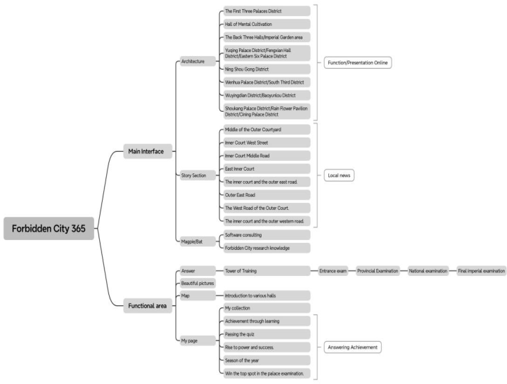
APP PAGE STRUCTURE COMPARISON According to the page structure analysis and comparison of the two apps below, the “Forbidden City 365” APP has obvious advantages in design. First of all, it has comprehensive functions, covering many aspects such as architecture, story, knowledge base, functional area, etc., with rich content, it can meet the diversified needs of users. The main interface is divided into a number of main parts, each part has a detailed sub-classification, hierarchical, easy for users to find and use. The APP contains a large amount of historical knowledge and stories, suitable for users interested in the history and culture of the Forbidden City. In addition, interactive functions such as “virtual tour” and “knowledge question and answer” are provided through the “functional area” to enhance the user’s sense of participation. It has a 3.9 rating on the App Store and has been praised for its interface design and usability. However, the number of features and content can be complicated and overwhelming for first-time users. However, because of the relatively good navigation design, the user does not affect the user experience too much.
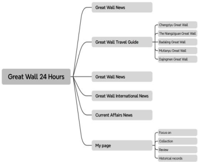
In contrast, the “24 hours of the Great Wall” APP has too much news information, and the function of the tourism promotion APP is rigid. It is mainly divided into five parts: news, travel guides, international news, current affairs news and personal pages. Although it is easy for users to get started, the main functions are concentrated on news and travel guides, and even the
640 Zhiyuan and Xin
proportion of news is higher, which will also make tourists lose their desire to use, and the goal is not clear enough to fully meet the travel needs of users. The personal page provides collection, comment, history and other functions, which are basic functions of the APP, and there is no additional design content. Compared with “Forbidden City 365”, the function of the APP is relatively simple, the content is not rich enough, may not be able to meet the diversified needs of users, and the practicality is very limited. Lack of interactive functions, such as virtual tour, knowledge questions and answers, user participation is weak. It has a rating of 2.7 on the App Store, with monotonous features, limited help for travel, and poor user feedback.
To sum up, “Forbidden City 365”is suitable for users with a strong interest in history and culture, providing comprehensive knowledge and interactive experience, interface design and practicality are widely praised, but attention needs to be paid to simplifying the user interface and enhancing the user experience. On the other hand, “24 Hours of the Great Wall” is rigid as a tourism promotion APP due to excessive news information and poor user feedback. The score on the App Store also reflects users’ demand for diversified functions and low evaluation on the use of apps with excessive text content.
Figure 1: “Forbidden City 365” APP page structure diagram (self-drawn by the author).
A Comparative Study of Visual Culture in Tourism Apps 641
Figure 2: “Great Wall 24 hours” APP page structure diagram (self-drawn by the author).
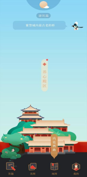
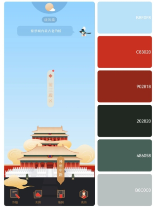
APP MAIN INTERFACE VISUAL ELEMENTS COMPARISON The two pictures show the main interfaces of the two apps “Forbidden City 365” and “Great Wall 24 Hours” respectively. The interface icon design of the Forbidden City 365 adopts the line style, simple and modern, which is in line with the current design trend. All ICONS are consistent in style and color, enhancing the overall feel of the interface. In the main graphic part, the illustrated images of various palaces in the Forbidden City are used, and the prototype and primary colors of the palace are kept to make visitors feel involved. The magpie and bat, two auspicious animal images in Chinese culture and commonly used in the decoration of the Forbidden City, are used as consulting link ICONS on the top, and these two visual elements correspond to the day, the architecture, the night and the story respectively. Also in line with the habits and inherent images of the two animals, the ICONS at the bottom of the functional area are clearly designed and easy to recognize, such as the “answer” icon uses the image of paper and pen, the “Meitu” icon uses the image of two overlapping pictures, which is intuitive and clear, and the “map” icon uses the image of the overall regional division map of the Forbidden City. In addition, when sliding the page to change the main palace, the red in the map will also change its position, and the “My”icon on the far right selects the traditional Chinese literati image, which echoes the feature of the APP to answer questions as a major feature. There are text annotations below each icon to further help users understand each function.
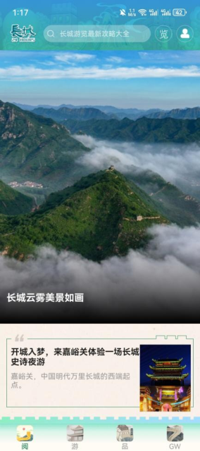
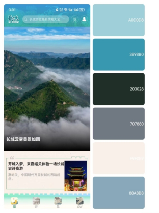
The interface icon design of the Great Wall 24 hours is simple, the main part of the page directly uses the bird’s eye view of the Great Wall, and the top search bar uses the color-changing illustration of the Great Wall as the background. The icon in the bottom navigation bar also adopts the illustration style, but the use of illustration in small ICONS makes the difference between each icon not obvious, nor can it clearly show the corresponding function, and the name corresponding to the icon uses a single word, which is easy to cause confusion, and finally the English news section represented by “GW” is also abbreviated. The ICONS in the top and bottom
642 Zhiyuan and Xin
navigation bars remain the same in style, but differ in color, with a turquoise top and a turquoise and white gradient at the bottom. The information section at the bottom is divided into lines and outer frames, using certain images of the Great Wall. However, the pictures chosen for Jiayuguan Pass of the Great Wall are more random. The colors of the pictures at night are dark and the images are not clearly reflected, which is easy to affect the impression of tourists.
From the comparison of advantages and disadvantages, the icon design of the Forbidden City 365 is consistent with the original building in style and color, which enhances the overall sense of the interface. The icon design is simple and modern, easy to identify, and each icon is marked with text to further help users understand each function. In contrast, the 24-hour icon design of the Great Wall is more complicated, some ICONS may not be enough to express the corresponding meaning, and the interface content is simple, the use of the Great Wall-related elements are few, not enough to express the cultural connotation and architectural image of the Great Wall.
In general, the icon design of the Forbidden City 365 is more excellent in style consistency, recognition and text annotation, which brings users a concise and clear visual experience. The 24-hour application of the visual elements of the Great Wall is simple, and the expression of the image of the scenic spot is limited.
Figure 3: “Forbidden City 365” APP main page (APP screenshot).
A Comparative Study of Visual Culture in Tourism Apps 643
APP COLOR APPLICATIN CONTRAST From these two color analysis charts, it can be seen that there are obvious differences in the use of color between the two apps “Forbidden City 365” and “Great Wall 24 Hours”. “Forbidden City 365” mainly uses colors such as red, orange and blue, which are highly consistent with the architectural colors of the Forbidden City. Red and orange represent the walls and roofs of the Forbidden City, and blue symbolizes the sky. The proper use of colors in “Forbidden City 365” can well convey the cultural atmosphere of the Forbidden City, enhance the tourist experience, and make it easier for them to immerse themselves in the history and culture of the Forbidden City.
The “24 Hours of the Great Wall” mainly uses colors such as blue, green and gray, which have a certain gap with the actual color of the Great Wall. The main colors of the Great Wall are gray and earthy yellow, while the blue and green colors used in the APP are more representative of the natural landscape than the Great Wall itself, and they cannot express the majestic characteristics of the Great Wall.” The color selection of “24 Hours of the Great Wall” does not reflect the cultural atmosphere of the Great Wall well, and the experience brought to users is not as good as “Forbidden City 365”.
Due to the color selection, users’ feedback on “Forbidden City 365” is more positive, believing that its color use is more appropriate and more in
644 Zhiyuan and Xin
line with the inherent aesthetic impression of traditional Chinese culture and architecture, while the color selection of “24 Hours of the Great Wall”fails to meet users’ expectations, affecting visitors’ perception and experience of the Great Wall culture. To sum up, “Forbidden City 365”is more successful in the use of color, can better convey the cultural atmosphere of the building, even before the play can make visitors immersive, enhance the tourist experience, and “24 hours of the Great Wall” needs to be adjusted in the color selection to better reflect the actual color and cultural atmosphere of the Great Wall. Thereby enhancing the overall visitor experience.
Figure 5: “Forbidden City 365” main interface color analysis.Figure 6: “Great Wall 24 Hours” main interface color analysis.
A Comparative Study of Visual Culture in Tourism Apps 645
CONCLUSION
Through a comparative analysis of “Forbidden City 365” and “24 Hours of the Great Wall” travel apps, this study reveals the important role of visual culture in enhancing user experience and conveying cultural meaning. The research results show that the unique visual culture of tourist attractions should be fully considered in the design of tourism applications, and the unique visual culture of tourist attractions should be reflected through reasonable page structure, unified visual elements and appropriate color selection, so as to enhance users’ immersion and cultural resonance. By focusing on the expression of the unique visual culture of a site, travel apps can serve not only as information tools, but also as a gateway to deeper cultural appreciation and understanding.
However, there are some limitations to this study. First of all, the study only analyzed two specific travel apps, and the sample scope is relatively limited, which may not fully reflect the design characteristics of all travel apps. Future studies could expand the sample to include more types and backgrounds of travel applications to validate the conclusions of this study.
ACKNOWLEDGMENT
First of all, I would like to thank my supervisor, Ms. Hu Xin, for giving me a lot of guidance and help in the process of writing my thesis. I would like to thank my school for providing me with a good learning environment and necessary resources. Thanks to my family, your understanding and support have enabled me to concentrate on my studies and research. Finally, I would like to thank all those who have helped me directly or indirectly in the process of writing my thesis.
REFERENCES
Chung, N., & Koo, C. (2015). The use of social media in travel information search.
Telematics and Informatics, 32(2), 215–229. Chung, N., Han, H., & Joun, Y. (2015). Tourists’ intention to visit a destination: The role of augmented reality (AR) application for a heritage site. Computers in Human Behavior, 50, 588–599. Farman, J. (2012). Mobile interface theory: Embodied space and locative media.
Routledge. Hjorth, L. (2011). Mobile@game cultures: The place of urban mobile gaming.
Convergence: The International Journal of Research into New Media Technologies, 17(4), 357–371. Huang, Y. C., Backman, K. F., Backman, S. J., & Chang, L. L. (2016). Exploring the implications of virtual reality technology in tourism marketing: An integrated research framework. International Journal of Tourism Research, 18(2), 116–128. Humphreys, L. (2013). Mobile social media: Future challenges and opportunities.
Mobile Media & Communication, 1(1), 20–25. Tussyadiah, I. P., & Fesenmaier, D. R. (2009). Mediating tourist experiences: Access to places via shared videos. Annals of tourism research, 36(1), 24–40. Yovcheva, Z., Buhalis, D., & Gatzidis, C. (2013). Engineering augmented tourism
experiences. In Information and communication technologies in tourism 2013 (pp. 24–35). Springer, Berlin, Heidelberg.
LISTED IN THE AHFE DIGITAL BOOKSTORE CATALOGUE
Explore the complete digital volume
Human Factors in Design, Engineering, and Computing
Read this individual research paper free through the original publisher, or explore the full digital proceedings book.
ISBN 978-1-964867-35-9
Explore this ISBN in the AHFE Bookstore ↗Listed in the July 2026 bookstore catalogue; search by ISBN to confirm current availability · Digital book purchase optional