Sarah Jane Carillo, Neil Adam L. Marinas, Richelle Relator, Lorelie C. Grepo (2022). Usability Evaluation of MOSES (Monitoring and Operating System for Emergency Services Tablet). In: Advances in Ergonomics In Design, Usability & Special Populations: Part II. AHFE Open Access, vol. 19. https://doi.org/10.54941/ahfe1001263
MOSES Tablet is a device specifically made for Filipinos to help prepare them for climactic disasters through its software applications. Currently in prototype stage, the tablet is not yet tested for usability. This study focused on the usability evaluation of the tablet before its deployment to different barangays all over the Philippines. Five officials from different barangays were asked to undergo the usability test. MOSES applications received high ratings on effectiveness and overall look and impression, but varied ratings on learnability and ease of use. NOAH and Arko are the top 2 desired applications by most test subjects, but they received the lowest ratings on ease of use. For NOAH, 3 of 5 test subjects had difficulty choosing the right option when checking a specific type of weather information. Most users agreed that performing tasks with Arko was difficult and more complicated than NOAH. Distinguishing between the functions of the two applications is quite difficult for one test subject. For other applications, issues about unrecognizable icons, illegible font size and hard to perceive message alerts were observed, among others.Given the findings from the study, it can be concluded that usability evaluation is indeed necessary in the development of MOSES tablet. Issues and problems that users encountered were revealed and thus could help in improving its design for the users.
MOSES (Monitoring and Operating System for Emergency Services Tablet) is a device that has the ability to provide local government units with unified and comprehensive hazard assessment and risk reduction tools. It is currently in its prototype stage, and is not yet tested for usability on local government officials who will be using it, which may lead to ineffective use of the device or possibly unuse/misuse of it, inhibiting the potential disaster prevention benefits it can offer. Evaluating and recommending improvements on the tablet’s interface (i.e. the one to bridge the user and the device) is therefore essential. The usability evaluation of mobile systems is an emerging area of research (Kjeldskov et. al, 2003). The primary concern is that traditional usability testing inside the laboratory is not sufficient because mobile systems involve movement in the user’s physical surroundings (Danesh et al, 2001). However, several literatures such as that of Kaikkonen and colleagues (2005) found out in their study that same usability problems were identified in laboratory and real-world environment. Given the difficulties and challenges in conducting usability testing in the field setting, some studies tried to modify the traditional lab-testing by incorporating the “mobility” characteristic of mobile devices. Kjeldskov and colleagues (2003) evaluated different techniques for evaluating mobile systems in the laboratory setting, in which the test subject is moving while using the device. Lee and Grice (2004) developed a usability testing method for mobile systems by combining several traditional usability techniques. They proposed what they called a hybrid usability testing method, which is a fusion of questionnaire-based, scenario-based, and heuristic-based approach to usability testing method for mobile devices. This combined approach to usability testing on mobile devices by Lee and Grice will be incorporated in this study.
METHODOLOGY
Figure 1: General Process Flow of the Usability Evaluation on MOSES Tablet Identification Basic Operations and Essential Features Basic Operations
Figure available in the original PDF paper.
1. Switching the tablet on and off. 2. Locking and unlocking the tablet. 3. Setting the user’s location. This is necessary for activating the Info Board. 4. Viewing and removing recently-used applications. 5. Zooming the map in and out. 6. Charging the battery. Essential Features
1. NOAH. This application allows the user to access the latest weather updates all over the Philippines. 2. Arko. This application gives information about historic flood levels all over the country through flood maps and remote monitoring. ARKO also provides its user with weather advisory. 3. Info board. This feature allows the user to receive messages/alerts from the command center of Project NOAH about the current state of a typhoon, where it is located at the moment, its maximum sustained winds, and the forecasted direction in which it will go. 4. Flood Patrol. This application allows the user to send flood reports to the authorities, know about the reported flooded areas, and view maps of previous flood reports. Flood patrol also comes with essential hot lines that the user can access during emergency situations. 5. Analog TV/FM Radio. This application allows user to tune in to media to know more about the weather situations in the country. 6. Image Uploader. The user can use the device to capture and upload photos onto the command center. The user can also add captions with the image. 7. Messaging/E-mail. The device also allows its users to communicate with other people through text messaging and electronic mailing.
Material Preparation As mentioned earlier, this study incorporated the hybrid usability testing procedure proposed by Lee and Grice (2004). Part of the hybrid methodology is the preparation of pretest questionnaires, scenario-based tasks, heuristics- based checklists, and post-test questionnaires. The pretest questionnaire aims to determine the demographic information of the test subjects, as well as gauge the test subject’s familiarity and knowledge on the use of mobile tablets. Scenario-based tasks are series of tasks based on the features and basic operations of the tablet that test subject will have to accomplish. Heuristics-based checklist/questionnaire aims to evaluate these features based on the new heuristic rules created by Lee and Grice (2004) to incorporate the “mobility” characteristic of mobile phones. Some traditional usability criteria by Nielsen (1993) were also used. Lastly, the post-test questionnaire aims to know which parts of the test subject’s interaction with the device are unsatisfactory, why is it unsatisfactory, and the test subject’s opinion on ways on how the device can be improved.
Usability Testing To begin, each test subject was asked to answer the pre-test questionnaire. Each test subject was then given an introduction to the MOSES tablet. Subsequently, the researchers taught each test subject how to do the basic operations as well as the main applications of the device. The researchers then gave each test subject a chance to explore and navigate the tablet for around 15 minutes. The list of scenario-based tasks was then given. Each test subject was timed and observed while doing each task. After each task was accomplished (or not accomplished), a heuristic-based checklist/questionnaire was given for the test subject to answer. This checklist/questionnaire is based on the Nielsen’s basic usability principles (learnability, memorability, match between the system and the real world) as well as new heuristic criteria based on Lee and Grice (2004):
1. Satisfaction or Preference. The test subjects evaluated each feature of the tablet according to ease of use, or the degree to which the application respond to test subject problems. 2. Feature use or Understanding. The test subjects evaluated each feature according to how easily it is understood, learned and navigated. 3. Functionality. The test subjects were asked how effective the application is in delivering its function. 4. Interoperability. The test subjects evaluated the extent to which one application can be used with other application on the device. This criterion was concerned on how well each application is connected with each other. 5. Task Success and Timing. The time it takes for the test subjects to accomplish each task was recorded. It was left blank if the test subject failed to do the task. The researcher also recorded his/her observation and remarks on how the test subject went into accomplishing the task. The time it took for one of the researchers to accomplish the tasks was also determined for comparison. 6. Overall impression of the application. The test subjects evaluated the overall “look” and “feel” of the application.
After completing all of the scenario-based tasks, each test subject was given the post test questionnaire. The last part of the study was the identification of usability problems based on the data from the five subjects in the usability test. Based on the results and analysis, proper recommendations were given.
RESULTS AND DISCUSSION
Overview There are three male and two female test subjects. Their ages range from 26 to 42 years old. All of them are familiar with Project NOAH, and 4 of them have used its website (noah.gov.ph) before. In terms of familiarity with mobile tablets, three of them currently own one; two of them do not own any tablet but had experienced using one before.
Table 1: Rating of MOSES Tablet on Different Criteria Criteria MOSES Tablet Highest Lowest
Table 1 shows the average rating received by MOSES tablet on four different criteria. The test subjects used a rating scheme with 1 being the highest and 5 being the lowest. The tablet received a good rating on satisfaction, and a mostly positive overall impression. Rating on navigation is also quite good, although one test subject rated it with 4. All of the test subjects agreed that the tablet will truly help their barangay in preventing disaster risks. The basic operations of the tablet are easy to do, according to all test subjects. In terms of the knowledge and skill needed to operate the more complex features of the device, it was observed that the test subjects still needed help on some of the scenario-based tasks even after the time spent on learning and familiarizing. Specific tasks which required most of the researchers’ help include those under the NOAH and Arko application. Four out of 5 agreed they needed more time in learning the features of the device. Only one agreed that even without help, the test subject can use the tablet’s features.
Evaluation of Main Applications The test subjects were also asked to individually rate the main applications of MOSES tablet based on several criteria.
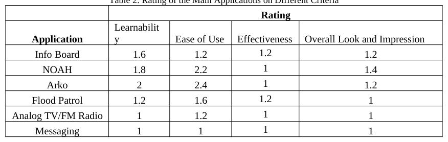
Table 2: Rating of the Main Applications on Different Criteria Rating Application Learnabilit y Ease of Use Effectiveness Overall Look and Impression Info Board 1.6 1.2 1.2 1.2 NOAH 1.8 2.2 1 1.4 Arko 2 2.4 1 1.2 Flood Patrol 1.2 1.6 1.2 1 Analog TV/FM Radio 1 1.2 1 1 Messaging 1 1 1 1
The test subjects again used a rating scheme with 1 being the highest and 5 being the lowest. All of the main applications received good ratings based on learnability, effectiveness and overall look and impression, but relatively low ratings on ease of use, for some applications. NOAH and Arko received the two lowest rating for the last mentioned criteria.
NOAH
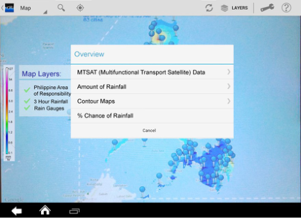
1. Choice of option One major problem encountered by test subjects involves choosing the right menu option in order to know a specific type of weather information. In the NOAH application, the menu named Layers provides five different options.
Test subjects were observed to choose the wrong option when asked to check the amount of rainfall for the next three hours. Instead of choosing Overview, they chose the Weather outlook to check for the probability of rainfall for the next three hours. This wrong choice of option may be due to unclear option labels (“3- hour rainfall” does not specifically indicate if it is an amount of rainfall or a probability of rainfall). In some cases, even if the test subjects chose the Overview option, they were observed to improperly interpret the information. They still said that “there is a low chance of rainfall for the next three hours” rather than “the amount of rainfall is low for the next three hours”. This misinterpretation might be due to the unapparent sidebar legend details, which should have informed the test subject that the color shown by the map reflects millimeters of rainfall.
2. Elements on the interface Another major problem is that a lot of elements on the interface of the NOAH application were not intuitive or apparent for the test subjects. All of the test subjects did not know the meaning of the PAR option under Layers, which actually means Philippine Area of Responsibility. They were also unfamiliar with some icons in the application such as settings, target locator, dopplers and sensors. In terms of interoperability with other applications, the target locator feature of NOAH, which is used to easily mark the current location of the test subject on the map by a single tap, is not in sync with the Locator application of the tablet. The Locator is used to set the current place of the test subject, which will be used by the info board in generating relevant updates about the place. When the target locator button was tapped, it was observed that a different address was marked, slightly different from what was set on the Locator.
3. Efficiency of use In terms of efficiency of use, the chance of rainfall sub-option under Weather outlook required tapping on the rainfall markers twice before showing information. The first tap will allow the test subject to zoom into the location of interest, while the second tap will bring the test subject into another page, where the desired probabilities of rainfall were displayed. Arko has the same feature, but does not require two taps and another page before showing information. Zooming the map in and out is quite hard for some of the test subjects, especially on slow internet connection. The application sometimes freezes as it updates the map with new information, and the test subjects tend to zoom the map repeatedly even if the map does not respond. When the application finally unfreezes, the map is either too zoomed in or too zoomed out, making it hard for the test subject to locate his desired place again. Accurate zooming motion was quite sensitive. There are small amount of zooms right after the test subjects lose touch of the screen. This is sometimes undesirable because the test subjects cannot gauge these extra zooms as they tried to find their location of interest.
Whenever the test subjects tried to add more layers on the map, the application tends to automatically zoom outside the country. This is undesirable since the test subject had to zoom in again to the desired place.
4. Prompts
When the application encountered problems, it prompts the test subjects by displaying messages which flashed instantly, making it hard to be perceived and understood by the test subjects.
Arko
1. Difficulty and Complexity
The main problem of the test subjects while using Arko was that they find it difficult to accomplish the scenario-based tasks under the application. According to the test subjects, the tasks performed using Arko have difficulty level ranging from medium to high. While it is true that Arko is quite similar to that of NOAH (except for a more detailed map and additional icons for added features), one test subject wrote that Arko was more complicated. The task of determining the path of a typhoon was observed to be difficult to most of the test subjects. Zooming out of the Philippine Area of Responsibility to check for the movement of the typhoon was not intuitive and memorable, even after it was taught by the researchers. There were no icons on the interface which indicates where the movement of the typhoon can be seen. The task of adding another location that is to be monitored was also observed to be difficult. The task includes “holding” a location marker in place for several seconds and “dragging” the marker to the desired location. The “holding” part was quite hard for most of the test subjects. Also part of this task is checking for the probability of rain for the recently marked location. It was observed that one of the test subjects tried to switch from Arko to NOAH to check for the probability of rain, and then back to Arko again when the subject thought a mistake has been made. The researchers believe that the test subject had not easily established the differences and similarities between the two applications which had lead to confusion.
Meanwhile, checking for the recent flood level information in different places was relatively easy. Only one test subject failed to identify the different colors on the map as different levels of flood.
2. Shared Features
Arko and NOAH shared one important feature, which is the chance of rainfall update. However this feature is not consistent on both applications. As explained earlier, checking the chance of rainfall was much easier on Arko because it requires fewer taps and does not need another page to display information. The target locator of Arko was also not in sync with the Locator application. Searching for location using the search bar was dysfunctional; the application cannot seem to locate places on its own. Zooming in and out of the map was much easier in Arko compared with the NOAH application. However, zooming is still quite hard especially for slow internet connections. It sometimes freezes as it loads and then crash. Accurate zooming motion was smooth, and is not accompanied by extra zooms even after the test subject lose touch of the screen.
3. Prompts Prompts about problems encountered by the application also flashed instantly that test subjects have not understood its meaning.
Flood Patrol The main problem in Flood Patrol is the very small font size of its options. On first glance, a subject with normal vision (clear eye sight) can easily see what the application offers: emergency hotline numbers, flood history map and flood report. However, these options are shown in really small font. Usually, the target test subjects are already on their 30s to 40s, which is when eyesight problems usually occur. One test subject pointed out that the options could not be clearly seen by a far sighted person. Moreover, there is an EXIT button on the lower right of the application but some test subjects find this redundant and do not use it to exit the application.
Analog TV / FM Radio The analog TV and the FM radio are usually the easiest applications to use. The applications are relatively easy to understand and navigate through. The test subjects only found two problems with these applications. The first one is the signal strength. The second one is that the test subjects agreed that the AM radio is more useful when it comes to news about the weather than the FM application. Overall, the test subjects find Analog TV and FM radio usable.
Image Uploader The main problem encountered by the test subjects was determining whether or not they have already taken the picture since there is no prompt. Several test subjects took multiple shots because they were not aware that they have already captured the image. Inserting caption/s was also found to be a problem for the users.
Messaging / Email In all of the four criteria (learnability, ease of use, effectiveness, overall look and impression), messaging application received the highest rating. The test subjects did not experience major problems with this application except for unrecognizable icons such as the messaging and send. The current messaging and send icons were not presented through a familiar metaphor. According to the general usability guidelines by Nielsen (1993), there should be a match between the system and the real world which were not well represented by the current icons.
Keyboard There were no observed problems in typing. However, if the predictive text is on, the test subjects experienced conflicts especially if the text they input is in Filipino. The predictive text function is based on the English language. This leads to typographic errors which may result to confusion to the people who will read the text. Furthermore, after typing, the test subject still needs to press another icon to hide the keyboard in order to display the next buttons that must be clicked to complete the action they want to do.
Doing Scenario-based Tasks on the Device The scenario based tasks, according to the test subjects, varied in terms of difficulty. Those tasks performed under the NOAH and Arko application, which are the two applications most functional to the test subjects, were observed to be difficult for the users. Since it is important to be updated with weather information in the quickest possible time, especially on the onset of climactic disaster, it is important that the tasks performed using NOAH and Arko be performed easily. Some recommendations in the interface are needed in order to improve these applications in terms of ease of use.
RECOMMENDATIONS Recommendations on Arko and NOAH Distinction between the functionalities of NOAH and Arko should be evident. It was mentioned that both applications shared one important feature, which is the chance of rainfall update. Although it is desirable to eliminate this redundancy to make the distinctions between the two applications clear, it is not recommended to eliminate this feature in Arko or in NOAH to avoid the need to switch between applications when one is already opened. The researchers also believed that having a chance of rainfall update in Arko is advantageous to users since it provides further insight about the safety of a place, in conjunction with the information provided by the historical flood level data.
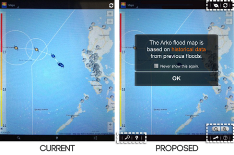
Arko The researchers recommend a new Arko welcome screen to prompt the user of the main feature of the application which is flood mapping. This new welcome screen will also avoid the misconception that Arko provides updated information on flood levels. As stated earlier for Arko, most of the test subjects had difficulty knowing what to do to determine the path of a typhoon. It is not intuitive and memorable for the test subjects to zoom out in order to see the travelled path of the typhoon and its forecasted route. With this, the researchers recommend to place an additional icon which will allow the user to view the typhoon’s path with just a click. The proposed icon is shown in Figure 2.
Figure 2: Proposed Typhoon Icon
Figure available in the original PDF paper.
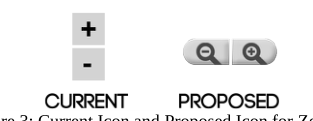
The current settings icon for Arko was not recognized by most users. The same icon is also used for all other applications and serves as a general settings icon for the tablet. The researchers recommend changing the current icon to something that is more familiar such as a wrench or a gear. Arko was often viewed by test subjects as complicated and difficult to understand. Currently, the application does not have a help button; the users need to click first on the settings button and the about the app sub-option to view the different information that is helpful for the users. It is therefore important for the application to have a help button that can easily be seen by the users. The original interface of Arko has the same icon for zoom in and add location functions, which is a plus sign. The researchers recommend using another icon for ‘zoom’ functions to avoid confusion as shown in Figure 3.
Figure 3: Current Icon and Proposed Icon for Zooming
It is also recommended to group the menu icons of Arko according to their functions. For example, icons such as the typhoon and refresh icon can be grouped together since they are both necessary for updates that are needed by the users. On the other hand, the search and add location icons can be grouped together since they both deal with locations on the map. Lastly, the settings icon, help icon and the zooming icon can be grouped together primarily because they both assist the users in using the application. Incorporating the new Arko welcome screen, additional icons such as the typhoon and help, icon modifications in the zoom and settings function, and the arrangement of all of these icons, the current and proposed Arko interface are shown in Figure 4.
Figure 4: Current Interface and Proposed
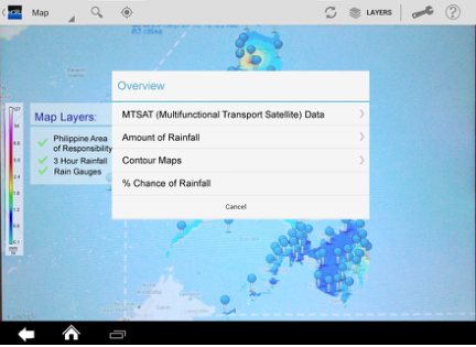
In the NOAH application, it is important to spell out unfamiliar abbreviations. The researchers recommend eliminating the Sensors and Doppler option under Layers menu since the test subjects are not familiar with these options and unaware of the possible function these options might serve. Under the Overview option, there are many sub-options shown on the screen. These options can be further grouped for easier understanding. The recommended groupings are shown in Figure 5. MTSAT, Processed MTSAT and MTSAT VIS can be grouped into MTSAT Data; 3-hour, 6-hour, 12-hour and 24-hour Rainfall can be grouped into Amount of Rainfall; Rainfall Contour, Temperature Contour, Pressure Contour and Humidity Contour can be grouped into Contour Maps.
Figure 5: Current Grouping and Proposed Grouping for Sub-options of Overview
Figure available in the original PDF paper.
This grouping also has the potential to eliminate the difficulty in choosing the right option to check for a specific weather update. For example, since the 3-hour, 6-hour, 12-hour and 24-hour Rainfall are all grouped under Amount of Rainfall, it is expected that the user will not mistaken them for chance of rainfall. The sidebar legend of the accumulated rainfall in the application can be improved by making it more obvious and apparent. This can be done by increasing its length, such that it covers the whole height of the screen, and increasing its width to 1 cm. A checklist of the opened map layers beside the sidebar legend is also recommended. Applying the recommendations stated previously, such as noticeable sidebar, checklist of opened map layers, new groupings for Overview Menu and icon improvements, a sample NOAH interface is shown in Figure 6 below. Icons are recommended to be grouped according to similarity of use. Icons associated to locations (search location and current location) are proposed to be placed on the top left side of the screen close to each other; then, the refresh/update and layers icons close together and the settings and info button grouped together. Same with Arko, new icons have been placed in substitution of settings.
Figure 6: Original and Proposed NOAH Interface
Recommendations on Icons Listed below are the icons that are not easily recognizable, and must be improved in such a way that they are easily detected, identified and interpreted correctly. Using application icons which represent their functionality in real world is highly suggested. These can be seen in Figures 7a to 7e.
(a) (b) (c) (d) (e)
Figure 7. Current and Proposed Icons for (a) Messaging, (b) Send, (c) Settings, (d) Home and
Other Recommendations For the Flood Patrol application, the font size for the emergency hotlines should be increased. A font size that is the same as that of the time display (located at the lower right corner of the tablet) is satisfactory. For the Image Uploader, include a feedback that will signal the user that a picture was already captured. Allow the recently-captured image to freeze for about three seconds before the whole screen blinks. This blink is a signal which tells that the camera is ready for the next shot.
CONCLUSIONS
Overall, the MOSES Tablet was rated highest (1.0) for its functionality and relatively lowest (2.0) for its ease of navigation. This implies that the tablet serves it purpose well according to the perception of the test subjects. However, enhancements should be made in the interface in order to help improve navigation through the tablet. Relative to all other applications that were tested, NOAH and Arko received the two lowest average rating in terms of ease of use and learnability but high ratings in terms of effectiveness, overall look and impression. In line with this, recommendations on these applications, which included changes in the overall screen interface and design of the icons to match the real world and improve their familiarity to the test subjects, were made.
Having identified the problems in the applications, it can be seen that usability has an important role in this development. It is able to elicit users’ perception on using the device and identify specific issues that users have while operating the device. This could further help the developers to improve the design of the device.
For further studies, it is recommended that this device and its applications be tested again for usability after changes in its design has been made so that it will be known if the users will find the next version easier to use. Also, involving more subjects in the testing is recommended to improve the statistical accuracy of the results.
REFERENCES
Danesh, A., Inkpen, K., Lau, F., Shu, K., Booth K., 2001. Geney: Designing a Collaborative Activity for the Palm and Handheld Computer. Proceedings of CHP2001, ACM, New York, pp 388-395. Kaikkonen, A., Kekalainen A., Cankar, M., Kallio, T., Kankainen, A., 2005. Usability testing of mobile applications: a comparison between laboratory and field testing. Journal of Usability Studies, volume 1, number 1, pages 416. Kjeldskov, J., Stage J., 2003. New techniques for usability evaluation of mobile systems. Int. J. Human- Computer Studies pp. 599-620. Kjeldskov, J., and Graham, C. (2003) A Review of Mobile HCI Research methods. In Proceedings of the 5th International Mobile HCI 2003 Conference, Udine, Italy, Sringer- Verlag,. Lee, K., Grice, R., 2004. Usability Testing Method for Mobile Devices. IEEE Computer Society.Taubman, P. (2008), Top
Engineers Shun Military; Concern Grow. The New York Times Website: http://www.nytimes.com/2008/06/25/us/25engineer.html Nielsen, C., 1998. Testing in the field. In: Werner, B. (Ed.), Proceedings of the third Asia Pacific Computer Human Interaction Conference, IEEE Computer Society.
LISTED IN THE AHFE DIGITAL BOOKSTORE CATALOGUE
Explore the complete digital volume
Advances in Ergonomics In Design, Usability & Special Populations: Part II
Read this individual research paper free through the original publisher, or explore the full digital proceedings book.
ISBN 978-1-4951-2107-4
Explore this ISBN in the AHFE Bookstore ↗Listed in the July 2026 bookstore catalogue; search by ISBN to confirm current availability · Digital book purchase optional