Chiaho Hsueh, Chien-Hsiung Chen (2024). Usability Study on the User Interface of Arts and Culture Activity Platforms. In: Usability and User Experience. AHFE Open Access, vol. 156, pp. 264–271. https://doi.org/10.54941/ahfe1005437
Cultural and artistic activities are thriving, and leisurely exploration of events has become a habit and a popular trend for many citizens around the world. According to the 2021 Taiwan Cultural Content Consumption Trends Survey by the National Academy for Educational Research, approximately 30% of the population participated in performing arts events in the past year, with the average number of exhibition visits on the rise. However, the current content on various cultural platforms is complex and lacks organization, making it difficult for users to find what they need and thus resulting in a poor user experience. Among these factors, the usability of the platform interface in accordance with user experience is a crucial key. Therefore, the purpose of this study is to enhance the user experience of cultural activity platforms to increase participation in events. The study will propose improvements and suggestions for information architecture pertinent to user interface design based on experimental results that align with user experience.In this research study, experiments were conducted to help analyze the information architecture and functionality of three existing cultural activity platforms. Smartphones were used as experimental devices, and a usability experiment design for task operations was implemented. The study also involved observing and recording participants' operational behaviors and task performances. Finally, the System Usability Scale (SUS) and the Questionnaire for User Interaction Satisfaction (QUIS) were also employed, along with semi-structured interviews, to help understand the strengths and weaknesses of the cultural activity inquiry system and to derive conclusions and recommendations.The results and recommendations of this study are as follows: (1) It is important to provide operation methods that align with users' mental models. (2) The platform's information architecture should be designed with shallow layers as well as a clear and concise hierarchical structure. (3) The design consistence regarding colors, icons and buttons should be maintained during the operation process. (4) It is necessary to optimize the site-wide search by providing visible and meaningful icons, enabling users to quickly locate information. (5) It is vital to provide clear and understandable feedback strategies to enhance the pleasure of user interactions.
The platform for arts and cultural activities serves as a crucial hub for people to explore, engage, and participate in various cultural events, exhibitions, and artistic endeavors. These platform interfaces facilitate user interaction, nav- igation, and overall user experience, playing a vital role. As intermediaries
Usability Study on the User Interface of Arts and Culture Activity Platforms 265
between users and systems, user interfaces on platforms promote effective user-system interactions. Users encounter the interface physically, perceptu- ally, and conceptually while using the system. Through the user interface, users interact with the system to accomplish tasks and goals. The usability study of this arts and culture activity platform interface aims to evaluate the effectiveness and efficiency of the platform’s user interface, with a focus on identifying usability improvements to enhance the user experience and create a positive experience for participants in arts and cultural activities.
Mental models and platform interface operation. The mental model is an important concept in effective user interface design. Crailk (1943) pointed out that the mental model is the cognitive process of understanding how things work in people’s minds. In user interface design, it is essential to con- sider users’ mental models to make them consistent with the design, allowing users to use the product smoothly and naturally. Norman (1983) believes that the user’s mental model is a significant cognitive aspect of the interaction between the user and the system. Gott, Lajoie, and Lesgold (1991) emphasize that users usually need to establish mental models to understand and solve tasks. By maintaining consistency with users’ mental models, the interface operation method can reduce users’ cognitive load and enhance usability.
Information architecture and platform design. Wurman (1996) proposed information architecture as a method of reorganizing and labeling informa- tion. Rosenfeld and Moville (1998) emphasize the importance of content planning and structure in website design. Through organization, classifica- tion, and labeling, users can easily find, understand, and obtain the required information (Morville, Rosenfeld & Arango, 2015). Therefore, establishing a clear and intuitive information architecture for the platform facilitates users to access and browse platform content easily and effectively. Good platform information architecture design can reduce errors in user operations, improve user goal achievement, and promote platform usability.
Icon design and usability. Interface icons have been proven to be very useful in promoting user interaction with smart products and generating pos- itive feedback (Caplin, 2002; Young, 1991). Nielsen (1994) pointed out that creating platform interfaces based on usability principles can provide users with a good user experience. The status visibility principle in usability prin- ciples allows users to clearly understand the system’s feedback, which helps users operate the system. The principle of consistency and standards, using a consistent colour scheme to create visual harmony, can help users iden- tify different elements. Adopting a unified set of icons ensures that users intuitively and universally understand them. Maintaining consistency in but- ton styles and interactions ensures that users feel in control and confident in their operations. Overall, interface design with status visibility principles and consistency and standards reduces users’ cognitive load, allowing them to quickly search and navigate, thus improving user satisfaction and platform engagement.
MATERIALS AND METHODS
This experiment invited participants through convenient sampling method. A total of 30 participants aged 16 to 65, both male and female were invited to
266 Hsueh and Chen
take part in the experiment. These participants all have experience searching for cultural activities via Internet, and heavy users who may overlook opera- tional details due to specific habits were excluded to avoid affecting the test results.
The experimental equipment used in this study is the Apple iPhone 14 plus, with a screen size of 6.7 inches, a resolution of 2778 × 1284 pixels, a density of 458 dpi, and running on the iOS 16 system. All participants conducted the tests in a consistent experimental environment with identical devices. Additionally, the platform used in the experiment was pre-downloaded onto the experimental devices to eliminate potential impacts from differ- ences in communication signals and ensure the consistency of experimental conditions.
The methods used in this study include collecting quantitative data from the experiments and analyzing them. The experimental design involved quan- titatively analyzing task operations by manipulating three platform interfaces on smartphones. A between-subjects design was adopted, with all partici- pants were randomly assigned to one of the three experimental conditions, conducting four task operations: 1. Querying current popular events. 2. Using search to find target activities. 3. Viewing basic information about target activities and finding addresses. 4. Sharing target activities with friends. Addi- tionally, the System Usability Scale (SUS) for subjective evaluation and the Questionnaire for User Interaction Satisfaction (QUIS) were adopted to help understand users’ perceptions of various interaction factors when operating the mobile interfaces.
RESULTS
Analysis of Task Completion Time This study employed the one-way analysis of variance (One-way ANOVA) method to conduct detailed statistical analysis of the research results. Through the SPSS software, the experimental data underwent careful data analysis. In the study, we systematically explored the issues users encountered while performing tasks on the platform. Finally, to gain a deeper understand- ing of the significant differences between different levels of factors, the LSD post hoc tests were adopted to further investigate significant differences. The descriptive statistical results of the four task performance measurements are shown in Table 1, where Tasks A, B, and C exhibit significant differences, while Task D does not.
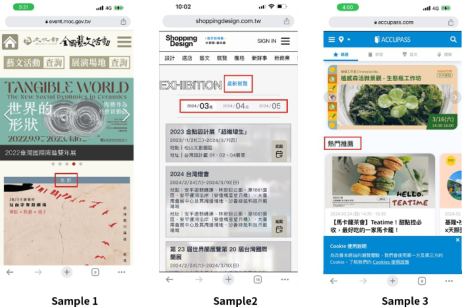
Task A: Query current popular events. The operation time of Task A, as determined by one-way analysis of variance (ANOVA), showed a significant difference among the three samples (P = 0.042<0.05), as shown in Table 1. The LSD post hot test revealed significant differences between Sample 1 and Sample 2, as well as Sample 3. Samples 2 (M = 27.61, SD = 27.23) and 3 (M = 21.55, SD = 7.79) performed better than Sample 1 (M = 43.97, SD = 19.49). In Sample 1, events on the homepage were sorted by region, and the event dates were not in chronological order, making it difficult for users to find current popular events. Conversely, Sample 2 provided users with a filtering mechanism by month on the exhibition page or sorted by the
Usability Study on the User Interface of Arts and Culture Activity Platforms 267
latest exhibitions, making it easy for users to find current popular events upon entering the page. Sample 3 highlighted popular and recommended events, allowing users to enter popular events based on the information architecture, as shown in Figure 1.
Table 1. Descriptive statistics of ANOVA on task operation performance of quantitative experiments *P < 0.05, there is a significant difference.
Table available in the original PDF paper.
Source Sample 1 M(SD) Sample 2 M(SD) Sample 3 M(SD) Test result LSD F P
Figure 1: Task A: query currently popular activities.
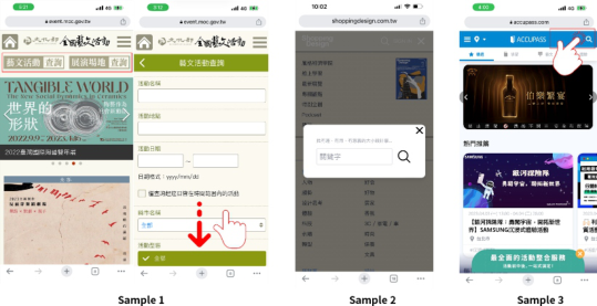
Task B: Find the target activity using search. The operation time of Task B, as determined by one-way analysis of variance (ANOVA), showed a signif- icant difference among the three samples (P = 0.002<0.05), as shown in Table 1. The LSD post hot test revealed significant differences between Sam- ple 1 and Sample 2, as well as Sample 3. Samples 2 (M = 15.94, SD = 5.79) and 3 (M = 13.15, SD = 3.06) performed better than Sample 1 (M = 21.37, SD = 4.92). In Sample 1, the lack of search icons and boxes made it difficult for users to discern, and the simultaneous display of cultural activities and venue searches confused users. The abundance of activity query information caused irritation, and the unclear position of the query button led to user abandonment midway. In contrast, in Sample 2, clicking the upper-left menu immediately revealed clear search icons. In Sample 3, the search was placed at the top right of the homepage with an icon, and clicking immediately revealed the search box for easy text input, as shown in Figure 2.
268 Hsueh and Chen
Figure 2: Task B: Find the target activity using search.
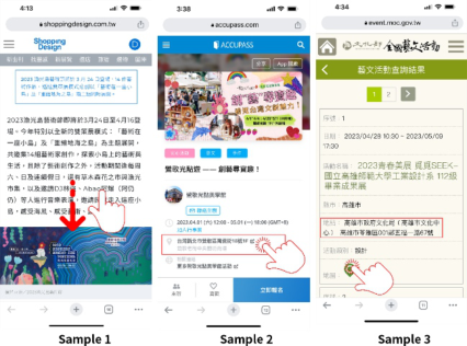
Task C: Check the transportation location of arts and cultural activities. The operation time of Task C, as determined by one-way analysis of vari- ance (ANOVA), showed a significant difference among the three samples (P = 0.000<0.05), as indicated in Table 1. The LSD post hot test of Task D results revealed significant differences between Sample 3, Sample 1, and Sample 2. Particularly, Sample 3 (M = 5.14, SD = 1.17) and Sample 1 (M = 8.02, SD = 3.45) performed better in operation time compared to Sample 2 (M = 56.22, SD = 29.86). Upon observation and interviews, Sam- ple 2 did not provide activity location information, making it difficult to quickly grasp the location, and the introduction information was lengthy and required complete browsing to find the location. On the other hand, Sample 3 placed basic information at the top, allowing users to quickly understand. Sample 1 also placed basic information on the main page, making it easy for users to understand at a glance, as shown in Figure 3.
Figure 3: Task C: Check the transportation location of arts and cultural activities.
Analysis of the System Usability Scale Questionnaire This study utilized the System Usability Scale (SUS) and underwent one- way analysis of variance (ANOVA). As shown in Table 2, F = 4.814, P = 0.016<0.05, indicating a significant difference among the three samples.
Usability Study on the User Interface of Arts and Culture Activity Platforms 269
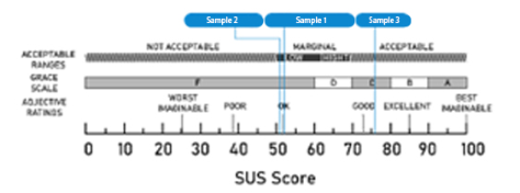
The LSD post hot test revealed that Sample 3 (M = 76, SD = 17.12) performed better in usability scores compared to Sample 1 (M = 52.5, SD = 20.88) and Sample 2 (M = 51.75, SD = 21.34), with participants showing a preference for Sample 3. Samples 1 and 2 were deemed acceptable but still have room for improvement. A comparison of SUS scores among Sample 3, Sample 1, and Sample 2 platforms is illustrated in Figure 4.
Table 2. System usability scale (SUS).
Table available in the original PDF paper.
Sample 1 M(SD) Sample 2 M(SD) Sample 3 M(SD) F P LSD SUS 52.5 (20.88) 51.75 (21.34) 76 (17.12) 4.814 0.016* Sample 3>Sample 1=Sample 2
Figure 4: Comparison of SUS scores for sample 1, sample 2, and sample 3.
This study employed a 7-point Likert scale for the User Interaction Satis- faction Questionnaire, comprising four dimensions: Dimension 1 ‘Overall Response,’ Dimension 2 ‘Interface Presentation,’ Dimension 3 ‘Interface Wording and Information,’ and Dimension 4 ‘Learnability.’ Analysing the results using one-way analysis of variance, as shown in Table 3, there was a significant difference in the ‘Overall Response’ section, with F = 4.554, and P = 0.019<0.05.
Table 3. Questionnaire of user interaction satisfaction (QUIS).
Table available in the original PDF paper.
Source Sample 1 M(SD) Sample 2 M(SD) Sample 3 M(SD) Test result LSD F P
In the overall reflection section of the three platforms, as determined by LSD post hoc test, there was a significant difference among them. Sam- ple three (M = 5.49, SD = 0.723) outperformed samples one (M = 3.96, SD = 1.165) and two (M = 4.52, SD = 1.513. Sample one’s overall opera- tion and terminology, as well as interface arrangement, deviate from common
270 Hsueh and Chen
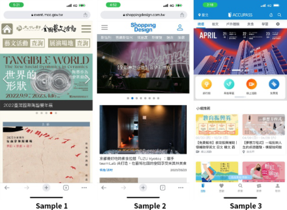
standards, leading to confusion and requiring more time to understand. Addi- tionally, the subdued and neat colour scheme of sample one lacks vibrancy and is not well-received see Figure 5 for details.
Figure 5: Sample 1, sample 2, and sample 3.
According to Table 3, the three cultural activity platforms show no signif- icant differences across the three aspects: ‘Interface Presentation,’ ‘Interface Wording and Information,’ and ‘Learnability.’ Moreover, the mean scores for all aspects are above 4, indicating user satisfaction across the board. Interviews revealed that the operation and usage of the three interfaces are generally similar to those of current platforms, and users find them relatively easy to navigate.
CONCLUSION
This study aims to investigate usability-related issues in the user interface design of cultural activity platforms. Designing a cultural activity platform interface that is easy for users to understand and operate is an important concern. The study first explores mental models, information architecture, and usability design principles.
Subsequently, we conducted experiments to investigate users’ task opera- tions on the platform interface. After the experiment, a brief interview was conducted. Based on the experimental results, the following design sugges- tions were proposed: (1) Provide operation methods consistent with users’ mental models. Consistency with users’ mental models ensures familiarity with the interface’s functional operations, reduces cognitive load, and enables users to navigate the interface effortlessly. (2) Ensure the platform’s informa- tion architecture is shallow and has a clear, concise hierarchical structure. The study found that users are often impatient during commuting. When conduct- ing queries, they need to know basic information such as the topic, time, and location to continue browsing the content. If basic information is scattered in other structures of the platform, it will take more time. Therefore, the structure must be hierarchical and conducive to easy exploration. (3) Design consistent colours, icons, and buttons to maintain consistency throughout the
Usability Study on the User Interface of Arts and Culture Activity Platforms 271
operation process. This helps users easily identify and operate. (4) Optimize site-wide search by providing visible and meaningful icons, allowing users to quickly find what they are looking for. Site-wide search is a critical feature. If it is not prominent or only has icons without a search box, or only text is available, it will extend the search time. Therefore, it should be placed at the top of the page, with a magnifying glass icon, a search box, and explanatory text, allowing users to quickly find and understand that they can enter text for searching. (5) Design clear and understandable feedback mechanisms to enhance the pleasure of operation. The function keys of the user interface need to have clear and immediate feedback mechanisms so that users can understand whether the current operation is successful.
ACKNOWLEDGMENT
The authors would like to thank all the participants for their participations in this experiment.
REFERENCES
Caplin, S. (2002). Icon Design. London: Cassell & Co. Craik, K. (1943). The nature of explanation. Cambridge, England: Cambridge University Press. Gott, S. P., Lajoie, S. P., & Lesgold, A. (1991). Problem solving in technical domains:
How mental models and metacognition affect performance. In R. F. Dillon and J. W. Pellegrino (Eds.), Instruction: Theoretical and Applied Perspectives, New York: Praeger. Morville, P., & Rosenfeld, L. & Arango, J. (2015). Information architecture: For the web and beyond. 4e. Sebastopol, CA: O’Reilly Media Inc. Norman, D. A. (1983). Some observations about mental models. In D. Gentner and
A. L. Stevens (Eds.), Mental Models, Hillsdale, NJ: Lawrence Erlbaum. Nielsen, J. (1994). Usability engineering. Morgan Kaufmann. Rosenfeld, L., & Morville, P. (1998). Information architecture for the world wide web. CA: O’Reilly. Wurman, R. S. (1996). Information architects. NY: Graphis Press Corp. Young, S. L. (1991). Increasing the noticeability of warning: Effects of pictorial color,
signal icon and border. Proceedings of the 35th Annual Meeting of Human Factors Society. 580–584.
LISTED IN THE AHFE DIGITAL BOOKSTORE CATALOGUE
Explore the complete digital volume
Usability and User Experience
Read this individual research paper free through the original publisher, or explore the full digital proceedings book.
ISBN 978-1-964867-32-8
Explore this ISBN in the AHFE Bookstore ↗Listed in the July 2026 bookstore catalogue; search by ISBN to confirm current availability · Digital book purchase optional