Ran Huang, Yanfei zhu, ChengQi Xue (2023). A comparative study on user experience of four apps for renting house based on D-Lab eye-tracking experiment. In: Intelligent Human Systems Integration (IHSI 2023): Integrating People and Intelligent Systems. AHFE Open Access, vol. 69, pp. 936–945. https://doi.org/10.54941/ahfe1002919
The popularity of mobile Internet and the application of big data and artificial intelligence technology have brought new development opportunities for the online rental industry. A large number of rental apps have rapidly occupied the market. Rental apps can help tenants screen and reserve housing in real time according to their needs, so users' demand for products has gradually changed from satisfying basic functional needs to providing good user experience.Objective: Because existing researches mainly focus on the construction of user experience index system of rental APP and the subjective evaluation of the user experience of APP, few scholars have conducted researches on the user experience of rental APP based on physiological experiments. Therefore, this study applied the eye-movement technology of D-lab experimental platform to conduct a comparative study on the user experience of four representative rental apps, and compared the functions, interactive process architecture and interface layout design of the four apps, providing reference value for the design of similar apps.Content: In this experiment, four representative rental apps in design are selected as experimental materials, namely Anjuke, Beike, Ziroom and Baletu. The experimental task was to ask the participants to select the matched housing resources and complete the rental on the four apps according to the given rental conditions. The whole experiment was completed based on the D-Lab experimental platform, which could record the interactive behaviors and eye movement data of participants during the experiment. After the experiment is completed, participants need to accept the interview of subjective evaluation of user experience, and the experience and existing problems of users in the process of use will be recorded as auxiliary materials for evaluation. Finally, based on interactive behavior video, eye movement data, fixation path diagram and heat map, this paper compared and analyzed the four apps from two aspects of interactive process architecture and interface layout design.Results: (1) The results of eye movement data showed that the order of average gaze count and average saccadic count was Anjuke > Baletu > Ziroom > Beike, which might be because the interface information density of Anjuke was relatively high and the layout lacked regularity, which made it difficult for users to search the target information. The layout of the interface of Ziroom and Beike is sparse, and the interest area of users is less. (2) According to the analysis of user interaction behavior, Anjuke has various functions, and users need to jump to the page several times to select the target function, which is a complicated interaction process; The interface function partition of Baletu is clear, the navigation function division is primary and secondary, and the interaction process is simple. (3) According to the analysis of the interface layout based on the heat map, it can be seen that the functional modules of Anjuke are not clearly divided and the interface layout is not easy to operate; The interface layout of Baletu adopts card design, compact layout, clear structure, and unified color style, good identification and aesthetics.
The popularity of mobile Internet and the application of big data and artifi- cial intelligence technology have brought new development opportunities for the online rental industry. A large number of rental apps have rapidly occu- pied the market. Rental apps can reasonably match the housing information with the needs of tenants and help them to screen and reserve housing in real time. Therefore, users’ demand for products has gradually changed from satisfying basic functional needs to providing good user experience (Lu et al. 2013). To put it simply, user experience refers to the subjective psychological fee- lings generated by the use of a product or service. User experience design aims to improve product experience and focuses on user behavior and usage design, rather than making users learn how to operate based on product ope- ration principles (Li et al. 2005). As a product developed for the purpose of searching housing resources, the evaluation of the interactive performance of mobile rental APP is an important content in the field of mobile rental research. Some scholars have carried out researches on the theoretical and
A Comparative Study on User Experience of Four Apps for Renting House 937
practical aspects of mobile rental APP user experience. The following will review the existing research from these two aspects.
Theoretical Research on Evaluation Indexes of Mobile Rental APP Xie et al. took the thought of cognitive psychology as the theoretical basis to explore the feasibility and advantages of cognitive psychology in the design of mobile rental App. The paper analyzed the cognitive characteristics of the perception system, control system, memory system and response system of brain information processing, and concluded that the application scope of cognitive psychology in the design of mobile rental App mainly inclu- des the following: Consistency, user orientation, fault tolerance, aesthetics, ergonomics (Xie et al. 2019).
Practical Research on the Evaluation and Design of Mobile Rental APP Xu et al. studied the four frequently used rental apps: Ziroom, Airbnb, Anjuke and Xiaozhu, and compared the advantages and disadvantages of the four apps from the aspects of user positioning, main functions and interactive experience (Xu et al. 2019). In view of the rental problems of college gradu- ates, Tang proposed that the user experience could be improved from two aspects of “reducing the burden for users” and “optimizing product details”. In addition, market research and user demand analysis were conducted accor- ding to the design objectives, and product information architecture, task flow design and interface visual design were completed (Tang, 2017). Xu took the overseas rental platform for overseas students as the design subject, summa- rized the advantages and disadvantages of the current popular products in the market, and finally established a general O2O rental platform, optimized the user browsing efficiency and operation process, and provided a reference direction for the design of similar products (Xu, 2019).
It can be seen that few scholars have conducted in-depth studies on the user experience of rental apps based on physiological experiments, and eye movement technology can provide strong support for the user experience evaluation of mobile apps. Dewi et al. used the eye tracker to obtain the eye movement data of the elderly, including fixation times and duration, and analyzed the interface design of Grab’s online traffic application (Dewi et al. 2020). Zhou et al. selected four typical mobile applications of social services for the elderly to evaluate the impact of interface design on task performa- nce of the elderly based on data such as fixation duration and pupil diameter change by combining eye movement measurement and subjective evaluation (Zhou et al. 2022). Hosam et al. used eye tracker to capture users’ prefe- rences for interface design elements to build a predictive model of interface design. They confirmed that the predictive model based on user’ eye move- ment data including gaze and saccade movement has great potential to predict user preference for interface design (AI et al. 2016).
Therefore, this study hopes to apply the D-lab experimental platform to conduct a comparative study on the user experience of several existing repre- sentative rental apps based on eye movement technology, and according to
Figure 1: Experimental procedure.
the user experience theory of mobile APP design proposed by Jesse James Garrett (Jesse, 2011), The function, interaction process and interface layout design of different apps are compared to provide reliable theoretical support for APP design.
METHOD
Equipment and Participants All experiments were carried out under normal office lighting (∼300Lux) in the Human Factors Engineering Laboratory of Southeast University. Instru- ments include a computer and eye tracker on the D-Lab platform, and a 9.7-inch iPad. The D-Lab platform was used to record real-time eye move- ment data and behavioral videos of participants during the experiment. The experimental materials are displayed on the iPad screen. Participants need to adjust the appropriate distance according to their own situation to ensure that they can clearly watch the experimental materials and conduct interactive operation on the screen with their hands.
The participants were 15 graduate students (8 male and 7 female, aged 20–25 years) recruited from Southeast University. All participants had experi- ence using smartphone apps and had never taken part in a similar experiment.
Materials
The experimental materials are four representative rental apps, namely, Anjuke, Beike, Ziroom and Baletu. There are significant differences in their interaction architecture, interface layout and color style.
Experimental Procedure
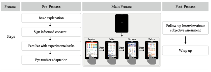
Figure 1 shows the experimental procedure. Before the experiment began, each participant was given a brief introduction to the experiment procedure and signed an informed consent. And participants were required to be fami- liar with the task. Then participants were asked to complete the interactive tasks of the four apps in turn according to the given rental conditions. The description of the task was as follows:
A Comparative Study on User Experience of Four Apps for Renting House 939
Table 1. Descriptive statistics of fixation duration, fixation frequency and saccade frequency of participants.
Table available in the original PDF paper.
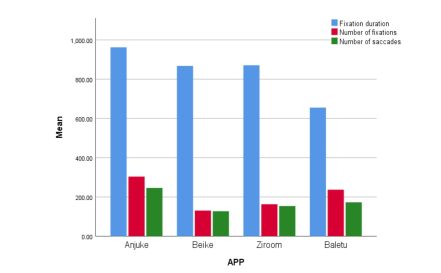
Measure(unit) Anjuke Beike Ziroom Baletu Fixation duration (ms) Mean 962.07 867.22 870.73 655.11 SD 56.45 195.32 225.01 182.72 Number of fixations (count) Mean 303.50 130.38 162.63 236.88 SD 62.35 46.64 29.31 68.25 Number of saccades (count) Mean 245.88 127.25 153.63 172.75 SD 58.03 45.19 31.87 70.51
Use the four rental Apps to select the house you like according to the given conditions and click “Favorites” (multiple houses can be selected from each APP, or if there is no suitable house, it is optional).
If you are a recent graduate, you need to rent a house near Andemen (Metro Line 1), Yuhuatai District, Nanjing for about one year, and you want to meet the following conditions: (1) A small apartment with one bedroom and one living room, including a bathroom, and a kitchen would be better; (2) The budget is not more than 3500 yuan a month, the deposit is best to pay one, the rent is best to support monthly payment; (3) The closer to the subway, the better; (4) The decoration style conforms to your aesthetic taste.
During the experiment, participants’ eye movement data and interaction behaviors were recorded in real time. When participants finished using an APP, the recording stopped, and they began to use the next APP after a short rest to continue the recording. Participants were asked to stay focused during the interaction. There is no time limit for the experiment, until the partici- pants have used the four apps and selected the appropriate house. After the experiment, participants were interviewed for subjective evaluation, and the question was “Which APP do you think has the best use experience? Please explain why.”
RESULTS
Eye-Tracking Data Analysis After the experiment, the eye movement data of the participants recorded by the eye tracker was exported, and the data types that have research value for the experiment were selected for statistical analysis. The results were as follows.
Table 1 shows the mean value and standard deviation of annotation duration, fixation number and saccade number of participants during the completion of the interactive task. The results showed that (average fixation duration Anjuke > Ziroom > Beike > Baletu), Anjuke had the longest average gaze duration, indicating that participants had the largest visual load when using the APP, consumed more attention resources, and completed the task with low efficiency. The average fixation duration of Baletu was the shor- test, indicating that participants did not need to consume too much attention resources during the task and completed the task efficiently.
Figure 2: Average value of fixation duration, fixation number and saccade number of participants.Figure 3: Video record of participants’ behavior process and fixation path.
The results show that (average fixation times and average saccade times Anjuke > Baletu > Ziroom > Beike), Anjuke has the highest average fixation count and saccade. It may be because the interface information density of the APP is relatively large and the layout lacks regularity, which makes it difficult for users to search for target information. The layout of the interface of Ziroom and Beike is sparse, and the interest area of users is less.
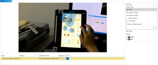
Interactive Flow Through the analysis of the operation process and the video recording of the fixation path of all participants during the completion of the task (see Figure 3), various interaction processes of participants using each APP are summarized, and the information structure of the interface is reasonable and whether users can quickly find the module they want to reach is explored. The results are as follows.
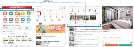
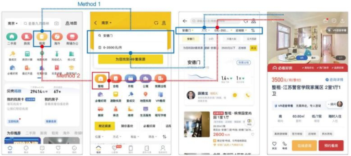
Figure 4 shows the interaction flow chart of Anjuke. Most participants choose Method 1, that is, select “rent” in the navigation area of the home page and then select “whole rent”on the secondary page. In this process, page hops are frequent, so the efficiency is low. A small number of participants chose Method 2, in which participants entered the destination in the search box at the top of the home page to locate the rental area. This process avoided
A Comparative Study on User Experience of Four Apps for Renting House 941
Figure 4: Interactive flow chart of Anjuke.Figure 5: Interactive flow chart of Beike.Figure 6: Interaction flow chart of Ziroom.
frequent interface switching and improved the operation efficiency. But the search box on the home page isn’t eye-catching enough, so few users notice it.
Figure 5 shows the interaction flow chart of Beike. Most participants cho- ose Method 1. First, select “Rent” from the navigation icon on the home page, and after jumping to the secondary page, select the area, price and ren- tal mode through the selection box for accurate positioning; Few participants chose Method 2, which is similar to Method 1. The difference is that, partici- pants choose the rental mode “whole rent” in the navigation area below the selection box. Both of these approaches lead users to their goals clearly and quickly.
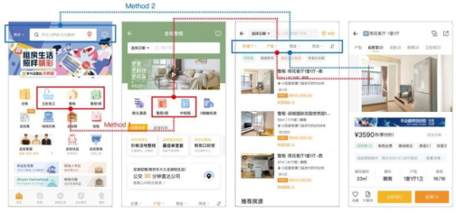
Figure 6 is the interaction flow chart of Ziroom. Some participants choose Method 1. First, select “Master bedroom alone bathroom” or “whole rent” or “whole rent 1 house” in the navigation area of the home page, and then
Figure 7: Interaction flow chart of Baletu.
select the rental type on the secondary page. Part of the participants chose Method 2, which is shorter. By locating the rental area through the search box at the top of the home page, the interface of the rental list can be reached more quickly. Then, the drop-down menu at the top of the interface can be used for accurate screening of conditions.
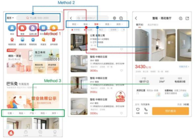
Figure 7 shows the interaction flow chart of Baletu. Most participants cho- ose Method 1: First, select the rental type in the navigation area of the home page, then jump directly to the rental list page, and perform accurate condi- tion screening through the drop-down menu. A small number of participants chose Method 2. First, enter the destination in the search box at the top of the home page to locate the rental area, and then jump to the rental list page. Both Method 1 and 2 require only two page jumps. Very few participants chose Method 3, because few users notice the filter bar at the bottom of the home page.
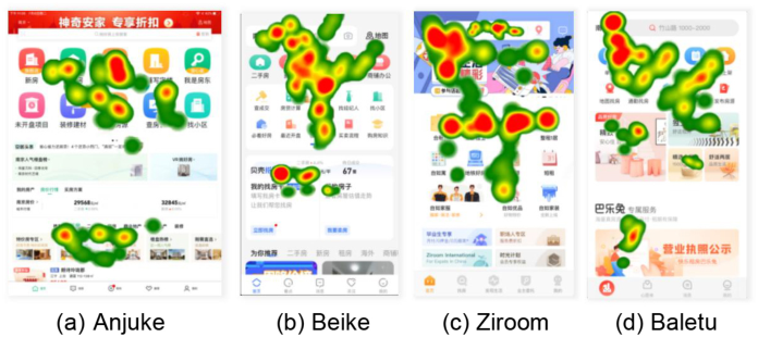
Interface Layout Design By analyzing the fixation duration, heat maps and gaze path diagrams of the participants’ browsing interface, we can observe whether the interface layout of each rental APP is clear and reasonable, whether it conforms to the user’s psychological model and operation habit. The following will fuse the heat maps of fixation points of all participants, and make a comparative analysis of the interface layout of each APP.
As can be seen in Figure 8 (a), participants’ attention area is mainly concen- trated in the navigation area of the Anjuke’s home page. The participants gaze for a long time in this area, indicating that there are many ICONS in this area and the lack of primary and secondary relationship, making it difficult for users to quickly search for the target function. Only few participants focused on the recommended housing area at the bottom of the interface, indicating that the area failed to attract users’ attention.
As can be seen in Figure 8 (b), participants’ attention area is mainly concen- trated in the main functional navigation area of the Beike’s home page. The main function is emphasized by increasing the icon background color and enlarging the icon size to attract user quickly. The other information areas
A Comparative Study on User Experience of Four Apps for Renting House 943
Figure 8: Heat map of four APPs’ homepage.
at the bottom of the interface are hardly noticed by users, indicating that the information provided in this area is not important, and the information con- tent in this area should be appropriately deleted to reduce the waste of page space.
As can be seen in Figure 8 (c), participants’ attention areas are mainly concentrated in the navigation area and the banner at the top of the Ziroom’s home page. Navigation ICONS use skeuomorphic design with high identifi- cation and search efficiency. However, the division of navigation functions is repeated, which affects the user’s quick choice. In addition, Ziroom pays attention to the shaping of brand image, in the design of banner to use illu- strations to convey the concept of youth and vitality to the users. The search box at the top of the interface provides a color contrast with the banner back- ground, which can attract the user’s attention and provide a quick way for the user to locate the area.
As can be seen in Figure 8 (d), in the home page of Baletu, participants’ attention areas mainly focus on the main functional navigation area and recommendation area. In the navigation area, the presence or absence of background color distinguish the main functions from the secondary functi- ons to improve the decision-making efficiency of users. In the recommended area, the card type design is adopted, and the different modules are distingui- shed by color, and the identification is high. In addition, the card uses a warm and bright home background picture to attract users’ attention and improve their browsing rate.
DISCUSSION
Compared with previous studies, new research methods were developed in this study: (a) Physiological data including fixation duration, fixation num- ber and saccade number of participants were measured with the help of eye movement technology. And the behavioral process of users were recor- ded by video, which more objectively explored the user experience of the rental APP. (b) Combine the objective physiological data of users with the
subjective interview results to evaluate the user experience of the APP more comprehensively and accurately; According to the research results, this section will put forward some of my own understandings on the user experience improvement of some apps. For Anjuke, the interface layout should be clear about the division of each functional area, highlighting the primary and secondary relationship; And it is necessary to reduce the irrelevant information in the interface to reduce the visual load of users; The overall style of the interface should be unified to improve the appearance. For Ziroom, the division of different functions in the navigation should be more clear, to ensure that users can quickly find the demand entry;
Therefore, in order to improve the user experience of the APP, the following aspects should be paid attention to: (a) Reasonable information architecture and functional entry: the overall information architecture should meet the business attributes of each region and be simple and easy to understand; Module entrance must meet the user’s mental model, so that the user can quickly search the demand module; (b) Highlight the main body of the inter- face: A page only requires the user to focus on one important thing, which is the theme of the interface. Common ways to highlight the theme are con- trast, hide, and remove. (c) Reasonable information richness of the interface: the information in the interface should not be too miscellaneous and lead to excessive visual load of users, nor should it be too sparse and reduce users’ interest.
CONCLUSION
The results show that (a) From the perspective of interaction process, the information structure of Beike and Baletu is more explicit than that of Ziroom and Anjuke, with clear functional hierarchy and short operation process; (b) From the perspective of interface layout, the home page of Anjuke is disorga- nized, with low usability and lack of unity in overall style; Beike’ home page layout is clear, with high operation efficiency; The Ziroom’ interface layout is clear, with prominent brand image, and color matching and poster design enhance the pleasure of the interface. The interface layout of Baletu is com- pact, the structure is clear, and the color style is unified, with identification and aesthetics.
LIMITATION Although this study provides some suggested methods for the interaction process and interface layout design of apps of the same type, there are still limitations: (a) The selection of experimental materials lacks rigor, and the selected APP may be interfered by user familiarity and bias. Therefore, pre- experiments should be conducted before the start of the experiment to reduce the bias of experimental results. (b) There were non-standard details in the experiment. The marker used for eye tracking and positioning was placed irrationally, which resulted in the user’s hand blocking the marker in the interaction process and no eye movement data was collected in part of the
A Comparative Study on User Experience of Four Apps for Renting House 945
process; In addition, the head movement of the user during the experiment may lead to the position deviation of the eye tracking. (c) The small number of participants may affect the scientific nature of the experimental results.
REFERENCES
Al-Samarraie H, Sarsam S M, Guesgen H. Predicting user preferences of environment design: a perceptual mechanism of user interface customisation [J]. Behaviour & Information Technology, 2016, 35(8): 644–653. Dewi D S, Ilmi N, Dewi R S. Applying eye tracker technology for analyzing user inter-
face design of online transportation applications (case study: grab application) [J]. IOP Conference Series: Materials Science and, Engineering, 2020, 722(1):012038 (13pp). Jesse James Garrett, User Experience Elements: User-centric Product Design [M].
Beijing: China Machine Press, 2011. Li Yang, Jiang Xiao. Research on the Application of User Experience Map in O20 Product Interaction Design [J. Theoretical Research,2005. Lu Yiqing, Li Chen. O2O business model and development prospect of research [J].
Journal of enterprise economy, 2013 (11): 98–101. The DOI: 10.13529 / j.carol carroll nki enterprise. Pa. 2013.11.042. Tang Y M. Design and research of college graduates Sharing APP based on user experience [D]. Changchun University of Technology,2017. Xie Xueping, Peng Huaming. Application of Cognitive psychology in mobile rental
App design [J]. Science and Technology Communication,2019,11(08):161–162. Xu Dong-dong, HAN Jin-Zhao, Li Min, ZHANG Wen-jing, LIU Yu-Yu. Research on the development of housing rental APP for college graduates [J]. Science & Technology Innovation Review,2019,16(17):248-249+251. Xu Liang. Research on the design of overseas rental O2O platform under the Internet
economy [D]. North China University of Technology,2019. Zhou C, Yuan F, Huang T, et al. The Impact of Interface Design Element Features on Task Performance in Older Adults: Evidence from Eye-Tracking and EEG Signals [J]. International Journal of Environmental Research and Public Health, 2022, 19(15): 9251.
LISTED IN THE AHFE DIGITAL BOOKSTORE CATALOGUE
Explore the complete digital volume
Intelligent Human Systems Integration (IHSI 2023): Integrating People and Intelligent Systems
Read this individual research paper free through the original publisher, or explore the full digital proceedings book.
ISBN 978-1-958651-45-2
Explore this ISBN in the AHFE Bookstore ↗Listed in the July 2026 bookstore catalogue; search by ISBN to confirm current availability · Digital book purchase optional