Yan Liu, Han Han (2026). The Impact of Visual Consistency in City Official Website Interface on City Brand: A Case Analysis of UNESCO Creative Cities of Design. In: Human Factors in Communication of Design. AHFE Open Access, vol. 216, pp. 99–112. https://doi.org/10.54941/ahfe1007628
In the context of intensified global competition, distinctive city branding has become a core strategy for urban development. As cities digitalize, official websites serve as central portals for cross-border communication and unified brand presentation. However, many city websites exhibit inconsistent visual identity, stylistic discontinuities, and visual hybridity, undermining credibility, recognizability, and communication efficiency. This study addresses the need to examine the impact of visual consistency in website interface design on city brand perception and to identify strategies for optimizing digital brand communication. The research has three objectives: ①classify City of Design official websites and sub-sites based on visual consistency and conduct in-depth analysis; ②empirically examine the impact of interface visual consistency on users’ perceptions of city brand image; and ③propose interface optimization strategies for digital branding. To achieve these aims, this study adopts qualitative case analysis as the primary methodological strategy, supported by theoretical and empirical evidence. Empirical research selects “City of Design” official websites within UCCN and categorizes them into high, medium, and low visual consistency groups. Representative cases from each group are then used for user studies employing mixed methods, including standardized questionnaires and semi-structured interviews. Based on Keller’s Customer-Based Brand Equity model (CBBE, 1993), indicators of brand cognition, preference, and behavioral intention are constructed. Findings demonstrate that visual consistency critically shapes users’ perceptions of city brand identity, enhancing trust, cultural recognition, and engagement. The study extends VIS research from the corporate domain to digital city branding, proposes a framework for evaluating visual consistency in official city websites, and provides strategic guidance for Cities of Design and other creative cities in digital brand construction.
The connection between people and cities is fundamentally mediated through perception and image, and that the objective of city marketing lies in shaping the city image, which constitutes the point of departure for city branding (Kavaratzis, 2004). Accordingly, theories and studies of city
100 Liu and Han branding have largely focused on the formation of holistic public perceptions, emotional attitudes, and associative structures through which cities are seen, understood, and perceived as brands.In global practice, the UCCN provides an international framework for city brand development. Within it, the City of Design emphasizes design’s strategic role in urban innovation, cultural expression, and social development. Through this designation, cities enhance cultural recognizability and brand differentiation while communicating their city image and values via City of Design-related official websites.With rapid digital media advancement, city communication has become increasingly dynamic. The City of Design network has facilitated a shift from one-way marketing to systematic brand construction and heightened awareness of VIS and digital communication. Digital city image communication now involves multimodal content, platform-based channels, and diverse actors, while official city websites remain authoritative gateways despite challenges such as information distortion and fragmented communication (Cheng Yali et al., 2025).
Theoretical Foundations of City Branding and Visual Consistency Theoretical Evolution and Research Status of City Brand Visual Identity Systems
The concept of VIS originated in corporate brand management as a tool to communicate brand values, shape images, and establish public recognition through systematic visual symbols. A unified VIS ensures stable expression across media, strengthening recognition, memory, and trust. Extending to cities, VIS research addresses multiple stakeholders, complex cultures, and long-term communication cycles. With digital transformation, studies examine city brand VIS online. Wang & Zhang (2023) assess color consistency and its effects on cognition and brand impressions. Zhang et al. (2024) analyze website functionality, content, and visual style to understand public preferences. Research gaps remain in visual consistency, cross-platform coordination, and holistic brand perception, forming this study’s focus.
Mechanisms of Visual Identity Design in City Brand Construction From a city brand communication perspective, VIS serves as a key carrier of urban cultural genes and brand attributes. Historical memory, industrial characteristics, and cultural values are encoded in visual symbols, shaping stable brand impressions. Visual consistency directly affects brand stability and credibility. Itsaso González et al. (2019) argue that without systematic embedding across digital touchpoints, semantic distortions may occur, widening the “brand gap” between intention and perception. Du and McDonald (2018) note that users associate orderly, consistent designs with professionalism, trustworthiness, and quality. Overall aesthetic quality, harmony, and consistency of interface design are essential for forming positive brand evaluations.
The Impact of Visual Consistency in City Official Website Interfaces on City Brand 101 Visual Consistency and Evaluation Methods
Conceptual Definition of Visual Consistency In this study, visual consistency is regarded as one of the vital design principles that exerts significant influence on city branding in digital communication. From a theoretical perspective, the concept of visual consistency is grounded in both VIS theory within brand design and the principle of consistency in interaction design. In the field of brand design, visual consistency is considered a fundamental prerequisite for the effective functioning of a VIS in establishing brand recognition. Within the domain of interaction design and human–computer interaction (HCI), consistency is likewise recognized as a core design principle for enhancing system usability and user experience. In Jakob Nielsen’s Ten Usability Heuristics for interaction design, consistency reduces users’ cognitive load and reinforces cognitive inertia during cross- interface and cross-task interactions.
Evaluation Methods for Visual Consistency This study adopts the Digital BrandUX framework (Itsaso González et al., 2019) as a key methodological reference for visual consistency analysis. Based on this method, the present study identifies four core variables of visual consistency: ①consistency of the logo system, including positioning, proportion, spacing, and stable presentation; ②consistency of the color system, emphasizing background–foreground relationships and emotional coherence; ③consistency of typography and layout structure, covering hierarchy, spacing, visual rhythm, and information organization; and ④consistency of graphic language and interface style, referring to the uniformity of image style, graphic elements, and overall visual atmosphere.
In preliminary analysis, textual content is downplayed due to translation variations, as non-native users’ brand perception relies more on visual atmosphere and structural stability than on specific text.
Research and Experimental Design Case Sampling Strategy and Sample Selection Criteria
This study examines official websites of City of Design within the UCCN. Selection is based on two reasons: City of Design highlights design’s strategic role in urban development and branding, and these cities have mature website systems, providing representative examples of brand expression, visual presentation, and design management. The analysis focuses on clusters of official websites linked to the same city, including: ①the City of Design website; ②city-level design week or major event websites; and ③websites of key design awards or initiatives endorsed by the city. Sample selection follows three principles: ①officiality; ②comparability; and ③international accessibility. Homepages and representative subpages were collaboratively collected and cross-reviewed to ensure validity and minimize bias.
Based on VIS theory and interaction design principles, this study constructs four evaluation dimensions of visual consistency for City of Design official websites. A graded scoring method assigns each dimension one point. Total scores classify websites into three groups: low (0–1), medium (2), and high (3–4) visual consistency, summarizing differences in cross-city visual system integration. Each website cluster is independently evaluated by multiple researchers, and the average score forms the composite visual consistency score. The four dimensions are: ①brand identity consistency—stability of logo and slogan across pages and websites; ②color system consistency— harmony between background and foreground colors; ③typography and layout consistency—uniformity of page layout and information hierarchy; and ④graphic language and interface style consistency—consistency of image style, graphic elements, and overall visual atmosphere.
Visual Consistency Evaluation and Analysis In practice, the evaluation of visual consistency follows a structured analytical procedure. First of all, systematic data collection is conducted for each selected city’s digital brand portals, including page screenshots, visual element documentation, and basic information records. A standardized analysis template is established to ensure analytical transparency and reproducibility. Secondly, based on the aforementioned evaluation dimensions, a comparative analysis is conducted across websites within each city, with particular attention to the degree of coordination between different platforms. After completing intra-city analyses, cross-city comparisons are carried out to identify differences in visual consistency performance.
Following the evaluation of official City of Design website clusters within the UCCN, composite scores for all sample cities are compiled and categorized. The results are presented in tabular form (see Table 1) to provide a clear overview of differences in the level of VIS integration across cities.
Table 1: Visual consistency evaluation matrix (developed by the author).
Table available in the original PDF paper.
The Impact of Visual Consistency in City Official Website Interfaces on City Brand 103 User Interview Study Design
Following the visual consistency evaluation, one representative city and its official website cluster are selected from each of the high, medium, and low visual consistency groups as the primary materials for the user study. Cases are comparable in city scale, international visibility, and City of Design background to minimize non-visual influences. Participants are general domestic users with basic internet experience and no professional design background to capture broader public perceptions. Prior to interviews, participants are briefed on the research purpose, procedures, and the cities’ visual consistency levels. They sequentially browse the website clusters under controlled timing and answer questions to evaluate city brand perception. This study employs a user experience–centered, perception-first approach and a semi-structured interview method, ensuring systematic data collection while reducing potential bias from professional terminology and enhancing interpretability across diverse participants.
RESULTS AND ANALYSIS Case Analysis of a High Visual Consistency City: Helsinki
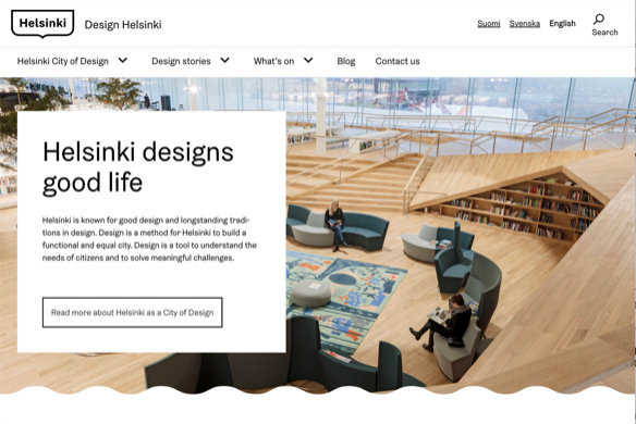
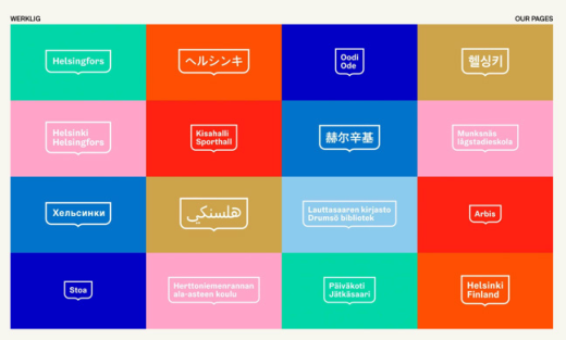
Analysis of Visual Consistency Characteristics Across the Official Website Cluster Within the high visual consistency group, Helsinki’s City of Design official website cluster demonstrates strong systemic integration. The city builds its brand on a VIS, supported by long-term and institutionalized design governance rather than isolated efforts. In 2017, Helsinki updated its VIS and applied unified visual guidelines across official digital platforms, including the city website, City of Design thematic sites, and public cultural platforms (see Figure 1–2), enabling stable and coherent cross-website brand expression. Helsinki’s strong design capacity and long-standing design tradition further reinforce design as a strategic tool for creating a functional, inclusive, and equitable city.
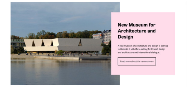
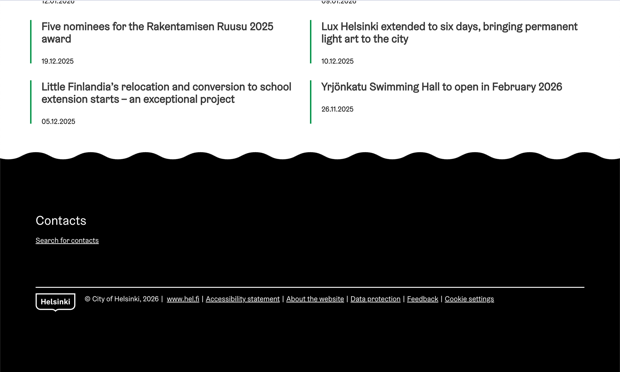
Across City of Design–related websites, high visual consistency is maintained (see Figure 3–6). Logos and slogans follow standardized size, placement, and spacing. The color system uses controlled primary and secondary colors to sustain coordinated visual tone and brand character. Typography, layout, grid structures, and graphic language remain consistent, reducing cognitive effort and supporting a coherent digital city brand identity.
Figures 1: Homepage introduction of the Helsinki brand visual identity system official website.
Figure 2: Homepage banner of the Helsinki city of design official website.Figure 3: Official webpage of Helsinki’s brand visual identity system.Figure 4: Information module on the homepage of the Helsinki city of design official website.Figure 5: Footer navigation of the Helsinki city of design official website.
Analysis of User Brand Perception Interview results indicate that after browsing Helsinki’s City of Design official website cluster, participants were able to form a clear and intuitive city brand image within a short time and establish consistent brand associations across platforms. Most agreed that the websites were visually recognizable as belonging to the same city brand, including participants without design backgrounds, suggesting that high visual consistency reduces cognitive load in brand recognition. At the cognitive level, participants accurately described Helsinki’s brand positioning using terms such as “design-oriented,” “high- quality public services,” “egalitarian,” and “design-driven vitality.” At the preference level, a unified and professional visual presentation enhanced trust and favorability, while updated VIS elements conveyed youthfulness and contemporary relevance. At the behavioral level, most participants expressed interest in further exploring design-related content or visiting the city.
Analysis of Cities with a Moderate Level of Visual Consistency: The Case of Shenzhen Analysis of Visual Consistency Characteristics Across the Official Website Cluster
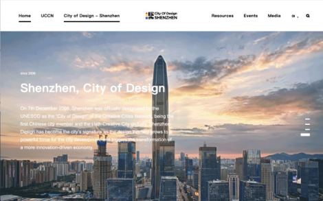
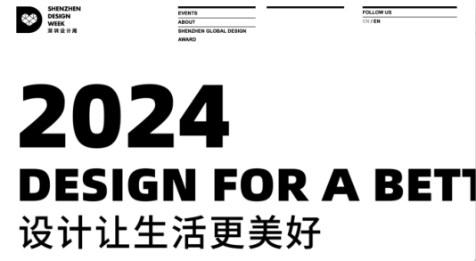
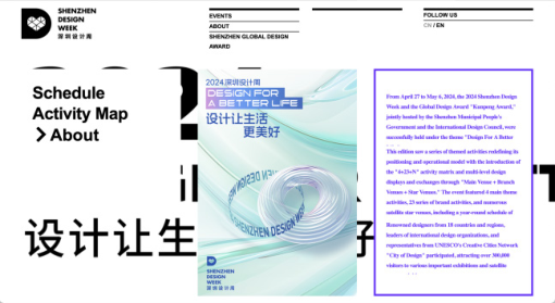
As a representative city in the moderate visual consistency group, Shenzhen shows awareness of visual integration in its Design City–related official website cluster, but overall systematization remains limited. Core visual elements show general unity with partial dispersion. The Shenzhen City of Design website uses the official logo consistently, while platforms such as the Shenzhen Design Week website adopt independently designed logos with distinct styles (see Figure 7–8). Variations in logo placement may weaken visual brand continuity, leading users to rely more on semantic cues. Color palettes maintain baseline consistency through black-and-white tones, but thematic variations cause visual fragmentation (see Figure 9–10). Typography and layout remain relatively stable. Overall, Shenzhen’s moderate visual consistency reflects a city
106 Liu and Han brand system still forming, emphasizing design awareness yet lacking cross- platform coordination under a unified visual guideline.
Figure 6: Homepage of the Shenzhen city of design official website.Figure 7: Homepage of the Shenzhen design week official website.Figure 8: Submodule information section on the homepage of the Shenzhen city of design official website.Figure 9: Submodule information section on the homepage of the Shenzhen design week 2025 official website.
Visual Consistency Analysis of the Official Website Cluster The interview results indicate that most participants perceived a certain degree of visual association when browsing Shenzhen Design City–related official websites. Nonetheless, they still relied on content-related information to confirm relationships among different websites. At the level of brand cognition, some participants accurately identified Shenzhen’s positioning using descriptors such as “dynamic”, “youthful”, “innovative”, and “technology-driven”. Nevertheless, several participants, especially those with design backgrounds, felt that the visual presentation did not clearly convey a unified City of Design brand image and remained ambiguous. Some noted that imagery, visual atmosphere, and logo application appeared relatively independent, causing confusion in visual styles. At the level of brand preference, participants generally held a positive impression of Shenzhen, although stylistic differences weakened overall brand coherence and favorability. At the level of behavioral intention, several participants expressed willingness to explore design activities or visit the city, but interest in specific events rarely extended to broader brand identification.
Low Visual Consistency Type: The Case of Graz Analysis of Visual Consistency Characteristics of the Official Website Cluster
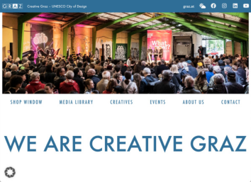
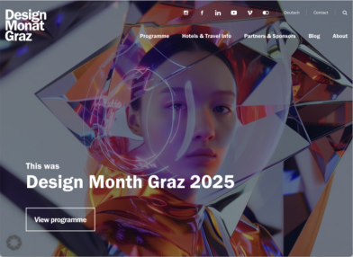
As a UCCN City of Design, Graz’s official website system includes the City of Design Graz, Designmonat Graz, and Kreatives Graz websites. Although all three focus on design-related city activities, they exhibit fragmentation in visual system integration. The lack of unified standards across logo usage, color systems, layout structures, and graphic and interface styles results in low visual consistency and weak digital brand cohesion.
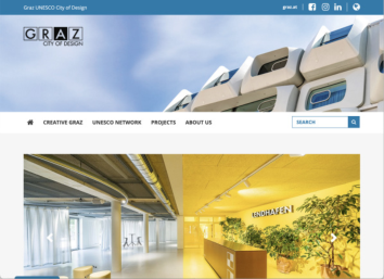
In terms of brand identity, the cluster lacks unified logo usage rules, weakening cross-platform continuity. The City of Design Graz website uses a minimal geometric black-and-white logo with a formal tone (see Figure 13). Kreatives Graz adopts a simplified version without the “CITY OF DESIGN”
108 Liu and Han text (see Figure 14), while Designmonat Graz uses a text-based logo (see Figure 15). Color usage remains inconsistent, with blue dominating two sites and black dominating Designmonat Graz. Differences in layout, interaction, and graphic style further hinder a coherent city brand visual experience. Graphic language and interface styles remain inconsistent, making it difficult to establish a coherent and unified city brand visual experience.
Figure 10: Homepage of the city of design Graz official website.Figure 11: Homepage of the Kreatives Graz official website.Figure 12: Homepage of the designmonat Graz official website.
The Impact of Visual Consistency in City Official Website Interfaces on City Brand 109 Analysis of User Brand Perception
Based on user interview results, low visual consistency within Graz’s official website cluster weakens city brand perception and user experience. At the level of brand cognition, participants perceived the brand image as fragmented, often stating that the websites “looked like different platforms,” which hindered the formation of a unified city brand connection. Some noted that while Designmonat Graz featured rich colors and event content, the other websites appeared simple and monotonous, making it difficult to consolidate the city brand image. This suggests that insufficient unified visual cues can cause confusion and weaken cohesive brand impressions.In terms of brand preference, aesthetic responses varied. Although some users appreciated the vibrancy of Designmonat Graz, they did not perceive overall visual coherence. Style differences, particularly the traditional and monotonous presentation of the City of Design Graz website, reduced interest in further exploration. At the level of behavioral intention, most participants showed neutral or low willingness to revisit, indicating that visual inconsistency may encourage fragmented engagement and weaken brand coherence.
Results and Discussion
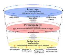
Building on prior visual consistency evaluation, city case analysis, and user brand perception research, this chapter proposes design optimization strategies. It treats visual consistency as a manageable and progressively improvable design dimension, focusing on official city website clusters to examine its digital application, assessment, and level-specific optimization strategies based on different consistency conditions.The model follows a bottom-up hierarchical structure with three interconnected levels (see Ficture 16). The Design Layer addresses core VIS elements, including logos, color systems, layout structures, and graphic and interface styles. The Perception Layer reflects users’ brand cognition, emotional preferences, and behavioral intentions when interacting with official websites. The Brand Layer represents city image stability, design value recognizability, and brand communication strength. The model emphasizes that these levels are interconnected through visual consistency as a mediating mechanism, forming a progressive influence pathway that transforms design coherence into users’ cognitive, emotional, and behavioral responses toward the city brand.
Figure 13: A three-tier strategic framework model of visual consistency—user perception—city brand (drawn by the author).
110 Liu and Han From Visual Unity to Stable Brand Expression: Consolidation of High Visual Consistency Cities
The study finds that cities with high visual consistency have achieved mature visual unity across official website clusters. However, maintaining surface- level uniformity can become rigid and monotonous, limiting users’ deeper brand understanding. Overreliance on fixed visual norms may also reduce cross-website differentiation and narrative flexibility. Therefore, the key challenge is sustaining visual consistency while avoiding formulaic expression and aesthetic fatigue. Design optimization should focus on deepening the brand by moving from visual unity toward stable and sustainable brand expression, and by strengthening semantic stability. While adhering to VIS guidelines, subtle differentiated design strategies can enhance content distinction, reinforce visual storytelling, and maintain long-term vitality and relevance.
From Local Consistency to Systemic Coordination: Brand Synergy in Medium Visual Consistency Cities Cities with medium visual consistency generally demonstrate awareness of the importance of city brand visual identity design. The issue for these cities is the absence of a systematic visual coordination mechanism.These websites may be managed by different teams, which can result in visually outstanding and prominent elements in individual sites, but an overall fragmented brand expression. For this category of cities, design optimization should shift the focus from emphasizing isolated design highlights to fostering systemic coordination. Establishing a cross-platform visual identity guideline (Extended VIS) and adopting a modular design system can ensure a consistent experience in structure and interaction logic across different websites.
From Fragmented Presentation to Brand Integration: Brand Consolidation in Low Visual Consistency Cities For cities with low visual consistency, the problem in their official website clusters goes beyond stylistic differences and extends to structural issues at the city brand level. Therefore, for these cities, efforts should focus on a holistic reconstruction of the visual system at the city brand level. This includes establishing or upgrading a unified and authoritative city VIS, clarifying the core visual language the city aims to convey, and promoting its consistent application across different official websites through design management. Additionally, low visual consistency cities can enhance key visual anchors to quickly strengthen cross-site visual associations and reinforce overall brand narrative. Gradual adjustments can improve the city brand’s holistic perception without disrupting the existing website structures.
Research Limitations and Future Directions Although this study systematically examined visual consistency in City of Design official websites and its impact on city brand perception, limitations
The Impact of Visual Consistency in City Official Website Interfaces on City Brand 111 remain. The qualitative analysis relied on participants from a single cultural background, which may influence interpretations of city image, design style, and brand value. Future studies could include more diverse cultural participants for comparative analysis. This research focused on official websites as primary digital carriers and examined visual consistency from branding and user experience perspectives. Future work could extend to social media, mobile applications, and multi-channel ecosystems to explore broader cross-platform coordination strategies.
REFERENCES
Cheng, F.F., Wu, C.S. and Leiner, B. (2019) ‘The influence of user interface design on consumer perceptions: A cross-cultural comparison’, Computers in Human Behavior, 101, pp. 394–401. Cheng, Y. and Qian, Y. (2025) ‘Design and evaluation of a digital communication
indicator system for global city image’, Contemporary Communication, (01), pp. 103–108. Du, P. and MacDonald, E.F. (2018) ‘A test of the rapid formation of design cues for product body shapes and features’, Journal of Mechanical Design, 140(7), 071102. Gonzalez, I., Val, E., Justel, D., Iriarte, I. and Lasa, G. (2019) ‘A new method to
evaluate good design for brand recognition in the digital world’, The Design Journal, 22(sup1), pp. 1957–1971. Göztaş, N.E.K.A. and Göztaş, A. (2010) ‘Digitalization of the cities: An analysis of city municipality web sites as a part of city brand’, Yaşar Üniversitesi E-Dergisi, 5(20), pp. 3331–3347. Iskandar, M.S. (2018) ‘Analysis of visual rhetoric for official website city government’,
in International Conference on Business, Economic, Social Science and Humanities (ICOBEST 2018), Atlantis Press, pp. 226–228. Jeffres, L.W. and Lin, C.A. (2006) ‘Metropolitan websites as urban communication’, Journal of Computer-Mediated Communication, 11(4), pp. 957–980. Kavaratzis, M. (2004) ‘From city marketing to city branding: Towards a theoretical
framework for developing city brands’, Place Branding, 1(1), pp. 58–73. Keller, K.L. (1993) ‘Conceptualizing, measuring, and managing customer-based brand equity’, Journal of Marketing, 57(1), pp. 1–22. Li, W., Zhou, Y., Luo, S. and Dong, Y. (2022) ‘Design factors to improve the
consistency and sustainable user experience of responsive interface design’, Sustainability, 14(15), 9131. Lu, J. and Fu, J. (2019) ‘Research on city brand identity design based on perception’, in International Conference on Applied Human Factors and Ergonomics, Cham: Springer International Publishing, pp. 381–390. Riegler, A. and Holzmann, C. (2018) ‘Measuring visual user interface complexity of
mobile applications with metrics’, Interacting with Computers, 30(3), pp. 207–223. Safitri, F.N.A. and Sriyanto, A. (2025) ‘The role of visual brand identity consistency in enhancing brand recall and consumer preference’, Jurnal Ar Ro’is Mandalika (Armada), 5(2), pp. 491–501. Van der Geest, T. and Loorbach, N. (2005) ‘Testing the visual consistency of web
sites’, Technical Communication, 52(1), pp. 27–36. Wang, L. and Zhang, Y. (2023) ‘The visual design of urban multimedia portals’, PLOS ONE, 18(3), e0282712.
112 Liu and Han Yang, T. and Bolchini, D. (2014) ‘Branded interactions: Predicting perceived product
traits and user image from interface consistency and visual guidance’, Interacting with Computers, 26(5), pp. 465–487. Zhang, Y., Hu, Y. and Pan, J. (2024) ‘Provision of personalized services in digital government: What type of government websites do the public prefer? An empirical analysis based on website function design, information supply, and visual style’, E-Government, (04), pp. 101–112. doi: 10.16582/j.cnki.dzzw.2024.04.009.
LISTED IN THE AHFE DIGITAL BOOKSTORE CATALOGUE
Explore the complete digital volume
Human Factors in Communication of Design
Read this individual research paper free through the original publisher, or explore the full digital proceedings book.
ISBN 978-1-964867-92-2
Explore this ISBN in the AHFE Bookstore ↗Listed in the July 2026 bookstore catalogue; search by ISBN to confirm current availability · Digital book purchase optional