Jiahui Qiu (2025). Design for Multi-Sensory: How Can Visual Design Help Communicate Human Sense. In: Human Factors in Design, Engineering, and Computing. AHFE Open Access, vol. 199, pp. 1883–1893. https://doi.org/10.54941/ahfe1006999
This critical report explores the application of multi-sensory theory within visual design practice, situated within the context of the independent research project Multi-sensory Narratives of Urban Sound: From Perception to Archive. The study begins by outlining foundational theories of multi-sensory integration and synaesthesia, which reveal the human capacity to receive and process sensory input in overlapping, interconnected ways. Through five selected design case studies, the report examines how visual design can serve as a bridge between senses, especially in projects that aim to translate auditory, tactile, or gustatory information into visual language.The paper then presents two self-directed projects, I Can Hear, In My Dream and Qiu Jiahui collected very loud noises in London made the Album it’s an Archive, in which the author explores the potential of visual design to communicate sound, evoke emotion, and raise awareness about urban noise. These projects use moving image, immersive installation, sound archives, and print publication formats to engage audiences through sight and hearing simultaneously. By critically reflecting on both theoretical knowledge and practical application, the report considers how visual design can activate empathy, memory, and bodily perception, ultimately enriching human experience through cross-sensory communication.
INTRODUCTION: MULTI-SENSORY DESIGN AS A METHOD OF COMMUNICATION In daily life, human perception rarely relies on a single sense. Instead, our experiences emerge from the interplay of sight, hearing, touch, taste, and smell—a cohesive system that helps us navigate and emotionally respond to our environment. Yet visual communication design has historically privileged sight, often overlooking the potential of other senses.
This study stems from a simple yet revealing observation: many people struggle to concentrate while listening to classical music, not from disinterest but from a lack of sensory context. The music’s harmonic complexity can feel inaccessible without reference points. This raises a crucial question: how can visual design translate abstract, non-visual experiences into accessible, emotionally resonant forms? And further—how can multi-sensory design
help connect people to disciplines or experiences that feel distant or hard to grasp?
One compelling example is Keita Onishi’s Meikyoku Album + “Manuel Cardoso: Requiem” (2021), which transforms a 16th-century choral piece into a visually rich, animated sequence. Awarded the Tokyo TDC Grand Prize in 2022, it visualises musical structure and rhythm through animated linework, allowing audiences to comprehend complex polyphonic sound. As Onishi (2022) puts it: “Pass some information to eyes so that ears will not be distracted.” His insight serves as a framework for this inquiry.
Multi-sensory design—often associated with product design, like textured packaging that suggests taste—remains underexplored in visual communication. Yet theories of multisensory integration and synaesthesia offer fertile ground. Cytowic (2002) defines synaesthesia as the involuntary activation of one sense by another, and while true synaesthetes are rare, neuropsychology confirms that sensory integration is universal (Newell & Mitchell, 2015). As Leeuwen et al. (2016) note, “Processes of multisensory integration… are common across all people.” This positions the theory as highly relevant for design: if our brains already link sensory inputs, designers can harness and shape those connections.
This report argues that visual design can foster sensory empathy—enabling audiences to understand and emotionally connect with experiences they may not directly perceive. It begins by outlining key theories, then examines five case studies in installation, packaging, branding, and signage. Finally, it presents two self-directed projects from Multi-sensory Narratives of Urban Sound: From Perception to Archive, exploring how visual design can engage with noise pollution, memory, and emotion. Through theory, case study, and practice, the report considers how visual design might not only reflect sensory experience but also activate and generate it.
METHODS: CASE STUDY ANALYSIS To understand the potential of multi-sensory design in visual communication, this section presents a selection of case studies across different media and sensory approaches. These examples serve as conceptual frames to critique the role of visual design in communicating and extending non-visual sensory experiences.
Keita Onishi’s animated visualisation of Manuel Cardoso’s Requiem demonstrates how auditory content can be translated into visual form.
Design for Multi-Sensory: How Can Visual Design Help Communicate Human Sense 1885
Through hand-drawn stroke animations representing each melodic line, the piece reveals the texture and structure of complex polyphonic sound. Rather than merely decorating the music, the visuals serve to clarify and expose musical structure. This approach not only appeals to trained listeners but also allows non-expert audiences to better comprehend the textural and temporal richness of classical music.
According to Onishi (2022), “The music itself has much complex information. Therefore, pass some information to eyes so that ears will not be distracted.” His insight reflects a key principle of multisensory design: that distributing sensory load between modalities can enhance comprehension and emotional response. Rather than competing with sound, visual design in this work enhances the auditory experience by providing an accessible interpretive layer.
Unlike traditional motion graphics or music videos, where visuals are often subordinate to sound or used to set mood, Onishi’s work positions vision and hearing as equal collaborators. The work challenges assumptions that classical music must be appreciated through passive listening, suggesting that visual aids can play a critical role in democratizing access to complex auditory forms.
Touching Sound: Touch the Sound by Maddalena Fanconi (2015)
Fanconi’s installation, designed for Brescia’s Roman font, uses digital sound waveforms to create tangible representations of audio. By translating real-time sound data into printed forms via digital fabrication, she produced a series of touchable “soundtracks.”
Though technically innovative, the work raises questions about the aesthetic and communicative value of literal data translation. As Fanconi (2015) notes, her process involved “no improvisation or mutations”—a direct, unmediated shift from signal to form. While materially compelling, the visuals feel generic and disconnected from the sound’s experiential or emotional content.
This approach lacks what Schön (1983) terms “reflection-in-action,” where designers actively shape meaning. Here, the designer acts more as technician than interpreter. The outcome is precise but emotionally flat. Without narrative or conceptual framing, users must infer significance, limiting engagement.
Still, the tactile emphasis successfully shifts sound perception from ears to hands, expanding sensory engagement and provoking curiosity. It sparks a useful discourse on balancing accuracy and expression in visualising non-visual data—a tension central to multi-sensory communication.
1886 Qiu
Taste and Texture: Juice Skin by Naoto Fukasawa (2004)
Fukasawa’s Juice Skin packaging is a classic example of sensory suggestion through material and form. By mimicking the tactile surface and shape of the contained fruit, the packaging creates an anticipatory experience. The flocked kiwi bottle, for instance, replicates the fruit’s fuzzy skin, letting consumers “feel” the taste before opening it.
This cross-modal design, where visual and tactile cues evoke gustatory associations, highlights the power of sensory marketing. As Krishna (2012) notes, such cues can “create subconscious perceptions of product attributes and influence consumer behaviour.” Fukasawa’s work supports this, delivering an experience that begins with sight and touch, not just consumption.
Yet, the project also exposes tension between conceptual purity and commercial practicality. The minimalist, material-focused design, though effective, complicates mass production and leaves little room for branding elements like logos or nutritional info. This reflects a broader challenge: balancing conceptual clarity, sensory richness, and market needs. Still, Juice Skin shows that packaging can do more than contain—it can communicate a product’s essence.
Unexpected Sound Cues: Martinelli’s Apple Juice Bottle (2022)
An unintentional yet highly effective example of sensory engagement arose from Martinelli’s apple-shaped plastic bottle. Users found that biting or squeezing the bottle produced a sound strikingly similar to biting into a real apple. This unexpected feature went viral on TikTok, turning the packaging into a multi-sensory marketing success.
Notably, the alignment of sound, shape, and product content was not deliberately designed. Yet it enhanced the consumer experience—auditory and visual cues reinforced taste expectations, prompting purchases driven by emotion and curiosity. The bottle’s shape and material enabled the accidental “bite” sound, showing how small physical choices can yield strong sensory effects.
Design for Multi-Sensory: How Can Visual Design Help Communicate Human Sense 1887
This case supports Schifferstein and Desmet’s (2008) argument that “unexpected sensory impressions can enhance product attractiveness and memorability.” The auditory surprise boosted user attention, social sharing, and brand visibility—without altering the product itself.
The key takeaway for designers: sensory affordances can stem from basic material properties, and even unintended cues can significantly influence perception and brand value.
Material as Meaning: Umeda Hospital Signage System by Hara Kenya (1998)
In his signage system for Umeda Hospital in Japan, Kenya Hara used soft, white cotton fabric for navigational graphics. Designed for a paediatrics and maternity care setting, the signs—resembling baby nappies—are removable, washable, and tactile, symbolising hygiene, care, and comfort.
Hara’s minimalist text combined with tactile material creates a layered sensory experience. Touch reinforces trust; material reinforces meaning. As Hara (2007) notes, “Design should not only be perceived through the eyes but also felt by the body.” This case shows that visual design extends beyond typography and colour to include material and spatial interaction. Users absorb not only wayfinding information but also the hospital’s ethos through sensory cues. By communicating values like cleanliness and warmth, Hara elevates a functional system into an emotionally resonant experience.
His approach aligns with emotional design theory, which holds that environments shape affect and interpersonal trust (Norman, 2004). Here, signage becomes an emotional interface, shaping how people feel, not just where they go.
Synthesis These case studies represent a spectrum of approaches: from expressive interpretation (Onishi, Hara), to literal translation (Fanconi), to sensorial marketing (Fukasawa, Martinelli). Together, they reveal core themes:
How directly should one sense be translated into another? Where is the room for interpretation?
Translation vs. Transformation
Can data visualisation be both accurate and emotionally resonant?
Precision vs. Emotion:
In a visual-dominant culture, how can other senses be elevated without being tokenistic?
Sensory Hierarchy
Can experimental sensory design survive in commercial contexts?
Commercial vs. Conceptual
1888 Qiu
These reflections serve as a foundation for the author’s own practical explorations in the subsequent section, where two original projects are analysed within the same multi-sensory framework.
RESULT: ANALYSIS of CASE STUDY AND PRACTICE This section presents two self-directed projects developed under the research initiative Multi-sensory Narratives of Urban Sound: From Perception to Archive. Each explores how visual design can translate or support auditory experience across various media. These works test earlier theoretical frameworks while investigating how sensory design can provoke emotional response, audience empathy, and critical reflection on everyday urban life.
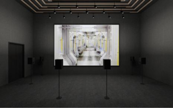
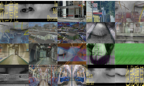
Project 1: I Can Hear, In My Dream Two-Minute Experimental Film / Immersive Installation This project stems from a personal encounter with urban noise pollution—a dream overwhelmed by sounds of traffic, shouting, and construction, evoking helplessness and anxiety. These everyday sounds, though omnipresent, are often unacknowledged yet emotionally disruptive. The project seeks to translate that internal, affective experience into a multi-sensory communication aimed at young, urban audiences.
Figure 1: Installation.
Concept and Aims The goal was to explore how visual design might frame urban noise not just as data, but as emotional experience. Using sound recordings from daily life— subways, traffic, nightlife—the project constructs a sonic portrait of the city. Rather than visually representing the sound’s source, the visuals express the emotional states the noise evokes.
Two formats were used:
1. A short video tailored for social media, using “dreamcore” aesthetics (Finn, 2021): saturated colours, surreal visuals, and non-linear editing to evoke a fragmented, anxious dream. 2. An immersive installation where viewers sit in an enclosed space with surrounding speakers; visuals on a screen respond dynamically to the sound’s intensity and frequency.
Design for Multi-Sensory: How Can Visual Design Help Communicate Human Sense 1889
Figure 2: Two-minute experimental film.
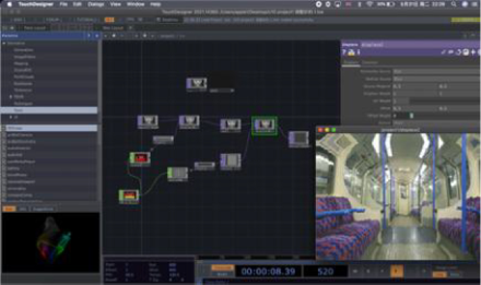
Multi-Sensory Strategies Sound data was processed using TouchDesigner software, with high frequencies triggering screen distortion and shake—rendering sound visually “palpable.” While echoing Onishi’s (2022) translation of sound into image, this project privileges emotional over analytical expression.
Prototype testing revealed notable audience response: “I’ve never felt the underground to be so noisy… But watching this made me realise how noisy it really is.”
This supports Christiano and Neimand’s (2017) view that memorable experiences are key to raising awareness.
Figure 3: Touch designer processing for sound visualisation.
Empathy Through Design The project invites viewers to experience noise from the perspective of the “noise victim,” prompting empathy through embodied discomfort. As Maya Angelou put it: “People will forget what you said… but never how you made them feel.”
Here, visuals amplify rather than compete with sound. In Hara’s (2021) terms, this is “designing for the senses”—not just conveying information but
1890 Qiu
shaping perception. The interplay between sound and image forms a multi- sensory feedback loop, enhancing memory and emotional connection.
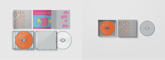
Project 2: Qiu Jiahui Collected Very Loud Noises in London Made the Album it’s an Archive Sound Archive / Album Design / RISO Print Publication The second project extends the first by archiving the urban soundscape. Rather than treating noise as disturbance, it reframes it as cultural data worth documenting and preserving. The project includes: a CD album with four tracks of collected urban noise; a printed publication with visual catalogue illustrations; and a blank CD with instructions, inviting users to build their own archive.
Figure 4: Design concept prototype.
Design Rationale Inspired by field recording and anthropological audio archives, the project treats city noise as both temporal and personal. The design challenge was to make the concept of a “sound archive” accessible and appealing to younger audiences. Survey data indicated that 75% of participants still buy physical music formats—not for function, but for symbolic value. Thus, the album needed to serve as both a tool for information and a collectible object with emotional resonance.
Multi-Sensory Design Elements While sound is the content, visual design acts as the medium. Hand-drawn illustrations and handwritten notes evoke diary entries—personal, symbolic, and interpretive. Bright colours and sketchy lines reflect the chaos and familiarity of urban sound, prompting associations of memory and meaning beyond literal waveform depiction.
The CD’s physical form adds a tactile dimension that digital formats lack. As Jarrett (2017) suggests, physical objects evoke emotional memory. The act of holding, unwrapping, and playing a CD becomes a ritual of engagement— akin to browsing a photo album or writing a diary.
The publication’s materiality also conveys permanence. Though noise is ephemeral, archiving it materially allows it to be remembered and reinterpreted—echoing Norman’s (2004) idea of emotional design, where affect matters as much as function.
Design for Multi-Sensory: How Can Visual Design Help Communicate Human Sense 1891
Design for Audience Activation Like the first project, this work treats the audience as co-creator. By providing a blank CD and instructions, it invites participation and curiosity about one’s sonic surroundings. The goal is not only to raise awareness but to promote a DIY culture of sound archiving.
This reflects participatory design principles, where the designer creates frameworks rather than fixed messages. Instead of declaring what noise means, the project asks: What does noise mean to you?
Reflective Comparison to Precedents Case Study Relation to Project 1 & 2
Keita Onishi Inspired visual-to-sound translation through motion; shared concern with visualising complexity.
Fanconi Revealed the limits of literal sound visualisation; influenced choice to avoid direct waveform imagery.
Fukasawa / Martinelli
Highlighted sensory marketing and the power of material cues; informed the album’s tactile ambitions.
Hara Kenya Reinforced belief in sensory empathy; influenced narrative-driven design and the role of material as message.
Together, these two projects extend and challenge the boundaries of visual communication by designing across senses. They shift visual design from a representational function to a sensory translation device—where sight, sound, and touch merge to communicate affect, environment, and memory.
CONCLUSION
This report has examined how visual design can act as a conduit for multi- sensory communication, particularly in translating auditory experience into visual and spatial forms. Grounded in theories of synaesthesia, multisensory integration, and emotional design (Cytowic, 2002; Newell & Mitchell, 2015; Norman, 2004), the study critically analysed five case studies and applied these insights through two self-directed projects developed within Multi-sensory Narratives of Urban Sound: From Perception to Archive.
Findings reveal that successful multi-sensory design is not just about combining sensory inputs—it requires orchestrating them meaningfully. Works like Keita Onishi’s Requiem and Kenya Hara’s hospital signage show how visual design can deepen understanding and emotional resonance by engaging shared perceptual mechanisms.
In the two projects presented, design was used as a tool for interpretation and empathy. I Can Hear, In My Dream employed immersive moving images to provoke emotional reactions to urban noise, while Qiu Jiahui collected very loud noises in London made the Album it’s an Archive reframed noise
1892 Qiu
as cultural memory through archiving and participation. Together, they demonstrate the potential of visual design to evoke empathy, memory, and awareness.
The practical outcomes highlight four key insights:
1. Visual design can reframe auditory experience through movement, form, rhythm, and metaphor. 2. Materiality and tactility are crucial for emotional resonance and engagement. 3. Metaphor and narrative may be more effective than literal translation in evoking sensory perception. 4. Audience participation can expand multi-sensory design from passive interpretation to active creation.
Some limitations and future directions emerged. While the projects focused on vision and sound, adding olfactory or thermal elements—such as scent in immersive spaces or tactile materials in publication—could further enhance emotional context. For example, I Can Hear, In My Dream might have included industrial or natural scents; the album’s packaging could explore thermochromic inks or textured surfaces to stimulate touch.
Additionally, as design increasingly moves into virtual and augmented environments, the role of motion, haptics, and spatial sound in multi-sensory interaction will become even more critical.
In a visually saturated world, designers have a responsibility to go beyond the optical and embrace the full sensory spectrum. This is not merely an aesthetic expansion but a form of cognitive and emotional care. Multi- sensory design, when anchored in empathy and research, becomes a powerful tool for shaping how we perceive and inhabit our environments.
Ultimately, this study is not a conclusion but a starting point. The theoretical foundation and practice-led experimentation conducted here serve as a basis for continued exploration. As technology evolves and audiences become increasingly attuned to experience over consumption, multi-sensory design will offer profound possibilities for reimagining communication, memory, and perception. As a visual designer, I am committed to continuing this line of inquiry—developing work that not only speaks to the eye but resonates through the body and lingers in memory.
REFERENCES
Christiano, A. and Neimand, A., 2017. Stop Raising Awareness Already. Stanford Social Innovation Review. [online] Available at: https://ssir.org/articles/entry/ stop_raising_awareness_already. Cytowic, R. E., 2002. Synesthesia: A Union of the Senses. 2nd ed. Cambridge, MA:
MIT Press. Doyle, C., 2011. A Dictionary of Marketing. 3rd ed. Oxford: Oxford University Press. Fanconi, M., 2015. Touch the Sound. Behance. [online] Available at: https://
Design for Multi-Sensory: How Can Visual Design Help Communicate Human Sense 1893
Finn, R., 2021. What is ‘Dreamcore’ and Why is it All Over TikTok?. i- D Magazine. Available at: https://i-d.vice.com/en_uk/article/bvzvk5/dreamcore- tiktok-aesthetic. Hara, K., 2021. Designing Design. 4th ed. Baden, Switzerland: Lars Müller
Publishers. Jarrett, C., 2017. The Psychology Behind Why We Value Physical Objects Over Digital. Research Digest. [online] Available at: https://digest.bps.org.uk/2017/10/ 24/the-psychology-behind-why-we-value-physical-objects-over-digital/. Jones, R., 2021. The Power of Your Senses: Why Coffee Tastes Better in a Red Cup
and Other Life-Changing Science. London: Welbeck Publishing Group. KINGDOM BRANDING, n.d. How Your Keen Observation of the Senses Could Help You Design Better Products and Services. [online] Available at: https://www.kingdombranding.com/how-your-keen-observation-of-the-senses -could-help-you-design-better-products-and-services/. Leeuwen, T. M., Trautmann-Lengsfeld, S. A., Wallace, M. T., Engel, A. K. and Murray, M. M., 2016. Bridging the Gap: Synaesthesia and Multisensory Processes. Neuropsychologia, 88, pp. 3–13. Miller, R., 2014. Wassily Kandinsky’s Symphony of Colors. Denver Art Museum. Available at: https://www.denverartmuseum.org/en/blog/ wassily-kandinskys-symphony-colors. Martinelli’s, 2022. ICYMI... Taking a “Bite” out of Martinelli’s Apple-Shaped
Bottles Goes Viral on TikTok - Martinelli’s. [online] Available at: https:// www.martinellis.com/mg_press/icymi-taking-bite-martinellis-apple-shaped- bottles-goes-viral-tiktok/. Marazzi, A., 2019. Aural Anthropology, a Way of Listening. [ebook] Available at: https://doi.org/10.1080/08949468.2019.1603037 [Accessed 5 May 2022]. Newell, F. N. and Mitchell, K. J., 2015. Multisensory Integration and Cross-Modal
Learning in Synaesthesia: A Unifying Model. Neuropsychologia, [online] 88, pp. 14–24. Available at: https://www.sciencedirect.com/journal/neuropsychologia Onishi, K., 2022. Interview with TDC2022 Grand Prize Winner Keita Onishi: I Give the Information to Eyes in Order to Keep Ears Focused. [online] Tokyo Type Directors Club. Available at: https://tokyotypedirectorsclub.org/en/award/ 2022_grandprix/. Sarita, 2017. Using Multi-sensory Design to Improve Human Experience. PDD
Innovation. Available at: https://www.pddinnovation.com/using-multisensory- design-improve-human-experience/. Tokyo TDC, n.d. Keita Onishi Meikyoku Album + Manuel Cardoso: Requie AWARD.
LISTED IN THE AHFE DIGITAL BOOKSTORE CATALOGUE
Explore the complete digital volume
Human Factors in Design, Engineering, and Computing
Read this individual research paper free through the original publisher, or explore the full digital proceedings book.
ISBN 978-1-964867-75-5
Explore this ISBN in the AHFE Bookstore ↗Listed in the July 2026 bookstore catalogue; search by ISBN to confirm current availability · Digital book purchase optional