Margarida Gamito, Fernando Moreira da Silva (2023). Color materiality and urban equipment: factor of inclusion, comfort and safety. In: Human Systems Engineering and Design (IHSED 2023): Future Trends and Applications. AHFE Open Access, vol. 112, pp. 171–177. https://doi.org/10.54941/ahfe1004127
Color is inseparable from matter, shape, object. Color, as an integral part of light, is inherent to the project, and is therefore an element of form. As long as there is light, Color is a component of everything around us and of ourselves, affecting us at every moment of our lives: our body but also our emotions, disposition and mental faculties. Color is light made visible, through interaction with surfaces of all kinds: opaque or translucent surfaces make Color visible. Whether designing a hand-scale object or a piece of equipment, interior design or architecture or urban space, they all deal with spatialities. The characterization of these spatialities goes through the structure, surface texture, coating, type of light (natural or artificial), shape/background relationships, ways of approaching and reading modes, and their correct use or fruition. Color, being matter, directly linked to the surfaces of objects, has to be understood globally and as part of the conceptual process of the product.However, designers are not always aware that the product they design, such as the Color inherent to the respective material used in its construction, can be a factor of inclusion or exclusion of its users, in addition to several other components that can value or not its use or fruition. The main aim of this paper is exactly Color as the material of urban equipment, addressing psychological and physiological aspects of Color, and the importance of its knowledge and correct handling in the act of designing equipment for urban space, not only as an integral part of the creative process, assuming itself as a cultural and imaginative act, but also as a product of a rational approach that can allow greater inclusion and provide greater comfort and safety to its users. In the development of this research Project, a mixed methodology was used, consisting of a literature review and a survey of users of urban garden equipment, aged between 35 and 75. The results achieved so far are presented, which underline the importance of a correct application of the Color materiality when designing urban equipment.
The main aim of this paper is to reflect on the psychological and physiological aspects of Colour as material of urban equipment, and the importance of its knowledge and correct handling in the act of designing this equipment for urban space, not only as an integral part of the creative process, assuming itself as a cultural and imaginative act, but also as a product of a rational
approach that can allow greater inclusion and provide greater comfort and safety to its users.
Urban equipment needs to be seen, in order to accomplish its functions, helping people to use it, showing the ways, transmitting information, and protecting people from the eventual obstacles that they may stand in their way. Therefore, the best way to accomplish these achievements is through colour because, as Per Mollerup asserts: “Colour is the component of human visual field that stands out most from an environment, being it a built setting (location) or a landscape because, depending exclusively on vision to be per- ceived, it is a means of communication that does not require any intellectual effort to be observed and is always seen before form and texture” (Mollerup, 2005, p. 14).
COLOUR Colour is inseparable from matter, shape, object. Colour, as an integral part of light, is inherent to the project, and is therefore an element of form.
Going further, Goethe in his Theory of Colours (1840) states: “We observed that all nature manifests itself by means of colours to the sense of sight. We now assert, extraordinary as it may in some degree appear, that the eye sees no form, inasmuch as light, shade, and colour together constitute that which to our vision distinguishes object from object, and the parts of an object from each other” (Goethe, 1840, p. 35).
Colour is a means of communication that does not require any intellec- tual effort to be observed and is always seen before the form and texture, which need a conscious analysis to be perceived. It is a fluid component that takes the shape of the surface it occupies, but is not restricted to that shape, spilling over and interacting with the colours that are close to it, sometimes creating optical mixtures, bringing the forms it supports closer or receding, transmitting temperature sensations and permanently attracting the attention, intentional or not, of any observer (Gamito, 2022).
Colour being light, what we see on coloured surfaces, is the result of the absorption and reflection of the different light rays that make up the incident light beam and that varies with the quality of the materials and coatings observed.
Considering this definition, it makes colour appear as a simple am immutable phenomenon linked solely to the surface in which it is built or to whom it is applied. However, that is not the case, the appearance of colour depends on several factors, like the quality and composition of the incident light and the activity and sensibility of the observer’s eye and brain.
In what concerns the quality of the incident light, being it natural or arti- ficial, the colour of the surrounding atmosphere changes with the hours of the day and the climatic seasons. It also depends on the interactions caused by other colours placed nearby, on the double reflection caused by other sur- faces highly reflective, and the social, cultural and physiological attributes of the observer.
Simultaneously simple, yet complex as a metaphysical experience, appar- ently unnecessary, yet profoundly affective, the appearance of colour varies
Colour Materiality and Urban Equipment: Factor of Inclusion, Comfort and Safety 173
constantly with light conditions and is entirely contingent on the context and reflectance of the material surface as well as the viewer (McLachlan, 2022).
In this respect, Michael Lancaster (1996) mentions that human beings manifest psychological and physiological reactions to colour that transform it into an important factor for information, communication and percep- tion of the environment, attracting attention, transmitting information and stimulating emotions (Gamito, 2022).
Inherent and Perceived/Reflected Colour The colours of the built environment, such as the colours of the facades, urban furniture and other elements present in the urban environment, are usually chosen through paint samples or correspond to the colours of the used materials. However, once applied, these colours may not match the chosen swatches. This happens because the conditions of observation and the quality of the observer vary, and neighbouring colours exert interactions that may alter their perception.
Inherent colour is a constant, physical quality of a surface that does not depend on whether it is seen or not, nor on external conditions such as the light under which it is observed, the colours that surround it and with which it can interact, nor on the observer’s vision.
It is the colour defined by the studies of the various theorists in the Study of Colour, corresponding to the reflected light beam that only coincides with the observed colour if the viewing conditions are those standardized by the colour measurement systems.
All inherent colour can be tainted by one or more coloured lights, in addition to the quality of visualization varying according to the observer. In addition to these conditions, we must also consider the observation dis- tance that can give rise to a mixture of colours similar to that which occurs in pointillist painting, climatic interference, and the quality and quantity of incident light.
In what concerns perceived colour, Anter (2000) defines it as the colour that an observer perceives that an object or a field has in any given light and viewing situation (Anter, 2000, p. 13).
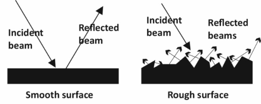
The perceived colour is partially determined by the ability of the surface to reflect different wavelengths of the light beam that strikes it, which can be affected by the brightness and texture of the surface and by the shadow pattern created by the interaction between different shapes (Figure 1).
Figure 1: Light reflected on different textured surfaces (source Gamito. 2018).
174 Gamito and Moreira da Silva
Smooth surfaces reflect light directly, so much of the incident light is reflected directly into the eye, appearing brighter than a rough surface. A smooth, polished surface reflects light so directly that much of it is reflected as white light, with only a tiny amount reflected as colour. When the surface is highly polished, it dazzles the eye with white light, deflecting most of the incident beam before reaching the colour-sensitive receptors, and the colour becomes less noticeable and darker.
A dull surface is a surface that is almost microscopically wrinkled, so that its roughness is so fine that it cannot be seen with the naked eye. This surface diffuses light equally in all directions, so the reflected beam is constant from any point of view. Colours, on a matte surface, are smooth and uniform, which makes them easy to see and understand.
Rough, or textured, surfaces reflect light in a fragmented way, scattering light in multiple directions and appearing darker than a smooth surface of the same material because the beam of light reaching the eye is smaller. If a surface is very rough, or has an uneven texture, the reflected light is scattered in so many directions, and with such different angles of reflection, that the surface appears nuanced with light, medium, and dark areas, appearing more dynamic and alive.
Visualisation Quality The perceived colour is influenced by the intensity, angle and composition of the lighting, by the distance and angle of observation, by the surrounding colours and by other factors that vary with the situation.
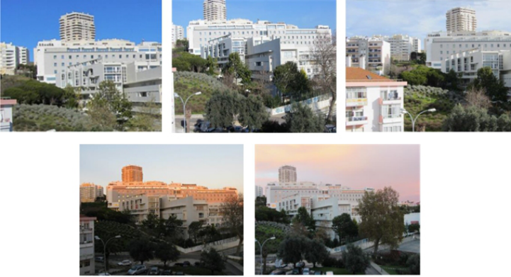
An incident light other than white light, such as some artificial lights, sun- light at dawn or dusk, or even light from overcast weather, modifies the colour of the object because, not being present all the wavelengths that con- stitute the solar spectrum, the reflected beam necessarily becomes different (Figure 2).
Figure 2: Building colour modified by incident sunlight wavelengths (source Gamito, 2023).
Colour Materiality and Urban Equipment: Factor of Inclusion, Comfort and Safety 175
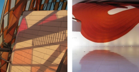
Changes may also arise as a result of the effects of an indirect light source. Indirect light occurs when the incident beam strikes the reflecting surface at such an angle that the reflected beam strikes another surface and is reflected as a double reflection back to the eye (Figure 3).
Figure 3: Example of double reflexion (source Gamito, 2016).
In addition to these conditions, we must also consider the observation dis- tance that can give rise to a mixture of colours similar to that which occurs in pointillist painting, climatic interference, and the quality and quantity of incident light (Figure 4) (Gamito, 2022).
Figure 4: Changes in perceived colour, depending on the observation distance (source Gamito, 2013).
References Intentions and Attitudes of the Observer Colour perception also changes with the observer. The human being is conditioned by references and notions of colour established in specific situations.
Human beings, in their evolution, inherited psychological and physio- logical reactions to colour which, despite not being able to be controlled or objectively explained, make it an important factor for information, communication and understanding of the environment.
The world population is constituted by people with different vision condi- tions, some of them caused by vision inabilities. Even two or more observers with healthy vision conditions, will not see the same when observing a deter- mined colour because the seen colour is a product of the combined action of the eye and the brain, and memory also has an influence on colour percep- tion, as a large number of perceived colours are based on previous experiences
176 Gamito and Moreira da Silva
and does not correspond to the reality, but to the recognition of a previously observed colour (Gamito, 2012).
In reality, the three colour sensitivities are always activated simultaneously, with different intensities, when looking at an isolated colour of the solar spectrum. However, when a primary colour is predominantly activated, it is the corresponding colour sensation that is received, while the influence of other sensitivities is bypassed (Moreira da Silva, 2013).
Also, the ease of perception is not identical for all colours, yellow and green colours are seen faster and more easily than reds and violets (Gamito, 2012).
Despite these statements, an experienced observer can try to cancel out external interference, mainly variables, and be able to identify the inherent colour, because our eyes are not mere receivers of information and the brain stores information and uses a memory of the colour: the colour that objects or surfaces usually have, which allows us to discard what could lead the observer to erroneous conclusions.
However, with regard to environmental colour, this colour memory can also be misleading, as the surrounding colours (colours of facades and vege- tation) can be so varied that it prevents the brain from using that memory. In this regard, (Monica Billger, 1999 apud Anter, 2000) introduced the concept of colour identity, which is the main sensation of what is seen as the colour of a surface.
CONCLUSION
Bridging the different literature sources and the practical experience imple- mented by the author during the last two research projects, mainly the post-doctoral project where was possible to develop field work with two municipalities, it is possible to conclude that when designing urban equip- ment systems, it is necessary to analyse the surrounding environment, and the more frequent illumination in order to eliminate, or at least minimize, the possible interferences on colour rendering.
Colour must always be seen as part of the material of urban equipment. And this, underlines the importance of addressing psychological and physi- ological aspects of colour, and the importance of its knowledge and correct handling in the act of designing equipment for urban space, not only as an integral part of the creative process, assuming itself as a cultural and imagina- tive act, but also as a product of a rational approach which can allow greater inclusion and provide greater comfort and safety to its users.
ACKNOWLEDGMENT
The author would like to acknowledge the support given by CIAUD – Research Centre for Architecture, Urbanism and Design, Lisbon School of Architecture, Universidade de Lisboa, and by FCT – Foundation for the Science and Technology, Portugal. This work is financed by national funds through FCT - Fundação para a Ciência e a Tecnologia, I.P., under the Strategic Project with the references UIDB/04008/2020 and UIDP/ 04008/2020.
Colour Materiality and Urban Equipment: Factor of Inclusion, Comfort and Safety 177
REFERENCES
Anter, K., Klaren, U. (2000). Colour and Light — Spatial Experience. Rutledge, UK. Gamito, M. (2012). Cor no Mobiliário Urbano: um fator de Inclusividade, Orientação e Identificação, PhD thesis, Lisbon School of Architecture, Universidade de Lisboa. Gamito, M. (2022). UrbanCroma, Metodologia de Planeamento Cromático para
Mobiliário Urbano, Postdoctoral project report, Lisbon School of Architecture, Universidade de Lisboa. Goethe, J. W. (1840). Theory of Colours, John Murray, Albermarle Street, London. Lancaster, M. (1996). Colourscape, Academy Editions, London. Maclachlan, F. (2022). Colour Beyond the Surface: Art in Architecture, London: Lund Humphries. Mollerup, P. (2005). Wayshowing, Lars Müller Publishers, Baden. Moreira da Silva, F. (2013). Colour and Inclusivity – a Visual Communication Design
Project with Older People, Lisboa: Caleidoscópio.
LISTED IN THE AHFE DIGITAL BOOKSTORE CATALOGUE
Explore the complete digital volume
Human Systems Engineering and Design (IHSED 2023): Future Trends and Applications
Read this individual research paper free through the original publisher, or explore the full digital proceedings book.
ISBN 978-1-958651-88-9
Explore this ISBN in the AHFE Bookstore ↗Listed in the July 2026 bookstore catalogue; search by ISBN to confirm current availability · Digital book purchase optional