Qi Li, Yihang Du, Pei Yan, Wang Wei (2022). Color Matching Method of HCI Interface Design Driven by Aesthetic Perception. In: Affective and Pleasurable Design. AHFE Open Access, vol. 41, pp. 72–80. https://doi.org/10.54941/ahfe1001783
A method of human-computer interface color design based on aesthetic feeling is proposed, which provides a basis for the design practice in accordance with users' aesthetic preference. Taking the mobile interactive terminal interface of intangible cultural heritage display as an example, the color matching of Cloisonne, a traditional Chinese craft, was selected as the primary color, and the colors were extracted by k-means clustering algorithm to form four groups of color matching samples. Secondly, the interface element model is constructed, and the matching relationship between color matching samples and interface interaction elements is established and applied. Thirdly, the network text analysis method ROST was used to extract the perceptual image semantics of interfaces, and the four groups of interfaces were subjectively evaluated to obtain the optimal scheme and verify the effectiveness of the proposed color matching method. The results show that the aesthetically driven color design method is beneficial to improve the information transfer and aesthetic experience of human-computer interaction, and promote the creative transformation of intangible cultural heritage in digital mobile media.Keywords: Human-computer Interface, Ergonomics Design, Color Design Method, Perceptual Image, Aesthetic Evaluation
Mobile media interactive interface is an important carrier to display cultu- ral heritage, and users put forward higher requirements for the visual effect and user experience of interactive interface design. The interface design that conforms to human visual cognition and operation habit can improve opera- tor’s pleasure. Color scheme has a strong influence on aesthetic experience, and color matching style consistent with content is the key factor to realize users’ emotional needs. Taking cloisonne intangible cultural heritage display interface as an example, this paper studies the hierarchical color combina- tion, analyzes the optimal color scheme combined with perceptual image, and applies it to the visual expression of mobile terminal media human-computer interaction interface.
Color Matching Method of HCI Interface Design Driven by Aesthetic Perception 73
LITERATURE REVIEW
As for the influence of human-computer interface color on visual perception, scholars at home and abroad have studied different color matching methods. Ahlstrom and Arend (2005) used hierarchical lightness coding to improve the design and analysis of the display interface of aviation fighters. Dennis (2008) pointed out that the perceptual hierarchy of color structure can con- stitute visual superiority, and the hierarchical color combination of lightness, hue and saturation can promote visual attention to information capture and importance ranking.In terms of the influence of the color coding method of the human-computer interaction interface on the user’s visual cognitive performance, Xue et al. (2015) found that on a black background, with the increase of the color difference between the target and the background, the reaction time showed a trend of slowing down.The current research are mainly focused on digital interfaces in complex industrial systems, while the display of intangible cultural heritage needs to considering aesthetics functionality.
CHARACTERISTIC ANALYSIS OF CLOISONNE COLORING STYLE Cloisonne, a kind of utensil, is the essence of China’s intangible cultural heritage, which contains strong traditional Chinese color characteristics and coloring styles.The main color characteristics of cloisonne is bright and gor- geous, with the traditional Chinese five colors: blue, yellow, red, white and black as the main color changes. Classical cloisonne is mostly satura- ted color with high purity and light color substrate, mostly blue and yellow contrast colors and less green and red, then use other colors with high bri- ghtness and purity to decorate the picture, widely distributed and dense in a small area (Kırmızı, Colomban and Quette, 2010). Cloisonne color has the richness of color contrast relationship under the pursuit of uni- form color structure, giving people a lively sense of color (Quette, 1999), enhancing people’s visual experience and aesthetic experience, it provide a good paradigm for the human-computer interaction interface color matching method.
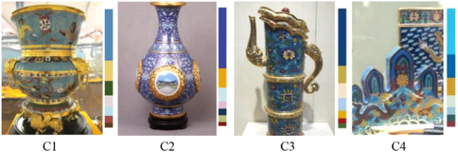
COLOR SCHEME EXTRACTION AND CLASSIFICATION Four typical blue-based low-black and medium-color cloisonne samples are selected, contained enamelled eight lion pattern in copper tire (C1), enamel- led four-seas life bottle (C2), enamelled Domu kettle with copper tire (C3), and drawing of enamelled mountain penholder (C4). Each group has rich hues and 7–8 different color biases.The k-means clustering algorithm is used to extract the coloring styles and distribution statistics of cloisonne cultu- ral relics, pre-determined K value to achieve the main color extraction needs (Mignotte, 2008) K = 7 (see Figure 1).
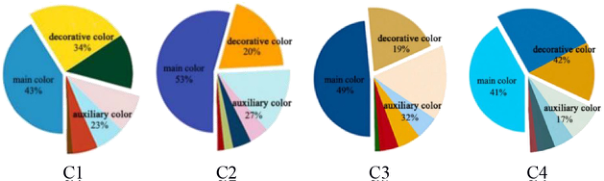
The color composition of the four samples can be classified into three types: main color, auxiliary color and decorative color. The main color affe- cts the color style of the whole picture, accounting for about 50 % of the whole picture color. Usually, high saturation color is more suitable for use as
Figure 1: Samples color extraction.Figure 2: Hierarchical color combination in cloisonne samples.
the main color. The auxiliary color has a slightly higher brightness than the main color, which usually accounts for about 30 % of the picture. Decorative color usually accounting for less than 20 % of the picture (Peter, 2003). The observation samples can draw the following conclusions. The four groups of samples are composed of blue system as the main color, bright gray and other colors as auxiliary colors, yellow green and blue as decorative colors. Among them, auxiliary colors and decorative colors are more flexible. According to this classification method, four groups of sample colors are classified (see Figure 2). Hierarchical color combination is an effective method to integrate complex color information, which is helpful for the rational arrangement of interface information levels (Van, 2001).
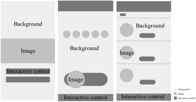
DESIGN OF INTERFACE MODEL Human-computer interface interaction elements include background, intera- ctive controls, and image views, the layout of relevant elements is designed according to the content displayed by Cloisonne (see Figure 3). It is conclu- ded from the figure that the amount of background color of the interface is about 69% or more of the whole. The color consumption of image view is divided into two categories: picture and text, which should be controlled within 18% of the whole interface, while the amount of interactive control color is usually 13%.
The background color of the cloisonne interface is bright gray or white, with the function of harmonizing and unifying visual elements. Interactive control with high saturation high black, eye-catching color, conducive to
Color Matching Method of HCI Interface Design Driven by Aesthetic Perception 75
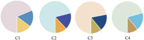
interaction, image color lightness between background and interactive con- trol. According to the requirements of the interface design elements and sample color matching relationship. The color of interactive controls in the interface should be consistent with the primary color in the sample, and the background color in the interface should be consistent with the auxiliary color in the sample. The image color is required to match the decorative color in the sample. According to the uniform principle of inter- face coloring, the main colors of the interface are no more than three tones (Van Den Broek, Kister and Vuurpijl, 2004). Therefore, the color scheme is adjusted according to the above analysis (See Figure 4).Each group sele- cts three colors that conform to the color characteristics.The amount of background color, image, and interactive control color is 69%, 18%, 13% respectively.
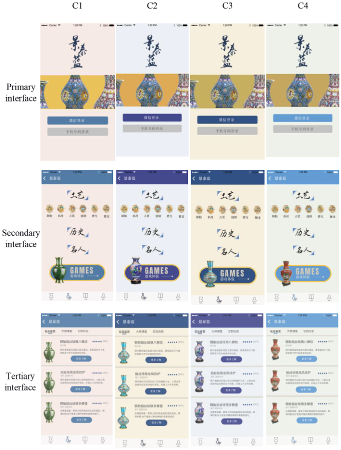
Apply the color scheme to the cloisonne interface to form four sets of interface samples (see Figure 5). Although the four schemes show differences in hue, they all use a bright color as the background color. The interactive controls use highly saturated colors, and the images use bright and gorge- ous decorative colors to highlight the traditional coloring style and aesthetic characteristics.
Figure 5: Cloisonne interface color matching model.
AESTHETIC EXPERIENCE TEST OF INTERFACE COLOR Interface color beauty is an important index to measure aesthetic experience. Interface color beauty image reflects users ‘ perceptual cognition and demand, but perceptual demand has the characteristics of fuzziness, dynamics, com- plexity and induction (Bertelsen, Petersen and Pold, 2004). Therefore, the test extracted six color perceptual image semantics through the analysis of netw- ork text data, established the mapping relationship between image semantics and interface color and scored them, and used Pearson coefficient correlation analysis to select the optimal color scheme.
Color Matching Method of HCI Interface Design Driven by Aesthetic Perception 77
Table 1. Words frequency analysis of image semantics on interface.
Table available in the original PDF paper.
Serial number Words Frequency 1 Elegant 156 2 Sophisticated 148 3 Ordered 140 4 Color 104 5 Charming 100 6 Creative 84 7 Aesthetic 60 8 Interface 53 9 Succinct 52 10 Tradition 46
Image Semantic Selection The representative intangible cultural heritage mobile interface is selected as the design example, and the network text analysis software ROST is used to capture the data of the core nodes of “ interface color matching “, “ Chinese traditional color “, “ emotion “ and “ aesthetics “. A total of 89 effe- ctive image semantics are extracted and the word frequency is analyzed (see Table 1). The six characteristic words with the most frequency are selected, namely Elegant, Sophisticated, ordered, charming, Creative, and Succinct, to form the typical color perceptual image semantics of the cloisonne interface, Since the experiment was conducted in Chinese, the above terms are gene- ralized and don’t cover all these definitions. Then we carry out subjective evaluation for target users, and obtain the consistency between the interface color and the user’s aesthetic cognition degree.
At the same time, four industry experts were invited to conduct open- ended interviews, and combined with relevant literature and materials, they made authoritative interpretations of these six terms (see Table 2). In order to facilitate subsequent experiments, testers will be familiar with the following information before the experiment starts.
The Mapping Relationship Between Image Semantics and Interface Color The subjects selected fifty-one adults aged 20-60 who were healthy and had normal color vision. Subjects were asked to subjectively evaluate the interface from six aspects: Elegant, Sophisticated, ordered, charming, Creative, and Succinct, SPSS 22.0 was used for data analysis (see Table 3). The Pearson correlation coefficient values between image semantics and color samples.
When the correlation coefficient is between 0.1 and 0.3, it is generally considered that there is a weak correlation between variables; when the cor- relation coefficient is between 0.3 and 0.5, it is generally considered that there is a moderate correlation between variables; when the value of the correla- tion coefficient is greater than 0.5, it is generally believed that there is a strong
Table 2. The interpretation of image semantics semantic Description example (Explanation)
Table available in the original PDF paper.
Elegant Use the aesthetic characteristics of Chinese art to show the beauty Sophisticated Analyze the complexity and advocate the integration of simplicity Ordered Standardize the arrangement and respect the principles of design Charming Consider human factors and focus on empathy to enhance interactivity Creative Solve conflicts according to needs and design products satisfied users Succinct Abandon unnecessary decorative to reduce visual redundant information
Table 3. Correlation values between image semantics and color samples.
correlation between the variables. The degree of influence of the correlation coefficient is indicated by *.
Sample C3 has the largest number of correlations with image semantics, and has a positive correlation with 4 image semantics, and has a significant correlation with the feature words “elegant” and “charming”. It shows that the combination of yellow and blue colors of sample C3 can better highlight the color characteristics of cloisonne, and at the same time, neutral and warm colors can make people feel warmer and satisfy users’ psychological feelings.
Color Matching Method of HCI Interface Design Driven by Aesthetic Perception 79
Sample C3 has no correlation with the imagery words “ordered” and “Succi- nct”, indicating that sample C3 should also pay attention to the overall color coordination when color matching. The correlation between sample C2 and the semantic “order” of imagery is significant, which means that the same color can be selected in the color matching of the interface, so as to reduce the mixed use of different colors, and ensure that the color scheme has a sense of clarity and information hierarchy.
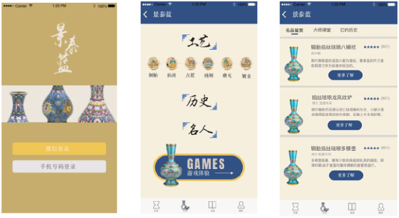
In order to ensure the accuracy of the test results, the arithmetic mean of the image semantic evaluation values of the four groups of samples is taken The arithmetic mean values of C1, C2, C3 and C4 are 0.312, 0.336, 0.385 and 0.325 respectively. The average order of the obtained color scheme is basically consistent with the above analysis, namely C3 > C2 > C4 > C1. Therefore, according to the test results, sample C3 is most in line with the public aesthetics. In summary, the final optimization of sample C3 is carried out (see figure 6).
CONCLUSION
In order to satisfy users’ emotional needs and aesthetic experience, the method of cloisonne interface color design is proposed. The color matching scheme is designed by color extraction and color stratification combination, and the rationality and validity of the color matching scheme is verified by establishing the mapping relationship between perceptual image and color sample. The scheme summarizes the interface coloring methods in line with the public color aesthetics, and realizes the digital protection, inheritance and activation of intangible cultural heritage.
ACKNOWLEDGMENT
This work has been supported by Beijing Municipal Education Com- mission Science Program (KM202110049001) and National Academy of Chinese Theater Arts Ideological and Political Education for College Students (XSCZD2022001).
REFERENCES
Ahlstrom, U. and Arend, L. (2005), “Color usability on air traffic control displays.”
Proceedings of the Human Factors and Ergonomics Society Annual Meeting, 49(1), 93–97. Bauerly, M. and Liu, Y. (2006), “Computational modeling and experimental investigation of effects of compositional elements on interface and design aesthetics.” International Journal of Human-Computer Studies, 64(8), 670–682. Bertelsen, O., Petersen, M. G. and Pold, S. (2004), “Aesthetic approaches to human-
computer interaction. DAIMI Report Series, 33(572). Dennis, M. P. (2008), “Perceiving hierarchy through intrinsic color structure.” Visual Communication, 7(2), 199–228. Faas, S. M. and Baumann, M. (2019), “Light-based external human machine
interface: Color evaluation for self-driving vehicle and pedestrian interaction.” Proceedings of the human factors and ergonomics society annual meeting, 63(1), 1232–1236.
Flachot, A. and Gegenfurtner, K. R. (2021), “Color for object recognition: hue and chroma sensitivity in the deep features of convolutional neural networks.” Vision Research, 182, 89–100. Henry, C. and Peters, J. F. (2010), “Perceptual image analysis.” International Journal
of Bio-Inspired Computation, 2(3–4), 271–281. Kırmızı, B., Colomban, P. and Quette, B. (2010), “On-site analysis of Chinese Cloisonné enamels from fifteenth to nineteenth centuries.” Journal of Raman Spectroscopy, 41(7), 780–790. Lo, K. Y., Liu, K. H. and Chen, C. S. (2012), “Intelligent photographing interface with
on-device aesthetic quality assessment.” Asian Conference on Computer Vision, 533–544. Mignotte, M. (2008). Segmentation by Fusion of Histogram-Based $K$-Means Clusters in Different Color Spaces. IEEE Transactions on Image Processing, 17(5), pp.780–787. Peter, B. (2003), “Chromaticity contrast in visual search on the multi-colour user
interface.” Displays, 24(1), 39–48. Quette, B. (1999), “Chinese cloisonne (Illustrated antique objects).” Magazine Antiques, 155(1), 206–213. Van Den Broek, E. L., Kisters, P. M. and Vuurpijl, L. G. (2004), “Design guidelines
for a content-based image retrieval color-selection interface.” Proceedings of the conference on Dutch directions in HCI, 14). Van Laar, D. L. (2001), “Colour coding with visual layers can provide performance enhancements in control room displays.” The Second International Conference on Human Interfaces in Control Rooms, Cockpits and Command Centres, 228–233. Xue, C., Li, J., Wang, H. and Niu, Y. (2015), “Effects of target and distractor satu-
rations on the cognitive performance of an integrated display interface.” Chinese Journal of Mechanical Engineering, 28(1), 208–216. Zhou, L., Xue, C., Tang, W., Li, J. and Niu, Y. (2013), “Aesthetic evaluation method of interface elements layout design.” Journal of Computer-Aided Design & Computer Graphics, 25(5), 758–766.
LISTED IN THE AHFE DIGITAL BOOKSTORE CATALOGUE
Explore the complete digital volume
Affective and Pleasurable Design
Read this individual research paper free through the original publisher, or explore the full digital proceedings book.
ISBN 978-1-958651-17-9
Explore this ISBN in the AHFE Bookstore ↗Listed in the July 2026 bookstore catalogue; search by ISBN to confirm current availability · Digital book purchase optional