Hiro Hiyama, Tomoharu Ishikawa, Kakeru Shono, Miyoshi Ayama (2023). Influence of Letter Design Elements in Transparent Package for Tomatoes on Consumer Kansei. In: Human-Centered Design and User Experience. AHFE Open Access, vol. 114, pp. 166–176. https://doi.org/10.54941/ahfe1004233
This study attempted to clarify the influence of design elements, such as the size, spacing, position, and color of letters in a product name and transparent packages in vegetables, on consumer kansei, as a foundational study for developing a support system for package design evaluation. We focused on tomatoes, which are widely consumed in the market, as the target product and created packages in which the above design elements were quantitatively changed according to the visual characteristics. The images captured at the time were adopted as the presentation stimulus group and were evaluated in terms of five kansei evaluative metrics: willingness to purchase, preference, impression, luxury, and cuteness. The relationship between the evaluation results and the design elements was analyzed. The results revealed that changes in the size of the characters in the product name affected consumer kansei. The characters’ position and color affected consumer kansei positively and negatively, depending on the conditions. Therefore, certain design elements of Tomato’s transparent packaging, namely the product name in large characters, easily distinguishable colors, and placement of the name in easily visible locations, enhance the willingness to buy in consumer kansei.
Product packaging plays two roles: 1) protecting the product from exter- nal shocks and the environment and 2) making the product look attractive (Bennett 1995). The research and development of environmentally friendly packaging materials, particularly considering their primary role, attempts to contribute toward the realization of a sustainable society. In contrast, con- sidering the second role, packages are designed according to the ideas and perspectives of producers and designers. The aesthetics of product packaging can influence a consumer’s decision to purchase a product; improving prod- uct quality and branding and designing product packaging strategically and systematically are important (Schumitt et al. 1997, Priya and Aradhna 1999).
Influence of Letter Design Elements in Transparent Package 167
Therefore, this study attempts to clarify the design elements that influence consumers’ purchasing decisions and develop a package design evaluation support system to evaluate and propose designs based on these elements. Many studies have investigated the effects of design elements such as pack- aging shapes, product names, and illustrations on consumer kansei (Ruth and Carol 2000, Lawrence et al. 2000, Paula and Karen 2001, Lawrence et al. 2009, Ishii and Onzo 2010, Saito et al. 2009, Yoshida et al. 2021). However, most of these studies focused on the design of packages based on opaque materials, such as wrapping paper. Transparent packaging utilized for vegetables has not been studied systematically. As consumers prioritize the quality of vegetables, such as freshness, vegetable packaging must first reassure consumers about the quality of vegetables. Second, the design must appeal to consumers’ kansei. Consumers’ purchasing decisions are assumed to be significantly influenced by their impressions of product names. Prod- uct names are composed of design elements such as font and size. Many studies have been conducted on product-name design fonts and their impres- sions, and the existence of fonts adapted to products has been demonstrated (Mukai 2015). However, it has been pointed out that the font of a prod- uct may be detrimental to the impression and value judgment of the product itself (Kawashima et al. 2019). Therefore, here, we focused on tomatoes, which are consumed in large amounts, and investigated fonts that have little influence on product impressions. We then focused on design elements such as letter size, spacing, position, and color of product names utilizing these fonts to clarify their influence on consumers’ kansei evaluations of the prod- ucts. Specifically, we created a package that quantitatively changed the above design elements while considering visual characteristics such as angle and spa- tial frequency. Images of tomatoes wrapped in the package were evaluated with the following metrics: willingness to purchase, preference, impression, luxury, and cuteness. We clarified the quantitative relationship between the design elements and consumer kansei based on the evaluation results. We also clarified the design conditions for transparent vegetable packaging that effectively enhances and impairs consumer kansei.
EXPERIMENT Package Design Elements
The font of the product name significantly influences the human kansei evaluation (Wada and Hagiwara 2005). However, this study attempted to investigate the influence of design elements such as letter size, position, and color on kansei evaluation, and utilizing fonts that do not influence kansei evaluation is necessary. Therefore, we conducted a preliminary experiment to evaluate sensitivity to fonts. First, 18 types of fonts, such as (Mukai 2013&2015, Ministry of Agriculture 2021), utilized in previous studies were selected as candidates, and each font was written in katakana to create “Iroha Uta” (Japanese pangram). Next, these “Iroha Uta” were presented to 41 participants (25 males and 16 females in their twenties), and four kan- sei evaluative metrics (“like-dislike,” “strong impression-weak impression,” “expensive-cheap,” and “cute-not-cute”) were evaluated on a seven-grade
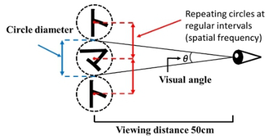
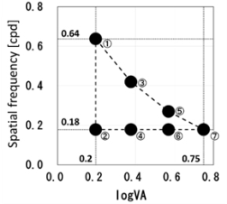
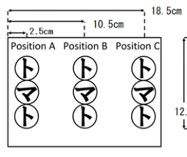
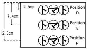
scale. As a result, “HG Soei Presence EB,” which had the lowest total abso- lute value of the evaluation mean for each evaluation word, was adopted. Figure 1 presents an example of “tomato” from HG Soei Presence EB. The letter spacing of the product name was measured as the distance between the centers of the letters, assuming a circle. In addition, because the letters were repeatedly arranged at equal intervals, the spatial frequency [cycles per degree (cpd)] (visual distance 50 [cm]), which is a characteristic of human vision, was utilized for convenience. However, the minimum letter spacing is limited to larger letter sizes. Figure 2 illustrates the concept of letter size and spacing, and Fig. 3 demonstrates the relationship between letter size (visual angle logVA) and spacing (spatial frequency [cpd]) for the seven types of pre- sentation stimuli. The six letters in the product name are vertical (left, center, right) and horizontal (top, middle, bottom), as illustrated in Fig. 4 and 5, respectively. The letter colors of the product names are black (N0) and red (7.5R 5/20), which are achromatic and chromatic colors, respectively. Mun- sell symbols are presented in parentheses, “N0” is an achromatic color with a brightness of 0, and “N” is an abbreviation for “Neutral.” “7.5R 5/20” indicates a bright red with a brightness of 5 and a saturation of 20. Red was selected because, as reported in packaging research, the evaluation tends to be higher when the letters are the same color as the product (Inoue 2022).
Figure 1: Example of product name font (HG soei presence EB).
Figure available in the original PDF paper.
Figure 2: Concept of letter size and spacing.Figure 3: Relationship between letter size and spacing (seven types of presentation stimuli).
Influence of Letter Design Elements in Transparent Package 169
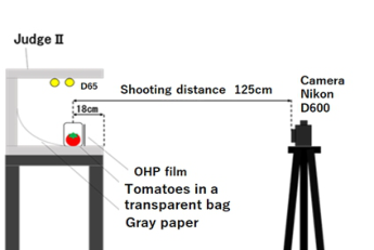
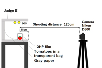
Package Production and Presentation Image Shooting While producing the package with the above design, the design was not printed directly on the transparent package but on OHP (overhead projector) films for each design. The OHP films were later pasted onto the transparent bag package to safeguard the final kansei evaluation from changes in the packaging of the tomatoes, viewing angle, and state of the transparent bag. In addition, we utilized two high-quality vegetable samples that were nearly identical to real tomatoes to protect them from discoloration or deformation during the long-term experiments and photography. Figure 6 illustrates the environment in which the presentation images were photographed. A Nikon D600 camera and a Nikon AF-S NIKKOR 50 mm 1:1.8G lens were utilized. The shooting distance from the camera to the package was 125 cm, and it was decided not to be smaller than the size that can be seen when observing the actual tomato, considering the relationship between the camera resolution, display resolution, and observation distance in the evaluation experiment. The package was photographed by placing it inside Judge II (X-Rite) in a dark room. The colored paper (gray) was laid on Judge II such that the bound- aries of the boxes would not be reflected. The standard light source D65 was adopted for illumination; the horizontal illuminance before the package and the vertical illuminance were approximately 1150 lx and 190 lx, respectively. In addition, the transparencies were fixed to the nylon thread utilizing Scotch tape to maintain the orientation of the transparent package and tomatoes while changing the transparencies. Based on the above, 85 types of stimuli
were presented, including 84 types of photographic images with the above- mentioned designs and one photographic image with no design (no text) as a reference stimulus. Figure 7 presents examples of the presented stimuli.
Figure 6: Shooting environment kernel.Figure 7: Examples of presented stimuli (left: maximum letter size, top, right: no letters).
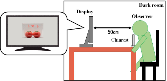
Evaluation Experiment Method Kansei evaluative metrics were examined based on previous food packaging research (Lawrence et al. 2000, Paula and Karen 2001) and questionnaire surveys on vegetable packaging. In the questionnaire survey, 30 students from Utsunomiya University were asked to answer two questions, “impres- sions of vegetable packages” and “requirements for vegetable packages,” in free description. We identified the following kansei evaluation terms: purchase (want to buy-do not want to buy), preference (like-dislike), impres- sion (strong impression-weak impression), luxury (seems expensive-looks cheap), and cuteness (cute-not cute). The evaluation scale was a bipolar seven-grade evaluation (−3–+3) for each kansei evaluative metric. Twenty students (10 males and females each) from Utsunomiya University partici- pated in the kansei evaluation experiment. After receiving an explanation of the experiment, all the participants provided informed consent, and the eval- uation experiment was conducted in a dark room. Figure 8 illustrates the experimental setup. Participants viewed 85 types of image presentations ran- domly presented at a distance of 50 cm and evaluated five kansei evaluative metrics for each presented stimulus. An EIZO color-edge CG2420 display (resolution:1920 × 1200) was utilized.
Influence of Letter Design Elements in Transparent Package 171
Figure 8: Evaluation experiment environment.
RESULT AND DISCUSSION
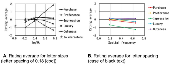
Effect of Letter Size and Letter Spacing on Kansei Evaluation We analyzed the results of the kansei evaluation for different letter sizes (visual angles) with the same letter spacing (spatial frequency [cpd]) and examined the effect of letter size on kansei evaluation. Figure 9a presents the average results of the kansei evaluation for each letter size as the evalu- ation results for the five kansei evaluation metrics at a letter spacing (spatial frequency) of 0.18[cpd]. The star in Fig. 9a indicates the average evaluation value for all the evaluative metrics without a design. This is illustrated in Fig. 9a; except for the evaluations of “impression” and “cuteness” for the letter sizes of 0.2 and 0.75 [logVA
], respectively, the kansei evaluation was high for results of all the letter sizes of the word “tomato.” In other words, improving the kansei evaluation by describing the product name on the veg- etable package was suggested. In addition, the evaluation of “impression” monotonically increased with the letter size. In other words, the letter size sig- nificantly affects the evaluation of “impression.” Conversely, the evaluation of “prettiness” and “luxury” tended to increase as the letter size decreased. In other words, the letter size affected the evaluation of “prettiness” and “luxury.” In addition, in the evaluation of “preference” and “purchase,” the evaluation changed slightly with the change in the letter size. In other words, the letter size did not affect the evaluation of “preference” and “purchase.” Furthermore, we analyzed the results of the kansei evaluation for different let- ter spacings (spatial frequency [cpd]) for the same letter size (viewing angle). The resulting kansei evaluation tended to be slightly lower when the letter spacing was widened for any evaluative word (Fig. 9b). However, no signifi- cant effect was observed on the kansei evaluation when different letter sizes were compared. This can be attributed to the dominant effect of the change in letter size on kansei evaluation, while the change in letter spacing possi- bility did not significantly affect kansei evaluation. In addition, owing to the large number of presentation conditions, a maximum of only two types of letter spacing existed for the same letter size. In the future, we believe that experiments with more types of presentation stimuli and focusing on letter spacing (spatial frequency) are necessary.
Figure 9: Results of kansei evaluation for each evaluation word.
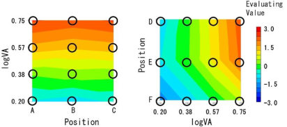
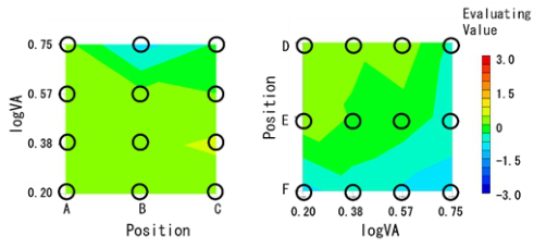
Influence of Letter Position on Kansei Evaluation According to the kansei evaluation by the position of each letter string “tomato,” the evaluation at Position F (below the horizontal letter string) was low for all evaluative metrics. Furthermore, the evaluation was low compared to the standard stimulus without letters. Position F (below the horizontal let- ter string) was considered to have a low evaluation because the product name overlapped with the tomatoes. In other words, the low evaluation of Position F was caused by improper design of the transparent packages of vegetables. Here, regarding the relationship between the letter size and position of the let- ter string, we examined the case of the evaluation of “impression,” which was significantly affected by letter size, and the case of “purchasing,” which was relatively less affected by letter size. Figures 10 and 11 present the evaluation results of “impression” and “purchasing” based on the relationships between letter size and letter string position, respectively. Color differences indicate the magnitude of the evaluation value. As can be observed from Figure 10, the evaluation of “impression,” which was significantly affected by the letter size, indicated a decrease in the evaluation at Position F (below the horizontal letter row); however, the influence of the letter size was dominant even after a change in the position.
Conversely, according to Fig. 11, the evaluation of “purchasing,” which is relatively slightly affected by the letter size, tended to be low at Position F (below the horizontal letter string), indicating the effect of changes in posi- tion on the evaluation. In other words, although the letter string position significantly affected the kansei evaluation, the adverse effect of overlapping letters was probably eliminated, depending on the evaluation item. This may be one of the findings for our future research.
Figure 10: “Impression” evaluation results (letter size vs. letter string position).
Influence of Letter Design Elements in Transparent Package 173
Figure 11: “Purchase” evaluation result (letter size vs. letter string position).
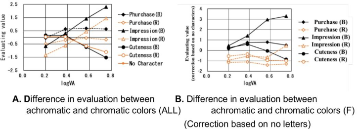
Influence of Text Color on Kansei Evaluation We evaluated each kansei evaluation metric for the achromatic (black) and chromatic (red) letters. Differences in the tendencies of the kansei evalua- tive metrics were observed to be caused by differences in letter size. Thus, the evaluation results for “impression”(significantly affected by font size), “pret- tiness” (affected by font size), and “purchasing” (not significantly affected by font size) are presented in Fig. 12a. The tendency of the evaluation against the change of letter size was identical regardless of the letter color. In other words, letter size largely affected kansei evaluation, irrespective of letter color. As for the effect of chromatic red and achromatic black on the kansei eval- uation, in the evaluation results of “impression” and “purchase,” those of achromatic black were higher than chromatic red. This is probably because black letters are easier to read than red letters, similar to tomatoes. In other words, in the evaluation of “impression”and “purchase,” the letter color was thought to be easy to be read, and its high visibility probably increased the evaluation. Conversely, as was assumed, the evaluation of “cuteness” was higher in the chromatic red than in the achromatic black; however, the eval- uation was not significantly different despite the color difference. This was probably because the chromatic red, similar to the color of tomatoes, did not change the overall color and led to an increase in the evaluation of “cute- ness.” In the future, trying other colors and considering a comprehensive letter color design will be necessary. In addition, the evaluation of Position F tended to be low, owing to the effect of the letter string position on the kan- sei evaluation. Figure 12b presents the difference in evaluation between the achromatic and chromatic colors at Position F after correction by subtracting the evaluation without letters. At Position F, because the product (tomatoes) and product name overlapped, the difference in color from tomatoes was considered to significantly affect the evaluation. The kansei evaluation dif- fered significantly depending on the letter size for the achromatic black color. Although the product and product names overlap, the letters are recogniz- able. Conversely, the effect of the difference in letter size on kansei evaluation was insignificant for chromatic red. This is probably because the product name was difficult to read as the letter and product colors were almost identical.
Figure 12: Results of evaluation for “impression,” “cuteness,” “purchase”.
Structure of Purchase Evaluation (Relationship Between Purchase Evaluation and Evaluation of Other Evaluation Terms) Primarily, package design attempts to stimulate consumers’ willingness to buy, leading to purchase opportunities. Multiple regression analysis was per- formed with the evaluative values of “purchasing” and other four metrics as the objective and explanatory variables to clarify the evaluative metrics related to purchase intention. The coefficient of determination was as high as 0.96, indicating that “preferences” and “impressions” were related to “pur- chasing.” In addition, the standard partial regression coefficient revealed that “preference” exhibited a high correlation of 0.81, followed by “impression” with a correlation of 0.22. We believe that factors that increase the willing- ness to buy based on the packaging are related to the “preference” of the package and the “impression,” such as large letters.
CONCLUSION
This study attempted to clarify the design conditions of a product name on a package that enhances consumer kansei, such as willingness to buy the product. In addition, this study determined the relationship between design conditions and kansei evaluative metrics as foundational research contribut- ing to the realization of a package design evaluation support system. We developed a modified package and conducted a visual evaluation. We found that some evaluative metrics demonstrated different tendencies depending on the letter size. Therefore, we concluded that the letter size of a prod- uct name affects consumer kansei. In terms of position, the product name placed at the edge and top of the package, where the product name and toma- toes did not overlap, received a high evaluation score. The evaluation scores tended to be higher when the words were black. The experimental results revealed that such designs improved the visibility of letters and that ensur- ing special design requirements for tomato packaging is necessary. Results of multiple regression analysis revealed that the evaluation metrics “prefer- ences”and “impressions”were related to purchasing intentions. This clarifies that the difference in the size of letters affects the kansei evaluation of tomato packages and that position and color play a role in securing special require- ments in the design of tomato packages. However, the results of this study
Influence of Letter Design Elements in Transparent Package 175
are limited by the letter system and font of the product name, as well as the design elements (size, spacing, position, etc.) and the number of products in the experiment. Therefore, further investigation is needed for other condi- tions. We studied the design requirements to enhance the kansei evaluation index based on these considerations. This design requirement is the differ- ence in position and color between the product name and the product on the package designed based on the design elements and is what consumers pay attention to in package design. Finally, we intend to design and develop a package design evaluation support system based on these relationships and requirements (Ishikawa 2021).
ACKNOWLEDGMENT
This study was supported by a research grant from the Fuji Seal Foundation for 2023.
REFERENCES
Bennett. Peter D. (1995) Dictionary of Marketing Terms, 2nd ed., NTC Business Books. Hiroaki Ishii and Naoto Onzo. (2010) Package Design Strategy from the Perspective
of Value, Marketing Journal, 30, 2, pp. 31–43. Inoue Mayuki and Kajiyama Tomoko. (2022) Extraction of Colors Expressing Taste Impression and Product Information for Applying to Beverage Package Images, Transactions of the Japan Society of Kansei Engineering, 21, 2, pp. 167–174. Ishikawa Tomoharu. (2021) Design Support Device and Design Support Program,
Patent Application JP2021-31043. Kawashima Takuya. Tsukidate Taai. Hosoya Mitsuki. Yamaura Hiroaki. Nakamura Satoshi. (2019) Investigation of the influence of fonts on user’s product selection behavior. The Journal of Institute of Electronics Information and Communication Engineers, HCS-23, 119, pp. 113–118. Lawrence L, Garber, Jr. Eva M, Hyatt and Ünal Ö, Boya. (2009) The Effect of Package
Shape on Apparent Volume: An Exploratory Study with Implications for Package Design, Journal of Marketing Theory and Practice, 17, 3, pp. 215–234. Lawrence L, Garber, Jr. Raymond R, Burke. J, Morgan Jones. (2000) The Role of Package Color in Consumer Purchase Consideration and Choice, Marketing Science Institute, Working Paper, #00-104, 46 pages. Ministry of Agriculture. Forestry and Fisheries. (2021) Vegetable Production
and Consumption Trend Report: https://www.maff.go.jp/j/seisan/ ryutu/yasai/in- dex.html Mukai Shioko. (2013) Consideration and Classification of the Factor Structure of Impression of Japanese Fonts, Proceedings of the 60th Annual Conference of Japanese Society for the Science of Design, Session ID: 8B-39 Mukai Shioko. (2015) Testing the Effects of Japanese Fonts on Aesthetic Impressions
Regarding Tea Beverage Packaging on PET Bottles, Proceedings of the Japanese Society for Cognitive Psychology 2015, 150–150. Nakamura Itsuki. Nishiyama Megumi. (2021) Impact of Font on Fragrance Impression, The Japanese Journal of Cognitive Psychology, 18, p. 81. Paula Fitzgerald Bone and Karen Russo France. (2001) Package Graphics and Con-
sumer Product Beliefs, Journal of Business and Psychology, 15, 3, pp. 467–489.
Priya Raghubir and Aradhna Krishna. (1999) Vital Dimensions in Volume Perception: Can the Eye Fool the Stomach, Journal of Marketing Research, 36, 3, pp. 313–326. Ruth Rettie and Carol Brewer. (2000) The verbal and visual components of package
design, Journal of Product & Brand Management, 9, 1, 22 pages. Saito Makiko, Ushioda Hiroshi and Wada Yuichi. (2009) Effect of Package Color on Taste Impression by Appearance of Plastic Bottled Green Tea, Transactions of Japan Society of Kansei Engineering, 8, 2, pp. 361–368. Schumitt. Bernd H, and Alexander Simonson. Marketing Aesthetics. (1997) The
Strategic Management of Brands, Identity, and Image, Simon and Schuster. Wada Akio and Hagiwara Masafumi. (2005) Japanese Font Automatic Creating System Reflecting Users’ Kansei, Journal of Japan Society of Kansei Engineering, 5, 2, pp. 1–8. Yoshida Muneka. Minato Nobuaki and Sato Mizuho. (2021) Package Design of
Gluten-free Foods using Semantic Differential Method, Transactions of the Japan Society of Kansei Engineering, 20, 1, pp. 101–110.
LISTED IN THE AHFE DIGITAL BOOKSTORE CATALOGUE
Explore the complete digital volume
Human-Centered Design and User Experience
Read this individual research paper free through the original publisher, or explore the full digital proceedings book.
ISBN 978-1-958651-90-2
Explore this ISBN in the AHFE Bookstore ↗Listed in the July 2026 bookstore catalogue; search by ISBN to confirm current availability · Digital book purchase optional