Che Liang-Yuan, Chien-Hsiung Chen (2023). User Experience on the Telecare System Menu Design with Handheld Devices. In: Usability and User Experience. AHFE Open Access, vol. 110, pp. 368–375. https://doi.org/10.54941/ahfe1003210
Telecare systems for handheld devices can support people who need medical help in a faster way through technology. This study is a continuation of the previous phase of the research and will design a prototype of a handheld device pertinent to a telecare system. The purpose of this study aims to investigate the user experience of telecare systems with handheld devices.In the previous phase of the study, most participants thought that the telecare system should have a clear information framework and function list to reduce the visual interference on the page and improve search efficiency. In particular, the functions in the "System Functions, Find Consultant, Hot Consultants" section should be clearly delineated. Therefore, the research design and experimental variables will primarily focus on the users' needs for remote care functions and the interactive menu interface design of the system. That is, the study will investigate the users' requirements for menu functions and the usability of the interactive interface of the system. The primary research method is a two-factor mixed experiment with a purposeful sampling method. Participants will be invited to take part in a usability test of the menu interface and will fill out a questionnaire after performing all typical tasks. Semi-structured interviews will be conducted with a representative sample of participants.After the experiment was completed, a two-way analysis of variance (ANOVA) will be conducted to investigate the main effects and interaction effect of the variables on the interactive user interface usability and users' subjective evaluations, such as psychological load, preference, and satisfaction. Through this study, it is hoped that the internal feelings of users when operating and interacting with the system can be understood via this study. The research results can be used as a good reference for future interface design of telecare system for handheld devices.
Since the beginning of the epidemic, medical care in various countries has entered the stage of digitalization and technological transformation. Today, we have gradually entered the Internet of Medical Things (IoMT) era (Vishnu et al., 2020). How to provide real-time, more professional, and more accurate medical services is an urgent issue to be solved. Due to the change in commu- nication behaviour between caregivers and patients caused by the epidemic, enhancing the user experience through the relevant interface is very impor- tant (Koonin et al., 2020). When users first encounter a user interface, its ease of use and preference determines whether they will continue to use the
User Experience Study on the Telecare System Menu Design 369
application in the future. In handheld devices, menus are an essential tool to help users navigate and operate. The use of menus is now widely used in all screen sizes. Because of the limitation of each screen size, how to design the menu is also very important. Generally speaking, the content of menu design includes pictures, text, layout, visual information, and screen size. Vander- donckt et al. (2019) also classified and discussed the graphic design of the menu in 8 dimensions. However, exploring the impact of visual design, such as text, icons, and colours, on usability is still the mainstream research.
Menu structure generally refers to functional grouping or sorting, such as menu type, hierarchy or structure, length, order, and appropriateness of mes- sages. Wang et al. (2004) systematically organized and discussed the menu structure. And the literature believes that hierarchical menus are better than full menus. It is known that menus composed of different design elements and structures will have other cognitive loads on users.
If the system provides the right amount of helpful information, it will give users a good service experience. Too much or too complex information may cause users to overlook it or generate negative feedback. There are many telecare systems in the app market, but there has yet to be a design guideline for a telecare menu system. This study aims to provide an apparent reference for menu designers to design a more reasonable menu through the above design elements.
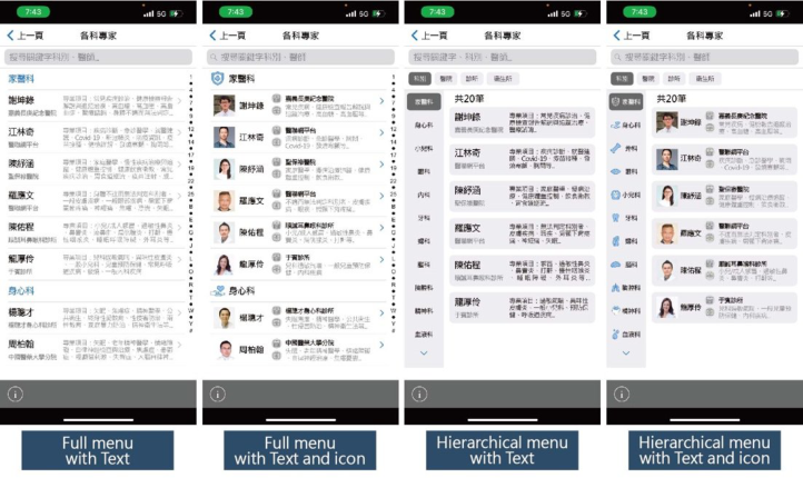
Jiang and Chen (2022) mentioned many menu types. In this study, two category menu types were chosen to help understand how the degree of collapsibility affects usability: (1) Full menu: The titles and content items are all visible. (2) Hierarchical menu: Users can see the group title, and the user can see the drop-down menu after touching it.
The purpose of this study is to explore the usability of the telecare system. In the previous phase of the study, most participants mentioned that the telecare system should have a clear information structure and function list, reducing visual interference on the page to improve search efficiency. There- fore, among the visual design elements of this study, only two layout types are used to investigate users’ subjective preferences.
(1) Text: The user interface design mainly consists of text content. (2) Text and icons: The user interface design mainly consists of text content and icons.
METHOD
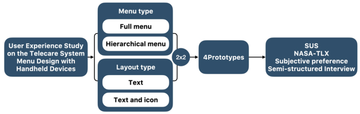
This research study is to understand the usability and subjective preference of layout type and menu type on the user interface of handheld device telecare system. A two-factor mixed experimental design was carried out through layout type 2 (within group) x menu type 2 (between group). The sample design of the research is based on the results of past interviews and research. It lists four primary functions of the system, including “Hot Experts, Finding
370 Liang-Yuan and Chien-Hsiung
Figure 1: Research structure.Figure 2: Experimental materials: Finding experts.
Experts, Personal Records, and Settings.” A total of four prototype interfaces were designed (see Figure 1 & 2).
Before the formal experiment begins, the participants will first listen to the researchers explain the steps of the research process. After completing the viewing test process of the first interface design, fill in the SUS (Brooke, 1996), NASA-TLX (Hart & Staveland, 1988) and subjective preference sca- les in sequence. Then go through the second process and fill out the second questionnaire. After the experiments are completed, a background question- naire is filled out. Researchers will ask participants to conduct a process of recall and semi-structured interviews.
RESULTS AND DISCUSSIONS A total of 20 participants (10 males and 10 females) were invited to conduct experiments in this study. The participants were aged 20–35 years. There
User Experience Study on the Telecare System Menu Design 371
were 16 participants with telecare experience and 4 without the experience. The experimental data were analyzed by two-way ANOVA with SPSS.
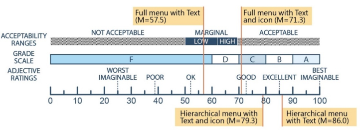
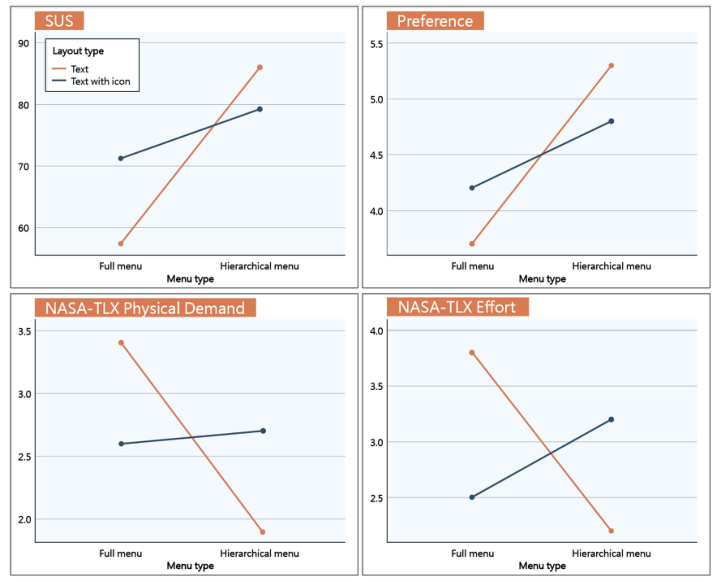
In the summary table of the SUS two-factor ANOVA analysis (Table 1), it was found that there was a significant difference in the menu type (F(1,18)= 37.179, p =0.000* < 0.05; η2 =0.674); there was no significant difference in the layout type (F(1,18)= 0; p =0.623 > 0.05 ;η2 =.014). There was a significant interaction between menu type and layout type (F(1,18)= 11.728, p =0.003* < 0.05; η2 =0.395).The averages from high to low are layered Hierarchical menu with Text (M = 86.0) > Hierarchical menu with Text and icon (M = 79.25) > Full menu with Text and icon (M = 71.25) > Full menu with Text (M = 57.5) (Figure 3).
It can be found in the interview that the participants think that the full menu is an old-school design method. Finding content may take time, and the search efficiency is poor. Consistent with the research results of Wang et al. (2004), most participants think that the hierarchical menu is more usa- ble, and they can see the information they need at a glance when searching for keywords. On the “Finding Experts” page, some participants mentioned that the introduction of expert information is also displayed on this page. Therefore, in the hierarchical menu, the text will be more useful than text and icons. On the “Personal Records” page, some participants also menti- oned that adding text and icons would make the interface more interesting. The layout type with text-only feels less emotional.
In the summary table of the NASA-TLX Physical Demand two-factor ANOVA analysis (Table 2), it can be seen that the participants think that there is a significant difference in the menu type (F(1,18)= 6.000, p
Table 1. Two-way ANOVA summary table for SUS.
Table available in the original PDF paper.
Source SS df MS F P η2
1050.62 1 1050.625 11.728 .003* .395
SUS Menu Type 3330.625 1 3330.625 37.179 .000* .674 Layout Type 122.500 1 122.500 0.250 .623 .014 Menu Type x Layout Type *p<.05
Figure 3: SUS scores.
372 Liang-Yuan and Chien-Hsiung
Table 2. Two-way ANOVA summary table for NASA-TLX.
Table available in the original PDF paper.
Source SS df MS F P η2 NASA-TLX Physical Demand
6.400 1 6.400 7.837 .012* .303
Menu Type 4.900 1 4.900 6.000 .025* .250 Layout Type .000 1 .000 .000 1.000 .000 Menu Type x Layout Type NASA-TLX Effort
13.225 1 13.225 5.914 .026* .247
Menu Type 2.025 1 2.025 .906 .354 .048 Layout Type .225 1 .225 .094 .763 .005 Menu Type x Layout Type *p<.05
=0.025* < 0.05; η2 =.250). Layout types were no significantly different (F(1,18) = 0.000, p =1.000 >0.05; η2 =0.000). There was a significant inte- raction between menu type and layout type (F(1,18)= 7.837, p =0.012* < 0.05; η2 =.303). The averages from high to low are Full menu with Text (M = 3.4)> Hierarchical menu with Text and icons (M = 2.7)> Full menu with Text and icons (M = 2.6)> Hierarchical menu with Text (M = 1.9).
From the interviews with the participants, it can also be found that the participants generally believe it takes much physical effort to complete the selection of simple texts, and it takes more time to find the information they need. Also, because of the size limitation of the mobile phone interface design, it will give users a poor impression. Moreover, the participants mentioned that a hierarchical menu with text and icons might produce too much visual stimulation due to the interference of menus and icons. Users are easily bur- dened and unable to find the critical information they need at one time. Most participants think the full menu with text and icons will not cause too much information interference. They only need to slide down to view the required information.
In the summary table of the NASA-TLX Effort two-factor ANOVA analy- sis (Table 2), it can be seen that there is no significant difference in the menu style (F(1,18)=0.906, p =0.354 > 0.05; η2 =0.048); layout type were not significantly different (F(1,18)=0.094, p =0.763 > 0.05; η2 =0.005). There was a significant interaction between menu type and layout type (F(1,18)= 5.914, p =0.026* < 0.05; η2 =0.247). The averages from high to low are Full menu with Text (M = 3.8)> Hierarchical menu with Text and icon (M = 3.2)> Full menu with Text and icon (M = 2.5)> Hierarchical menu with Text (M = 2.2).
In the interview, the participants believed that on the “Find an Expert” page, the “Full menu with Text” needs more time to concentrate on under- standing the content. In addition, the “Hierarchical menu with Text and icon” may take more time to understand due to a large amount of information. On the “Personal Records” page, the participants also mentioned that because of privacy concerns, “Full menu with Text” requires more effort to check the information, which may cause trouble to poor eyesight or the elderly.
In the summary table of the NASA-TLX two-factor ANOVA analysis (Table 3), it can be seen that there are significant differences in the menu
User Experience Study on the Telecare System Menu Design 373
Table 3. Two-way ANOVA summary table for subjective preference.
Table available in the original PDF paper.
Source SS df MS F P η2 Subjective Preference
.025 1 .025 .034 .856 .002
Menu Type 13.225 1 13.225 17.966 .000* .500 Layout Type .225 1 .225 .096 .760 .005 Menu Type x Layout Type *p<.05
Figure 4: Interaction plot.
style (F(1,18)= 17.966, p =0.000* < 0.05; η2 =0.500). Layout type were not significantly different (F(1,18)=0.096, p =0.760 > 0.05; η2 =0.005). There was no significant interaction between menu style and layout style (F(1,18)=0.034, p =0.856 > 0.05; η2 =0.002). The averages from high to low are Hierarchical menu with Text (M = 5.7)> Hierarchical menu with Text and icon (M = 5.6)> Full menu with Text and icon (M = 4.6) = Full menu with Text (M = 4.6).
In the semi-structured interviews, the participants mentioned that the “Hierarchical menu with Text” felt cleaner, fresher, and more usable. Secondly, in “Hierarchical menu with Text and icons”, participants also mentioned that icons would have a more positive and interesting feel in the interface design. Compared to “Full menu with text and icons”, “Full menu
374 Liang-Yuan and Chien-Hsiung
with text” was the least preferred interface by the participants, which was generally considered to be old-fashioned and inefficient.
CONCLUSION
In this study, four user interface designs were conduct to help understand the influence of interface design and menu type on the usability of telecare systems and users’ subjective preferences. Finally, it was found that the hie- rarchical menu was more usable than the full menu in the interface design of the telecare system for handheld devices. Because of the limitation of the screen size of the handheld device, the full menu with text requires more phy- sical demand and effort and may result in a lower user evaluation. When finding experts, users preferred a “hierarchical menu with text” interface design. The main reason is that the introduction of each specialist includes the doctor’s specialty, the name of the medical institution, etc., and the icon may cause visual interference. The second preference was for the “hierarchi- cal menu with text and icon” because the appropriate use of icons can make the interface feel lively and interesting.
Summarizing the interview results, it was found that the icons in the hiera- rchical menu could be of interest to users because of the size of the handheld screen. However, it still needs to be configured appropriately to avoid exces- sive information interference. This study also found that the participants expected different experiences from the application for different stages of information needs. It is suggested that other visual design factors, user’s back- ground, and information involvement level can be incorporated for more in-depth study in the future.
ACKNOWLEDGMENT
The authors would like to acknowledge the financial support of this study from the National Science and Technology Council (previously Ministry of Science and Technology) under the grant number of MOST 108-2410-H- 011-008-MY3.
REFERENCES
Hart, S. G. & Staveland, L. E. 1988. Development of NASA-TLX (Task Load Index): Results of empirical and theoretical research. Advances in psychology. Elsevier. Jiang, L. & Chen, Y.-H. 2022. Menu Design on Small Display User Interfaces: Mea-
suring the Influence of Menu Type, Number of Preview Items, and Menu Breadth on Navigation Efficiency. International Journal of Human–Computer Interaction, 38, 631–645. Koonin, L. M., Hoots, B., Tsang, C. A., Leroy, Z., FarriS, K., Jolly, B., Antall, P., McCabe, B., Zelis, C. B. & Tong, I. 2020. Trends in the use of telehealth during the emergence of the COVID-19 pandemic—United States, January–March 2020. Morbidity and Mortality Weekly Report, 69, 1595. Vanderdonckt, J., Bouzit, S., Calvary, G. & Chêne, D. 2019. Exploring a design
space of graphical adaptive menus: normal vs. small screens. ACM Transactions on Interactive Intelligent Systems (TiiS), 10, 1–40.
User Experience Study on the Telecare System Menu Design 375
Vishnu, S., Ramson, S. J. & Jegan, R. Internet of medical things (IoMT)-An overview.
2020 5th international conference on devices, circuits and systems (ICDCS), 2020. IEEE, 101–104. Wang, A.-H., Lai, Y.-Y. & Sun, C.-T. 2004. Effect of PDA scrolling- and hierarchymenu design on users’ operating performance. Displays, 25, 109–114.
LISTED IN THE AHFE DIGITAL BOOKSTORE CATALOGUE
Explore the complete digital volume
Usability and User Experience
Read this individual research paper free through the original publisher, or explore the full digital proceedings book.
ISBN 978-1-958651-86-5
Explore this ISBN in the AHFE Bookstore ↗Listed in the July 2026 bookstore catalogue; search by ISBN to confirm current availability · Digital book purchase optional