João Neves, Paulo Noriega, Daniel Raposo, Rogério Ribeiro (2023). Graphical and ergonomic evaluation of symbols on traffic signs. In: Ergonomics In Design. AHFE Open Access, vol. 77, pp. 837–842. https://doi.org/10.54941/ahfe1003444
1 CIAUD, Research Centre for Architecture, Urbanism and Design, Lisbon School of Architecture, University of Lisboa, Rua Sá Nogueira, 1349–063 Lisboa, Portugal; Instituto Politécnico de Castelo Branco, Av. Pedro Álvares Cabral, No. 12, 6000–084 Castelo Branco, Portugal ↗
2 Instituto Politécnico de Castelo Branco, Av. Pedro Álvares Cabral, No. 12, 6000–084, Castelo Branco, Portugal ↗
In Europe, traffic signs, although identical, are not the same, varying from country to country, focusing this study on the Portuguese case. The guiding principles and technical standards for the development, production and installation of traffic signs in Portugal are defined in a normative document, the Traffic Signaling Regulation. Regulatory Decree No. 6/2019 presents the first major revision to the Traffic Signaling Regulation approved in 1998, introducing new information signs, new tourist, geographical, ecological and cultural indication symbols, as well as the graphic representation of drivers signals, traffic regulatory agents and traffic lights. The Traffic Signaling Regulation of 1998 presented 112 symbols for indications, adding the 2019 revision plus 10 symbols, which makes a total of 122 information symbols, lacking this area of normalization and standardization. Part of the pictograms present on the vertical signage are not easily perceptible. The iconic level used in the design of the pictograms is very different, with some being extremely simplified and easily perceptible and others requiring a higher level of decoding by the user, caused by the complexity of the sign. This article is the result of a graphical and ergonomic evaluation of the new symbols added to traffic signs in Portugal. For the evaluation of the symbols, a mixed methodology, non-interventionist and interventionist, with a qualitative basis, was used, divided into three phases: The first phase of aesthetic and functional analysis of the new symbols presented, the second phase of graphic normalization of the symbols and the third phase of evaluation and validation of the developed standardized symbols. With the project developed, it was possible to understand the inconsistency of the system proposed by the Portuguese State, verifying through the results obtained an improvement in terms of visual ergonomics, understanding and aesthetic balance in comparison with the symbols in use today.
In Europe, traffic signs, although identical, are not the same, varying from country to country, focusing this study on the Portuguese case. The gui- ding principles and technical standards for the development, production and installation of traffic signs in Portugal are defined in a normative document,
the Traffic Signaling Regulation. Regulatory Decree no. 6/2019 presents the first major revision to the Traffic Signaling Regulation approved in 1998, introducing new information signs, new tourist, geographical, ecological and cultural indication symbols, as well as the graphic representation of drivers signals, traffic regulatory agents and traffic lights.
The Traffic Signaling Regulation of 1998 presented 112 symbols for indi- cations, adding the 2019 revision plus 10 symbols, which makes a total of 122 information symbols, lacking this area of normalization and standardi- zation. Part of the pictograms present on the vertical signage are not easily perceptible. The iconic level used in the design of the pictograms is very diffe- rent, with some being extremely simplified and easily perceptible and others requiring a higher level of decoding by the user, caused by the complexity of the sign.
This article is the result of a graphical and ergonomic evaluation of the new symbols added to traffic signs in Portugal, developed within the curricular unit of Visual and Cognitive Ergonomics, of the Master in Graphic Design, teaching at the Polytechnic Institute of Castelo Branco in association with the University of Lisbon.
FRAMEWORK In Portugal, Regulatory Decree no. 6/2019 of October 22nd introduces the first major revision to the Traffic Signaling Regulations (RST) approved by Regulatory Decree no. 22 -A/98, of October 1st, which aims to improve and update road signs in accordance with the Highway Code and in alignment with the National Strategic Plan for Road Safety - PENSE 2020.
Regulatory Decree no. 6/2019 imposes that from April 1, 2020, new signs that do not comply with the approved standards cannot be placed, with the Regulatory Decree coming into force 180 days after the date of its publication, i.e. April 20, 2020.
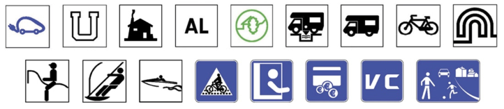
This revision of the Regulation introduces new information signs, new tou- rist, geographic, ecological and cultural indication symbols (Fig. 1), as well as the graphic representation of signs by drivers, traffic regulation agents and light signals.
Several of the current symbols present in indication signs in Portugal are those developed by Otl Aicher for the 1972 Munich Olympic Games. If we carry out a comparative study between the symbols present in the Traffic Signaling Regulation and the pictograms created by Aicher, we can conclude
Figure 1: New Portuguese indication symbols, introduced by regulatory decree no. 6/2019 (adapted from regulatory decree no. 6/2019 of October 22nd, pp. 100–104).
Graphical and Ergonomic Evaluation of Symbols on Traffic signs 839
that in many pictograms certain elements were added that broke their simplicity, unity and structural balance, contributing to a deficient perception and recognition of the significance and signifier of the represented sign.
METHODOLOGY
Starting from the traffic signs approved by the Regulatory Decree no. 6/2019 which came into force on April 1, 2020, specifically the new information signs and symbols, a graphic and ergonomic analysis of the system was carried out, applying a mixed methodology, non-interventionist and interventionist, of qualitative basis, divided into three phases: The first phase of aesthetic and functional analysis of the new symbols presented, the second phase of graphic normalization of the symbols and the third phase of evaluation and validation of the developed standardized symbols. The project was developed in 3 groups of 4 students.
In the first phase, of investigation and analysis, a semantic, syntactic and pragmatic analysis of the new symbols of the system was carried out. For the semantic analysis, the signs were grouped by message areas with common meaning, starting from the meaning of each sign. In the syntactic analysis, the form of each sign (lines, shapes, background, graphemes) was analyzed, grouping the signs by groups/categories with similar graphemes. Finally, for the pragmatic analysis, the Standard ISO 9186:2014 (Part 1 - Method for testing comprehensibility) was applied.
The test was applied through an online questionnaire survey, consisting of the following phases: Preparation of test material; Respondent selection; Questionnaire application; Analysis of the results of the comprehension test; Categorization of results; Analysis of the categorization of responses; Presentation of results; Determination of the most comprehensible variant.
Starting from the symbols selected in phase one, in phase two (graphic development) it was intended that the students would create a uniform and standardized system, through the redesign of the pictograms, starting from the definition of a library of shapes, selection of a construction grid and conception method and subsequent design of the symbols (Fig. 2).
In the third phase of the process, the students would have to evaluate and validate the developed system. To this end, based on the symbols developed in phase two, the Standard ISO 9186-1: Graphical symbols - Test methods / Part 1: Method for testing comprehensibility was applied, following the same procedure used in phase one. The surveys were conducted online, using
Figure 2: Selection of symbols, analysis and definition of a library of shapes, selection of a construction grid, conception method and design of the symbol. Result of the redesign, and symbol from 1998 (adapted from images of group of Students 1 of the project).
Figure available in the original PDF paper.
the Google Forms platform, and were subsequently disseminated through the Facebook social network. An average of 64 respondents were validated for both tests.
RESULTS/OUTCOMES From the applied research methodology, it was possible in the first phase for students to understand the subject under study, the applicable legislation and standards and the guiding principles of design and ergonomics for the evalua- tion of symbols in the area of road signs. The semantic analysis allowed listing the symbols by message areas with common meaning. In syntactic analysis, students decomposed the symbols into their elementary forms, comparing and grouping common graphic elements. In the pragmatic analysis, the com- prehensibility of the symbols was evaluated through the application of the Standard ISO 9186-1: 2014, which allowed understanding which symbols were better understood and which ones needed to be redesigned.
The results of the application of the ISO 9186-1 Standard by the 3 groups of students, based on a sample in which, on average, 68.5% of the respon- dents were female, 70.5% had a university degree and 9.5% did not have a driving license. From the analysis of the results of the comprehension test, to the new information signs, new tourist indication symbols, it was found that 8 of the symbols had a correct assessment of their meaning by less than 50% of respondents. It was agreed to redesign the symbols with the worst performance.
Once the comprehensibility of the symbols was evaluated, phase two of the system’s graphic development was carried out, in which the intention was to graphically standardize the 10 new symbols, slightly adjusting the better understood symbols and redesigning the symbols with less comprehensibi- lity. Pedagogically, the redesign process was important, centered on aesthetic functions but above all functional, suggesting the determination of constru- ctive principles likely to have a greater normative character and ergonomic adaptation to users. To this end, a shapes library, a construction grid, a design method and subsequent design of the symbols were defined.
After redesigning the 10 symbols, in the third phase of the process, the students evaluated and validated the developed system. To this end, based on the symbols developed in phase two, the Standard ISO 9186-1: Graphical symbols - Test methods / Part 1: Method for testing comprehensibility was applied.
The results obtained allowed analysing the legibility, readability and constructive aspects of the symbols added to the Portuguese Traffic Signa- ling Regulation, as well as evaluating their comprehensibility, redesign the symbols with a lower comprehension rate, evaluating and validating the developed options.
DISCUSSION
Using the active teaching methodology PBL (Project Based Learning), based on the collective construction of knowledge, an attempt was made to escape
Graphical and Ergonomic Evaluation of Symbols on Traffic signs 841
conventional teaching centered on the transmission of knowledge by the tea- cher and passive reception by the students. Thus, the Project was launched, in which the students had to develop several phases centered on autonomous work and the application of research methodologies to the proposed themes.
Throughout the process, students conducted research, collected data, dee- pened their understanding of the subject and validated the solutions of a complex graphic project, with multiple stages, where students managed their own learning and acquired technical and scientific skills that in the future may allow them to connect the academic context with professional practice.
Emphasis is placed on the applied methodology, which allowed the project to be developed in a structured way. In a first phase, the literature review was important, which allowed collecting information in the area under study and the research problem in particular. The semantic and syntactic analysis of the new system was equally relevant, where two ordinations of the symbols were obtained: by their meaning and by the graphic similarity of the signs, allowing to distinguish the significance from the signifier and the different signs.
It was also crucial to focus the project not on the designer, but on the user, resorting to assessing the comprehensibility of the symbols by the publics. In this way, the students understood the importance of evaluating pictogra- phic systems, not focusing only on the design professional or on the aesthetic component, but above all functional and ergonomic.
Also noteworthy is the symbol design process applied, which requires stu- dents to develop a set of sequential stages of standardization and graphic uniformity (shape library, construction grid, pictogram design method, and symbols design).
Determinant for the results of the process was the final evaluation and vali- dation of the system, through comprehensibility tests of the symbols, which allowed the students to evaluate the redesign of their symbols, but mainly to submit the proposed system to the users’ evaluation and to understand that the developed proposal obtained more positive results than the symbols in use in the traffic signaling system in Portugal.
With the project developed, it was possible to understand the inconsistency of the system proposed by the Portuguese State, verifying through the results obtained an improvement in terms of visual ergonomics, understanding and aesthetic balance in comparison with the symbols in use today.
CONCLUSION
The application of a PBL - Project Based Learning approach, aimed to emph- asize collaboration, co-creation, critical thinking and problem solving as students deepened the theme of graphic and ergonomic evaluation of sym- bols in traffic signs. From research group work and understanding of the state of the art, the problem was investigated and a methodological plan was developed, centered on design, visual ergonomics and results for the user.
The program of the curricular unit of Visual and Cognitive Ergonomics, of the Master in Graphic Design focuses on content on perception, atten- tion, memory, representation of knowledge and mental image, introducing
notions of experimental research in cognitive ergonomics, methods and tech- niques of ergonomic intervention in information design, building skills for an ergonomic approach to systems and user-centred design.
In this curricular context, students were proposed to develop an informa- tion design project, centered on the new indication signs and symbols present in the Traffic Signaling Regulations, in force in Portugal since 2020, with a graphic and ergonomic analysis being carried out to the new symbols. From the ten symbols selected and evaluated, it was possible to prove that 80% of these symbols had a comprehension rate of less than 50%, that is, only 20% of the tested symbols are understood by more than half of the respondents.
Extrapolating the results obtained, their implications are profound, the whole system in need of a much deeper evaluation, particularly the 122 indi- cation symbols approved by the Traffic Signaling Regulation and present in the indication signs in Portugal. The developed study, centered on the graphic and ergonomic evaluation of the new symbols added to traffic signs in Por- tugal, thus responds effectively to the stated problem, proving that certain symbols present in vertical signs are not easily perceptible.
There are multiple studies on road accidents, focusing on speeding, dri- ving under the influence of alcohol or other substances, but there is a lack of clear studies about the graphics of the signs, comprehension, perception, memorization, visual ergonomics, and adaptation of the artifact to the user.
For future research, a broad study promoted by the Ministry of Infrastru- cture and Transports, in partnership with research centers and other entities, is recommended, which allows for a deep, consistent analysis and which allows to centered the system on the user and not on the designer.
ACKNOWLEDGMENT
Ana Silva, Ana Geirinhas, Andreia Carvalho, Caroline Santos, Joana Can- deias, Maria Rodrigues, Marta Ferreira, Sofia Barros.
REFERENCES
International Organization for Standardization, 2014, Graphical symbols: Test methods - Part 1: Method for testing comprehensibility, ISO 9186-1:2014, ISO, Geneva. Ministério da Administração Interna, 1998–10-01, Decreto Regulamentar n.
22-
A/98: Regulamento de Sinalização do Trânsito, Diário da República, I Série-B n.
227, pp. 2–119, Lisboa. Presidência do Conselho de Ministros, 2019–10-22, Decreto Regulamentar n.
6/2019: Regulamento de Sinalização do Trânsito, Diário da República, Série I n.
203, pp. 41–267, Lisboa.
LISTED IN THE AHFE DIGITAL BOOKSTORE CATALOGUE
Explore the complete digital volume
Ergonomics In Design
Read this individual research paper free through the original publisher, or explore the full digital proceedings book.
ISBN 978-1-958651-53-7
Explore this ISBN in the AHFE Bookstore ↗Listed in the July 2026 bookstore catalogue; search by ISBN to confirm current availability · Digital book purchase optional