Daniel Raposo, Fernando Moreira Da Silva, Ricardo Correia, Rogério Ribeiro, João Neves, Jose Silva (2022). Brand Marks examination. Empirical study of graphic parts in their relation to contrast, recognition, and memorization. In: Ergonomics In Design. AHFE Open Access, vol. 47, pp. 574–582. https://doi.org/10.54941/ahfe1001985
Brand Visual Identity is an identification system that, with flexibility, ensures the unity and coherence of visual communication (in multiple media: physical as products, objects, or graphics; architectural and ambiance; audio-visual; digital and virtual).Brand Marks occupy a top place in the good performance of most Brand Visual Identity systems, even when these rely more on imagery and use Brand Marks with less expressiveness. In dynamic Visual Identity systems, the Brand Marks may constitute themselves as systems within the Brand Visual Identity supersystem.This study aims to dissect existing brand marks, focusing on how the graphic components (symbol, logotype) are designed, prioritised, and correlated to achieve differentiation, contrast, recognition, and memorisation. This include an empirical examination based on direct observation and exploration and in survey by questionnaire with a sample of 400 participants, aiming at the definition of design principles to aid the design of Brand Marks and to be considered in the definition of the "map of competitors" tool, which intends to aid in the analysis of multiple visual identities competing in the same market or segment.
The main purpose of a Brand Mark (logo, wordmark, logotype and/or sym- bol) is to identify and differentiate the brand from its competitors, acting as a graphic-semantic synthesis of everything the brand stands for. If identification consists of a set of distinctive, aggregating and differentiating characteri- stics associated with an entity or brand, visual identity is a group of traits
Brand Marks Examination. Empirical Study of Graphic Parts in Their Relation 575
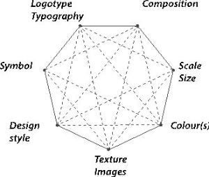
Figure 1: Visual Identity System for normative design principles (Daniel Raposo).
selected / designed with criteria and recognisable by third parties as being those of the entity or brand (Bassani, Sbalchiero, Youssef, & Magne, 2010; Raposo, Oliveira, & Farinha, 2020).
Brand Marks are systems, that is, a group of graphic and symbolic com- ponents (Castro, 2021; Rijo, 2022), with rules of use, which give them unity, and which are perceived as an integrated whole. In turn, the Visual Identity is a supersystem, as it includes systems such as the Brand Mark and seve- ral graphic-semantic components and because it has more complex rules of use that ensure recognition and create the visual language of the brand in physical, digital, and virtual, two-dimensional, three-dimensional, spatial, and audio-visual media. Regardless of the role that Brand Marks can play in providing unity and ensuring recognition, the needs of contemporary brands require broader visual identity systems with greater capacity for language and discourse. More than ever, visual identity is inseparable from a netw- ork of symbols and the language of the brand (Johnson, 2019). In van Ness (2012) and Lorenz’ (2021) perspective, Dynamic or Flexible Identities offer great elasticity in visual adaptation, particularly at the Brand Mark level, including profound changes in what it is and how it is represented. Thus, although Brand Marks may have variants (e.g., symbol and logo, only sym- bol, only logotype, horizontal version, vertical version, etc.) and other cases, like Nike, that are visually dynamic, their requires normative principles about design changes and component metamorphosis, as we resume: what changes or is stable; How does this transformation take place and with which cri- teria; Does it change logotype/typography, the composition, scale/size, the colour(s), the texture/images, design style or the symbol; Does the dynamic happen at the level of the Brand Mark or in the brand visual identity?
When creating a Brand Mark, designers’ resort to common base compo- nents (geometric shapes, letters, typefaces, and colours) and adopt similar procedures at a symbolic level (such as analogies and graphic metaphors that dictate what will be drawn) and graphic level (the style and expressiveness of drawing or the level of iconicity). The success of a Brand Mark’s design rela- tes directly to its memorability, familiarity (Morioka, 2006), and how well it evokes a brand idea or personality (Siegel+Gale, 2015; Signs.com, 2017). On the other hand, a well-designed Brand Mark ensures its flexibility
of use in various media in multiple dimensions and reproduction proces- ses without compromising its quick memorisation and recognition process (Viñuales, 2015). Brand Marks can be more complex or simpler, depending on the market, strategy, and requirements of the brand (Llorente-Barroso & García-García, 2015). Nevertheless, most designers and some studies cor- relate the simplicity of the Brand Marks with their memorability and with audience preference (Siegel+Gale, 2015; Suárez-Carballo, Galindo-Rubio & Martín-Sanromán, 2018).
This study aims to dissect existing Brand Marks, mainly their graphic components (symbol, logotype) design and its relation to memorisation and recognition, from the following research question: How the different components and graphical features of the Brand Marks contribute to the memorisation and recognition of the brand?
In this sequence, the following research objectives were defined: To dissect existing Brand Marks of brands with an international dimension, seeking to understand how their features and graphic elements contribute to memori- sation and recognition, with special attention to the levels of simplicity; To study Portuguese olive oil brands, comparing their recognition at a natio- nal level and in their main export market; To compare the perception of the Brand Marks alone with the evaluation of the Brand Visual Identity System.
METHODOLOGY AND PROCEDURES To answer the research question, we used active research and non- interventionist research methodologies. The active research is exploratory and consisted in dissecting Brand Marks, dividing them by their parts to determine how they impact in memorization, mainly in recognition.
We selected 14 brands with international dimension and 10 Portuguese olive oil brands, those leading in national exportation. The questionnaires were applied to 200 Portuguese and 200 Brazilians, considering that Brazil is the main exportation market for Portuguese olive oil.
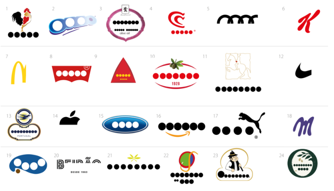
The questionnaire survey was selected with the objective of assessing the recognition of the Brand Marks, the role played by each graphic sub- component, comparing the perception of the Brand Mark alone with that obtained by the Visual Identity. To this end, 400 people were surveyed, divi- ded into two samples of adults excluding those with design training. We’ve designed two questionnaires, one for Portugal and another for Brazilian respondents, which were based on a set of 24 Brand Marks from various sectors, with a predominance on food brands.
Study Procedures According to Shumate (2021), simplicity is the first principle of good design, equally valuing legibility (ease to identify, recognise the shape) and contrast (clear definition of boundaries that allows to differentiated a component or shape from the background) in the form and use of colours. Shumate (2021) also indicates that the design of Brand Marks can result from the following graphic techniques: symbols that function as Containment, mainly to pro- vide unity, include elements and ensure contrast (e.g., Heinz, Gap, Oral-B;
Brand Marks Examination. Empirical Study of Graphic Parts in Their Relation 577
Ford, IKEA; Deep Containment, to reinforce and combine graphic com- ponents, ensurig meaning, unity and contrast (e.g., Pinterest, LG, Harley Davidson, MLB, Starbucks); Planar or Sillouette, the use of a shape-bottom object profile (e.g., Puma, Johnnie Walker, Danone Nutricia); Fragmetation, subdivision into parts to create differentiation (e.g., Woolmark, IBM, United Airlines); Unique Coincidence, the graphics reinforce the name or meaning (e.g., City Direct; Studio Eight); Linear Treatment, simplification for lines (Airbnb, VW, Toyota); Ligatures, Swashes ad Flourishes (e.g., Exxon, Smo- othies, Coca-Cola); Negative Shapes (e.g., USA, Babelfish, elefont); Essence, simplification and visual emphasis (e.g., Apple, Mastercard, Rockport Publi- shers); System of Shapes (e.g., Unilever, Heartbrand, Texaco); and Sculpted type (e.g., Pringles, Metallica, Halls).
In this sequence, we tried to work the sample of 24 brands in order to cover a wide variety of Brand Mark typologies, selecting widely recognized brands. On the other hand, considering the lack of consensus about Brand Marks classifications or taxonomies, we checked the procedures of other previous studies and decomposed each one of the 24 brands, substituting the logo or symbol.
The Siegel+Gale’s study (2015) seeks to find out which Brand Marks are most memorable, which features make them most memorable and how their graphic styles and attributes are perceived. The study was carried out by questionnaire among 3000 respondents spread across the US and UK, which evaluated random samples of 30 out of a set of 100 Band Marks of glo- bal brands, organised by nine categories: Illustrative Cusctom Wordmark, Organic, Geometric, Sans Serif Wordmark, Serif Wordmark, Holding Shape, Initials, Font Based Wordmark, Stylized Effects. The study indicates a correla- tion between Brand Marks presence in advertising and brand consumption, with recall and memorisation as well as that Brand Mark recognition has a very positive impact on people’s value judgement. Furthermore, it indica- tes that the simplest Brand Marks are the most memorable ones, and there is a correlation with their Design, Name, Shape and Colours. Regarding the Brand Marks classes, the best results occur with the Illustrative Custom Wordmark and the Organic Logo.
In signs.com study (2017), over 150 Americans were asked to draw 10 famous Brand Marks from memory as accurately as possible, resulting in a base of 1,500 drawings over 80 hours. The results indicate that 80% of peo- ple correctly associate the colours of the brand, while the symbols and logos are more difficult to remember accurately (16% drew near perfect brand marks, 37% were good, 47% not very similar), with components being added or omitted, changes in orientation, proportion, and mirroring. This study indicates that the more complex Brand Marks are more difficult to remember and that depending on their age, people can best remember different versi- ons of the Brand Mark (Signs.com, 2017). The study of Suárez-Carballo, Galindo-Rubio, & Martín-Sanromán (2018) was based on a previous pilot experience, seeking to analyse the recipient’s response to the simplicity or complexity of Brand Marks, using the Preference index and the assessment of the redesign of 30 real identifiers by 1304 participants, a group of desi- gners and a group of non-specialists. The study shows a preference or affinity
Table 1. Proposal for Brand marks classification or taxonomic system (Daniel Raposo).
Type-based Lettering based Handwriting based Dynamic
for the simpler Brand Marks, although with exceptions and cases of greater dispersion in the answers.
Thus, in agreement with Siegel+Gale’s (2015) and following the results of the study Raposo, da Silva, Neves, Silva, Ribeiro & Correia (2021), we defined the categories and Table 1 was adopted. Considering that the design of the Brand Marks must satisfy aesthetic, operational and symbolic requi- rements, we defined the different Graphic-Perceptive role that each graphic sub-component can play in the Brand Mark: Main element; Subordinate ele- ment; Semantic reinforcement; Container; Aggregator; Indivisible. And the following graphic features: Two dimensional / Flat; Plan with 3D suggestion; 3D effect; Filled; Contoured. Considering some uses of Brand Marks, common in graphic design pra- ctices at the brand communication level (where the Brand Mark appears partially on packaging faces, avatars, interface design, clothing, etc.), but also to understand how Brand Mark sub-components reinforce memorisa- tion and recognition, the decision was made to break them down and gauge whether the most contrasting elements are sufficient to ensure recognition (Figure 2).
Questionnaire Survey Procedures and Results The questionnaire was organised in the sections: presentation, characterisa- tion of the respondent, Recognition by graphic components, evaluation of the most memorable brand marks, evaluation of Brand Marks vs A Brand Visual Identity; Complexity vs simplicity (version A vs version B of the Brand Mark). Was anonymous, distributed in Portuguese online via Google Forms, over two weeks to a sample of 200 people, from the Brazilian population, and another sample of 200 from the Portuguese population, excluding desi- gners, advertisers, and students in these fields. Using the same Brands with
Brand Marks Examination. Empirical Study of Graphic Parts in Their Relation 579
Figure 2: Some of the graphical sub-components of Brand Marks.
the corresponding Brand Mark in use in each country. In Brazil, respondents were 57.4% female, 41.9% male and 0.8% another gender, evenly distri- buted between 18 and 69 years old and less representative with more than 70 years old, 99% with higher education qualifications. In Portugal, 65.1% were female and 34.9% male, evenly distributed between ages of 18 and 69 years and less representative of those over 70 years, 96% were students or with higher education qualifications.
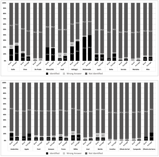
When asked to write down the name of the Brand Mark, identifying it only by a sub-component of the Brand Mark, most respondents showed dif- ficulty, even to recognize global well-known Brands (Figure 3). Even so, the results of this question point to greater recognition of Brand Marks in the Schematized Symbol, Logotypes Handwriting based and Alphabetic Symbols classes. In general, it seems to us that the lack of a brand context compromi- sed recognition. Besides the context, the complementarity of the components avoids confusions, namely between brands that share the object represented in the symbol, such as Gallo and Le Coq Sportif, Audi and Olympic Games, Puma and Jaguar, as well as the name and logo between Beirão and Licor Beirão. There are no statistically significant differences between brands with equal presence in Brazil and Portugal. However, this idea is reinforced by the answers to the following question.
From the list of 24 Brand Marks, when asked to select the 12 most memo- rable ones, Brazilian respondents selected in descending order: McDonalds, Apple, Nike, Puma, Amazon, Ford, Audi, Kellogg’s, Gallo, Levi’s, Ore- o/Milka. And in Portugal, the same brands were selected, although in a different order: Hello, McDonalds, Apple, Nike, Delta, Audi, Puma, Milka, Kellogg’s, Levi’s, Gallo, Ford/Amazon.
When called to justify what makes the Brand Marks more memorable, Brazilians and Portuguese coincide in pointing out, in descending order: For their strong presence in advertising; For their simplicity; For the shape of the symbol/logo.
Figure 3: Survey results of Brand Marks evaluation.
When asked about perceived quality (Low Quality; Average Quality; Supe- rior Quality) based on the 10 Brand Marks of the leading export brands of Portuguese olive oil, the answers from the two groups were broadly similar, with no notable dispersion, contrasting in brands such as Camponês, Gallo, Oliveira da Serra and Andorinha, possibly due to cultural issues and the size and presence of the brand in each country. On the other hand, when the same question was asked about perceived quality based on Brand Visual Identity, there was greater consensus between the two samples, and that Brand Visual Identity tends to concentrate the appreciation at an upper or lower level, with no evidence of a change from one extreme to the other.
CONCLUSION
The decomposition of the Brand Marks allowed us to better observe their anatomy, structure, and graphic-semantic system. In an era where brand com- munication requires Brand Marks to have great flexibility of use or even to be responsive, with situations where identification is made solely by the symbol or by a part as an initial (e.g., McDonalds, Nike, Kellogg’s, Apple). However, the data from this study indicate some sub-components of Brand
Brand Marks Examination. Empirical Study of Graphic Parts in Their Relation 581
Marks have the potential to identify and ensure recognition, but with limita- tions, such as context and other elements of the brand’s visual identity system. One such example is the symbols whose object is shared by several brands, such as Gallo, Audi and Puma. Brand Marks with a less defined visual stru- cture, with high graphic complexity obtain lower results than those that are more schematic and simplified and have a character of fascination. However, the public-brand relationship and the strong presence of the Brand Mark in advertising seem to occupy a greater place. On the other hand, with time, undefined symbols, designed to contain, unite, and guarantee contrast in the Brand Mark, start to play a relevant role in recognition, as in the case of Ford, although Levi’s partially contradicts. On the other hand, situations as in Oreo are insufficient. Without compromising simplicity, expressiveness and contrast play a relevant role in identifying Brand Marks (e.g., Kibon/Olá, McDonalds, Kellogg’s, Milka). The complementary symbols appear to have less strength to generate recognition, as is the case of De Prado, Serrata, Innoliva, although with the contradiction of Amazon. The most recognised symbols by the respondents are those that are already widely used alone by their respective brands. In the same sense, the results show the importance of the Brand Visual Identity system for a more adequate and real evaluation. About the limits of this study, it is important to mention that we chose two samples of respondents, from Portugal and Brazil, although, for representa- tiveness reasons, the sample of respondents in Brazil should be higher. On the other hand, the limitation in the number of pages of this article does not allow us to present all the stages of the empirical process, all the questions, detail and discuss the data with the desired depth. The study allowed disse- cting Marks of brands with an international dimension, understanding that some of their features and graphic elements contribute to memorisation and recognition. Moreover, it was found that Portuguese olive oil brands gene- rate greater recognition at a national level than in their main exportation market, generically with low levels of recognition, which may show shortco- mings in terms of the Brand Visual Identity system and lack of investment in advertising.
ACKNOWLEDGMENT
The authors would like to acknowledge CIAUD, Lisbon School of Archite- cture, Universidade de Lisboa, Portugal and FCT – Foundation for Science and Technology, for their financial support. This article stems from the research process at post-doctoral level carried out by Daniel Raposo.
REFERENCES
Bassani, M., Sbalchiero, S., Youssef, K. B., Magne, S. (2010). Brand Design.
Construire la Personalité d’une marque gagnante. Bruxelles: De Boeck. Castro, I. L. d. (2021) “Logic’s visual identity: Contribution to reputa- tion management in the logistics outsourcing sector”, Convergences - Journal of Research and Arts Education, 14(28), pp. 151–159. doi: 10.53681/c1514225187514391s.28.122. Johnson, M. (2019). Branding in five and half steps. London: Thames & Hudson.
Llorente-Barroso, C. y García-García, F. (2015): “The Rhetorical Construction of Corporate Logos”, Arte, Individuo y Sociedad, 27(2), pp. 257–277. doi: https://doi.org/10.5209/rev_ARIS.2015.v27.n2.44667. Lorenz, M. (2021). Flexible Visual Systems. The Design Manual for Contemporary
Visual Identities. Slated. Morioka, A. (2006). Logo Design Workbook. A hands-on guide to creating logos.
Massa-chusetts: Rockport Publishers. Raposo D., da Silva F.M., Neves J., Silva J., Ribeiro R., Correia R. (2021): Brand Marks Analysis. Criteria and Evaluation Components to an Analysis Tool. In: Markopoulos E., Goonetilleke R.S., Ho A.G., Luximon Y. (eds) Adva- nces in Creativity, Innovation, Entrepreneurship and Communication of Design. AHFE 2021. Lecture Notes in Networks and Systems, vol 276. Springer, Cham. https://doi.org/10.1007/978-3-030-80094-9_52 Raposo, D., Oliveira, F., & Farinha, L. (2020). From Identity Into Brand Visual Iden-
tity: Finding and Defining the Intangible Brand DNA. In L. Farinha, & D. Raposo (Ed.), Handbook of Research on Driving Industrial Competitiveness With Inno- vative Design Principles (pp. 66–85). IGI Global. https://doi.org/10.4018/978-1- 7998-3628-5.ch005 Rijo C. (2022). Mapping of Graphic-Semantic Representations in Design Teaching.
In: Raposo D., Neves J., Silva J. (eds) Perspectives on Design II. Springer Series in Design and Innovation, vol 16. Springer, Cham. https://doi.org/10.1007/978-3- 030-79879-6_19 Siegel+Gale, 2015. Logos Now: What makes a logo design memorable? London: Siegel+Gale. Signs.com (2017). Branded in Memory. 1500 Drawings Reveal Our Ability to
Remembr Famous Logos. [Online] Available at: https://www.signs.com/branded- in-memory/#summary [Accessed 3 November 2021]. Suárez-Carballo, F., Galindo-Rubio, F. y Martín-Sanromán, J. R. (2018): “La simplicidad en el diseño de marcas gráficas: análisis de la preferência”, Arte, Individuo y Sociedad, 30(2), pp. 275–293. doi: https://doi.org/10.5209/ARIS.56791. van Nes, I. (2012). Dynamic Identities. How to create a living brand. BIS Publishers. Viñuales, D., 2015. Keep It Simple, Stupid! KISS: toda una filosofía de branding.
[Online] Available at: https://www.marketingdirecto.com/punto-de-vista/la- columna/keep-it-simple-stupid-kiss-toda-una-filosofia-de-branding-david- vinuales [Accessed 3 November 2021].
LISTED IN THE AHFE DIGITAL BOOKSTORE CATALOGUE
Explore the complete digital volume
Ergonomics In Design
Read this individual research paper free through the original publisher, or explore the full digital proceedings book.
ISBN 978-1-958651-23-0
Explore this ISBN in the AHFE Bookstore ↗Listed in the July 2026 bookstore catalogue; search by ISBN to confirm current availability · Digital book purchase optional