Elisabete Rolo, Rafaela Costa (2022). Portugália publishing house and designer João da Câmara Leme. In: Human Factors in Communication of Design. AHFE Open Access, vol. 49, pp. 126–131. https://doi.org/10.54941/ahfe1002045
In the history of Portuguese graphic design, the editorial design assumes an important role, especially through the covers – an object to which designers and visual artists were most often called to act. In this context, the Portugália publishing house stood out as a reference in the 50s, 60s, and 70s of the twentieth century and, concomitantly, the designer João da Câmara Leme, as he was primarily responsible for the design of the covers of this publisher. This article describes the path of the Portugália publishing house and João da Câmara Leme through a literature review. And through the collection and analysis of examples of covers he designed for Portugália, we seek to identify the main characteristics of his work.
THE PORTUGÁLIA PUBLISHING HOUSE – A BRIEF HISTORICAL OVERVIEW “This publishing house was responsible for most of the illustrations published in Portugal between the 1960s and 1970s, João da Câmara Leme was the author who worked most for it” (Montaner, 2012, s.p.)footnoteT.L. ““Esta editorial fue responsable de la mayor parte de la ilustración publicada en Portugal entre los años 60 y 70 y él fue el autor más prolífico que trabajó para ella.”
Portugália publishing house was founded in 1942 in Lisbon by booksel- lers Pedro de Andrade (1901–1989) and Raul Luís Dias (1894–1958). In this decade, the publishing house was structured, and João Gaspar Simões (1903–1987) held the position of literary director (Melo, 2018, p. 1). The publishing house was always linked to the Portugália book shop – created by Pedro de Andrade, Raul Dias, and Henrique Pinto – which operated from 1942 until 2012 in Lisbon. In Oporto, the Portugália book shop operated from 1945 until 1953.
In the history of Portugália publishing house, Agostinho Fernandes (1886–1972) was one of the most notable names. He was, since 1942, closely linked to the institution, supporting it at various levels. He was a fina- ncier of the publishing house, a constant presence in the bookstore (as a
Portugália Publishing House and Designer João da Câmara Leme 127
customer), and editor of Contemporânea, a magazine dedicated to moderni- sts, directed by José Pacheco (Melo, 2018, p. 1). In 1958, he became its sole shareholder.
In 1963, José da Cruz Santos was responsible for introducing innovative forms of direct sales to the public, such as the “Monthly Book” campaign, which consisted of the mail delivery of a package with a book for public appreciation and another book as a gift. This campaign consisted of the custo- mer buying a book, who could later return it and get a refund of the amount he had already paid. The gift remained his. José da Cruz Santos also created a credit sales system. If there was a balance, the customer could always buy his books. During that time, the trio that was in charge of Portugália publishing house was composed of Fernando Alves, José da Cruz Santos, and Joaquim Soares da Costa (AAVV, s.d., p. 11).
Some experts argue that, in 1964, Portugália publishing house was the first Portuguese book club for members only, whose first work was the edition of a manuscript by Almeida Garrett, “Poemas Libertinos – O Roubo das Sabi- nas”, which also included an essay by Augusto da Costa Dias (s.a., 1964, p. 6). However, despite all the successes, not everything was always easy at Portugália. When the publishing house went into crisis, Eurico Fernan- des (Agostinho Fernandes’ son) did everything to save it. Consequently, his sons Diniz and Sérgio Nazareth Fernandes bought it and took over as pre- sident and vice-president in 1971 (one year before Agostinho Fernandes’ death).
Due to the revolution of April 25, 1974, the grandchildren of Agosti- nho Fernandes were forced into exile in Brazil, where, in 1975, they created the Portugália publishing house (Brazil). In 1977, they returned to Portu- gal, intending to recover the management and ownership of Portugália. Due to its rise, between 1977 and 1985, Portugália stood out as a publisher of best-sellers and thus became the only one to be present on both sides of the Atlantic Ocean (AAVV, s.d., p.12).
In honor of his grandfather Agostinho Fernandes, they created Agostinho Fernandes Foundation. In 2008, the Foundation acquired the Sá da Costa book shop and the right to use the historical name of the Buchholz book shop.
Throughout its history, Portugália publishing house has launched seve- ral collections covering different thematic areas such as national and foreign romance, poetry, narrative, theater, and children’s literature. Examples of these collections are, “Escritores de Sempre” (Writers of Always), “Contem- porânea” (Contemporary), “O Livro de Bolso” (The Pocket Book), “Antolo- gias Universais” (Universal Anthologies), “Documentos Humanos” (Human Documents), “Poetas de Hoje” (Poets of Today), “Portugália”, “Problemas” (Problems), “Teatro” (Theatre), “Biblioteca dos Rapazes” (Library for Boys) and “Biblioteca das Raparigas” (Library for Girls). Among these collecti- ons, we must highlight the pocketbook collection that allowed the Portuguese public to have contact with several foreign authors on a large scale. The juve- nile collections “Biblioteca dos Rapazes”and “Biblioteca das Raparigas”also played an essential role since they contributed to creating reading habits in several generations of young people.
128 Rolo and Costa
CÂMARA LEME’S BRIEF BIOGRAPHICAL AND PROFESSIONAL PATH João da Câmara Leme, illustrator, and graphic designer was born in the Afri- can city of Beira, Mozambique (then a Portuguese colony), in 1930 and died in Lisbon in 1983. In the 1950s, he traveled to Portugal, where he remained until his death. He began his career as an illustrator working for Portugália – one of the most prestigious Portuguese publishing houses at that time – where he designed “hundreds of the most beautiful book covers that were published, especially in the 60s and 70s” (AAVV, s.d., p. 30).
He stood out in illustration, and numerous children’s and teenage books, easily recognized by the youth of the time, were designed by him. This is the case of the Juvenil collections “Biblioteca dos Rapazes” or “Os pequenos Pioneiros” (Little Pioneers). In addition, he was responsible for most of the visual identities developed for the collections of Portugália publishing house.
The supplement “A Mosca” (The Fly), of “Diário de Lisboa” newspaper, and the decoration of public spaces such as the tile panel on the facade of Livros do Brasil publishing house in Bairro Alto in Lisbon, were other of his reference works.
To celebrate the 25th anniversary of “Gazcidla” in 1964, he designed six posters (49x69cm) to decorate the points of sale of the gas supplier. In these posters, he uses a language very close to the one he used in illustrations for children’s books. His work was “a combination of precisely placed ele- ments with a strongly marked synthetic and geometric essence that, together with the absence of perspective, has the power to invoke without confusing” (Montaner, 2012).
With a work considered a real treasure trove with several different graphic registers, he became one of the sixties’ most talented and most appreciated Portuguese designers.
One of the great valences of Câmara Leme’s work is the ability to defend his work with different and diverse registers, in which we can observe textures marked in children’s stories, imitation of stained glass through flat paints, the weave or the use of refined and thick line. These techniques revealed impressive originality and freedom to illustrate different and unmatched by his contemporaries (Rolo, 2015, p. 614).
Much of the designer’s work reveals virtuous use of color, form, back- ground, and contrast between colors and geometric shapes. The use of thick and thin strokes in an organic manner often synthesizes the figures and land- scapes. His covers invite us to enter the stories whose content the designer could synthesize in “an exemplary way. He had a great sense of humor that he combined with his drawings and his typographic and calligraphic culture”.
CÂMARA LEME’S WORK FOR THE PORTUGÁLIA PUBLISHING HOUSE One of the best ways to obtain knowledge in communication design is a visual analysis of the design objects themselves. It is essential to have an analysis model to systematize observation and knowledge collection.
Portugália Publishing House and Designer João da Câmara Leme 129
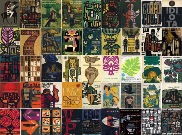
To better understand the work of João da Câmara Leme, we used a model adapted from Laurent Gervereau (Gervereau, 2007) and Elisabete Rolo (Rolo, 2018), which includes three main fields of analysis: description, context, and interpretation. From this model, we focused on the description and interpretation fields to analyze 45 covers. From this process, it was possible to compile the main characteristics of the designer’s work.
“There is, in certain covers, the expressionist vigor of a Ben Shahn, with a nervous and modulated stroke, but the ease with which Câmara Leme demonstrates the figuration of recognizable referents (faces, hands, bodies, boats, etc.) in a game of colored lines and shapes without impeding the reco- gnition of these referents is notorious. It is this glimmer of figuration that makes some covers true icons of Portuguese Neo-Realism”(Marques & Silva, 2015, p. 9). In general, Câmara Leme’s work is characterized by the power of syn- thesis. Geometrized and figurative forms, flat and vivid colors, simple language resembling stained glass, cut-outs, use of thin or thick black lines are some characteristics that can be globally observed when we think about his extensive work.
Through the study and analysis of the covers designed by the designer, we can conclude that there is no defined geometric grid. However, the position of the textual elements on some book covers denotes a previously studied stru- cture. The graphic marks of the collections and Editora Portugália are placed in different places to integrate each cover’s graphics. As far as typography is concerned, typefaces with and without serifs are widely used, positio- ned powerfully and affirmatively when used in black. The text appears to complement the illustrations, integrating and enhancing them.
An overview of the designer’s work shows that he rarely uses photography. The cover illustrations are conceived in a language of their own, which allows for quick identification of their authorship.
Another characteristic that stands out in the designer’s work is the use of the thick, heavy stroke in the outline of the illustrations. When this type of stroke separates the colors, it resembles the idea of stained glass.
The works are often printed in two, three, or four plain colors, frequen- tly using warm tones (such as red and orange, combined with black, in a very expressive contrast) and cold colors (such as green and blue, usually combined with less contrasting colors, such as dry green).
In his work, João da Câmara Leme presents a very own language, harmo- nious and expressive, which fits his time, and makes his graphic style stand out from other authors.
An extensive analysis of the work of João da Câmara Leme, as well as the study of its context, can be found in the master’s thesis of Rafaela Costa (Costa, 2020), co-author of this article.
CONCLUSION
Portugália publishing house was a reference in the Portuguese publishing scene from the 1950s to the 1970s. It distinguished itself through several
130 Rolo and Costa
Figure 1: Examples of book covers designed by João da Câmara Leme for Portugália Publishing House. (Authors, 2020).
strategies that differentiated it, such as introducing innovative ways of sel- ling directly to the public and creating a credit sales system that allowed a more generalized public to access reading and books. In the publishing con- text, graphic design and, specifically, covers are elements of great importance and a resource that also contributes to commercial success. Aware of this, the Portugália publishing house commissioned work from the best Portugu- ese graphic artists, and João da Câmara Leme was the designer who worked the most for the publisher. Through his work, we can understand a little about the author’s and the company’s history. Briefly, we can characterize his work by the power of synthesis, harmony, expressiveness, and unique and distinctive identity.
ACKNOWLEDGMENT
This work is financed by national funds through FCT – Fundação para a Ciência e a Tecnologia, I.P., under the Strategic Project with the references UIDB/04008/2020 and UIDP/04008/2020.
REFERENCES
(s. a.), (1964). O primeiro clube do livro português. Livros de Portugal, n.° 61. AAVV. (s.d.) Fundação Agostinho Fernandes: Portugália Editora, Portugália Brasil, Sá da Costa Editora, Livraria Sá da Costa, Livraria Buchholz. Lisboa: Fundação Agostinho Fernandes. Costa, R., (2020). O Design da Capa de Livro: João da Câmara Leme e a Editora Por-
tugália (Masters Dissertation). Lisboa: Faculdade de Arquitectura da Universidade de Lisboa.
Portugália Publishing House and Designer João da Câmara Leme 131
Gervereau, L., (2007). Ver, Compreender, Analisar as Imagens. Lisboa: Edições 70. Marques, P., & Silva, J., (2015). João da Câmara Leme. Lisboa: Imprensa Nacional Casa da Moeda. Melo, D., (2018). Semblanza de Portugália Editora (Lisboa, 1942–c. de 2010).
In Biblioteca Virtual Miguel de Cervantes – Portal Editores e Editores Ibero- americanos (séculos XIX-XXI). Available in: http://www.cervantesvirtual.com/o bra/-portugalia-editora-lisboa-1942-c-de-2010-semblanza-928682/ Acess date: 23/05/2020. Montaner, M., (2012). João da Câmara Leme. Available in: http://crean.es/joao-daca-mara-leme/ Access date: 03/11/2019. Rolo, E., (2015). Olhar | jogo | espírito de serviço: Sebastião Rodrigues e o
Design Gráfico em Portugal (Phd Thesis). Lisboa: Faculdade de Arquitectura da Universidade de Lisboa. Rolo, E., (2018). Graphic Design Analysis Model, in: Ahram, T., Karwowski, W., Taiar, R. (Eds.), Human Systems Engineering and Design (IHSED 2018). Springer, pp. 433–438. https://doi.org/10.1007/978-3-030-02053-8
LISTED IN THE AHFE DIGITAL BOOKSTORE CATALOGUE
Explore the complete digital volume
Human Factors in Communication of Design
Read this individual research paper free through the original publisher, or explore the full digital proceedings book.
ISBN 978-1-958651-25-4
Explore this ISBN in the AHFE Bookstore ↗Listed in the July 2026 bookstore catalogue; search by ISBN to confirm current availability · Digital book purchase optional