Vera Barradas, Cátia Rijo (2022). The Creation of the Identity for the Territory Themes: The International Congress SD2021 as Case Study. In: Human Dynamics and Design for the Development of Contemporary Societies. AHFE Open Access, vol. 25, pp. 149–156. https://doi.org/10.54941/ahfe1001383
Valoriza – Research Centre of Endogenous Resource Valorization, Polytechnic Institute of Portalegre, Edifício BioBIP, Campus Politécnico, 10, 7300-555 Portalegre, Portugal ↗
This paper aims to explore the problematics of the creation of visual identity forterritories. The visual representation of territories must be illustrative of the values,culture and history of the territory, with the ultimate goal of the creation of selfrecognitionin its inhabitants... As a case study we bring the creation of the visualidentity for the International Congress on Sustainable Development, LandscapePlanning and Territorial Governance (SD2021). The challenge was launched forfirst-year students of the master’s degree in Digital Identity Design at PortalegrePolytechnic.
The creation of a visual identity associated with a territory has as its main goal the identification of the citizen with the place contributing to the increase of their sense of belonging and reinforcing their identity. The visual identity cre- ated must be illustrative of the values, culture and history of the territory to create self-recognition in its inhabitants, identifying them as belonging to the place. The visual representation must convey trust and seriousness, reinfo- rcing the places specificities, stimulating affective relationships, and fostering credibility and recognition by the local inhabitants and visitors.
For the graphic representation of the brand an attempt should be made to simplify, graphically materializing the specifics of the territory, and ensuring that people easily understand it. Any representation associated with the terri- tory must therefore be projected through a coordinated and coherent image, which facilitates communication between citizens and the territory in que- stion. For this, the designer needs to assess the brand’s identity, specifying its concept, identifying its attributes, i.e., identifying and evaluating what distin- guishes it. In this context, the designer is a cultural agent who works in the construction of meanings and must assess his intervention as an active agent of change, it being essential to highlight the responsibility inherent in the cre- ative process. In this sense, the designer is therefore a mediator who optimizes the transmission of a message that does not belong to him. With this issue in mind, and with the aim of training designers more aware of the issues of social responsibility and sustainability, the challenge was launched for first-year students of the master’s degree in Digital Identity Design to create a
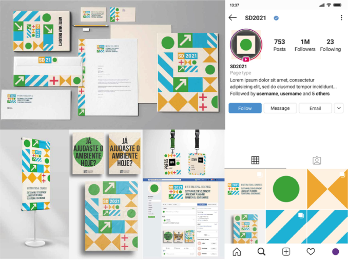
graphic brand and visual identity for the International Congress on Sustaina- ble Development, Landscape Planning and Territorial Governance (SD2021). The case study presented here was developed by the student Afonso January and it was the visual identity chosen to represent the conference.
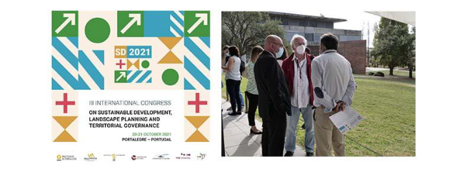
THE INTERNATIONAL CONGRESS ON SUSTAINABLE DEVELOPMENT, LANDSCAPE PLANNING AND TERRITORIAL GOVERNANCE (SD) SD 2021 is an annual international scientific event, whose third edition took place at the Campus of the Polytechnic of Portalegre, co-organizer of the event. With the full designation of III International Congress on Sustainable Development, Landscape Planning and Territorial Governance, the scientific congress had as topic of the special sessions: Accessibility and Connecti- vity Transport Systems, Biodiversity Policies and Strategies, Circular and Green Economy, Cross-Border Cooperation and Inter-Regional Cooperation, Environmental Rights and Legislation, Inter-Organizational Cooperation, Migratory fluxes - Strategies, Management and Planning, Natural Based Solutions, OECD Sustainable Development Goals, Public Management, Renewable Energies, Smart Cities, Sustainable Culture Management, Sustai- nable Development, Sustainable Planning, Sustainable Tourism Management and Territorial Governance and Strategies.
The initiative is the result of collaboration between several partners - Politécnico de Portalegre/ Valoriza, Research Center for the Valorization of Endogenous Resources, University of Extremadura, Extremadura (Spain), University of Évora, University of Madeira, WSB University, (Poland) and FISAT (Peru/Spain) - that have been promoting reflection and knowledge about the themes presented above with an unquestionable focus on respect for territories and their identities.
This congress appears to fill the gaps found, since there was no event in which design, territory, economy, climate, and diversity were topics discus- sed together. Therefore, this event is a global meeting that intends to welcome participants from all over the world, uniting it with the objective of evalu- ating development goals, the way forward and the need to go further using interdisciplinary perspectives.
With a common concern, working on sustainability from a holistic perspe- ctive, where environmental, cultural, economic, and social interests intersect. The diversity of the themes has resulted in creative processes with dynamic results capable of meeting the central objectives of the congress and, at the same time, transmitting not only the identity but also the personality of the event in an effective response with which the organization and participants from all over the world felt identified.
THE PRISM OF BRAND IDENTITY Assessing the brand’s identity it is important to identify the attributes of the brand, i.e., identify and evaluate what distinguishes it. According to Kapferer
The Creation of the Visual Identity for the Territory Themes 151
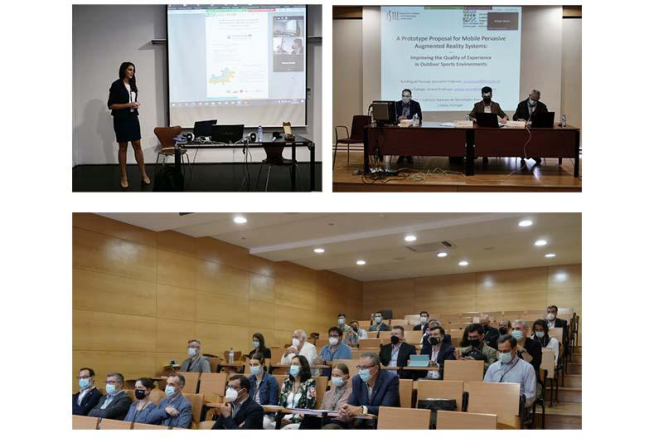
Figure 1: Moments of the the Event. 20 and 21 October, 2021.Figure 2: Moments of the the Event. 20 and 21 October, 2021.
(2008) ist’s important to define the brand identity and the author propo- ses a prism to better the brand identity. On this prism the author states that the assessment should be carried out at three different levels: functional attributes, emotional attributes and attributes that it intends to achieve.
Brand identity focuses on the way the public decodes the signals emitted by the products, but also on the price and the way it communicates with the outside, that is, on the image that is perceived. This image is, therefore, the result of the messages issued by the brand (consciously or unconsciously), which is why one must be aware that not only is it important to pay attention to what the brand emits, but it must also ensure that that the signals are being picked up correctly by the receivers (Kapferer, 2008).
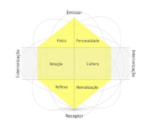
Kapferer (2008) proposes the prism of brand identity which, as the name implies, is represented in the form of a prism with six different traits at each end – on one side we have the sender and on the other, the receiver (to whom
152 Barradas and Rijo
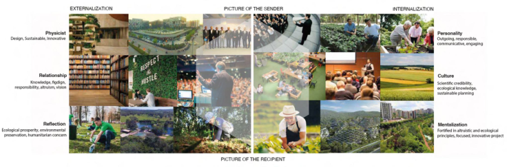
Figure 3: Prism of Brand Identity of Kapferer (Rijo, 2015, p. 109).Figure 4: Prism of Brand Identity applied at SD2021 International Conference. Author’s adaptation.
the brand is intended). The six traits present in the prism are: physical aspects (brand basis), personality, culture, mentalization and reflection relationship.
In the next image is visible the prism applied at the SD 2021 conference identity.
Analyzing this model we can conclude that brand identity is very closely influenced by organizational culture and that the brand management should reflect this same culture. The brand image can be changeable, as it concerns the perception that the target audience has, however, its identity must be strong, unique and consistent.
SD VISUAL IDENTITY & BRAND MARK CREATION The term visual refers to what we can observe physically and/or mentally, through visual elements and images. While the identity must be unique,
The Creation of the Visual Identity for the Territory Themes 153
Figure 5: Application of the GSEM (Rijo, 20202) to the creation of the SD2021 brand mark.
the bran mark can be altered and adjusted to the brand identity, the term ≪visual≫refers not only to the objective representation of the graphic image, but also to all associations with other visual universes, that is, to the graphic interpretation that each receiver already has or perceives of that represen- tation. It is through the visual that we can, in fact, have some vision and perception of identity – the visual allows its representation. Identity is no longer a symbolic and theoretical concept and starts to be represented visu- ally, in practice, through the image. The visual identity consists of the brand image, both the one we can physically see and the one we mentally visualize when we think about it. It is this image and this look that defines its essence and conveys its goals through what it shows itself to be.
Design is the concept for designing the brand image, that is, the visual identity. The visual identity allows for a clearer perception of the brand, in the sense that it demonstrates its personality, qualities and recognition. Some of the design elements that make up the visual identity – logo, symbol, typo- graphy, colors and the reproduction of these elements for the public – offer a symbolic communication of what the brand itself is. Since the brand is all the feeling, history, essence, personality, nature, experience and reflection of a particular company, it must have something that recognizes and represents it;
154 Barradas and Rijo
Figure 6: Brand Mark creation for the SD2021 International Conference.Figure 7: Visual Identity for the SD2021. Project developed by Afonso Januário, stu- dent of the 1st year of the master’s degree in Digital Identity Design at Portalegre Polytechnic.
that is visible and identifiable; whatever its projection – it must be represented graphically.
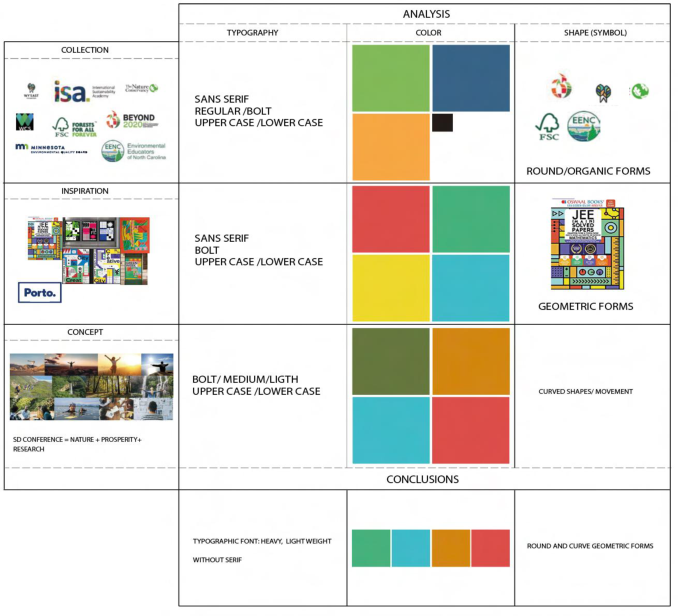
This graphical representation is designated by brand mark and “is one of the most relevant visual identity elements for the differentiation and identi- fication of a brand and often the most used sign in various media. Although the effectiveness of some contemporary brand visual identity systems does not depend heavily on an easily recognizable symbol and/or logotype, Brand marks still play a very relevant role in most cases, especially in small systems” (Raposo et. al., 2021, p. 441) For the brand mark creation, we start with application of the methodo- logical tool Graphic-Semantic Expressions Map (GSEM), this tool intend to
The Creation of the Visual Identity for the Territory Themes 155
help in the process of creating brand marks and “proposes crossing the col- lection made in the research phase, the design concept and the elements of inspiration with the typography, color and shape.” (Rijo, 2020, p. 255).
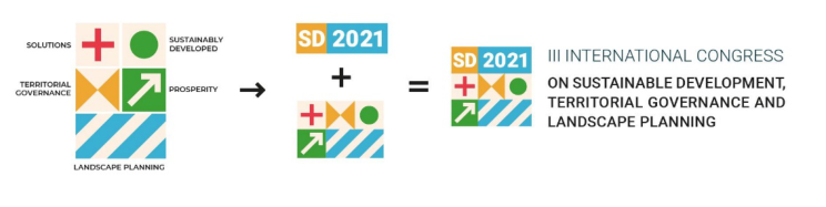
Subsequently, and considering the guidelines generated by the application of GSEM, the creative process of the graphic identity went through the gra- phic representation of each of the thematic axes of the conference (solutions, territorial governance, sustainable development, prosperity and landscape planning), with the aim of to offer visual solutions that could build and dismantle diverse visual representations. In the end, the result consists of a junction of these elements with the acronym SD 2021 that give rise to the final graphic identity.
The graphic representation comes from the creative process where the type- face used in the acronym SD2021 (Roboto Black) was selected to create a harmonized composition between the typography and the other visual ele- ments. Using the same principle, the typography that accompanies the symbol is also Roboto in the Medium and Light variants. The colors used in the com- position come from a cross between research and inspiration, which were part of the process of creating the brand identity and which were graphically expressed in the GSEM, except for the beige color, which was also added it to harmonize the general composition of the symbol, but whose purpose is to represent the human issue that accompanies the conference as a whole.
CONCLUSION
This article aimed to explain the processes adopted for the brand identity for the SD2021 International Conference and explore the issue related to the construction of a visual identity for a territory brand. It is concluded that, to have an territorial identity in a visual identity it is necessary that it be based on its physical appearance, its relationship, reflection, personality, culture and mentality, which are the six factors that build it. It is not just the combination of a name, a product, a logo, but also other intangible components such as values, mission, target audience, personal behavior, among many others.
The application of the GSEM was essential for the options delimitation of the graphics elements that compose the final brand mark and for the selection of the typography.
Since the beginning we aim for a brand identity that represents in the best way the territory and that passes by the values of the conference.In the end we conclude that the initial goals were achieved, the creation of a brand identity that illustrates in the best way the spirit of this conference.
ACKNOWLEDGMENT
The authors would like to acknowledge all those involved in the project pro- cess. A special thanks to the students of the Master in Digital Identity Design of Politécnico de Portalegre, Afonso Januário, the student responsible for the development of the SD2021 Internacional Conference visual identity.
The authors also would like to acknowledge the VALORIZA Research Center, from the Polytechnic Institute of Portalegre, for the possibility of
156 Barradas and Rijo
being present at this conference and to the Foundation for Science and Technology (FCT) for funding this research.
REFERENCES
Kapferer, J. N. (2008) The New Strategic Brand Management. Londres: Kogan Page. Raposo D., da Silva F.M., Neves J., Silva J., Ribeiro R., Correia R. (2021) Brand Marks Analysis. Criteria and Evaluation Components to an Analysis Tool. In: Markopoulos E., Goonetilleke R.S., Ho A.G., Luximon Y. (eds) Advances in Creativity, Innovation, Entrepreneurship and Communication of Design. AHFE 2021. Lecture Notes in Networks and Systems, vol 276. Springer, Cham. https://doi.org/10.1007/978-3-030-80094-9_52 Rijo. C. (2020). Graphic-Semantic Expression Map: A New Approach in Design
Teaching Methodologies. In D. Raposo & J. Neves (Eds), Advances in Ergonomics in Design, 253–267, Springer. Rijo, C. (2015). Design de comunicação, cultura, identidade dos sítios e suas representações. Alcântara dos sítios aos sítios: território para um modelo. Tese de Doutoramento em Design, Faculdade de arquitetura da Universidade de Lisboa.
LISTED IN THE AHFE DIGITAL BOOKSTORE CATALOGUE
Explore the complete digital volume
Human Dynamics and Design for the Development of Contemporary Societies
Read this individual research paper free through the original publisher, or explore the full digital proceedings book.
ISBN 978-1-958651-01-8
Explore this ISBN in the AHFE Bookstore ↗Listed in the July 2026 bookstore catalogue; search by ISBN to confirm current availability · Digital book purchase optional