Cátia Rijo, Vera Barradas, Mariana Dias (2022). Mapping of Graphic-Semantic Representations: Bisar an Emotional Brand. In: Human Dynamics and Design for the Development of Contemporary Societies. AHFE Open Access, vol. 25, pp. 120–127. https://doi.org/10.54941/ahfe1001379
1 CIAUD, Lisbon School of Architecture, Lisbon University, Rua Sá Nogueira, 1349-063 Lisboa, Portugal ↗
2 Computational Valoriza – Research Centre of Endogenous Resource Valorization, Polytechnic Institute of Portalegre, Edifício BioBIP, Campus Politécnico, 10, 7300-555, Portalegre, Portugal ↗
This paper aims to demonstrate the effectiveness of the tool called the Graphic-semantic Expression Map in the creation of a new brand mark, with the intend of validating this new methodological approach. This tool was developed to assist the process of expressive code synthesis and boost the relationship between graphic expression and semantics in design practice. As a case study this tool was applied on the creation of the Bisar brand mark within the scope of the curriculum internship of the master’s degree in Digital Identity Design at Portalegre Polytechnic. Bisar – eco brand inspired by people -, consists of an identity focused on the reuse of industrial waste, specifically from the textile industries in Guimarães, through the donation of industrial waste by each company, allowing the creation of a brand focused on its values and objectives, emotional and social, through experiences, supporting sustainability and making a difference in the community. Bisar is a sub-brand of Guimarães municipality that emerged from a project called “From Granny to Trendy” by the “Vintage for a cause brand”, a sustainable brand that has won a series of awards and is supported by the Calouste Gulbenkian Foundation, which stands out for its concern at a sustainable, ecological, and environmental level and creativity. Through the application of the tool, it is intended to assess the brand's values, relating them to semantic and graphic values, aiding methodologies and instruments promoting the association between semantics and visual thinking. Visual thinking is an essential tool because it helps to clarify ideas, defines concepts, interpret the problem, and give a systemic view. In this context, concept maps are a widely used tool in design teaching to help students visualize and communicate concepts, using semantic panels, associations are made at the semantic level, which allows working the relationship between the semantic attributes and the previous experience of the receiver. The intrinsic relationship between the brand mark and what it represents can be described as a semantic differential, and, according to Formiés and Vázquez (2016), the semantic differential technique allows us to evaluate opposing adjectives, noting whether there is any relationship between elements such as the color, the set, the visual pattern and the semantic attributes that the brand intends to convey, which can also be used to determine the recognition of the graphic brand. The implementation of the new visual synthesis tool – designated Graphic-semantic Expressions Map in concrete contexts of learning in the scope of Design Education constitutes the undertaking that succeeds its conception and aims to create conditions for its scientific validation. In the end, an attempt is made to evaluate if the association of semantic elements with several communication elements promotes the convergence between the project goals and the synthesis expressive codes, while the interpretation and creation of a brand mark project.
Bisar is an eco-brand inspired by people, it is a sustainable fashion brand cre- ated by people and inspired by people, which aims to be commercialized and internationalized, with the concept of reusing industrial waste. This brand had already been conceived, due to the From Granny to Trendy project by Vintage For a Cause (VFC). It ended up being developed in January 2020, in the context of a curricular internship, through the Municipality of Guima- rães, in the Economic Development Division. VFC, a sustainable brand that has already won a series of awards, supported by the Calouste Gulbenkian Foundation, has this innovative project of free sewing workshops for women over 50 years of age, outside the working life, whose objective is to combat textile waste and promote social inclusion.
Thus, conceived from this project – From Granny to Trendy – Bisar was born, a brand that fights for slow fashion and that stands out through its physique, its relationship with consumers, its reflection in the community, its personality, culture and mentality. Its visual and corporate elements aim
Mapping of Graphic-Semantic Representations: Bisar an Emotional Brand 121
to demonstrate the brand’s feeling, history and essence; the objectives and goals that it intends to achieve, internally and externally, based on its real experiences, identity, communication and image. The naming is related to the concept that the brand intends to convey, Bisar means “to request the repetition or recurrence of something; redo, repeat or redo”, became the ideal naming to represent this brand, which is linked to the reproduction and reuse of industrial waste.
THE CHALLENGE OF A NEW VISUAL IDENTITY When a brand is built, attention must be paid to how it can be made visible. Nowadays, when we are constantly surrounded by brands, it is essential to think about differentiating and distinctive elements.
The creation of an effective visual identity can be based on four factors: how it is characterized; the way it believes to be characterized; the idea of what it should be, and the way others believe it should be (Chaves, 1998). Brand and visual identity are two concepts that always go hand in hand, they do not exist and do not work without each other. According to Morgan (1998, p. 75) “a brand is the visual identity of a group related to products or services from a common source”. The visual identity incorporates the brand and all the ways in which it expresses itself, through the image, logo, sym- bols, color, and all communicational and emotional design. Brands are able, through their emotional design, to convey social and emotional values to the community, through real experiences.
Sustainability is one of the themes that increasingly connects companies and people. The values associated with sustainability can create groups of defenders of this cause, uniting them in order to fight for a healthier, greener and more ecological world. When an entity’s product or service is defined, its entire corporate visual identity will be equally focused on what it sells or intends to sell and on what it is and assumes to be, in its essence, it’s not possible to have the same identity in all brands, not in all those that fall within the same sector.
With technological advances, and since we live in an increasingly digital age, there are several platforms that can spread the values of brands that support causes such as sustainability. Its advocates feel connected to brands that meet its principles, whether social, ethical, emotional, or otherwise. With digital platforms, the brand can have more ways to reach its target audience and, at the same time, make its values known to the entire digital community, being able to acquire more people interested in its goals.
The visual identity of a brand is made up of all the factors that differen- tiate it from the others – either by the way it is characterized/believed to be characterized, or by the idea of what it wants to be/believe it should be.
GRAPHIC-SEMANTICS EXPRESSION MAP: A METHODOLOGICAL TOOL To create the brand mark Bisar the tool Graphic-Semantic Expressions Map (GSEM) of Rijo (2020) was applied. According to the author this tool aims to
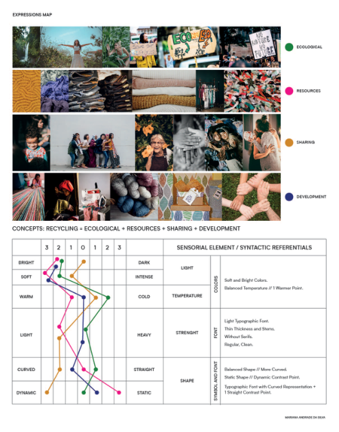
Figure 1: Expressive categories map (Rijo, 2020) applied for the Bisar concept.
assist in the construction of graphic marks through the definition of graphic- semantic parameters allowing the graphic and semantic analysis of the images collected in the initial phase of the development of a design project. “Graphic- visual representations help to organize and link what we already know with new ideas, as they provide a panoramic look at the set of information col- lected, as well as the simultaneous perception of different possibilities of connection between the elements” (2021, p. 423) This map is based on a traditional moodboard to relate and visualize the different images and visual references that are collected in the research and inspiration and concept phase that, in the end, cross the guidelines resulting from each of the topics, syn- thesizing the conclusions of the moodboards with the essential elements for the graphic representation: typography, color and shape.
In the case study of the Bisar brand, naming is related to the concept that the brand intends to convey: Bisar means “requesting the repetition or recur- rence of something; redo, repeat or perform again”; and in this way, it will be possible to understand to what extent it constitutes the ideal naming to represent a brand that is linked to the reproduction and reuse of industrial waste.
Around reuse – are ecology, resources, sharing and development; and the inspiration for the brand’s visual identity is linked to the fabric strips and the sewing concept itself, making it clear that the domains are related.
Mapping of Graphic-Semantic Representations: Bisar an Emotional Brand 123
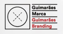
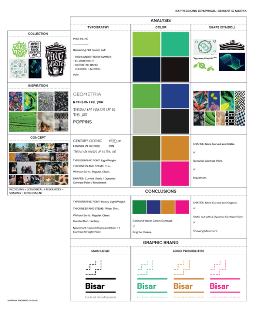
Figure 2: Guimarães brand visual identity.Figure 3: Graphic-semantics expression map (Rijo, 2020) applied for the Bisar concept.
Given that Bisar is designed as a sub-brand of Guimarães Marca, there must be a link between both visual identities, adapting the Bisar symbol to the dashed line present in the X of Guimarães Marca, maintaining the inspiration (sewing) and the concept; it should also be noted that the straight lines of the parent brand also represent the sub-brand.
It was through these focuses and the analysis based on the collection, inspi- ration, and the very concept of Bisar, that it was possible to evaluate the conclusions of the map and the matrix, focused on the different typography fonts, colors and shapes/symbols resulting from this study.
After applying the Expressions Map and the GSEM, the resulting colors also meet bisar’s ideals, and from this conclusion the colors green, blue, pink and orange resulted.
In this sense, to represent the brand, a mixture of green and blue (aqua green) was chosen, which represents two of the main focuses of the brand:
Figure 4: Brand mark created for Bisar.
Figure available in the original PDF paper.
the green color, linked to nature, to destiny, to what is strange (representing the ecological domain); and the color blue, linked to infinity, fidelity and love (representing sharing). The visual identity can also be manifested through two more distinct colors: pink, linked to tenderness, purity, delicacy, and the heart (representing development); and orange, also linked to nature and prosperity (representing the focus of resources).
The visual identity can, similarly, be expressed through the symbol that encompasses the link to Guimarães Marca (mother brand) through dashed lines, but with a focus on the Bisar brand, that is, its icon of differentiation; naming, which is represented through the brand name, also having elements of the Guimarães Brand, through the lines, the slogan that represents the brand concept; and the combination of symbol, naming and slogan, which represents the entire visual identity.
They all work separately, and only one of them can be used, depending on which one suits you best at the time of use.
Regarding the typographic font chosen, this is in line with the conclusions of the Categories Expression Map and the GSEM created – heavy typographic font, thick and wide, sans serifs –, and with a choice that represents the parent brand, through an identical typography.
The brand has versions for the collections of its godmothers and for the partners’ catalogs. Its waste or unwanted products are Bisar’s raw mate- rial and the inspiration for the project’s godmothers. From industrial waste, value-added products are born, which represent the human value associa- ted with the production of each piece and which defend sustainable values through the process of upcycling and creative reuse, with greater environmen- tal value. In both versions, a color is defined for each company, and it can only be one of the brand’s official ones – aqua, pink and orange. Thus, there are the denominations Collection by and Catalog by, where these are the ones that privilege the color, followed by the logo referring to the company that is addressed in the collection/catalog. The visual identity of the Bisar also must be always present in these versions.
BISAR AS AN EMOTIONAL BRAND MARK It is the emotional experiences that arouse great interest in a brand, these can change behaviors and thoughts; encourage attitudes and win over consumers. Emotional experiences are not only related to the specific products, but to the entire brand environment – physical and symbolic, palpable visuals and non-palpable visuals. This means that, in addition to the importance of the garment, the strip of fabric, its material (palpable visual), symbology is also important: its shape, its design, its portrait of reality (visual not palpable). For
Mapping of Graphic-Semantic Representations: Bisar an Emotional Brand 125
this reason, creating a brand has many steps. For it to conquer the community, it has to offer real experiences, linked to the emotional forum, that have a physical and mental impact.
Bisar intends to win over the community through the experiences it can offer, changing behaviors and changing mentalities for a more sustainable future. It’s not just another brand that makes money through people, it’s offe- ring people the real profit of the brand, its real purpose. It is intended that the community not only know the brand externally, but also internally, as part of it. For this, the symbology is transformed into experience. The value of the visual identity symbol, related to fabric and sewing strips, is put into practice through training. These trainings make it possible to offer memora- ble experiences of sharing, development, and prosperity, both in terms of the resources used and worked on, as well as the participating community.
It is intended, through a sustainable functional and financial municipal strategy, training, and specialization in the area of sewing, encompassing a community of unemployed women, with a professional history in the textile area. The objectives of this emotional experience are the fight against social inclusion, human and social relationships, support for entry into work and the promotion of Bisar in a creative and sustainable way. In addition to the value of form, colors also gain another perspective of an emotional and expe- rimental nature. As noted earlier, colors identify the brand, both internally and externally.
In the case of Bisar, the colors are part of it as a whole. The main focuses defined to represent the sustainable fashion brand – ecological, sharing, deve- lopment and resources – show all Bisar’s ideals. In this way, the value of color is integrated both in the community that works internally for the brand, and in the community that observes it. Unconsciously, our mind associate’s colors with values that have always been part of us in society. The colors of a brand are, therefore, always considered choices. It is not just a random choice, but a choice that best represents what you defend and what you want to convey. Bisar, through its aqua-green color, represents two of the main focuses of the brand – the green color (linked to nature, to destiny, to what is strange) represents the ecological; the blue color (linked to infinity, fidelity, and love) represents sharing. The visual identity can also be manifested through two more distinct colors, these being pink (linked to tenderness, purity, delicacy, and the heart), which represents development; and orange (also linked to nature and prosperity), which represents the focus of resources.
The value of colors is present in the training objectives, they are no longer just visually expressed colors and become forms of work for a particular purpose. Ecology is represented through the action of companies, which guarantee the raw material for these women to work in their training. By donating surplus products from their industries, they guarantee the continuity of materials and guarantee their sustainability – aqua-green color.
It is through the supply of this raw material that the brand can have resou- rces, fighting for their prosperity. These are the resources that allow the existence of new developed parts. They are the basis of the pieces themse- lves, their use and treatment, which will lead to their development – orange. This is where the development of what will be the final product comes in.
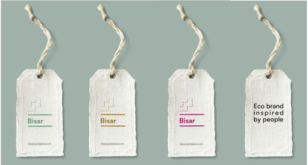
Figure 5: Bisar brand application.
However, this development is full of dedication on the part of the women who practice it. In this way, it becomes an art, linked to the tenderness and compassion that they place on their work. The development of these pie- ces is much more than a methodical practice. It is a symbolic and emotional practice – color pink.
Finally, through the result, it can be said that all the factors previously discussed led to the infinity of the pieces, through a faithful commitment and love in the construction and reconstruction of the same. For their long dura- bility, which allows them to be used again. For a new sharing of experiences – both for those who will have the opportunity to use them in their daily lives, and for those who built them because, in that environment, unforgetta- ble memories were also created – color blue. Both the value of the form (the formations) and the value of the color (their objectives and process) lead to the value of the link. The latter is also quite important, as this connection is built through emotions and experiences. Therefore, the creation of an emo- tional connection with a brand is greatly influenced by these factors and, when it is internally in this way and works towards these values, it ends up truly showing its intentions to the outside. The fact that the construction of the brand’s pieces offers real experiences to these women is very positive, as they create this essential connection with it. They are not just workers for the brand, they mainly have an opportunity for enriching experiences, which allows them to want to do the work they do, knowing that they contribute to something greater than Bisar’s profit.
CONCLUSION
By following Bisar, you can see how it works and the values that the brand defends. Everything in this brand is interconnected, from the symbol to the colors and their values integrated into them – these are the theoretical and practical terms that give to this emotional brand consistency. But more impor- tantly, Bisar is a brand inspired by people and for people, working only with them and for them, in an ecological way. The brand mark final solution found
Mapping of Graphic-Semantic Representations: Bisar an Emotional Brand 127
based on the Expressive Categories Map and the Graphic-Semantics Expres- sion Map (Rijo 2020) helps not only to create a visual identity that meets the desired ideal solution but is also an aid in substantiating the brand and what it intends to convey. As mentioned before, everything is interconnected through this final solution: the essence of the brand is transparent to the desi- gned visual identity, it is considered that these two methods are fundamental in the process of creating any identity and helping to trigger paths not initially considered.
ACKNOWLEDGMENT
The authors also would like to acknowledge the VALORIZA Research Cen- ter, from the Polytechnic Institute of Portalegre, for the possibility of being present at this conference and to the Foundation for Science and Technology (FCT) for funding this research.
REFERENCES
Chaves, N. (1988). La Imagen Corporativa. Teoría y metodología de la identificación institucional. Ediciones G. Gili, SA de CV. Barcelona, España. Morgan, C. (1998). Logos logo, identidade, marca, cultura. Lisboa: Destartes
Edições. Rijo C., Sanches M.C., Franceschi R. (2021) Integrating the Syntactic and Semantic Dimensions in Packaging Design Projects. In: Rebelo F. (eds) Advances in Ergo- nomics in Design. AHFE 2021. Lecture Notes in Networks and Systems, vol 261. Springer, Cham. https://doi.org/10.1007/978-3-030-79760-7_111 Rijo C. (2020) Graphic-Semantic Expressions Map: A New Tool on Design Teaching.
In: Rebelo F., Soares M. (eds) Advances in Ergonomics in Design. AHFE 2019. Advances in Intelligent Systems and Computing, vol 955. Springer, Cham. https: //doi.org/10.1007/978-3-030-20227-9_67
LISTED IN THE AHFE DIGITAL BOOKSTORE CATALOGUE
Explore the complete digital volume
Human Dynamics and Design for the Development of Contemporary Societies
Read this individual research paper free through the original publisher, or explore the full digital proceedings book.
ISBN 978-1-958651-01-8
Explore this ISBN in the AHFE Bookstore ↗Listed in the July 2026 bookstore catalogue; search by ISBN to confirm current availability · Digital book purchase optional