Yuan Cao, Xiaozhou Zhou (2022). Investigating Users’ Color Perception in Optical See- through Augmented Reality: The Effect of Ambient Light on Interface Color. In: Intelligent Human Systems Integration (IHSI 2022): Integrating People and Intelligent Systems. AHFE Open Access, vol. 22. https://doi.org/10.54941/ahfe100966
The light perceived by users in optical see-through augmented reality (AR) comes from the mixed light of the real-world and AR devices, so the AR interface elements will be affected by the real-world light, which may lead to the color distortion of virtual graphics. This paper focuses on the user's perception of AR interface color and the influence of ambient light on AR graphics color. We conducted a user behavior study and recruited 18 participants to observe eight AR colors under three ambient illuminations through Microsoft HoloLens. Participants need to complete the color matching task, and match the color perceived in AR with the palette rendered on iPad. Our analysis shows that red and yellow are relatively stable in AR, and the perception difference between participants in these two-color regions is small; In addition, we also found that the ambient light intensity only affects a few colors, such as blue and purple, but has little effect on most colors. This study can provide a reference for the design of AR interface color coding.
Intelligent Human Systems Integration (IHSI 2022): Integrating People and Intelligent Systems https://openaccess.cms-conferences.org/#/publications/book/978-1-7923-8988-7
INTRODUCTION
The emergence of augmented reality brings users a novel sensory interaction experience. Through technical methods, virtual information is directly superimposed into the real world (Azuma, 1997). Although Optical see-through (OST) head-mounted displays (HMDs) are currently the most popular AR devices in the market, there are still some perception barriers in the actual use. The characteristic of optical perspective display is that the light perceived by the observer is the mixed light from the real world and the device graphics display system (Hassani, and Murdoch, 2019). The combination of real-world lighting, background and virtual graphics will have an impact on usability and user performance, resulting in visual obstacles such as unstable color rendering and chromaticity distortion of user interface, poor text readability, and may further affect depth perception (Gabbard et al. 2010, Van Krevelen & Poelman, 2010).
Display color distortion can be divided into objective measurement of color distortion and perceptual distortion. For OST display, color distortion is mainly caused by the mixed light of real environment and display. In this study, we focus on the problem of color perception distortion of OST AR displays. We study the robustness of OST-HMD color appearance and the influence of ambient light on user perceived interface color. We asked participants to conduct color matching experiments using Microsoft HoloLens (an OST-HMD device) in different ambient light to quantify the distortion of color perception, and evaluated the degree of user perception distortion of eight basic color categories in AR.
EXPERIMENT DESIGN We designed a color matching experiment to explore the robustness of AR color representation and the influence of ambient light on user perceived interface color. This section will describe the environmental tasks of experimental instruments and experimental procedures in detail.
APPARATUS AND ENVIRONMENT This experiment was conducted on Microsoft HoloLens 2. AR scene is built by using Unity3D v2019.3.1f1 and HoloLens Mixed Reality Toolkit. The color matching palette is displayed on the iPad Pro 2018.
We have prepared an isolated space (3.5m×1.5m) surrounded by black curtains to ensure that the subjects will not be disturbed by other visual stimuli during the experiment and can better control the experimental variables. The amount of ambient light in the scene is controlled by setting two lights in front of the participants for illumination. The lights are located at 2m from the participants. The virtual cube was set 7cm above the camera with a size of 1. We chose to set the depth of the virtual object to 0.6m. All objects are illuminated by a white (#FFFFFF) directional light with an intensity of 1.0.
Intelligent Human Systems Integration (IHSI 2022): Integrating People and Intelligent Systems https://openaccess.cms-conferences.org/#/publications/book/978-1-7923-8988-7
METHODS
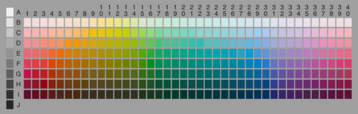
We improved (Gabbard et al. 2020) experimental method and applied it to OST-HMD. Participants need to complete the color matching task to match the perceived colors in HoloLens with the world color survey (WCS) palette on iPad. This paper briefly introduces the related work of WCS. WCS color board (see Figure 1) contains 40 hues at the maximum saturation and 8 brightness levels, making up 320 chips. In our experiment, the WCS palette was rendered to the iPad. After the participants viewed the HoloLens colors, they matched the color patches in the palette. The program on the iPad records the relevant data of the participants' response color block.
The experimental analysis is carried out in 1931 CIE color space. CIE 1931 XYZ is a primary color system related to RGB. CIE xyY color space is directly derived from CIE XYZ, y value is used to represent the brightness of the color, x represents the red component, y represents the green component.
Figure 1. The WCS stimulus palette (Kay et al. 2009).
PARTICIPANTS We recruited 18 design students from the university, including 9 males and 9 females. They were between 23 and 27 years old (M=24.81, SD=1.50). All the participants had normal or corrected-to-normal vision, and no visual diseases such as color blindness; nine participants wore glasses during the experiment. Two participants had no experience in using VR or AR, fourteen participants had almost no experience (using VR or AR devices 1-5 times), and two participants were experienced users (>5 times).
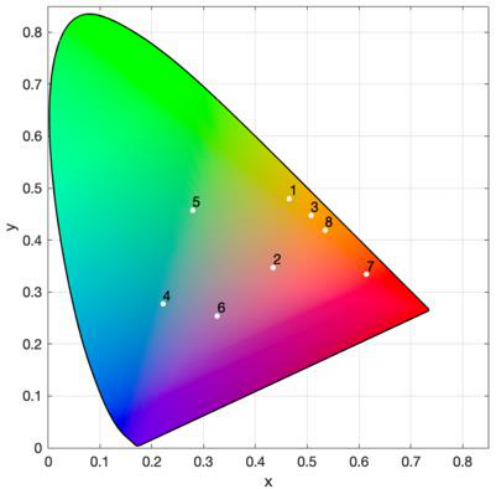
INDEPENDENT VARIABLES WCS defines 11 basic color categories (black, white, gray, blue, brown, green, orange, pink, purple, red, yellow), which are the most prominent for human color recognition (Kay et al. 2009). We finally chose eight basic colors (blue, brown, green, orange, pink, purple, red, yellow) as color stimuli. Use colorimeter to measure the x and y coordinates of the target color. The position of the target color on the CIE xyY chromaticity map is shown in the figure
Intelligent Human Systems Integration (IHSI 2022): Integrating People and Intelligent Systems https://openaccess.cms-conferences.org/#/publications/book/978-1-7923-8988-7
2.
Figure 2. The x and y values of the target color. The number on the graph is the order in which the colors appear.
To evaluate the influence of physical environment illumination on user perception of AR color, we control the overall illumination in the environment and set three illumination levels, 10-19 lx, 230-290 lx and 490-580 lx respectively.
We render eight different colors of AR color block stimulus under three different illuminations of ambient light. This experiment is an 8 × 3 repeated measurement experiment.
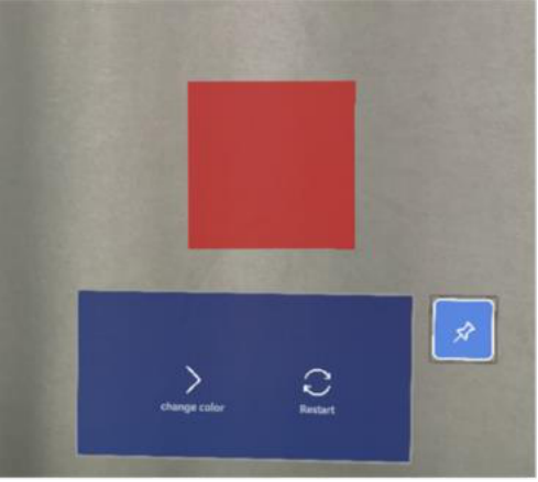
EXPERIMENT PROCEDURE Before the experiment, participants were asked to fill in an informed consent form. After that, they accepted the task instructions, and the experimenter made sure they understood the task. Participants wore HoloLens glasses and adjusted pupil spacing. Before each trial, the brightness needs to be calibrated, and the experimenter needs to calibrate the iPad brightness. After calibration, the participants performed the task. Participants start the procedure; a cube and a blue panel appear in the field of vision. The default color of the cube is white. As shown in Figure 3, eight colors will appear in the field of vision. Click the "change color" button on the blue panel in the field of vision to change the color. After perceiving the color
Intelligent Human Systems Integration (IHSI 2022): Integrating People and Intelligent Systems https://openaccess.cms-conferences.org/#/publications/book/978-1-7923-8988-7 of HoloLens, participants moved the front lens of HoloLens upward to ensure that the naked eye selected the response color on the color board of iPad. Click the "restart" button to enter the next trial. During the trial, participants can rest for one minute, look at the distance and relax eyes.
Figure 3. The scene that the subjects saw in the virtual environment. In the field of vision, there is a square following the subject's head movement and a movable blue panel.
RESULTS
We use the quantitative measurement method to calculate the chromaticity shift and dispersion degree. Chromaticity shift is to measure the movement of the x and y coordinates of the subjects' response colors in the CIE chromaticity plane relative to the original target color coordinates, mainly to understand the influence of the mixing of ambient light and AR color on the user's perception of interface color. Dispersion is the similarity of different subjects' perception of a specific color, which has nothing to do with the original value of the target color. Dispersion mainly considers the degree to which the target color is perceived as different colors by different individuals, to understand the individual differences of color perception.
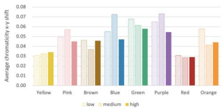
The influence of different ambient illumination on chromaticity shift is shown in the figure 4 (left). ANOVA showed that there were significant differences in color perception bias among different colors (P < 0.01). The results showed that yellow, red, and Brown had the smallest color perception shift, while purple, green and blue had the largest color perception shift. In addition, there was no significant difference in the perceptual shift of most colors
Intelligent Human Systems Integration (IHSI 2022): Integrating People and Intelligent Systems https://openaccess.cms-conferences.org/#/publications/book/978-1-7923-8988-7 under different ambient lights (P>0.05), but there was significant difference in the perceptual shift of blue and purple under different illuminances (P<0.05).
The effect of different ambient illumination on different color dispersion is shown in the figure 4 (right). ANOVA showed that the dispersion degree of different colors was significantly different (P<0.01). The results showed that when subjects perceived yellow and red, the similarity between different individuals was the highest, and the perception differences of green, blue, and purple among different individuals were relatively large. There was no significant difference in the dispersion of most colors under different ambient light (P>0.05); However, there are significant differences in blue under different illuminances.
Figure 4. Left: Average x-y shift by color and illuminance. Right: Average x-y dispersion by color and illuminance.
DISCUSSION
In this study, we investigated the user's color perception in OST-HMD and the influence of ambient light on different AR interfaces color. A human factor study is carried out. Through the color matching experiment, it is found that the distortion degree of different colors perceived by users in AR is significantly different, and the illumination level of ambient light has no effect on most AR color perception.
In AR display system, appropriate ambient illumination is very important. However, in our experiment, different ambient illuminations have no significant effect on most AR interface color perception, but only affect individual colors (such as blue, purple) in some illuminance range. We speculate that on the one hand, we may not choose enough illumination level, and there is little difference between the high illumination group and the low illumination group. In the future study, we can set the illumination level above 1000 lx to simulate the outdoor environment illumination. In addition, most of the color perception in the experiment is not affected by the ambient light, which may be due to the color constancy. Color constancy refers to the perceptual characteristics that human perception of the surface color of an object remains unchanged when the color light on the surface of the object changes(Foster, 2011). Changing the illuminance of ambient light in the experiment cannot cause the change of user's perception of AR color. However, for colors with shorter wavelengths like blue and purple, the change of ambient light has a certain impact on them. These colors are suitable to be presented in appropriate high illumination. Therefore, it is necessary to consider the
Intelligent Human Systems Integration (IHSI 2022): Integrating People and Intelligent Systems https://openaccess.cms-conferences.org/#/publications/book/978-1-7923-8988-7 color presentation environment in the future interface design. In addition, in the interview with the subjects after the experiment, it was found that male was less sensitive to color recognition than female, and most of the male subjects pointed out that red was the most suitable color to be recognized in AR. Whether the subjects wore glasses or not had no effect on the results.
Due to the limitation of experimental equipment, this experiment only measures the subjective distortion of AR color, and cannot use colorimeter to measure the original color presented by HoloLens, so it is unable to measure the objective distortion of color in AR. We have not considered the objective physical changes and cannot calculate the objective color x-y shift. When the user perceives the interface color, color distortion may have occurred, that is, the actual x-y offset. We can't compare the actual x-y shift with the perceived x-y shift. In addition, we can't accurately adjust the brightness of HoloLens display.
CONCLUSIONS AND FUTURE WORK In this study, we investigated the user's color perception in OST-HMD and the influence of ambient light on different AR interfaces color. A human factor study is carried out. Through the color matching experiment, it is found that the distortion degree of different colors perceived by users in AR is significantly different, and the illumination level of ambient light has no effect on most AR color perception.
In the future work, try to study the color appearance under different light conditions of color temperature. Since the illuminance of ambient light has little effect on the color, the illuminance is fixed to explore the influence of color temperature on AR interface color. In addition, this experiment places the virtual object at a fixed depth, and the influence of color on depth perception has been studied previously. The next work can explore the relationship between color and depth perception in AR and place the virtual object at different levels of depth to investigate whether the color appearance will change.
ACKNOWLEDGMENTS
This work was supported by the National Natural Science Foundation of China (No. 71901061).
REFERENCES
Azuma, R. T. (1997). A survey of augmented reality. Presence: teleoperators & virtual environments, 6(4), 355-385. Hassani, N., and Murdoch, M. J. (2019). Investigating color appearance in optical see-
through augmented reality. Color Research & Application, 44(4), 492-507.
Intelligent Human Systems Integration (IHSI 2022): Integrating People and Intelligent Systems https://openaccess.cms-conferences.org/#/publications/book/978-1-7923-8988-7
Gabbard, J. L., Swan, J. E., Zedlitz, J., and Winchester, W. W. (2010, March). More than meets the eye: An engineering study to empirically examine the blending of real and virtual color spaces. In 2010 IEEE Virtual Reality Conference (VR) (pp. 79-86). IEEE. Van Krevelen, D. W. F., and Poelman, R. (2010). A survey of augmented reality
technologies, applications and limitations. International journal of virtual reality, 9(2), 1-20. Gabbard, J. L., Smith, M., Merenda, C., Burnett, G., and Large, D. R. (2020). A Perceptual Color-Matching Method for Examining Color Blending in Augmented Reality Head- Up Display Graphics. IEEE Transactions on Visualization and Computer Graphics. Kay, P., Berlin, B., Maffi, L., Merrifield, W. R., and Cook, R. (2009). The world color
survey. Stanford, CA: CSLI Publications. Foster, D. H. (2011). Color constancy. Vision research, 51(7), 674-700.
Intelligent Human Systems Integration (IHSI 2022): Integrating People and Intelligent Systems https://openaccess.cms-conferences.org/#/publications/book/978-1-7923-8988-7
LISTED IN THE AHFE DIGITAL BOOKSTORE CATALOGUE
Explore the complete digital volume
Intelligent Human Systems Integration (IHSI 2022): Integrating People and Intelligent Systems
Read this individual research paper free through the original publisher, or explore the full digital proceedings book.
ISBN 978-1-7923-8988-7
Explore this ISBN in the AHFE Bookstore ↗Listed in the July 2026 bookstore catalogue; search by ISBN to confirm current availability · Digital book purchase optional