Shino Okuda, Mana Nishimoto, Satoko Taguchi, Miho Muguruma, Katsunori Okajima, Juan Serra, Daniel Vázquez, Manuel Melgosa (2026). Effects of Light Color on Visual evaluation of Sorolla’s Outdoor Paintings. In: Human Factors and Ergonomics In Design. AHFE Open Access, vol. 210, pp. 140–149. https://doi.org/10.54941/ahfe1007434
The present study investigates the impact of light source characteristics on the subjective perception and aesthetic appreciation of representational paintings, specifically works by Joaquín Sorolla. The primary objective was to determine how correlated color temperature (CCT) and spectral power distribution (SPD) while keeping the CCT constant influence the viewer’s perception of the depicted season, time of day, and overall atmospheric quality. Participants evaluated three artworks—depicting autumn foliage, a winter landscape, and a summer seaside—under 20 illuminant conditions with CCTs ranging from 3000 K to 10,000 K, utilizing both representative daylights and typical light-emitting diode (LED) spectra. The results demonstrate that CCT is the decisive factor in shaping the perceived atmosphere and temporal context while the specific SPD of the illuminant has a negligible effect. The effectiveness of specific lighting was highly dependent on the painting’s content: mid-range CCTs (4000–5000 K) best complemented the vitality of autumn scenes, and a similar range (4000–6500 K) was preferred for the summer seaside scene to capture its natural brilliance. In contrast, high CCTs (8000–10,000 K) were essential for conveying the crisp texture and frigid atmosphere of winter landscapes. These findings suggest that "atmospheric congruency," aligning the CCT of the illuminant with the environmental cues within the artwork, is more critical for viewer appreciation than differences in SPDs. This research provides valuable insights for museum lighting design to optimize the visual experience of representational art.
Spanish painter Joaquín Sorolla, often referred to as the “painter of light,” was deeply committed to outdoor painting and sought to capture on canvas the scenes under natural illumination. He was acutely sensitive to the fleeting qualities of daylight, striving to capture the specific atmospheric conditions Received February 6, 2026; Revised March 29, 2026; Accepted April 14, 2026; Available online July 20, 2026
Effects of Light Color on Visual Evaluation of Sorolla’s Outdoor Paintings 141 and immediacy of the moment. Consequently, the visual impressions conveyed by his works may shift depending on the characteristics of the lighting in the exhibition room.
In recent years, advances in LED lighting technology have led to its widespread adoption in museums and galleries. LEDs emit almost no ultraviolet or infrared radiation, offer high energy efficiency, have long lifespan, and allow flexible control of brightness and color.
In previous studies on the appearance and impression of paintings, it was reported that a correlated color temperature of 2850 - 4000 K and an illuminance level of 200 - 800 lx were perceived as comfortable when observing oil and opaque watercolor paintings under LED lighting (Zhai et al., 2015). Another study found that LED illumination at 3500 K was generally preferred over 2700 K for viewing watercolor and oil paintings (Bhattacharjee and Pal, 2019). In other investigation, observers preferred correlated color temperature (CCT) around 5100 K when the appearance of paintings was reproduced under CIE daylight illuminants with CCTs ranging from 3600 to 25,000 K (Pinto et al., 2008). Further, the optimal CCT for the visual appreciation of artistic paintings varies by artwork and averages approximately 5700 K, based on experiments using real paintings illuminated by a spectrally tunable daylight source (Nascimento and Masuda, 2014). Additionally, using the same CCT adjustment range as the latter study, Portuguese participants preferred a CCT of around 5400 K whereas Japanese participants preferred a higher CCT of around 6900 K (Nascimento et al., 2021). Our previous studies also demonstrated that Spanish observers favored illuminants with 4000–5000 K for red-dominant Ukiyo-e prints, and 5000–6500 K for those dominated by blue (Okuda et al., 2020). Regarding Monet’s landscape paintings, another study revealed that low CCTs led viewers to perceive landscape scenes as “evening” or “autumn,” whereas high CCTs evoked impressions of “morning,” “summer,” or “winter” (Okuda et al., 2023).
Building upon this background, the present study aims to clarify how differences in CCT and spectral power distribution (SPD) while keeping the CCT constant influence the perceived atmosphere and visual impression of scenes depicted in Sorolla’s paintings.
METHODS
Illuminant Conditions In this experiment, two types of SPDs were used: CIE daylight illuminants and typical LED illuminants composed of a blue LED and a yellow phosphor. For the daylight illuminant conditions, when CCTs were above 4000 K, the SPDs were determined according to daylight equations provided in CIE 015:2018, and when CCTs were below 4000 K, the SPDs were calculated using Planck’s law of blackbody radiation (Planck, 1901). The LED illuminant conditions were generated from the SPDs of typical blue-LED/yellow-phosphor light source. For 3000 K and 4100 K LED conditions, the CIE LED-B2 and CIE LED-B3 illuminants were used, respectively.
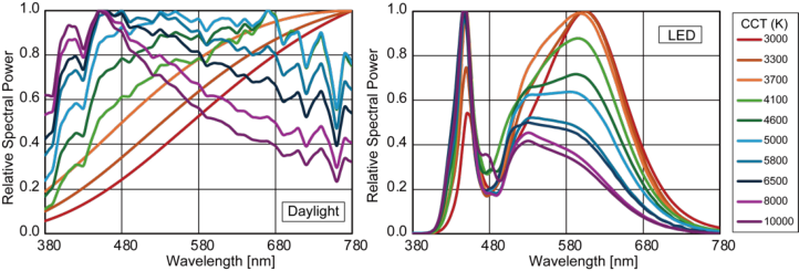
For each illuminant type, ten CCT values (3000 K, 3300 K, 3700 K, 4100 K, 4600 K, 5000 K, 5800 K, 6500 K, 8000 K, and 10,000 K) were selected, resulting in a total of 20 illuminant conditions. Table 1 presents the CCT, distance to Planckian locus in the u, v chromaticity diagram (Duv), chromaticity coordinates (u’, v’), CIE general color rendering index (Ra), and CIE color fidelity index (Rf) defined in CIE 224:2017, for each illuminant condition. The SPDs of the various illuminant conditions used in this study are shown in Figure 1, categorized by daylight and LED sources.
Table 1: Details of the 20 illuminant conditions considered in the current work.
Figure 1: Spectral power distributions (SPDs) in each illuminant condition.
Effects of Light Color on Visual Evaluation of Sorolla’s Outdoor Paintings 143 Paintings as Visual Targets
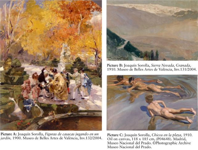
In this research, three paintings depicted by Joaquin Sorolla were selected as the visual stimuli. Figuras de casacas jugando en un jardín (1900, oil on canvas, 175 × 137.3 cm, Museu de Belles Arts de València) depicts individuals dressed in court attire engaging in leisure activities within a garden characterized by autumn foliage. Sierra Nevada, Granada (1910, oil on canvas, 63.2 × 95.5 cm, Museu de Belles Arts de València) presents a landscape view of the Sierra Nevada mountain range in Spain. Chicos en la playa (1909, oil on canvas, 118 × 185 cm, Museo del Prado) portrays boys reclining on the beach along the Valencian coast around midday during the summer season. In the current paper, these three Sorolla’s paintings are denoted by letters A, B and C, as shown in Figure 2.
Figure 2: Three paintings by Joaquín Sorolla used as visual targets in the experiment.
Generating Digital Images of Paintings First, we measured the spectral radiances of the surfaces of the three mentioned paintings, displayed on the walls of exhibition rooms in each museum, using a two-dimensional spectroradiometer [TechnoOptis/SR-5100]. To calculate the spectral reflectance of the paintings, the spectral radiance of a white reference plate was also measured under the same illumination. Next, we generated digital images of each painting under 20 illuminant conditions indicated in Table 1, using the measured spectral reflectance values of paintings, spectral power distributions of mentioned illuminants, and calibration data of an LC-display [EIZO/ColorEdge CG2700X] used in our experiments. The digital reproduction on the LC-display is theoretically
identical to the illuminated painting under any fixed illuminant condition. The vertical illuminance at the center of each painting in the simulation was set to 200 lx. A total of 60 images were generated by using the 20 different illuminant conditions for each of the three selected paintings.
Experimental Procedure The generated digital images of the paintings were displayed in the LC-display located in a dark room. The display was rotated to a portrait orientation for painting A and to a landscape orientation for paintings B and C. Participants observed each image at a visual distance of 50 cm which is equivalent to observation of real-size paintings at distances of 222.5 cm for A, 100 cm for B and 187 cm for C.
First, participants were asked to rate the perceived season and time of day using integers 1 to 12 for months, and 0 to 23 for time. Next, they evaluated “overall impression of the painting” using eight adjective pairs, ‘cool – warm’, ‘muddy – clear’, ‘dull – vivid’, ‘artificial – natural’, ‘dark – bright’, ‘blurred – crisp’ ‘static – dynamic’ and ‘gloomy – cheerful’ using a numerical scale from -5 to +5, where negative and positive numbers indicate left and right mentioned opponent adjectives, respectively. They also rated “impression of details within the painting” by answering two questions for each painting: “Feeling rich colors of foliage,” and “Feeling dynamism from the persons” for painting A, “Feeling the depth of the mountains” and “Feeling the unevenness of the snow-covered mountain surface,” for painting B, and “Feeling the movement of the water” and “Feeling the brilliance of light reflected on the skin” for painting C. Finally, participants evaluated “overall preference” of painting under each illuminant condition on a scale from -5 (‘strongly dislike’) to +5 (‘strongly like’).
A panel of twenty individuals with normal color vision (10 men and 10 women) living in Spain with a mean age of 21.3 years (SD = 2.81 years) performed this experiment. Each observer evaluated 60 images: An image was presented and after 10 seconds the observer evaluated all items mentioned in the previous paragraph; next the experimenter presented a black screen for 10 seconds, before the next image was evaluated by the observer.
RESULTS AND DISCUSSION
Evaluations for the Perceived Season and Time of Day To analyze the effects of illuminant characteristics on the perception of time and season, multinomial logistic regression models were constructed. Likelihood ratio tests were subsequently performed to evaluate the contribution of CCT and SPD to the model fit. In this study, the SPD factor specifically represents the qualitative difference between the two spectral types: daylight-simulating and LED-based spectra. For both evaluation types and all three paintings, the inclusion of CCT significantly improved the model fit compared to the null model (all P < 0.001), while adding SPD to the CCT-based model provided no significant improvement (Time of day: P > 0.751, Season: P > 0.211). These results consistently indicate that CCT, rather than SPD, serves as the
Effects of Light Color on Visual Evaluation of Sorolla’s Outdoor Paintings 145 decisive determinant for participants’ judgments of both the temporal and seasonal contexts depicted in the paintings.
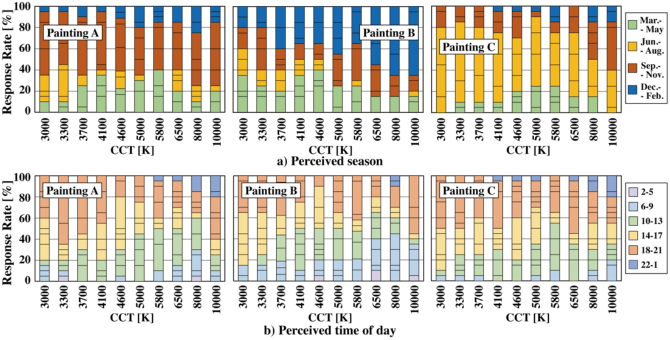
Figure 3 presents the evaluation results for perceived season and time of day, focusing on the 10 LED illuminant conditions as representative data. Regarding the perceived season (Fig. 3a), more than 45% participants evaluated the scene of the painting A as autumn (Sep.–Nov.) across all CCTs, due to the original warm palette of the foliage, exceptionally high at lower CCTs (3000–4000 K). For painting B, the response winter (Dec. – Feb.) was most frequent under CCTs ranging from 5000 K to 10000 K. In particular, the response rate at 8000 K and 10,000 K exceeded 65%, indicating a strong tendency for the scene to be perceived as winter as the CCT increased. The bluish shadows within the snow harmonized with the cool illuminant, intensifying the impression of a harsh, cold climate. For painting C, summer (Jun.–Aug.) was the predominant response across most conditions, exceeding 70% at 3000–3700 K. However, at 10,000 K, 45% of participants identified the season as autumn (Sep.–Nov.). This shift aligns with previous findings where CCT significantly influences seasonal perception. High CCTs evoke winter in general landscapes, the departure from the optimal summer range (5000–6500 K) in painting C likely introduced a seasonal ambiguity, leading observers to perceive the clear but cooler light as autumnal.
Regarding the perceived time of day (Fig. 3b), a consistent trend was observed across all three paintings: lower CCTs were predominantly linked to afternoon and evening hours (14:00–21:00). As CCT shifted to higher values, there was a marked increase in morning (06:00–09:00) and midday (10:00–17:00) responses. This indicates that observers rely heavily on the CCT of the illuminant to decode the diurnal context of the paintings, correlating warmer light with sunset and cooler light with daylight hours.
Figure 3: Results for perceived season and time of day under LED illuminants.
Evaluations for the Impression and Preference A two-way ANOVA was conducted using R (ver. 4.5.0) to examine the effects of CCT and SPD on psychological impressions and overall preference of the paintings. As shown in Table 2, a significant effect of CCT was observed
for most items across all paintings. In contrast, the effect of SPD and its interaction with CCT were significant only for a limited number of items, such as “dull–vivid” in painting B and “gloomy–cheerful” in painting C.
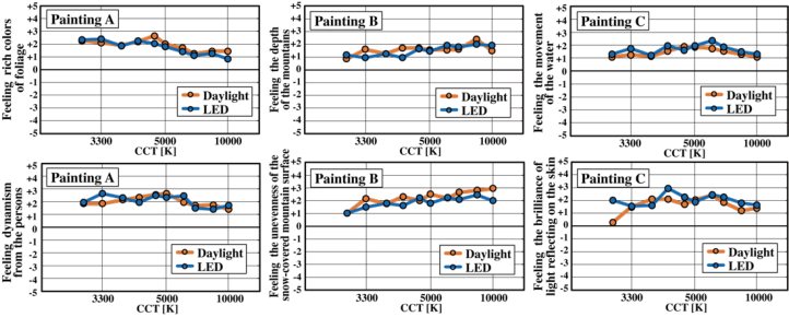
Figure 4 illustrates the mean evaluation scores for two specific items of each painting across different CCTs and SPDs (daylight vs. LED). For painting A, both “Feeling rich colors of foliage” and “Feeling dynamism from the persons” show a general downward trend as CCT increases beyond 5000 K. The scores remain in the positive range (+1 to +3), suggesting that lower to mid-range CCTs (around 3000-5000 K) enhance the perceived color richness and dynamism of the scene more effectively than higher CCTs. For painting B, “Feeling the depth of the mountains” and “Feeling the unevenness of the snow-covered mountain surface” exhibit an upward trend as CCT increases. Interestingly, the “Unevenness of the snow-covered mountain surface” rating reaches its peak at highest CCTs (around 8000–10,000 K), suggesting that bluish light enhances the shadows and structural details of the snowy landscape, reinforcing the winter perception noted in previous results. For painting C, “Feeling the movement of the water” and “Feeling the brilliance of light reflected on the skin” show relatively stable positive ratings across the CCT range, with a slight peak around 4000–6500 K. The “Brilliance of light reflected on the skin” results show a significant effect for both CCT and SPD (P < 0.05), which is visible in the plot where the LED condition occasionally yields higher scores than the daylight condition, particularly at 4600 K. This indicates that the spectral peaks of LEDs may enhance the perceived luster of highlights on skin textures more than daylight spectra.
Table 2: Summary of two-way ANOVA results for psychological impressions and preference across three paintings.
Table available in the original PDF paper.
Painting A Painting B Painting C
Evaluation Items CCT / SPD / Int. CCT / SPD / Int. CCT / SPD / Int.
Preference 0.230 / 0.677 / 0.785 0.001** / 0.269 / 0.905 0.009** / 0.207 / 0.408 *P < .05, **P < .01, ***P < .001 Notes: Specific items correspond to the following evaluation criteria for each painting: † Painting A: Rich colors of foliage; B: Depth of the mountains; C: Movement of the water. ‡ Painting A: Dynamism from the person; B: Unevenness of the snow-covered mountain surface; C: Brilliance of light reflected on skin.
Figure 4: Evaluation results for two specific items of each painting.
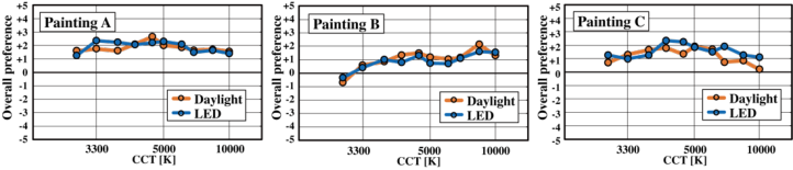
The overall preference scores across different CCTs and SPDs are shown in Figure 5. For painting A, preference scores remain consistently high in the positive range (+1 to +2.5). There is only a slight peak around 4000–5000 K, particularly under the LED condition. As CCT increases beyond 6500 K, the preference shows a gradual decline. This suggests that for scenes depicting rich foliage and human activity, participants prefer a balanced or slightly warm white light that emphasizes color richness and vitality. For painting B, a distinct upward trend is observed as CCT increases. At the lowest CCT (around 3000 K), the preference score is negative (below 0), indicating that yellowish light is perceived as unsuitable for this snowy mountain scene. Preference scores turn positive above 3300 K and continue to rise, peaking at high CCTs, around 8000–10,000 K. This correlates with the increased ratings for “Depth of the mountains” and “Unevenness of the snow-covered mountain surface” at high CCTs, suggesting that bluish light is essential for effectively conveying the crisp, cold atmosphere of a winter landscape. For painting C, preference ratings are relatively stable across the mid-to-high CCT range (3300–8000 K). However, a sharp drop in preference is observed for the daylight condition at 10,000 K, while the LED condition at this CCT maintains a higher score. This aligns with the significant effect of SPD observed for “Brilliance of light reflecting on skin” in this painting. This suggests that for scenes with intricate light reflections (like water and skin), the specific spectral peaks of LEDs might provide a more “distinct” and “vivid” impression than high-CCT daylight.
Figure 5: Evaluation results for the overall preference.
CONCLUSION
This study concludes that correlated color temperature (CCT) is the dominant factor in determining the visual appearance and psychological impressions of Sorolla’s paintings considered in this work. While the influence of spectral power distribution (SPD) was negligible for most evaluations, CCT significantly influenced perceived seasonality, time of day, and overall viewer preference.
The effectiveness of specific lighting was highly dependent on the painting’s content: mid-range CCTs, 4000–5000 K, best complemented the vitality of autumn scenes, and a similar range of 4000–6500 K was preferred for the summer seaside scene to capture its natural brilliance. In contrast, high CCTs, 8000–10,000 K, were essential for conveying the crisp texture and atmosphere of winter landscapes.
These results underscore the importance of “atmospheric congruency”, aligning the CCT of light with the environmental cues of the depicted scene, as a much more critical factor for viewer appreciation than the differences of SPD. Consequently, for museum lighting design, current findings highlight the necessity of tailoring CCT to the specific visual characteristics of each artwork to optimize the viewer’s experience.
ACKNOWLEDGMENT
We would like to express our sincere gratitude to the Museo de Bellas Artes de Valencia (Valencia, Spain) and the Museo Nacional del Prado (Madrid, Spain) for allowing us measurements of Sorolla’s artworks. Also, we would like to thank Masato Nagata for generating digital images of the paintings. This study was supported by JSPS KAKENHI Grant Number JP23KK0185 and Ministry of Science and Innovation of Spain, PID2022-138031NB-I00.
REFERENCES
Bhattacharjee, A., Pal, S. (1996) “Effect of color temperature on appearance of paintings exhibited under LED lighting”, Color Res. Appl. 44, 762–771. CIE 224:2017. CIE 2017 Colour Fidelity Index for accurate scientific use. CIE
Central Bureau, Vienna, 2017. CIE 015:2018. Colorimetry, 4th Edition. CIE Central Bureau, Vienna, 2018 Museo de Bellas Artes de Valencia. (n.d.). Figuras de casacas jugando en un jardín.
Retrieved January 23, 2026. Museo de Bellas Artes de Valencia. (n.d.). Sierra Nevada, Granada. Retrieved January 23, 2026. Museo Nacional del Prado. (n.d.). Chicos en la playa. Retrieved January 23, 2026. Nascimento, S.M.C. and Masuda, O. (2014) “Best lighting for visual appreciation of
artistic paintings –experiments with real paintings and real illumination”, J. Opt. Soc. Am. A , 31(4), 214–219. Nascimento, S.M.C., Herdeiro, C.F.M., Gomes, A.E., Linhares, J.M.M., Kondo, T., Nakauchi, S. (2021) “The best CCT for appreciation of paintings under daylight illuminants is different for Occidental and Oriental viewers”, LEUKOS 17(3), 310–318.
Effects of Light Color on Visual Evaluation of Sorolla’s Outdoor Paintings 149 Okuda, S., Taguchi, S., Okajima, K., Gómez-Robledo, L., Melgosa, M. (2020) “Effect
of lighting on visual appearance of Japanese woodblock print painting (Ukiyo-e) for Spanish observers”, AIC 2020 Symposium Natural Colours, 352–355. Okuda, S., Yagi, S., Taguchi, S., Okajima, K., Melgosa, M. (2023) “Influence of lighting colour on visual evaluation of landscape paintings – Focus on some Claude Monet’s artworks”, IASDR2023, International Association of Society Design Research. Pinto, P.D., Linhares, J.M.M., Nascimento, S.M.C. (2008) “Correlated color
temperature preferred by observers for illumination of artistic paintings”, J. Opt. Soc. Am. A, 25(3), 623–630. Planck, M. (1901) “Ueber das Gesetz der Energieverteilung im Normalspectrum”, Annalen der Physik, Vol. 4, No. 553, 553–563. Zhai, Q.Y., Luo, M.R., Liu, X.Y. (2015) “The impact of illuminance and colour
temperature on viewing fine art paintings under LED lighting”, Lighting Res. Technol. 47(7), 795–809.
LISTED IN THE AHFE DIGITAL BOOKSTORE CATALOGUE
Explore the complete digital volume
Human Factors and Ergonomics In Design
Read this individual research paper free through the original publisher, or explore the full digital proceedings book.
ISBN 978-1-964867-86-1
Explore this ISBN in the AHFE Bookstore ↗Listed in the July 2026 bookstore catalogue; search by ISBN to confirm current availability · Digital book purchase optional