Andi St Clair, Alex Chaparro (2023). Automotive Head-Up Displays (HUDs): Considerations for Color-limited Users. In: Human Factors in Accessibility and Assistive Technology. AHFE Open Access, vol. 87, pp. 26–32. https://doi.org/10.54941/ahfe1003650
Head-Up-Displays (HUDs) were initially developed for use in aircraft to provide the pilot with essential aircraft flight information aid while flying. The HUD allows the pilot to view primary flight information overlaid on the external scene without the necessity of looking down inside the cockpit at their instruments. Thus they can maintain their gaze outside of the cockpit during critical phases of flight like landing while still having access to critical flight information like altitude, speed, and heading. HUDs have also been adapted to ground vehicles. The first production vehicle with a HUD was the General Motors Cutlass Supreme, in 1988 (Weihrauch et al., 1989). Over 30 companies have implemented this technology into select vehicle models (Korentsides et al., 2021). This technology is also gaining traction among aftermarket manufacturers that offer hardware that owners can integrate into their vehicles. Information typically displayed on a HUD includes safety alerts, navigation directions, and the status of vehicle parameters such as speed. The systems allow drivers to customize the information they see displayed and they can change the information based on the situation. Most HUDs employ a limited color palette of red, green, yellow, and sometimes blue to code information and to represent hazards or risks. Typically alphanumeric information in aviation and automotive applications is rendered in bright green that is visible across a wide range of external illumination conditions. The use of color in consumer products poses some challenges because approximately 8% of the male population and a much smaller percentage of women have color deficiencies that affect their ability to discriminate among some hues including the widely used red, green, and yellow hues (Chaparro & Chaparro, 2017). By recognizing this issue, designers, engineers, and human factors practitioners can ensure that all users, irrespective of their visual status, can use their systems safely. In this paper, we explore different strategies to ensure that information is accessible to users regardless of their visual status. The strategies include using redundant coding so that critical information is encoded using multiple stimulus dimensions (e.g., brightness, color, saturation, texture, font, etc). We also discuss the use of software applications that simulate how any color combination might appear to persons with different color limitations allowing designers to evaluate different color codes or palettes.
Head-up Displays (HUDs) are standard in many military aircraft and can also be found in some commercial and private planes (Cider et. a. 2020). The HUDs aid the pilot in targeting, landing, and providing access to primary flight information such as airspeed, altitude, heading, and the horizon line. Gilbert Klopfstien, a French test pilot, developed the first modern HUD and standardized the symbology and display layout making it easier for pilots to adapt to a different aircraft (Connor 2017). HUDs have found broader applications across a range of transportation applications including water vehicles, spacecraft, and automobiles (Cider et. al. 2020).
The first production vehicle with a HUD was the General Motors Cutlass Supreme, in 1988 (Weihrauch et. al., 1989). While the use of HUDs in vehicles has increased, this technology is not widely available (Korentsides
Automotive Head-Up Displays (HUDs): Considerations for Color-Limited Users 27
et al., 2021). Unlike military and commercial aviation, consumer applicati- ons lack a standardized symbology set or form factor. Some applications use the entire windscreen while others consist of a smaller optical display (Stumpf 2021). Consumers can also purchase a HUD as an add-on from a third-party manufacturer if their vehicle does not already come equipped with one.
The consumer user population is considerably more heterogeneous than the population of military or commercial aviation pilots. This is particularly relevant considering the design and use of color in HUDs to convey infor- mation about object identity or hazard risk. While commercial and military pilots are screened for color deficiencies, this is not an exclusion criterion for driving licensure. The use of some sets of colors may pose a problem for drivers with color deficiencies, especially when faced with detecting and identifying hazard warnings under time constraints.
The Americans With Disabilities Act (ADA) addresses color deficiency and offers guidelines for the use of color and acknowledges that the needs of peo- ple with color deficiencies are not widely reflected in the design. The ADA states, “Products must provide at least one mode that allows access to all functionality without relying on users’ perception of color” (ADA website) and the ADA “requires {that} disabled people receive equal or comparative access to information” (Jenny & Kelso, 2007). The ADA also states that “Color must not be used as the only visual means of conveying informa- tion, indicating an action, prompting a response, or distinguishing a visual element” (United States Access Board, 2010). Information should be com- municated effectively and not place individuals with color deficiency at an unnecessary disadvantage.
In this paper, we describe different types of color limitations and how they affect the perception of the user. Then we will describe the difference betw- een preference and performance in design and how this can inform design decisions. Additionally, we explore different strategies to ensure that infor- mation is accessible to users regardless of their visual status. We also discuss the use of software applications that simulate how any color combination might appear to persons with different color limitations allowing designers to evaluate different color codes or palettes.
LITERATURE REVIEW
Color Normal v Color Limited Approximately 9% of the population, 8.1% male and.43% female, have a color deficiency and cannot discriminate between certain hues. While 9% may not seem like a lot, considering the U.S. population is about 334 mil- lion; 30 million people have some form of color limitation. There are three general forms of color deficiency including monochromacy, dichromacy, and anomalous trichromacy. Monochromacy is very rare and affected indivi- duals lack two of the three types of cone photoreceptors referred to as the long-wavelength photoreceptor, middle-wavelength photoreceptor, and short-wavelength photoreceptors typically found in the human retina. Their perceptual experience consists of solely brightness differences varying betw- een black and white like a black-and-white photograph. Dichromacy is more
28 StClair and Chaparro
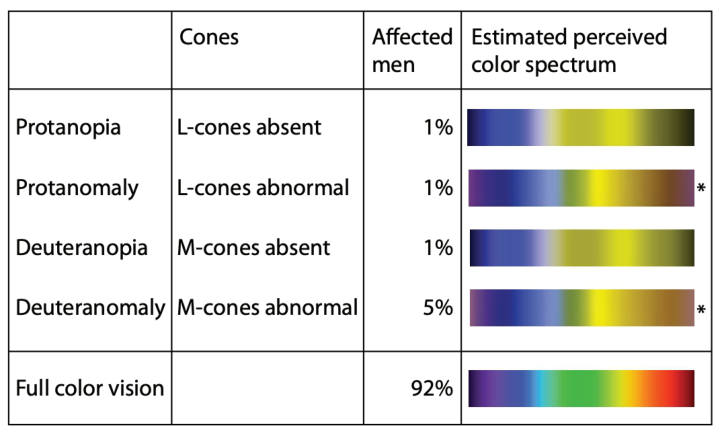
Figure 1: Forms of red-green confusion, percentage of affected men and color perce- ption of the spectrum (from Jenny & Kelso, 2007).
common and is associated with a loss of one of the three types of cones. The most common forms of dichromacy--protanopia and deuteranopia--are asso- ciated with the absence of the long-wavelength and middle-wavelength pho- toreceptors, respectively. These individuals report difficulty discriminating between many pairs of hues including the frequently cited red and green hues. Anomalous trichromacy is more common but the disturbances of color vision are less severe than those reported by dichromats (Chaparro & Chaparro 2017). Typically these color disturbances concern shifts in the assi- gnment of color to the spectrum relative to those of observers with normal color vision (Jenny & Kelso, 2007) thus appearing less vibrant.
Color deficiency not only affects color discrimination but can also slow perception of some hues. A study by Atchison et al. (2003) found that par- ticipants with deuteranopia and protanopia were slower to identify a red light than participants with normal color vision and that deuteranopes were slower than protanopes. This highlights an important safety consideration regarding the use of color coding in HUDs especially when color is used to convey safety-relevant information such as hazard identity or risk.
Appropriate Color Use in General Design In aviation, HUD symbology is displayed against a relatively homoge- nous background whereas the background terrestrial environment will be much more varied. HUD text and symbology are usually rendered in green to ensure legibility under bright illumination conditions and prevent blending of the information into a background, regardless of the color (da Silvia Rosa et. al., 2017). Newer display technology allows the use of a broader color palette however in aviation applications the use of color is
Automotive Head-Up Displays (HUDs): Considerations for Color-Limited Users 29
codified and regulated whereas this is not the current case for consumer applications.
Color can be useful to convey information on a display, but the excessive use of color can be distracting. Larger color palettes allow designers to high- light different classes of road hazards (e.g., stop signs, pedestrians, cyclists, other cars) using different colors. Studies of visual search show that searching for multiple targets of the same type is faster if said targets are the same color (such as pedestrians), however, searching for a single target (i.e., a stop sign) is faster if that target is defined by a unique hue (Wickens & Andre 1990) and may be slowed depending on the number colors and the number of uni- que stimuli highlighted on the display. The designer risks increasing display clutter which decreases search performance and the ability of the user to find the most relevant information (Wickens & Andre 1990).
Preference Versus Performance Although users often prefer colored displays to monochromatic displays, experimental evidence shows that they do not necessarily lead to better user performance (Andre & Wickens, 1995). For instance, Jeffrey and Beck (1972) tested photo interpreters and found that color did not improve the detection and identification of image details contrary to the participants’ expectati- ons. Similarly, Merwin and Wickens (1993) investigated the use of color in data visualizations and found that color benefited tasks involving abso- lute judgments of intensity levels whereas monochromatic images (e.g., gray scale) were superior for relative judgments. They found that users preferred the color display every time even though their performance was often worse (Reising and Calhoun, 1982; Schutz,196; Martin, 1984; Krebs et. al., 1978; Christ, 1975; Jeffery & Beck, 1972; Merwin & Wickens 1993). Table 1 shows situations when color should be used in design and when it shouldn’t.
Redundant Coding The use of redundant coding can ensure that color deficient users can discriminate stimulus differences that might otherwise not be accessible to them. For example, the redundant use of color, shape, and brightness diffe- rences provides multiple ways to encode the same information. Interestingly, not all redundant codes are created equal. Simons and Overmeyer (1984) evaluated the effect of redundant shape and color on retrieval times. They presented participants’ stimuli sequentially on a screen and asked them to judge whether the second stimulus was the same or different than the first. Redundant shape coding (shape+color) was significantly faster than the
Table 1. Preference v. Performance (Adapted from Andre & Wickens, 1995).
Table available in the original PDF paper.
Color is appropriate Color is not appropriate Qualitative judgments Quantitative judgments Attracting attention in clutter Attracting unnecessary attention Discriminating confusable items
30 StClair and Chaparro
color coding group (409 ms vs 540 ms) but was not significantly faster than the shape coding group (456 ms) (Simons & Overmeyer, 1984). Thus, color coding alone was significantly slower than redundant coding using shape and color.
Designers can use shape to convey the same message as the color with lit- tle worry as to how color-limited users will perceive it. A study testing the discriminability of a target using color coding, orientation coding, and redun- dant coding (color+orientation) on reaction time (RT) found that redundant coding had no significant effect on RT. That is, a target that was defined by a different orientation or color was detected equally as fast as a target that employed redundant coding (different color and orientation). Howe- ver, under conditions where the chromatic difference between the target and non-targets was low, the orientation difference was significantly more discri- minable (Monnier 2003). This finding illustrates how redundant coding aids information transmission under conditions where access to stimulus proper- ties (e.g., color, shape) might be degraded by environmental conditions (e.g., rain, darkness, etc) or visual conditions such as color deficiency.
Map design offers a compelling example of how careful design can accom- modate the needs of users with color deficiency. Jenny and Kelso (2007) outline how the use of line weight (thin, bold), line hatching pattern (dot- ted, dashed, and solid), color, and brightness can be leveraged to distinguish between classes for information while ensuring all readers can use the map.
Tools Several online tools are available to simulate color limitation so that desi- gners can get a better understanding of what a design looks like to someone with a color limitation. Jenny and Kelso (2007) highlighted Color Oracle in their paper noting it is accessible on Mac OS X and Windows. This applica- tion also allows the user to toggle between color normal and color limited to maintain a desired aesthetic. Vischeck is another tool that can be downloaded on a number of platforms as a Photoshop plug-in (“About Vischeck,” 2016). This site is not fully functional according to Chaparro & Chaparro. Addi- tionally, Colorbrewer (Brewer, 2016) allows users to select the color scheme they need for map development and is a sophisticated and well designed tool (Chaparro & Chaparro, 2017).
CONCLUSION
With almost 9% of the population having some form of color limitation, designers should consider the implications when it comes to using color in a display like a HUD. The majority of people with color limitations have trou- ble discriminating between reds and/or greens, therefore, designers should use discretion with these colors when designing. The use of redundant coding would aid users with color limitations as they would not have to rely on the meaning of the color and could instead use the redundant code (i.e. line wei- ghts, hatching patterns, or shapes). The use of redundant coding would also adhere to ADA recommendations that color cannot be the only means of communicating information. There are plenty of tools for designers to utilize
Automotive Head-Up Displays (HUDs): Considerations for Color-Limited Users 31
when designing with color so they can simulate a color limitation and better understand 9% of their users’ visual status.
Vehicle HUD displays a variety of information including speed, direction, alerts about incoming calls/texts, music, time, gas level, etc. Future systems like those being developed by Volvo will use the entire windscreen instead of only utilizing a small portion of the windscreen directly in front of the driver. The system will alert the driver to different types of road hazards or display accessory information (e.g. rest stops, eating options, or gas stations) as well (Stumpf, 2021). These advances pose significant design challenges requiring careful consideration of the diverse user population and how to accommodate their needs. Based on the literature review, we recommend that HUDs:
Limit the number of colors used in the design
Utilize redundant coding
Allow users to modify things like brightness and what information is being displayed
Minimize clutter by limiting the amount of information being displayed at a time Further research should be done to ensure the effectiveness of HUDs in automotive vehicles. There is limited research on the effects of background interference with the HUD. This can interfere with chosen colors and make them appear less salient or even blend in, therefore, becoming less effective. There is no evidence of research including individuals who experience color limitations in this context, either. Additionally, regardless of whether univer- sal coloring or redundant coding is used in the design or not, user testing should be done to ensure the target audience can effectively and safely use this feature.
REFERENCES
About Vischeck. (2016). Retrieved from www.vischeck.com/vischeck/ Andre, A. D., & Wickens, C. D. (1995). When users want what’s not best for them.
Ergonomics in design, 3(4), 10–14. Atchison, D. A., Pedersen, C. A., Dain, S. J., & Wood, J. M. (2003). Traffic signal color recognition is a problem for both protan and deutan color-vision deficients. Human factors, 45(3), 495–503. Chaparro, A., & Chaparro, M. (2017). Applications of color in design for color-
deficient users. ergonomics in design, 25(1), 23-30. Christ, R. E. (1975). Review and analysis of color coding research for visual displays. Human Factors, 17, 542–570. Connor, G. (2017). Garmin offers a new HUD. Professional Pilot, 51(8), 46–50.
Retrieved from https://online.propilotmag.com/ Crider, J., Greene, J., & Morey, S. (2020). Digital Daimons: Algorithmic Rhetorics of Augmented Reality. Computers and Composition, 57, 102579. da Silva Rosa, D. L., Peinecke, N., & Ernst, J. M. (2017, May). Review of colored
conformal symbology in head-worn displays. In Degraded Environments: Sensing, Processing, and Display 2017 (Vol. 10197, pp. 231-239). SPIE.
32 StClair and Chaparro
Jenny, B., & Kelso, N. (2007). Color Design for the Color Vision Impaired.
Cartographic Perspectives, (58), 61–67. Korentsides, J., Clair, A., Dyapa, M., Chaparro, A. (2022). Head-Up Displays: Analysis of automotive use considerations. In: Matteo Zallio (eds) Human Factors in Accessibility and Assistive Technology. AHFE (2022) International Conference. AHFE Open Access, vol 37. AHFE International, USA. https://doi.org/10.54941/ ahfe1001642 Krebs, M. J., Wolf, J. D., and Sandvig, J. H. (1978). Color display design guide (Office of Naval that provide superior Research ReportONR-CR213-136-2F). Arlington, VA: ONR. Martin, K. W. (1984). Display visual performance prediction in military cockpit envi-
ronment. In C. P. Gibson (Ed.), Proceedings of the Workshop on Colour Coded vs. Monochromatic Electronic Displays (pp. 7.1–7.5). Farnborough, England: Royal Air Force Establishment. Merwin, D. H., and Wickens, C. D. (1993). Comparison of eight color and gray scales for displaying continuous 2D data. In Proceedings of the Human Factors and Ergonomics Society 37th Annual Meeting Society (pp.1330–1334). Santa Monica, CA: Human Factors and Ergonomics Society. Monnier, P. (2003). Redundant coding assessed in a visual search task. Displays,
24(1), 49–55. Nathan, J., Henry, G. H., & Cole, B. L. (1964). Recognition of colored road traffic light signals by normal and color-vision-defective observers. Journal of the Optical Society of America, 54, 1041–1045. Okabi, M., & Ito, K. (2002, rev. 2008). Color universal design (CUD): How to make
figures and presentations that are friendly to colorblind people. Retrieved from jfly.iam.u-tokyo.ac.jp/color/ R. Dougherty and A. Wade: http://www.vischeck.com/daltonize/ Reising, J. M., and Calhoun, G. L. (1982). Color display formats in the cockpit: Who needs them? In Proceedings of the Human Factors Society 26th Annual Meeting (pp.446–449). Santa Monica, CA: Human Factors and Ergonomics Society. Schutz, H. G. (1961). An evaluation of formats for graphic trend displays- Experi-
ment II. Human Factors, 3, 99-107. Simon, J. R., & Overmeyer, S. P. (1984). The effect of redundant cues on retrieval time. Human factors, 26(3), 315–321. Stumpf, R. (2021). Volvo wants to turn your entire windshield into a heads-up
display. Popular Science. Retrieved December 27, 2021, from https://www.popsci .com/technology/volvo-spectralics-windshield-hud-display/ United States Access Board. (2010). Guidelines and standards for access. Retrieved from www.access-board.gov/guidelines-and-standards Weihrauch, M., Meloeny, G. G. and Goesch, T. C. (1989). The first head up display
introduced by general motors (No. 890288). SAE Technical Paper. Wickens, C. D., & Andre, A. D. (1990). Proximity compatibility and information display: Effects of color, space, and objectness on information integration. Human factors, 32(1), 61–77. Aug2017/Default/25/0#&pageSet=25.
LISTED IN THE AHFE DIGITAL BOOKSTORE CATALOGUE
Explore the complete digital volume
Human Factors in Accessibility and Assistive Technology
Read this individual research paper free through the original publisher, or explore the full digital proceedings book.
ISBN 978-1-958651-63-6
Explore this ISBN in the AHFE Bookstore ↗Listed in the July 2026 bookstore catalogue; search by ISBN to confirm current availability · Digital book purchase optional