Carlo Martino, Laura Ricci, Sabrina Lucibello, Davide Fornari, Vincenzo Maselli, Lorena Trebbi, Alessio Caccamo, Silvia Cosentino, Carlotta Belluzzi Mus, Eugenia Maria Canepone (2022). Brand Design Strategy for Public Administration. An experimentation on Lazio Region’s Employment Centers in Italy. In: Ergonomics In Design. AHFE Open Access, vol. 47, pp. 299–309. https://doi.org/10.54941/ahfe1001949
The paper deals with the theme of public services through the lens of Design and intends to report experiences and preliminary results of the research project aimed at the Employment Centers of the Lazio Region, which develops a Brand Design Strategy for the renewal of the service through an activity structured in distinct operational phases. In fact, the discipline of Design has the role of guiding a conscious structure of the brand in a systemic perspective, which, in addition to the visual identity, includes the service and spatial design, promoting accessibility, inclusiveness and usability. A case of methodological experimentation that aims to establish itself as a case of national best practice.
≪Design of public service is itself an essential public service≫(FDIP in Dal Buono et al. 2020, p.11). The admonition contained in this sentence is one of the most sensitive points of the decalogue drafted by the designers involved in the Federal Design Improvement Program, the design program for Public Administration (PA) initiated by the US President Richard Nixon in 1972 and which had the purpose of “coordinating” all the communica- tion interfaces of PAs in the United States, from Architecture to Interior, up to visual communication (Sinni, 2018; Dal Buono et al. 2020). An exhor- tation that invited to approach the public service system in a design sense, interpreting this activity as “essential” for its effectiveness, and that in the decade of the Program’s activity had been applied to different areas of the U.S. PA involving high-level graphic designers such as Massimo Vignelli. After more than 50 years, many people in Italy are now aware that Design
is an essential part of the project of public services and PA, since it can inte- rvene both on consolidated areas, already identified by FDIP in 1973, such as visual communication and interiors, and on new project fields emerged with the digital revolution such as UX, Interaction and Service Design (Sinni, 2020), but it can intervene especially on the whole “strategy” of re-design of PA.
THE REFORMING ROLE OF BRAND DESIGN FOR PUBLIC ADMINISTRATION In Italy, the story of “public utility” graphics dates back to the early 1970s, emerging in a professional and territorial context that wanted to break free from commercial graphics and ≪free itself from Milan’s primacy and assert its own dignity, both graphic and cultural≫(Rauch, 2017, p. 219), addressing a potential market represented by political and administrative institutions. In the background there was a sensitive change in the internatio- nal and national political scenario: the long wave of the movements of ‘68 and the changes in the political structure of many municipalities. It never became a full-fledged movement but found followers throughout the country who identified public service graphics as ≪an exercise in democratic practice≫ (Fedriga, 2006, p. 26) through visual communication. One of the main pro- tagonists was the graphic designer Massimo Dolcini, who turned his work with the municipal administration of Pesaro into a field of experimentation of new languages of institutional communication that became a school for the whole world (Piazza, 2015).
Today, the choice to apply Brand Design Strategy to PA is left to the free initiative of individual institutions, indeed to some actors of individual insti- tutions - often even in contrast in the same administration - and although the Italian digital agenda, at the end of 2015 had published the “Design Gui- delines for the Web of PA”, interpreted as a founding political act for the application of a coherent and coordinated project of the communication of the Italian State, it is possible to detect still today the incompleteness of the project starting from the very sites of the ministries, mirror of the individual and autonomous corporate image (Sinni, 2018).
Research Methodology The research developed by the team coordinated by Carlo Martino and Laura Ricci of the PDTA Department – Sapienza University of Rome, for the Depar- tment of “Labor and New Rights, Training, School, Reconstruction Policies, Personnel” of the Lazio Region, through the company LazioCrea SpA, is unprecedented in the context of collaboration activities between Universities and PA. Active recruitment policies are, in fact, at the center of the Euro- pean agenda and of the strategies of the Lazio Region which, like the entire system of Centri dell’Impiego Italiani - Italian employment centers (CPI), has recently inherited the management of them, at first the prerogative of the provinces. Councilor Claudio Di Bernardino, in accordance with the political and cultural strategies for the development of the Region defined by the new
Brand Design Strategy for Public Administration. An Experimentation 301
administration, has grasped the economic and social importance represented by the relaunch of the CPI, pursuing a radical reformist policy that invests the entire system starting from the Brand Strategy. It is useful to underline that the territorial network of the Employment Centers represents the only direct touchpoint of the administration with the citizen, unlike other areas of management of the regional administration such as, for example, health and the environment where this relationship is mediated by other subjects. The research team was first of all made aware of the active and reformist policies designed by the Department for the relaunch of the CPI, and set itself the main objective of giving, through research, a fundamental and substantial contribution to these policies. In fact, the strategic approach to the project of the Brand of the employment centers excludes a simple visual translation of an identity (Sinni, 2018) as an outcome of research and experimentation, in favor of the design of a real “semiosphere” able to originate and update a familiar sign environment, recognizable, consistent, and integrated. As a mat- ter of fact, ≪doing branding [...] means – first of all – recognizing that every single area of intervention of the communication project although endowed with its own specificities, works only if it is thought of as a tile of a larger mosaic, governed by the Design Strategy≫(Carmi, 2020, p.6). The Brand Design Strategy invests in fact the entire system of signs associated with the identity of the subject (public body) that is being represented, identifying some material and immaterial areas on which to decline: from Corporate Design to Editorial Design, up to Digital and Spatial Design (Carmi, 2020). So the design of the logotype is defined not only through the possible applicati- ons on signs, business cards or letterheads, as so far interpreted in the context of public clients, but lives and feeds for example on the new dynamic potential offered by spaces and digital devices (web platforms, apps, etc.) becoming a dynamic logo if not parametric, as well as completed in its integration in space through the design of wayfinding or spatial components (color and graphics of walls and floors, lighting, furniture, etc.). The analysis of benchmarking on Italian and foreign employment centers, both public and private, as well as the study of surveys administered to employees and users of the CPIs in Rome, has shown strong disparities between the public system, both Italian and foreign, compared to the private system – as seems obvious – where the private system for recruiting (cf. LinkedIn, Addecco, etc.) has instead fully understood the strategic importance of a slavish application of brand stra- tegy. It follows that the reformist approach sought by the administration of the Lazio Region finds its concrete realization in the pioneering application of Brand Strategy in Italy. Other regional administrations, such as those of Pie- dmont, Emilia Romagna, or Sardinia, for example, in redefining an identity project for employment services, have applied only in part advanced branding strategies, in some cases including Digital Design, while neglecting the cohe- rence and reinforcing role represented by editorial and Spatial Design. None of the Italian projects for employment centers has gone so far as to decline the brand concept in the physical space of the employment centers, a space that instead plays a fundamental interface role in the delivery of the service to the user.
RESEARCH AND DEVELOPMENT PHASES In the first two phases of the project the team of visual and interior designers conducted two parallel analyses, aimed at identifying the criticalities percei- ved by users and employees, the margins for improvement and at outlining set-up projects and visual strategies adopted by other job agencies active on the national territory and abroad, like the CPI of the Lazio Region.
Benchmarking and Survey: Analysis of the State of the Art At first the team collected and analyzed a bunch of case studies (bench- marking) selected on the basis of quality criteria of visual design choices, innovation, coherence, articulation and completeness of the Brand strate- gies. The absence of references, and the formulation of the selection and analysis criteria were the main issues that the design team dealt with in this first phase, also considering that there is no evidence of similar studies deve- loped by University research centers or other institutions. The reasons for this gap are arguably linked to national and international social and poli- tical contexts, since just recently, in the public sphere, the need to qualify these services in strategic terms has emerged. Five national job agencies were selected for the analysis, three public and two private, and fourteen inter- national ones, three public and eleven privates, and the selection followed parameters and indicators related to: (i) when the brand strategy or service rebranding project was carried out; (ii) how many offices and employees does the agency have, (iii) services reputation; (iv) if the project is recognizable in terms of graphic and communication choices. For each case study, a data sheet was drawn up. Subsequently, the visual strategy – including editorial design (fundamental characteristics, declinations of the brand identity) – the digital strategy (website, social platforms, online services offered), and the environmental/interior design was investigated, in order to outline an ove- rview of the most embraced design and communication choices, to identify the best practices, to compare the communication and graphic options, and the applied strategies, to understand the trends, and to draw up a plan to improve the satisfaction rate of the service/brand. It emerged that the “Brand Strategy” of the international private agencies has a more consistent stru- cture, demonstrating that it’s possible to strengthen identity and reputation through services with specific target and well-coordinated design parameters. The international public system, on the other hand, is less dynamic. Another preliminary activity carried out by the design team consisted of the constru- cting of a survey to be submitted to the Lazio Region CPI stakeholders. The survey aimed at acquiring information useful for defining requirements and values to consider in designing an effective Brand strategy. During the defini- tion of the survey objectives, and after a debate with the Client, the need to involve both employees and users of the CPI through two separate surveys emerged. In structuring the surveys, the personal questions - age, country of origin, etc. - have been integrated with requests about the education level, the knowledge of one or more languages, and the level of mastering digital tools. Furthermore, both groups of recipients - employees and users - was asked specific questions related to the perception of the current identity of the job
Brand Design Strategy for Public Administration. An Experimentation 303
agencies, to the quality and channels through which communication is conve- yed, and to the functionality, accessibility, and quality of spaces. The two final surveys count, respectively, 15 questions for the employees and 18 questions for users, and they were supposed to be answered both online (via Google module), and through anonymous answer sheet submitted in presence. The collected answers revealed important data related to the current perception of the quality, effectiveness and functionality of actual communication sup- ports, wayfinding and space set-up designed for the job agencies. As regards of the communication system, the most relevant data concerned the need to improve the website and to engage the social platforms as communica- tion channels. Finally, no less important, both employees and users suggest improving the use of classic communication supports, and the organization of public events.
Spatial Design Analysis As regards of the spaces, the main issues reported by employees concerned the lack of basic furniture and digital tools, as well as the lack of privacy during individual interviews. The orientation system and wayfinding, instead, recei- ved just a few critics about tangled spaces and often scarce or barely visible signs. The approach adopted by the Spatial Design team has been grounded on the scientific method and therefore structured according to the following main stages: observation, hypothesis formulation, experimentation, analysis of the results and eventual reiteration of the experiment. The process then was not linear, but rather cyclical and iterative, according to the results of experiments and observations. The experimentations conducted employed varied tools, from virtual to physical, such as drawings, illustrations, ren- derings, mockups, and prototypes. The material surface of objects indeed, represents a sensory casing equipped with sensitive areas (Zannoni, 2016), and therefore acts as “osmotic membrane” capable of favoring or inhibiting the exchange between inside and outside (Manzini, 1986; Dal Buono and Scodeller, 2016). Then, on-site investigations were made in three selected employment center headquarters – Cinecittà, Torre Angela and Testaccio – to provide a photographic report, identify typical common problems and observe the directional flows. As last step of the first stage of observation, the services provided by the employment centers were mapped, identifying the typology and location of each specialized area as well as the average time employed for each service. From this first stage a set of main problems and issues emerged, from which the main components of the project were derived and translated into keywords and directional axes. The main criti- calities emerged, were the unwelcoming spaces and furniture elements, often austere and cold, the poor lighting and the presence of confused and undefi- ned areas. The answers provided to solve such issues have been articulated in three macro concepts: (i) person / welcome of the staff which supports and accompany the user; (ii) change / sustainability of the project for a transition towards a circular system; (iii) openness / transparence of PA. The Spatial Design has been developed hand-in-hand with the visual design, interpreting from the spatial point of view the path undertaken. The goal was to find the
connection among visual elements, spatiality and services provided, develo- ping the brand strategy as a single whole, a cohesive and fluid concept where visual and Spatial Design strengthen one another, with the wayfinding as a key element which unifies these two faces of the project. The Spatial Design proposal complements the pure and sinuous geometries of the brand strategy with functional modular furniture able to adapt to the various needs of the different locations, proposing a vision of “soft contract” aimed at promoting a new idea of hybridization between office space and comfort of a domestic environment. The soft qualities of materials indeed, contribute to create a fulfilling emotional experience for the user. Therefore, the choice of mate- rials, textures, but also immaterial elements such as odors, sounds, colors, or light, represented an interesting design input, affecting the way the whole environment is perceived.
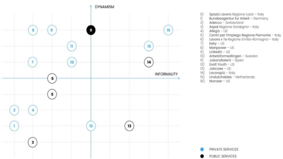
ANALYSIS OF HUMAN FACTORS After phases 1 and 2, it was necessary to define additional analysis tools that could highlight, on the one hand, the entirety of the user experience, and on the other hand performance, and emotional factors (Belluzzi Mus et al. 2021). The research team opted for the Service Design’s research tools (Stickdorn et al. 2018), as a discipline able to analyze – in a systemic and holistic perspe- ctive – a service considering crucial factors such as the role of the user and the context of use. Seven tools were identified divided by objective. For the (i) Analysis of stakeholders and degrees of interest related to the project and (ii) perceptually based comparison of market positioning and competitors, it’s been chosen the Stakeholder Map (Giordano et al. 2018) and Evaluation Matrix (Stevanovic et al. 2015). In particular, the Stakeholder Map clarifies the roles and relationships of the various players involved, allowing a more precise orientation of the project towards those figures considered core to the service under analysis. Similarly, the Evaluation Matrix (fig. 1) compa- red – from the point of view of visual perception – national and international services, both private and public, considered competitors of CPI. Through the construction of a comparison structured on two variables, dynamism and informality of visual identity, it was therefore possible to declare from the position of the existing project in the international scenario, paving the way for the drafting of the guiding objectives of the entire implementation and restyling project.
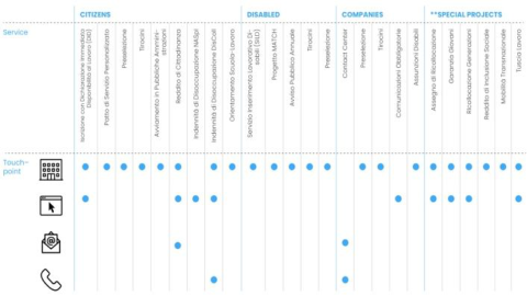
As can be seen from the graphs (see fig. 1), with respect to almost all the public services analyzed, the new Job Agency intends to fit into the flow of trends in European and international private agencies, implementing the degree of dynamism and attractiveness of the identity. For the (iii) Analysis of the touchpoints of the digital and physical services offered, (iv) General perceptual evaluation of the service experience, and (v) Qualitative evaluation of the accessibility of some specific services, it’s been chosen the Touchpoint map (Ieva and Ziliani, 2018), Empathy Map (Gibbons, 2018), and the SUS Questionnaire (Brooke, 1996). The construction of a map of the touchpoints relating to the various services provided by the agency has highlighted the difficulty of accessibility and usability through digital and telematic channels
Brand Design Strategy for Public Administration. An Experimentation 305
(see fig. 2). In fact, the overload of services that can only be used on the premises makes it difficult for users to navigate the site. Greater flexibility and digitalization of the system would greatly simplify the experience of users and operators in the management of Customer Journey actions.
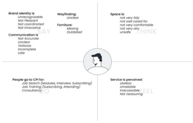
Mixing the interviews and surveys results, it was possible to visuali- zed them through the Empathy Map (see fig. 3), which highlighted strong criticalities in terms of perception of safety, and accessibility of services offered.
The Sus Questionnaire investigated the degree of accessibility of certain services - both physical and digital - offered by Employment centers. The sample selected is composed of 20 subjects (F = 10, M = 10) heterogeneous in age and nationality. Foreign subjects were not taken into consideration due to the lack of material in the language that would inevitably distort the results. The test analyzed three digital services: (1) search for job offers, (2) search for communications to businesses (3) enrollment in the Youth Guarantee portal and three physical services: (4) Training (5) Youth Guarantee (6) Citizenship Income interviews.
Figure 3: Empathy map.Table 1. Sus questionnaire results.
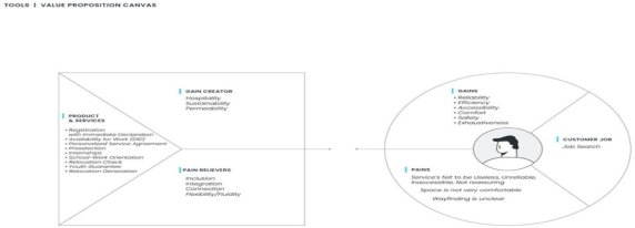
As shown in Table 1, all services – except for Task 5 – failed to meet the minimum usability threshold of 68.5 pts, with particularly drastic peaks on digital services. For the (vi) Defining design principles and (vii) assessing the relationship between services offered and design proposal it’s been chosen the Experience Principals and Value Proposition Canvas (Lewandowski, 2016).
To resolve the issues and criticalities that have emerged, four design pri- nciples have been defined, namely: Inclusion/Hospitality; Integration/Con- nection; Permeability/Sustainability; Flexibility/Fluidity. These criteria allow to fill the performance gaps emerged (see fig. 4).
Brand Design Strategy for Public Administration. An Experimentation 307
IDEATION PHASE Brand, Editorial and Digital Design
The project proposal moves from the state of the art of CPI, taking some iconic elements and projecting them into a dynamic system that falls into the desire to define the brand as an innovative but solid reality. The logotype – whose focus on the “IO” (ie. I in Italian) – can be considered useful to reinfo- rce the idea of identity and enhancement of individuals, has been combined with the payoff “Il tuo futuro al Centro”(ie. Your future at the Center), which plays on the semantic ambivalence between the centrality of the user and the Employment Center. The composition of the two key letters also generates a pictogram, which in turn can inspire and be translated into geometric and chromatic patterns that contribute to creating the semiosphere of the iden- tity project. The services and communication of the project are intended to be as personalized and inclusive as possible. Through intuitive chromatic codes and a multilingual typography with easily readable characters, the project gains visual ergonomics and integration. Because the construction of an effi- cient community starts from the care for the users’ needs. In the editorial section, the basic coordination aims to homogeneously reflect the coordina- ted image of the brand, while incorporating the institutional visual language of the Lazio Region. The use of an important system of advertising and infor- mation is functional to increase the attractiveness and dissemination of the work of the institution on the territory. An important role in the construction of the project concept is covered by the introduction of a strong digital com- ponent. The Digital Design operates as an extension of the brand itself and is articulated on multiple platforms with different objectives, with a view to communication and service at 360°.
Spatial Design Moving on an “inter-subjective” terrain - which draws inspiration from memory and individual experience to stimulate new languages, behaviors, forms of use and typologies - the project concept for Spatial Design was deve- loped paying particular attention to the spaces intended to the public. In fact, it is here that the initial and most important moment of what is defined as the user’s “perceptual experience” takes place. Who, in fact, hasn’t happe- ned to enter certain public spaces, especially in some offices, and to have experienced a real sensation of “perceptive” disorientation? This condition, generated primarily by the coexistence of multiple perceptual stimuli, places great difficulty in our ability to compose a coherent mapping of space puts a strain on our mind, which, in a short time, will no longer be able to decode the visual information in a clear way as well as the geometric variations and the different auditory and olfactory stresses that pervade the spaces (Lucibello, 2019). The concept developed for Spatial Design, therefore, has the inten- tion of enhancing the perceptive experience of the user, also loading it with synesthetic values. The communication modality of the project was also the subject of study. In fact, it was decided to tell the concept, through a story- telling that we could define as phygital, that is through both the physical and the virtual experience. The use of embedded technology, which inte- rvenes to form a closer relationship with the environment the person, the
product, the table, the chair, the building and even the city and to allow staff to interact with customers and the environment (Hecht and Colin, 2003). Physical space is therefore implemented in the narrative by an “augmented space” (Manovich, 2005), which, as Bucci Glucksmann states, is part of the contemporary urban space in which physical structures are superimposed on immaterial information of different nature, that is, invisible data flows that they cross (or increase) the space and can be captured at any time with cell phones, PDAs, Wi-Fi connections, infrared devices or Bluetooth technology (2004). This is how the global perceptual experience (atmosphere) becomes a new value to be achieved, but not as a set of assorted sensations, but rather as cognitive ergonomics for the construction of a real “Sensory Architecture”, in which space will be more and more enveloping, because it can involve all our senses, pervaded by an atmosphere full of perceptive stimuli. A question now remains to be understood, that is, the wise combination of a multipli- city of sensory stimuli, can give rise to a new form of consumerism that will enable us to “consume more intensely”, as well as faster.
CONCLUSION
What has just been discussed represents a snapshot of a portion of a larger Research Project whose designed content is currently being tested and valida- ted. The experience contained within the contribution highlights the strategic role that design can also have within the public administration. The discipline of design, attentive to the quality of experience and centered on the needs of users, offers the methodological and operational key to enhance the public service by reducing the distance between people and institutions, offering accessible and inclusive services. In this framework, the brand design applied to PA can play a central role in Italy especially if interpreted in a strategic sense, helping to reduce that serious distance between the citizen and the PA denounced by the OECD-EU surveys (Dal Buono et al. 2020) and repeatedly complained by Sinni (2018a; 2020).
ACKNOWLEDGMENT
The paper is the result of a joint reflection by the Authors. However, the para- graph ‘The reforming role of brand design for Public Administration’ was written by C. Martino, L. Ricci and D. Fornari, the paragraph ‘Benchmarking and Survey: Analysis of the State of the Art’ by V. Maselli and S. Cosentino, the paragraph ‘Spatial Design Analysis’ and ‘Spatial Design’ by L. Lucibello, L. Trebbi, the paragraph ‘Analysis of Human Factors’ and ‘Brand, Editorial and Digital Design’ by A. Caccamo and C. Belluzzi Mus.
REFERENCES
Belluzzi Mus, C., Caccamo, A., Fazi, R., and Maselli, V. (2021). Digital sociability in Covid-19 era. Service Design for the analysis of emotional involvement in the digital city. In AGATHÓN | International Journal of Architecture, Art and Design, 10, 250-261.
Brand Design Strategy for Public Administration. An Experimentation 309
Brooke, J (1996). SUS-A quick and dirty usability scale. In Usability Evaluation in Industry, 4–7. Buci Glucksmann, C. (2004). L’art à l’époque virtuel. In Arts, 8, Paris, L’Harmattan. Carmi, E. (2020). Branding D.O. Progettare la marca. Una visione design oriented.
Fausto Lupetti Editore. Dal Buono, V. and Scodeller, D. (2016). Integumentary design. Involucri sensibili e sinestesie di superficie. In MD Journal, 1, 14–19. Dal Buono, V., Sinni, G., Zannoni, M. (2020). Appunti al progetto di buona
cittadinanza. In MD Journal, 10, 10–23. Fedriga, R. (2006). Pubblica utilità, comunicazione ed esercizio della pratica democratica. In Progetto Grafico, 9, Milan, AIAP edizioni, 26–29. Gibbons, S. (2018, January 14). Empathy Mapping: The First Step in Design Thin-
king. Nielsen Norman Group. Retrieved February 11, 2022, from https://www. nngroup.com/articles/empathy-mapping/ Giordano, F. B., Morelli, N., De Götzen, A., and Hunziker, J. (2018). The stakeholder map: a conversation tool for designing people-led public services. In A. Meroni, A. M. O. Medina, and B. Villari (Eds.), ServDes.2018 Conference: Service Design Proof of Concept Linköping University Electronic Press. Linköping Electronic Conference Proceedings No. 150 Hecht, S., Colin, K. (2003). Things That Go Unseen. Industrial Facility Publisher. Ieva, M., and Ziliani, C. (2018). Mapping touchpoint exposure in retailing. Interna-
tional Journal of Retail and Distribution Management, 46(3), 304–322. Lewandowski, M. (2016). Designing the business models for circular economy— Towards the conceptual framework. Sustainability, 8(1), 43. Lucibello, S. (2019). Verso un’Architettura sensoriale. In C. Cecchini, Spazi tempo-
ranei contemporanei. 10 anni del master in Exhibit and public design. Silvana editore, Milan. Manovich, L. (2006). The poetics of augmented space. In Visual Communication, 5(2), 219–240. Manzini, E. (1986). La Materia Dell’Invenzione. Arcadia, Milan. Piazza, M. (2015). Massimo Dolcini. La grafica per una cittadinanza consapevole.
Sondrio, Fondazione Gruppo credito valtellinese. Rauch, A. (2021). Il racconto della grafica. Storie e immagini del graphic design italiano e internazionale dal 1890 a oggi. Ediz. ampliata. La Casa Usher. Sinni, G.(2018a).Una, nessuna, centomila. L’identità pubblica da logo a piattaforma.
Quodlibet. Sinni, G. (2018b, October 1). The Design Necessity - Gianni Sinni. Medium. Retrieved February 12, 2022, from https://medium.com/@giannisinni/the-design-neces sity-a174a5a39129 Sinni, G. (2022, January 6). Un’immagine coordinata per l’Italia. - Gianni Sinni.
Medium. Retrieved February 12, 2022, from https://medium.com/@giannisinni/ comunicare-lo-stato-al-tempo-del-pnrr-c80275a0eb79 Stevanovic, M., Marjanovic, D., and Storga, M. (2015). A model of idea evaluation and selection for product innovation. In DS 80-8 Proceedings of the 20th Inter- national Conference on Engineering Design (ICED 15) Vol 8: Innovation and Creativity, Milan, Italy, 27–30.07. 15, 193–202. Stickdorn, M., Hormess, M. E., Lawrence, A., and Schneider, J. (2018). This Is Service
Design Doing: Applying Service Design Thinking in the Real World (1st ed.). O’Reilly Media. Zannoni, M. (2016). Un approccio materico all’interazione tattile per il design delle interfacce. In MD Journal, 1, 92–105.
LISTED IN THE AHFE DIGITAL BOOKSTORE CATALOGUE
Explore the complete digital volume
Ergonomics In Design
Read this individual research paper free through the original publisher, or explore the full digital proceedings book.
ISBN 978-1-958651-23-0
Explore this ISBN in the AHFE Bookstore ↗Listed in the July 2026 bookstore catalogue; search by ISBN to confirm current availability · Digital book purchase optional