Digital devices, particularly smartphones, have become deeply embedded in everyday life—people routinely search for information and make selections and decisions on screens. In such an environment, the process of understanding information and performing an action strongly shapes user experience; therefore, GUI icons are widely used as a space-efficient means of presenting information while reducing cognitive and learning load. Meanwhile, as apps and services become more feature-rich and integrated—and as usage contexts expand to smaller displays, such as wearable devices—the number of situations in which single-element icons cannot sufficiently convey meaning is increasing. This research focuses on compound icons, which create new meanings by combining multiple visual elements, and examines how the visual structure between elements—specifically relative size and spatial arrangement—influences semantic interpretation. A survey of existing designs found that compositions combining two elements (a large primary element plus a small secondary element) are common and that their semantic relationships can be organized using a part-of-speech-like framework. In an experiment on relative size, configurations of action or status (small) + object (large) tended to be perceived as “easy to understand and less likely to cause hesitation,” with familiarity and physical metaphors supporting comprehension. However, judgments about element hierarchy sometimes vary depending on factors such as the importance of the conveyed information. In an experiment on spatial arrangement, lower-right placement received the strongest overall support, although exceptions were observed owing to directional cues and tool metaphors. These findings suggest that an effective compound-icon design requires a hierarchy aligned with semantic relations, structural decisions that consider placement-driven reading order, and consistency of metaphors.
People routinely search for information and make selections and decisions on digital screens. In such an environment, a GUI design that does not rely solely on text is essential, so that users can quickly grasp information within a limited display area (Putkonen et al., 2025). In GUIs, icons are fundamental elements that visually represent actions, concepts, and products, thereby supporting intuitive interaction (Microsoft, 2025). As platforms have grown, apps and services have become more Received February 19, 2026; Revised April 6, 2026; Accepted April 21, 2026; Available online July 20, 2026
Investigating Integrative Visual Expressions in GUI Design 45 feature-rich and integrated, increasing the amount of information that must be presented on a single screen (Hasselwander, 2024). In addition, the widespread adoption of small-screen devices such as wearables demands even greater space efficiency (IDC, 2025). As a result, there are a number of situations in which a single icon cannot sufficiently convey meaning, leading to a rising need for composite meaning representations that extend or complement meanings by combining existing signs. Compound icons, which generate new meanings by combining multiple visual elements, offer the possibility of expressing complex meanings in a space-efficient manner (Zhao et al., 2020). When interpreting compound icons, users likely rely not only on the meanings of the individual constituent elements but also on the relationships between elements within the same icon (Zender & Mejía, 2013). Moreover, because compound icons are formed through spatial combinations, such as juxtaposition and overlay, it has been suggested that identifying structures, such as modifier-like or predicate-like relations, may contribute to comprehension (Zuanelli, 2015). However, the manner in which the visual structure that intuitively communicates such relationships—namely relative size and spatial arrangement—affects semantic interpretation remains insufficiently organized. Therefore, this research aims to clarify how differences in the visual structure between the constituent elements of compound icons influence users’ semantic interpretations and to systematically characterize these effects.
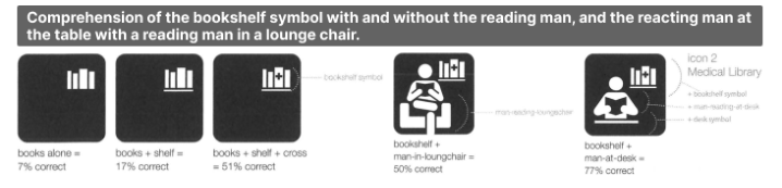
Meaning Representation Through the Combination of Multiple Visual Elements For complex concepts that are difficult to express using a single graphic, designers construct meaning by combining multiple visual elements. Understanding such combinations is not determined solely by the meanings of individual elements; rather, it has been argued that the role each element plays in the overall meaning matters (Zender & Mejía, 2013) (see Figure 1). From the perspective that multiple symbols interact to evoke meaning, recent studies have discussed symbol combinations as a form of composition (Zender, 2022). It has also been suggested that compound expressions can be organized by analogy to language, for example as modification or predication (Zuanelli, 2015). Related research on emoji sequences has reported that meaning construction through ordering is subject to certain constraints (Cohn et al., 2019), and datasets that treat compositional meaning as lexical composition have been proposed (Yang et al., 2024). Although many studies have addressed the combination of multiple visual elements, a systematic framework remains underdeveloped for GUI compound icons regarding how visual structure—such as relative size and spatial arrangement—specifies the roles of constituent elements. To address this gap, this research organizes inter-element relations in compound icons using a framework analogous to part-of-speech relations. Based on this framework, we manipulate and evaluate relative size and spatial arrangement as design variables to clarify the structural cues that communicate element roles.
Figure 1: Effect of an added element on symbol comprehension (Zender & Mejía, 2013).
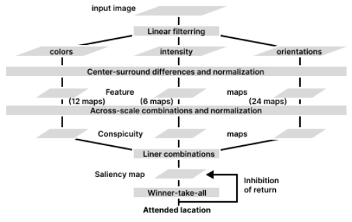
Theoretical Rationale for How Visual Structure Guides the Reading of Element Relationships When constructing meaning from multiple visual elements, people do not process all elements equally and simultaneously. Instead, they infer an attentional starting point, dominance relations, and reading order based on attention, salience, and perceptual grouping. In attention research, Feature Integration Theory distinguishes between the parallel processing of basic features and their integration through attention, thus providing a framework for explaining how elements are perceived as coherent units (Treisman & Gelade, 1980). Salience-based models of attention further address which element in a multi-element display is likely to be attended to first (Itti et al., 1998) (see Figure 2). Moreover, grouping and figure–ground segregation driven by Gestalt principles contribute to the conditions under which multiple elements are perceived as a single unit and to the ease of reading relationships among them (Wagemans et al., 2012). Spatial attention also exhibits left–right asymmetries, suggesting that placement can influence attentional starting points and perceptual weighting (Jewell & McCourt, 2000). Together, these findings imply that in compound icons, relative size and spatial arrangement can shape where attention begins, how hierarchy is perceived, and how elements are read in sequence. Building on this perspective, the present research applies these concepts to the interpretation of inter-element relationships in compound icons and empirically tests their effects through experiments that manipulate the relative size and spatial arrangement.
Figure 2: General architecture of the model (Itti et al., 1998).
RESEARCH METHOD This research aims to clarify how the visual structure between the constituent elements of compound icons—specifically the relative size and spatial arrangement—influences users’ semantic interpretations. The research was conducted in the following four steps (see Figure 3).
Figure 3: Research flow.
Figure available in the original PDF paper.
Step 1: Survey of Existing Designs to Classify the Forms of Compound Icons To select representative forms for later experiments, we reviewed 1,300 icons from the top three Google Material Symbols categories (UI actions/Social/ Actions) and extracted “compound icons”—those whose meaning is extended or complemented by combining multiple elements. We then classified them by element count, size hierarchy, and spatial arrangement.
Step 2: Survey of Existing Designs to Extract Compositional Principles of Compound Icons We examined how existing compound icons express meaning via a two- element size hierarchy. From 32 smartphone apps, we collected 100 compound icons and inferred their meanings using in-screen placement, nearby labels, and post-tap destinations. We then modeled each icon’s two-element relation as a linguistic POS(Part-of-speech) relation, labeled each element (e.g., verb/ object), and analyzed rules linking POS roles to size (see Figure 4).
Figure 4: Example of how to assign POS-like labels.
Figure available in the original PDF paper.
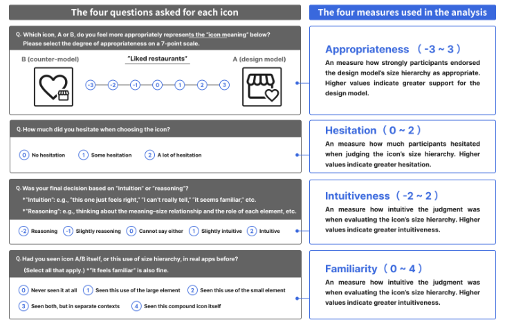
Step 3: Experiment Examining How the Relative Size of Two Elements Affects Semantic Interpretation This experiment tested how appropriate users find the POS-based size- hierarchy design model identified from Step 2. Participants were 31 undergraduates. Stimuli comprised 25 compound icons (5 categories × 5). Each trial presented a meaning (e.g., “exchange points”) and two icons (A/B) that differed only in size hierarchy; participants rated which icon better represented the meaning on a 7-point scale. The appropriateness score increases when A (design model) is chosen and decreases when B (counter- model) is chosen. To probe decision factors, we also measured three additional measures—hesitation, intuitiveness, and familiarity—and interviewed some participants (see Figure 5). We tested category differences using a repeated- measures ANOVA followed by post hoc tests.
Figure 5: Questions asked for each icon and the four measures used in the analysis.
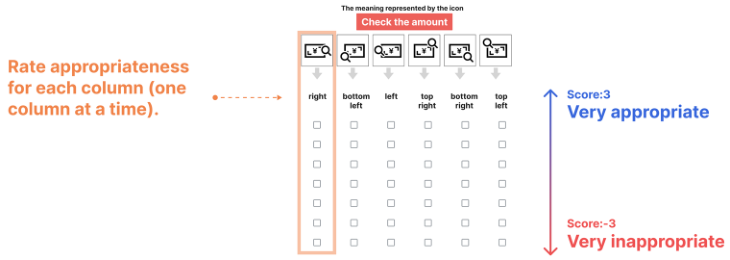
Step 4: Experiment Examining How the Spatial Arrangement of Two Elements Affects Semantic Interpretation This experiment tested how small-icon position affects compound-icon interpretation. Participants were 34 undergraduates (18 Step3-experienced, 16 naïve). Stimuli were 15 compound icons that scored high appropriateness ratings in Step3; size hierarchy was fixed, and only the small icon’s position was varied across six conditions (bottom-right, right, top-right, top-left, left, bottom- left). Each trial presented the meaning and the six variants simultaneously; participants rated each variant’s appropriateness on a −3 to +3 scale (see Figure 6). We analyzed position effects with a repeated-measures ANOVA followed by multiple comparisons. In addition, to typologize placement- evaluation patterns across icons, we conducted a hierarchical cluster analysis (Ward’s method, Euclidean distance) using the six placement scores. Interviews with some participants provided qualitative reasons for position preferences.
Figure 6: How participants rated placement appropriateness.
RESEARCH RESULT AND CONSIDERATION Step 1: Survey of Existing Designs to Classify the Forms of Compound Icons
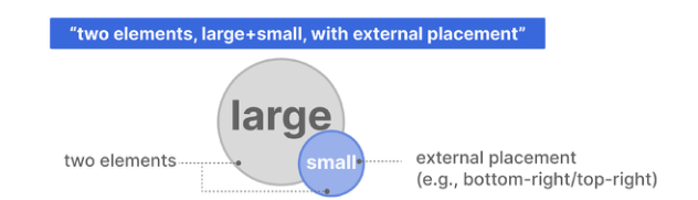
Among 1,300 icons, 159 were compound icons, all with two elements. A large+small hierarchy dominated (140/159, 88.1%). These large+small icons clustered in a limited set of layouts—mainly bottom-right, embedded, and top-right—though embedded was concentrated in specific base icons. Thus, when designing experimental samples, it is reasonable to treat “two elements, large+small, with external placement (e.g., bottom-right/top- right)” as the most representative form (see Figure 7).
Figure 7: Representative compound-icon forms used in subsequent experiments.
Step 2: Survey of Existing Designs to Extract Compositional Principles of Compound Icons From the meanings expressed by compound icons, the POS-like labels assignable to the large and small elements were organized into six types: verb, object, domain modifier, quality modifier, status modifier, and modified element (see Table 1).
Table 1: Definitions and examples of POS-like labels.
Table available in the original PDF paper.
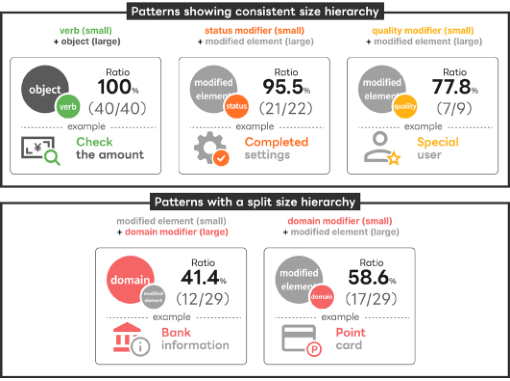
Next, for the two elements composing each compound icon, we identified the “POS + POS” combination and tallied which POS was carried by the large vs. small element. We found three POS relations with consistent size- hierarchy patterns: verb (small) + object (large), status modifier (small) + modified element (large), and quality modifier (small) + modified element (large). In contrast, domain modifier + modified element showed no single consistent size pattern, splitting into two cases where the domain modifier was either large or small (see Figure 8).
Figure 8: Five patterns of POS roles and size hierarchy.
Step 3: Experiment Examining How the Relative Size of Two Elements Affects Semantic Interpretation Based on the POS-based framework obtained in Step 2, we compared two versions of each compound icon that differed only in size hierarchy (A = design model; B = counter-model) and evaluated their appropriateness for the intended meaning. Following the size-hierarchy patterns of the design model, we defined five POS categories: the verb category, status category, quality category, domain (large) category, and domain (small) category (the domain category was split into two models because its size hierarchy did not converge in the step2 survey) (see Figure 9).
Figure 9: Five categories in the icon samples used in the experiment.
Figure available in the original PDF paper.
As a result, the mean values of the four measures for each POS category and the results of a repeated-measures ANOVA with POS category as the factor were as follows (see Table 2).
Table 2: Mean values of the four measures and the repeated-measures ANOVA results.
Table available in the original PDF paper.
Investigating Integrative Visual Expressions in GUI Design 51 Next, the characteristics of each POS category are summarized below.
1) Verb category (verb small + object large ) Most participants judged this size hierarchy to be appropriate. Interviews suggested that this preference may be linked to a “physical visual relation,” in which an action (small) is perceived as attached to a target object (large) (see Figure 10).
Figure 10: Characteristics and interpretation of the verb category.
2) Status category (status modifier small + modified element large ) Most participants judged this size hierarchy to be appropriate. This may be because a status is perceived as “added information,” making the role split intuitive: a main entity (large) with an additional status (small) (see Figure 11).
Figure 11: Characteristics and interpretation of the status category.
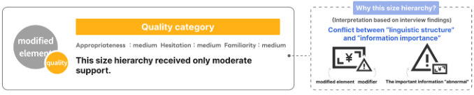
3) Quality category (quality modifier small + modified element large ) This size hierarchy received only moderate support, with some disagreement. While the “modifier = small” structure was generally favored, when a highly salient element such as a warning mark was present, a different criterion— perceived information importance—appeared to influence judgments (see Figure 12).
Figure 12: Characteristics and interpretation of the quality category.
4) Domain (large) category and domain (small) category (domain modifier large/small + modified element small/large ) Both the domain (large) and domain (small) categories showed no consistent size-hierarchy preference across participants. In interviews, many participants
52 Haneishi and Yang reported judging by assuming a usage context for the icon, suggesting that decision criteria may have differed from person to person (see Figure 13).
Figure 13: Characteristics and interpretation of the domain (large) and (small) category.
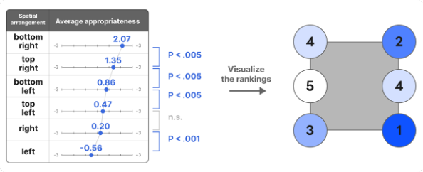
Step 4: Experiment Examining How the Spatial Arrangement of Two Elements Affects Semantic Interpretation Participants rated the appropriateness of each of six small-icon positions (bottom-right, right, top-right, top-left, left, bottom-left) (N = 34). A repeated-measures ANOVA showed a significant main effect of position (p < .001), confirming that appropriateness varies by placement. Based on post hoc comparisons, the overall ranking can be summarized as: bottom- right ≫ top-right > bottom-left > (top-left ≒ right) ≫ left (see Figure 14).
Figure 14: Mean scores by position and post hoc comparison results.
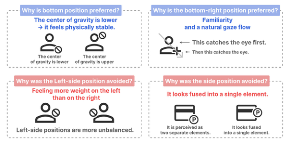
These results can be interpreted in terms of the “impressions induced by placement.” Accordingly, as supplementary context to explain the rating tendencies for each position, we summarize in the figure below our interpretation based on participants’ comments and prior findings (see Figure 15).
Figure 15: Interpretation of the results for each position.
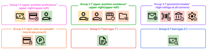
Investigating Integrative Visual Expressions in GUI Design 53 Furthermore, to examine similarities in placement-evaluation patterns across icons, we conducted a hierarchical cluster analysis. As a result, the compound icons were classified into the following six groups (see Figure 16).
Figure 16: Six groups with similar position-rating patterns.
In Group 1 (“upper-position preference”: upper-right/upper-left), upper placements were supported when participants wanted to highlight important information or when strong prior UI experience favored upper positions, such as the “+” button commonly placed in the upper-right corner. In contrast, in Group 2 (“upper-position avoidance”: upper-right/upper-left), upper placements were rated low because they could occlude distinctive features of the large icon (e.g., a folded file corner), or—when the large icon depicted a person—because placing an element on top disrupted visual balance and sometimes prompted incorrect situational interpretations (e.g., “something is hitting the head”). In Group 4 (“right-side acceptable”: lateral placement), the right position received a relatively high score (1.01) for the “exchange points” icon, suggesting that lateral placement is preferred when the left– right directionality of an arrow aligns with the exchange flow. In Group 5 (“tool type 1”), for the “edit information” icon, the right placement (2.06) exceeded the lower-right placement (1.79), indicating that positions that best satisfy the tool’s directionality (e.g., a pen tip) and its contact with the target are prioritized.
CONCLUSION
This research examined how the visual structure between elements in compound icons—specifically relative size and spatial arrangement— affects semantic interpretation. Surveys of existing designs have shown that many compound icons consist of two elements and are often used as asymmetric structures in which an auxiliary element is added to a primary element. The semantic relations between elements can be organized using a part-of-speech-like framework, suggesting that the appropriate hierarchy may vary depending on the combination of part-of-speech roles. In the relative- size evaluation experiment, verb (small) + object (large) and status modifier (small) + modified element (large) were consistently preferred, indicating higher appropriateness and lower hesitation. Considering the interview results, these structures may facilitate reading consistent with everyday experience—namely, that an action or status is attached to an object (the main entity)—and comprehension may be supported by familiarity and physical metaphors. In contrast, evaluations were split for some quality /category
54 Haneishi and Yang modifiers. In particular, when highly salient elements such as warning marks were involved, the “linguistic” modification structure and cues for emphasis of importance competed, leading to unstable judgments of hierarchy. In the spatial-arrangement evaluation experiment, an overall tendency emerged in which lower-right placement was the most preferred, followed by upper-right and lower-left placements. Left-side placements tended to receive lower ratings. However, placement preferences were not uniform; exceptions occurred depending on factors such as symbol directionality, tool metaphors, emphasis on critical information, and occlusion of distinctive shape features. This suggests that placement decisions are governed by both general principles and local rules shaped by the interaction between form and meaning. Overall, these findings indicate that an effective compound- icon design requires hierarchy aligned with semantic relations, structural decisions that consider placement-driven reading order, and consistency with underlying metaphors.
REFERENCES
Cohn, N., Engelen, J., & Schilperoord, J. (2019). “The grammar of emoji? Constraints on communicative pictorial sequencing,” Cognitive Research: Principles and Implications, 4(1), Article 33. Hasselwander, M. (2024). “Digital platforms’ growth strategies and the rise of super
apps,” Heliyon, 10, e25856. International Data Corporation IDC 2025 [Wearable Devices Market Insights] IDC.
2025-10, [https://www.idc.com/promo/wearablevendor/](https://www.idc.com/ promo/wearablevendor/), (Accessed 2026-01-22). Itti, L., Koch, C., & Niebur, E. (1998). “A model of saliency-based visual attention for rapid scene analysis,” IEEE Transactions on Pattern Analysis and Machine Intelligence, 20(11), 1254–1259. Jewell, G., & McCourt, M. E. (2000). “Pseudoneglect: a review and meta-analysis of
line bisection tasks,” Neuropsychologia, 38(1), 93–110. Microsoft (2025) Icons in Windows apps (Microsoft Learn) [https://learn.microsoft.
com/en-us/windows/apps/develop/ui/controls/icons](https://learn.microsoft.com/ en-us/windows/apps/develop/ui/controls/icons) (Accessed 2026-01-22) Putkonen, A., Jiang, Y., Zeng, J., Tammilehto, O., Jokinen, J. P. P., & Oulasvirta, A.
(2025). “Understanding visual search in graphical user interfaces,” International Journal of Human–Computer Studies, 199, 103483. doi:10.1016/j.ijhcs.2025. 103483. Treisman, A. M., & Gelade, G. (1980). “A feature-integration theory of attention,” Cognitive Psychology, 12(1), 97–136. Wagemans, J., Elder, J. H., Kubovy, M., Palmer, S. E., Peterson, M. A., Singh, M., &
von der Heydt, R. (2012). “A century of Gestalt psychology in visual perception: I. Perceptual grouping and figure-ground organization,” Psychological Bulletin, 138(6), 1172–1217. Yang, Z. Y., Zhang, Z., & Miao, Y. (2024). “The ELCo Dataset: Bridging Emoji and Lexical Composition,” in Proceedings of LREC-COLING 2024, 15899–15909. Zender, M., & Mejia, G. M. (2013). “Improving Icon Design: through focus on the
role of individual symbols in the construction of meaning,” Visible Language, 47(1), 66–89.
Investigating Integrative Visual Expressions in GUI Design 55 Zender, M. (2022). “Interaction of Symbols: Multiple symbols interact to provoke
meaning, the foundation for better icon design,” Visible Language, 56(1), 72–105. Zhao, N., Kim, N. W., Herman, L. M., Pfister, H., Lau, R. W. H., Echevarria, J.
I., & Bylinskii, Z. (2020). “ICONATE: Automatic Compound Icon Generation and Ideation,” in Proceedings of the 2020 CHI Conference on Human Factors in Computing Systems (CHI ’20), Paper 491, 14 pages. doi:10.1145/3313831.3376618. Zuanelli, E. (2015). “Icons and Icons: New Paradigms In Interface Design,” The Online Journal of Science and Technology, 5(4), 44–56.
LISTED IN THE AHFE DIGITAL BOOKSTORE CATALOGUE
Explore the complete digital volume
Interdisciplinary Practice in Industrial Design
Read this individual research paper free through the original publisher, or explore the full digital proceedings book.
ISBN 978-1-964867-98-4
Explore this ISBN in the AHFE Bookstore ↗Listed in the July 2026 bookstore catalogue; search by ISBN to confirm current availability · Digital book purchase optional