Juhee Lee, Sungnam Kim, Sunghee Ahn, Jong-Il Park (2026). A Color-Contrast-Based XR Interface Design Study: Focusing on AI-Driven Hazard Detection Scenarios. In: Human Interaction and Emerging Technologies (IHIET-AI 2026): Artificial Intelligence and Future Applications. AHFE Open Access, vol. 201, pp. 528–535. https://doi.org/10.54941/ahfe1007206
This study analyzes how a warning system UI centered on color contrast in XR interfaces can efficiently convey situational information to users, based on AI-driven hazard detection scenarios. With recent technological advancements, XR systems have become capable of detecting potentially threatening hazards through the use of real-time object recognition models such as YOLO. However, even when AI achieves high levels of accuracy, if such predictive information is not clearly presented to users, information awareness may be reduced when these systems are later commercialized as safety systems. To address this issue, this study proposes a color-contrast-based interface framework structured according to different levels of urgency within XR environments. A hypothetical XR system, ORION VISION, was developed, and extreme-environment hazard detection scenarios were established by integrating a HoloLens-based interface with YOLO technology.To verify the effectiveness of the proposed design framework, a user experiment was conducted with 20 participants in a HoloLens 2–based environment. Both quantitative data—including user reaction time and visibility evaluations—and qualitative data collected through interviews were gathered and analyzed. The experimental results indicate that higher levels of color contrast significantly reduced reaction time. In particular, red warning UIs that maintained high contrast in dark environments enabled users to clearly distinguish levels of risk and enhanced situational communication, thereby effectively forming a hierarchical structure of hazards. In contrast, repetitive warning alerts raised concerns regarding user fatigue, highlighting the importance of controlling alert frequency and intensity. This study demonstrates that color contrast in UI design is a key factor in enhancing situational awareness and the accuracy of information delivery in hazard prediction environments, and it presents practical guidelines for designing reliable and commercially viable UIs for XR safety systems.
INTRODUCTION AND RESEARCH BACKGROUND XR technology, alongside advancements in AI and sensor systems, has become a core element for supporting users in high-risk work environments such as industry, architecture, and space exploration (Wang et al., 2023). Recently, the development of computer vision models in the YOLO family
A Color-Contrast-Based XR Interface Design Study 529 has enabled real-time analysis of object types and associated risk levels, thereby creating environments in which hazards can be identified and warnings can be issued based on objects within the user’s field of view (Jeong et al., 2025). However, for such AI-based object recognition technologies to be meaningfully integrated into user experience, UI designs are required that allow users to perceive and interpret AI-derived information quickly and accurately. If warning information in XR environments is presented without sufficient contrast against surrounding objects or backgrounds, it can be easily overlooked by users, and repeated alerts may instead reduce system credibility. In this context, color serves as an appropriate visual communication method for conveying AI-assessed hazard information, and in particular, a staged contrast structure based on yellow and red has become the central focus of this study, as it can intuitively communicate levels of urgency and priority in warnings.
While prior studies have primarily examined the effects of UI color and luminance on visibility and cognitive processing speed in HUD environments (Zhang et al., 2025), this study focuses on the experimental validation of warning design centered on hazard detection within a HoloLens 2–based XR environment (Erickson et al., 2020). The purpose of this research is to investigate how quickly and clearly users can understand emergency situations predicted by AI-based hazard detection systems when such information is delivered through color-contrast-centered XR interfaces. To this end, the study first analyzes the extent to which color-contrast-focused UIs reduce the speed of situational recognition. Second, it examines the effects of UIs employing a staged color transition from yellow to red on visibility and perceived reliability. In the subsequent sections, scenarios, user experiment design, and result analysis are presented to validate the effectiveness of the proposed approach, followed by a discussion on XR interface design directions based on AI–UI integration.
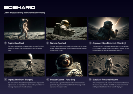
ORION VISION is a hypothetical smart helmet system incorporating an XR warning interface, and it is configured as an experimental environment for verifying the effectiveness of UI design in this study. The scenario is set in outer space, an extreme environment characterized by diverse environmental variables and a limited number of complex obstacles, making it suitable for initial experimental validation. The scenario assumes a user conducting geological sample collection during a lunar exploration mission. During this process, potentially collidable hazardous objects—such as fine surface debris and equipment fragments—are detected, and the system visualizes predicted information through the UI.
The ORION VISION system assumes a structure in which a YOLO- based object recognition model extracts the direction and positional values of hazardous objects within a single frame and converts them into an XR coordinate system.¹ This information is then delivered as warning alerts
(XR UI) with emphasized color contrast according to the assessed level of risk, supporting intuitive information interpretation and rapid hazard awareness for the user. The scenario sequence proceeds as follows: exploration initiation, sample collection, approach of an unidentified colliding object (caution), collision warning and impact preparation (danger), post-collision, escalation of hazard alerts, and system stabilization. The detailed narrative of the scenario is illustrated in Figure 1 below.
Figure 1: Storyboard of the ORION VISION scenario.
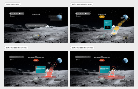
Interface–AI Integration Design Strategy This study defines a staged alert structure centered on color contrast in order to effectively convey AI-based collision prediction results through XR UIs. As shown in Figure 2, the alert system consists of three visually differentiated stages according to the level of risk.
Variant 1 is the “caution” stage, which applies when an AI-detected collision-risk object exists within the exploration path but poses a low immediate threat, requiring only partial user attention (Cheng et al., 2022a). In this stage, a relatively low level of alert is conveyed using yellow-toned colors and primary speech-bubble elements in a complementary cyan color. Variant 2 is the “danger” stage, in which warnings are intensified as an object enters a critical distance threshold. At this stage, the UI transitions from yellow to red tones to reinforce the alert. A red warning UI is accompanied by an auditory alert, and the predicted approach trajectory of the potentially colliding object is visualized. Compared to the previous stage, this phase emphasizes increased visual color contrast to more strongly capture the user’s attention. Variant 3 is the “heightened danger” stage, which corresponds to situations that require immediate user action, such as moments just before collision. While maintaining the red color scheme, this stage maximizes visual urgency through increased stroke thickness, glow effects, and the display of the predicted collision range (Cheng et al., 2022b). Through this color- differentiated staged structure, AI-predicted outcomes are not conveyed
A Color-Contrast-Based XR Interface Design Study 531 solely as fragmented textual information but are translated into visual cues that can be immediately perceived by users.
Figure 2: ORION VISION interface design mockups.
In addition, considering issues identified in prior studies regarding user fatigue and reduced trust caused by frequent warning alerts (Calvi et al., 2020), the system adjusts alert intensity according to urgency. In Variant 1, only color changes are applied to provide light attentional cues, whereas in the more critical Variants 2 and 3, both UI elements and auditory alarms are presented. This approach establishes an interface design system that maintains a high level of reliability by aligning alert strength with situational urgency.
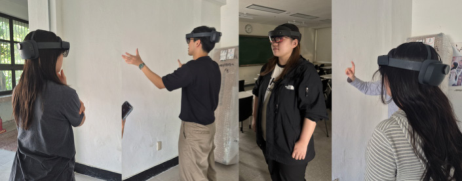
User Experiment Design and Procedure The experiment was designed to allow participants to experience an AI-based hazard detection scenario within a HoloLens 2–based XR environment. A total of 20 participants in their 20s and 30s were recruited, with XR experience levels ranging from novice to intermediate users. Participants were selected with general users in mind, considering potential future commercialization of the system. To examine color contrast under different luminance conditions, two environmental settings were implemented: a bright environment at approximately 700 lx and a dark environment at approximately 80 lx.
During the experiment, participants primarily experienced moments centered on hazard events, corresponding to the stages of caution, danger, and heightened danger. Following the experience, both quantitative and qualitative data were collected. Static screens of the three interface variants were presented, and participants were asked to evaluate the visibility and hazard recognizability of each design using a 7-point scale, in order to assess user understanding of each interface. Finally, semi-structured interviews were conducted to gather participants’ perceptions regarding the acceptability of the warning alerts and the visibility of the interface designs under varying luminance conditions.
Figure 3: Photographs of the user experiment procedure.
User Test Results Differences in Reaction Time and Visibility According to Color Contrast
Reaction time measurements showed that all three warning interface variants enabled hazard recognition within 2 seconds; however, reaction time tended to decrease progressively as color contrast was enhanced. The yellow-based Variant 1 exhibited the slowest response, with an average of approximately 1.8 seconds, and some participants reported that “the warning bar was not noticed at first.” In contrast, the red-based Variant 2 demonstrated a significant improvement, with an average reaction time of approximately 1.3 seconds, while the red-emphasized Variant 3—featuring reinforced stroke thickness and glow effects—recorded the fastest response at an average of approximately 1.1 seconds.
Notably, under bright luminance conditions, cases were observed in which reaction times for Variant 1 exceeded 2 seconds, and interview responses repeatedly indicated that “in bright environments, yellow warnings tend to blend into the background.” In comparison, red-toned variants maintained relatively consistent reaction times across both bright and dark luminance conditions (Ma et al., 2024). This finding aligns with previous AR HUD and color-contrast studies reporting that red hues provide higher salience and more stable visibility than yellow hues (Li et al., 2023).
1 similar trend was observed in the Likert-scale evaluations. For the item “the color contrast was sufficient and easily noticeable,” Variant 1 remained at an average score in the low 5-point range, whereas Variants 2 and 3 received evaluations in the low 6-point range. In particular, for the statement “color contrast was maintained even in bright environments,” Variant 1 scored the lowest, with an average of 4.7 points, while Variant 3 increased to 5.9 points. Cross-analysis of luminance conditions and interface variants revealed that the combination of “dark environment + red-emphasized design (Variant 3)” yielded the highest responsiveness and UX satisfaction, whereas the “bright environment + yellow design (Variant 1)” combination showed the greatest likelihood of response delay and perceptual errors. These results clearly indicate that when delivering AI-based hazard information through
A Color-Contrast-Based XR Interface Design Study 533 XR interfaces, simple color assignment alone is insufficient, and luminance conditions and visual emphasis strategies must be considered in conjunction. (Kim & Gabbard, 2022)
Risk Perception, AI Trust, and UX Implications Based on Staged Color Contrast In the risk-stage arrangement task, most participants accurately distinguished the three interface Variants (1/2/3) as corresponding to the stages of caution, warning, and critical danger, respectively. This finding indicates that when color changes are combined with visual elements such as stroke thickness, glow effects, and screen occupancy, users’ perception of risk is naturally structured into a hierarchy. During interviews, statements such as “yellow feels like a stage where I should be cautious, while red feels like a signal that the situation is dangerous right now,” and “when red is more strongly emphasized, it is perceived as a situation that requires immediate avoidance” were repeatedly reported. In other words, users were able to understand the progression and severity of risk solely through color contrast and form changes, without textual explanations. This suggests that AI-generated risk scores can be directly translated into UI stages. These results demonstrate that a color-contrast-centered UI functions not merely as a visual embellishment, but as an “expressive layer” that translates AI-based hazard models into a form that aligns with human perception.
Meanwhile, qualitative analysis of user acceptance toward AI-based warnings revealed both trust and fatigue. Participants evaluated positively that “AI assesses risks and informs the user on their behalf,” while simultaneously expressing concerns that “trust may decrease if warnings are repeated excessively.” In particular, many participants stated that “if the red emphasized screen appears only when the situation is truly dangerous, I would be more willing to trust and follow it,” and that “yellow warnings can remain subtle, but red emphasized warnings should appear only when there is high certainty.” These responses indicate that the over-alerting and alarm fatigue issues commonly discussed in AI systems can be reproduced in XR environments as well, highlighting the necessity of precisely controlling warning intensity and frequency from a UX perspective.
Synthesizing these findings, several UX implications for AI-driven, color- contrast-centered XR warning design can be derived. First, the default warning color should be set to high-saturation red tones, while yellow should be used selectively for preparatory or precursor stages. Second, when AI determines that risk levels are increasing, visual emphasis—such as stroke thickness and glow intensity—should be progressively reinforced alongside color changes to naturally focus user attention. Third, critical-stage warnings should be designed to appear only in moments that demand a high level of trust, thereby minimizing alarm fatigue. Fourth, future XR safety systems may consider expanding multimodal warnings by centering on color- contrast-based visual alerts and selectively integrating auditory and haptic feedback as the confidence level of AI risk scores increases. These design strategies constitute key elements for delivering AI-based hazard detection results in a manner that is trustworthy and sustainably acceptable from a user experience perspective.
CONCLUSION
This study assumed an AI-based hazard detection scenario and systematically verified the UX effects of color-contrast-centered warning UIs within a HoloLens 2–based XR environment. The staged color-contrast transition from yellow to red to emphasized red enabled users to intuitively understand a hierarchical structure of risk, while visual adjustments such as stroke thickness and glow effects elicited higher salience and a stronger sense of urgency than color alone. Luminance conditions were found to have a significant impact on warning UI performance, and the results confirmed that even AI-based warnings can undermine user trust if color contrast, visibility, and alert frequency are not properly managed. In particular, because AI-detected hazard information inherently carries the possibility of false positives, careful UI stage design and alert frequency control are essential, making these factors critical UX strategic variables from an AI–UI integration perspective.
Future research should extend color-contrast-centered warning UX by connecting it with more complex AI-based predictive models and by exploring luminance-adaptive and context-adaptive UIs that dynamically respond to environmental lighting, user state, and task context. In addition, beyond color contrast, multimodal warning UX that combines auditory and haptic feedback in multiple stages according to the confidence level of AI-based risk assessments represents a promising direction. Such approaches could serve as valuable design assets applicable to real-world contexts, including industrial safety, space exploration, and human–robot collaboration. From a speculative design perspective(Dunne & Ruby, 2013), extreme scenarios such as ORION VISION hold significance not in the immediate implementation of commercial functions, but as experimental apparatuses that proactively examine the conditions under which AI+XR warning UX can be accepted by humans.
ACKNOWLEDGMENT
- This research was supported by Culture, Sports and Tourism R&D Program through the Korea Creative Content Agency grant funded by the Ministry of Culture, Sports and Tourism in 2024(No. RS-2024-00399136). - This paper was supported by the 2025 Hongik University Innovation Support Program Fund.
REFERENCES
Calvi, A., D’Amico, F., Ferrante, C. and Ciampoli, L. B. (2020). Evaluation of Augmented Reality Cues to Improve the Safety of Left-Turn Maneuvers in a Connected Environment: A Driving Simulator Study. Accident Analysis & Prevention, Volume 148, Article 105793. Cheng, Y., Zhong, X. and Tian, L. (2022). Does the AR-HUD System Affect Driving
Behaviour? An Eye-Tracking Experiment Study. Transportation Research Interdisciplinary Perspectives, Volume 14, Article 100615. Cheng, Y., Zhong, X. and Tian, L. (2022). Usability Evaluation of In-Vehicle AR-HUD Interface Applying AHP-GRA. Human-Centric Intelligent Systems, Volume 2, No. 2, pp. 124–137. Dunne, A. and Raby, F. (2013). Speculative Everything: Design, Fiction, and Social
Dreaming. Cambridge, MA: MIT Press. Erickson, A., Kim, K., Bruder, G. and Welch, G. (2020). Exploring the Limitations of Environment Lighting on Optical See-Through Head-Mounted Displays. Proceedings of the ACM Symposium on Spatial User Interaction (SUI ’20). Jeong, I., Kim, K., Jung, J. and Cho, J. (2025). YOLOv8-Based XR Smart Glasses
Mobility Assistive System for Aiding Outdoor Walking of Visually Impaired Individuals in South Korea. Electronics, Volume 14, No. 3, Article 425. Kim, H. and Gabbard, J. L. (2022). Assessing Distraction Potential of Augmented Reality Head-Up Displays for Vehicle Drivers. Human Factors, Volume 64, No. 5, pp. 852–865. Li, Y., Wang, Y., Song, F. and Liu, Y. (2023). Assessing Gender Perception Differences
in Color Combinations in Digital Visual Interfaces Using Eye Tracking – The Case of HUD. International Journal of Human–Computer Interaction, Volume 39, No. 10. Ma, J., Lin, J., Cheng, Y. and Tian, L. (2024). Dynamic Visual Warning Cues and Gradient Types: Key Factors Shaping AR-HUD Warning Interface Design. Sensors, Volume 24, No. 3. Wang, C.-Y., Bochkovskiy, A. and Liao, H.-Y. M. (2023). YOLOv7: Trainable Bag-
of-Freebies Sets New State-of-the-Art for Real-Time Object Detectors. arXiv preprint. Zhang, Y., Wang, R., Peng, Y., Hua, W. and Bao, H. (2021). Color Contrast Enhanced Rendering for Optical See-Through Head-Mounted Displays. IEEE Transactions on Visualization and Computer Graphics, Volume 27, No. 5, pp. 2556–2571.
LISTED IN THE AHFE DIGITAL BOOKSTORE CATALOGUE
Explore the complete digital volume
Human Interaction and Emerging Technologies (IHIET-AI 2026): Artificial Intelligence and Future Applications
Read this individual research paper free through the original publisher, or explore the full digital proceedings book.
ISBN 978-1-964867-77-9
Explore this ISBN in the AHFE Bookstore ↗Listed in the July 2026 bookstore catalogue; search by ISBN to confirm current availability · Digital book purchase optional