Amic Ho, Chau P.W. (2025). The Influence of Culture on Typeface Perception and Design. In: Human Interaction and Emerging Technologies (IHIET 2025). AHFE Open Access, vol. 197, pp. 518–528. https://doi.org/10.54941/ahfe1006745
This study aims to explore the impact of culture on typeface design and its communicative effectiveness, particularly in a multicultural city like Hong Kong. The research will employ a mixed-methods approach, combining surveys and semi-structured interviews to gather data from a diverse sample of individuals from various cultural backgrounds. The aim is to provide empirical insights into the relationship between cultural dimensions and preferences for typefaces, as well as practical guidelines for designers to create culturally sensitive typefaces. The study will contribute to the field of design psychology by establishing a foundation for understanding the relationship between culture, typography, and user experience. The findings will be presented to design practitioners in multicultural contexts, while also addressing limitations and suggesting potential directions for future research. The study will also explore the impact of emerging technologies on cross-culturally relevant typography.
Typography, being both a visual and communicative art, significantly influences how diverse groups perceive, experience, and interpret information. Typefaces, beyond aiding linguistic communication, have cultural, historical, and psychological connotations, gently conveying identity, values, and mood. Typefaces do not emerge spontaneously, nor are they just design selections; they are imbued with cultural and historical significance, crafted by designers, ultimately to be selected by you, the designer. As globalisation and digitisation progress, the relationship between culture and typography becomes increasingly significant, prompting critical observations on how typography is interpreted and utilised by individuals from diverse cultural backgrounds. This is especially evident in a multicultural metropolis like Hong Kong, where Eastern and Western visual traditions converge, and typographic choices may serve as both facilitators and impediments to communication. Despite a substantial body of scholarship exploring psychological and semiotic elements in type choice, much remains unclear regarding how cultural context affects perceptions and preferences for certain fonts in situations marked by varying degrees of linguistic and cultural hybridity. This study seeks to address the gap
The Influence of Culture on Typeface Perception and Design 519
by experimentally investigating the influence of culture on font perception and design in Hong Kong, utilising both quantitative and qualitative methodologies to elucidate the nuanced ways in which culture mediates the visual language of typography. This investigation aims to enhance culturally sensitive typographic design practices that recognise the profound impact of cultural identity in visual communication and promote inclusiveness, resonance, and effectiveness in the design of written messages.
EXISTING RESEARCH ON TYPOGRAPHY, CULTURAL PSYCHOLOGY, AND VISUAL COMMUNICATION The literature on typography, cultural psychology, and visual communication reveals a diverse and evolving field that emphasises the psychological, social, and cultural dimensions of typographic design. However, it also highlights several issues, particularly the deficiency of empirical research on typographic design and its cultural foundations in multilingual and multicultural contexts such as Hong Kong. The psychology of typography reveals that fonts are not just carriers of words and characters; instead, they actively influence mental impressions, perception, and memory. Recent studies suggest that a font style may elicit a modal, unconscious mood, potentially affecting the affective tone and believability of a communication before its semantic information becomes available. Serif typefaces are associated with tradition, respectability, and reliability, whereas sans-serif fonts are related to modernism, transparency, and professionalism. Such combinations are not universal; instead, they are influenced by the reader’s cultural and historical context, as demonstrated by experimental research indicating that a font may be seen as ‘formal’ and ‘unfriendly’ by various groups. The psychological impact of type establishes a robust reciprocal interaction with the cultural environment, shaping first perceptions and subsequently affecting the interpretation and retention of messages.
This endeavour highlights the profound importance of culture in interpreting typographic meaning through cultural psychology and visual communication theory. Culture, as a framework of shared interpretations, values, and behaviours, functions as the conduit for decoding visual messaging. In an era characterised by visuality and visual communication, the manner in which a designer or artist engages with aesthetics in their work is essential, yet insufficient; the artist’s role has evolved into a cultural and impactful endeavour focused on the translation of meaning for an audience. This is especially evident in cross-cultural contexts due to the disparities in linguistic and cultural norms and traditions, which may lead to divergent interpretations of identical visual clues across various cultures. Evidence serves a purpose that design communication must acknowledge, recognising the cultural context and being equipped to address these foundational components in the visual representation of a message, such as typography. The relationship between culture and communication is a reciprocal process; culture affects how communications are formulated and understood, while communication practices may also impact cultural elements and interpretations.
520 Ho and Chau
A recent study has begun to explore the semiotic possibilities of typography, specifically recognising it as a medium of expression within the context of multimodal communication. Foundational studies by theorists such as Theo van Leeuwen and Hartmut Stöckl have demonstrated that typography possesses a distinct ‘semiotic grammar,’ wherein weight, curve, and orientation serve as visual metaphors that convey interpersonal and ideational connotations. These are not only decorative elements; they are imbued with cultural and historical significance. The characteristics of national museum edifices narrate tales of national history, political identity, and collective memory. Specific fonts have significant cultural or historical connotations: Fraktur with German nationalism (Waldeck, 2018), Garamond with French tradition, and Bodoni with Italian modernity (Zucchi, 2019) demonstrating that the meaning of a typeface is frequently inseparable from its contextual use. Critics of this semiotic approach contend that by prioritising visual-graphic elements, authors may inadvertently oversimplify the social and contextual significance of typographic meaning, which also influences audience interpretation of texts.
Anecdotal and empirical research (Cubitt, 2013) on cross-cultural perceptions of fonts has shed light on the role of culture as a mediator in typographic preference and interpretation; nonetheless, the existing data remains insufficiently comprehensive. A research study involving Korean and non-Korean participants revealed significant disparities in font preference: the URW Light was perceived as antiquated and unintelligible by Koreans (Qin & Choi, 2024), whereas it was regarded as contemporary and legible by non-Koreans. The results suggest that not all font properties are universally processed; instead, they are interpreted through culturally dependent frameworks shaped by historical usage, exposure, and associative memory. Research on cultural festival brandmarks indicates that, although designers frequently prioritise internationalism in their typographic choices, the underlying narratives and cultural norms associated with the type continue to influence meaning construction. These findings indicate the necessity of considering both the form and cultural significance of fonts in design, since typefaces serve as culturally mediated symbols that influence social and cultural organisations.
However, there are evident gaps in the empirical study of typographic perception in contexts where cultures and languages converge, such as in Hong Kong. Despite the increasing research on cross-cultural differences in typeface perception, the majority of studies have focused on a binary comparison between Western and non-Western contexts, neglecting hybrid cultural environments where multiple visual languages converge and intersect. Hong Kong, characterised by its traditional characters, dual colonial histories, and ‘global’ visual culture, provides a distinctive framework for examining the negotiation and performance of ‘the typographic self’ within a multicultural environment. Takagi (2016) and Tam (2017) have noted that studies on Hong Kong’s typographic culture are limited, with the majority of current material either predominantly on the technical components of font creation or treating typography as a secondary consideration to language and visuals (Ho, 2013). Considering
The Influence of Culture on Typeface Perception and Design 521
the pivotal intersections of displacement, temporality, and globalisation that persistently influence the political and commercial landscape of Hong Kong’s urban and graphic realities, empirical research is essential to ascertain how typefaces are perceived and utilised by the city’s designers, consumers, and general populace, how typeface designers navigate the tension between local specificity and global uniformity, and consequently, how this facet of typography contributes to the visual dialectic of this rapidly evolving global city (Ho, 2015).
Research regarding the user experience of typography in multicultural contexts is notably scarce. Substantial data demonstrate the psychological impact of fonts on mood and memory in Western contexts; nevertheless, there is a minimal understanding of these effects and their potential variations when users often encounter multiple scripts and typographic traditions. The era of digital, AI-driven typesetting has further complicated this domain, creating new chances for customisable and culturally unique typographic design. Nevertheless, the integration of technical advancements with cultural psychology to affect user experience in heterogeneous settings remains inadequately explored in the literature.
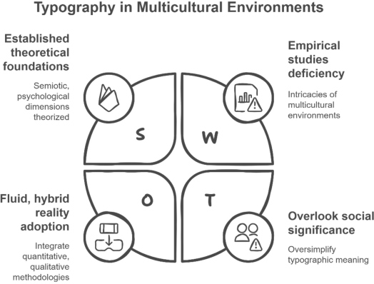
Figure 1: Typography in multicultural environments.
Hence, research on font and cultural psychology has established that typefaces serve as potent transmitters of emotions, identity, and meaning, with their influence predominantly shaped by the cultural environment. The discipline has progressed significantly in theorising the semiotic and psychological dimensions of typography and in demonstrating cross-cultural variances in typographic perception. Nonetheless, a considerable deficiency of empirical studies persists regarding the intricacies of multicultural environments, such as Hong Kong, where multiple visual languages and cultural influences coexist. Future research must move away from binary cultural comparisons and adopt the fluid and hybrid reality of global cities, integrating quantitative approaches with qualitative methodology to capture the perspectives and lived experiences of users and designers in
522 Ho and Chau
these environments. By doing so, scholars and professionals will gain a deeper understanding of the interplay between typography, culture, and user experience, thereby establishing a basis for crafting more sophisticated and impactful visual communication strategies in a progressively globalised context (Ho, 2018).
RESEARCH METHODS AND PROCEDURE This article examines the cultural influence on font perception and design via a mixed-method approach. The study employed a questionnaire to examine participants’ perceptions of specified typefaces on modernity, tradition, friendliness, formality, readability, originality, and cultural associations. The participants supplied demographic data, including age, sex, cultural background, and language competency, for subgroup analysis and descriptive objectives. The survey was administered to 30 workers in a convenience sample to provide a broad representation of nationalities. The quantitative data were examined for completeness and consistency, missing values identified, and descriptive statistics computed to summarise the distribution of font preferences and borrowing cultures concerning the sample. The inclusion of open-ended questions in the survey enriched the quantitative results and facilitated the targeted selection of interview participants. Semi- structured interviews were conducted with a sample of five persons chosen from the survey respondents to get diverse cultural viewpoints. We employed a semi-structured framework for contrasting interviews with neo-patients and experts, with an open and adaptable method for identifying and addressing new difficulties. The interview guide was formulated around open-ended themes aimed at exploring the significance of fonts in daily life, the emotional and cultural connotations of specific typefaces, and the appropriateness of typefaces for various communication contexts.
Qualitative findings were examined via Braun and Clarke’s thematic analysis technique. The transcripts were meticulously reviewed many times to attain immersion, and preliminary codes were extracted from the text to encapsulate the essential elements of the data. The codes were further categorised into sub-themes that illustrated the impact of culture on participants’ perceptions and experiences related to typefaces. Participants’ associations of typefaces with the ideas of ‘out of place’ and ‘inappropriate’ in several cultures were examined, illuminating some of the implicit cultural traditions that inform typeface creation. This study employed a convergent parallel mixed-methods design, wherein quantitative and qualitative data were gathered and analysed independently yet concurrently, thereafter integrated during interpretation. This methodology enabled the researcher to juxtapose information from both threads to achieve a comprehensive and profound comprehension of the subject under examination. Ethical concerns were maintained throughout the project; participants were assured anonymity and confidentiality about their responses and provided informed consent. Participation was optional, and people could withdraw at any moment without repercussions. Data was meticulously controlled in alignment with institutional protocols, and results were disseminated to respect the diversity of participants’ experiences and perspectives.
The Influence of Culture on Typeface Perception and Design 523
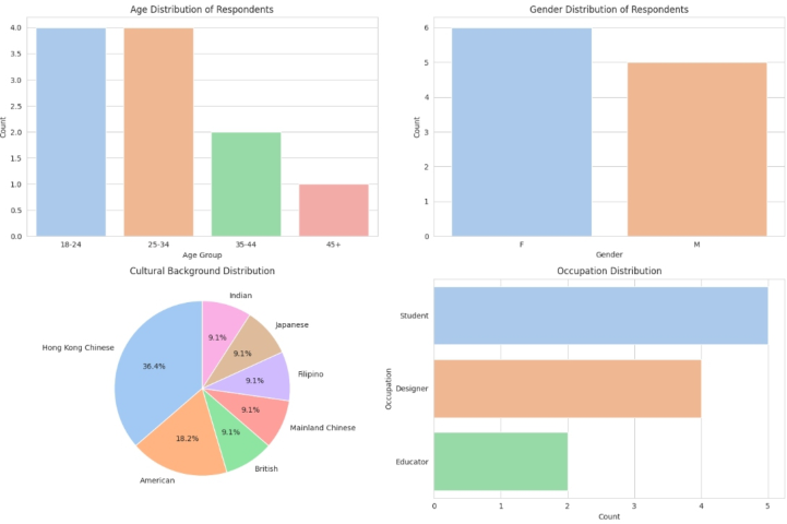
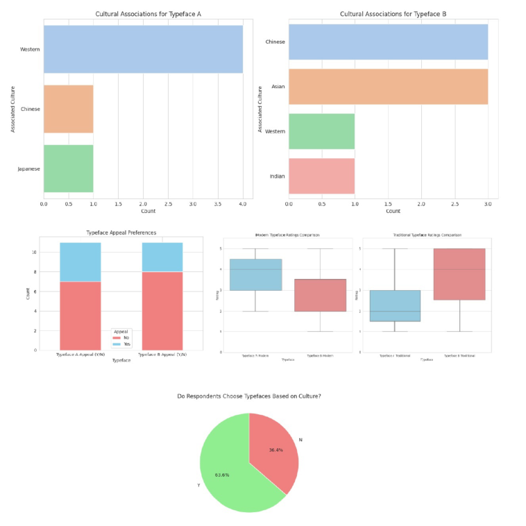
RESEARCH FINDINGS Research indicates a complex relationship between culture and the cognitive and emotional responses to written language. The poll, conducted with 30 participants from many cultures, demonstrated that typography is neither universal nor enough for expression, since it is intertwined with cultural influences, language, and experience. Evaluations of each typeface were conducted based on the criteria of modernism, traditionalism, friendliness, formality, legibility, and creativity. Rounder or more aesthetically pleasing font shapes were regarded as more approachable and comprehensible across all cultural and script groups; however, users from East Asian cultures, particularly Hong Kong and Mainland China, exhibited a pronounced preference for font shapes that are more traditional to calligraphy. Boldness and curvature in typefaces were perceived differently depending on the linguistic and cultural context. English and Spanish speakers rated bold, rounded typefaces as clearer and more familiar, while Chinese participants did not display the same preference. Qualitative disconnected survey responses further illuminated these quantitative patterns. Some typefaces were perceived as ‘wrong’ or ‘unsuitable’ when their use did not align with their cultural connotations and implications. Emotional response to typefaces was also heavily influenced by culture. UK and Australian participants rated unique, memorable fonts as performing significantly better at communicating trust and brand identity, while participants in France, Spain, and Portugal preferred the traditional, high-quality, and emotive associations of a serif style. Japanese respondents responded most favourably to handwritten, low- contrast, humanistic fonts, which they perceived as innovative, trustworthy, and authentic.
Figure 2: Survey responses table (N = 30).
524 Ho and Chau
Figure 3: Survey responses on typeface based on culture.
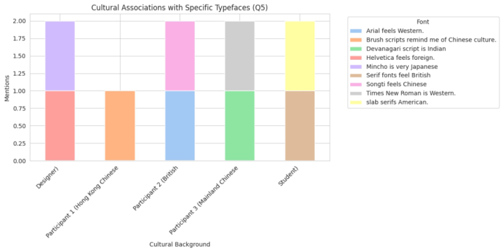
The semi-structured interviews with five participants, drawn from across the cultural spectrum, provided robust qualitative data that framed and enriched the survey results. Respondents emphasised that their cultural background influenced their perception of the appropriateness and effectiveness of a typeface. For example, one from Hong Kong felt a strong personal attachment to typefaces in which traditional Chinese brushwork overlays the characters, which she believes makes the project feel more of a heritage and community. However, a British designer placed more emphasis on clarity and modernity and was more likely to focus on sans-serif typography for its perceived neutrality and professionalism. The schisms like those in the Figure 4 chart were not simply aesthetic preferences; they were fraught with emotion and symbolism: Participants described typefaces as ‘clothing for words,’ able to convey respect, trust, or even exclusion based on their cultural appropriateness. Some quoted interviewees recalled instances where the choice of typeface in a message did not align with its cultural context, confusing (or, at a very general level, a sense of inauthenticity). For instance, a playful, cartoonish font in a formal government document, or one
The Influence of Culture on Typeface Perception and Design 525
of the Gothic fonts in a festive, playful context, had everyone in agreement that this had been jarring and wrong, highlighting the cultural coding of typographic communication.
The interviews also revealed how participants situated themselves in the multicultural setting, in terms of the Asian and Western influences that were uniquely represented in Hong Kong. Some also described an increased openness to the influence of type in multilingual or multicultural environments, where the choice of a typeface might be a subtle acknowledgement of inclusion or cultural agreement. They were especially aware of the challenge of promoting a balance between local and global aesthetics and often blended aspects of both to design typefaces that appeal to the broadest possible audience. This practice was regarded as a challenge of ingenuity and a negotiation of culture, involving consideration of the typefaces’ semiotic operations and their capacity to express also layered meanings. This aligns with the evidence from the interviews, indicating that the choice of typeface is a culturally specific act that has rhetorical and interpersonal significance. In addition, the interviews revealed how much of the participants’ emotional reaction to typefaces was due to early exposure to typefaces and shared memory, with some fonts eliciting feelings of nostalgia, pride, or unease based on their historical and cultural associations.
Figure 4: Cultural association with specific typefaces.
By comparing the survey results with those of the interviews, we see that the perception and usage of typefaces are clues to the culture. Facial features like roundness, boldness, and familiarity are not universally understood, but rather are mediated by cultural and linguistic backgrounds. The emotional response to typefaces also depends on these factors, and different cultures have been known to associate certain typeface styles with values such as trust, innovation, tradition, or modernity (Figure 4). The empirical findings indicated that understanding kinetic backgrounds in video is important for retaining full attention during the first but not the second exposure to a video,
526 Ho and Chau
and that switching to a kinetic background can help increase attention. This is particularly relevant in multicultural and globalised settings, where the potential for misunderstanding or cultural clash is high. Ultimately, this is a demonstration of how typography is a visual and cultural artefact that can initiate meaning, evoke emotion, and even facilitate the universal processing of messages.
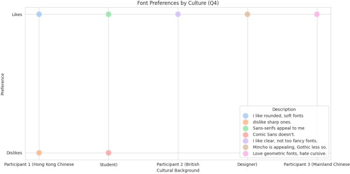
Figure 5: Font preferences by culture.
DISCUSSION
This research demonstrates that culture has a significant influence on the perception and selection of typefaces, underscoring the intricate relationships between cultural identity, typography, and user experience. The typeface qualities, including modernity, tradition, groundedness, emotional expressiveness, liveliness, activity, and readability, possessed varying cultural meanings. Individuals from East Asia, particularly those from Hong Kong and mainland China, had a pronounced preference for typefaces that included traditional calligraphic traits, resonating with their values of authenticity, tradition, and emotional depth. This supports the assertion that typefaces, in their essence (rather than as visual classifications, sounds, or pictures), function as semiotic instruments and embody cultural history and social significance, as articulated by alumna Rian today. Western participants favoured sans-serif and contemporary typefaces for their clarity, professionalism, and friendliness, aligning with the profound cultural values inherent in Western design traditions, innovation, and clarity. The findings were substantiated by comprehensive interview data that illustrated how personal and contextual variables affected font use. Numerous individuals indicated that their backgrounds influenced their typographical choices and the emotions elicited by typefaces. A participant from Hong Kong demonstrated that script typefaces serve as a potent medium for local and historical connection, whilst an English
The Influence of Culture on Typeface Perception and Design 527
designer illustrated that professionalism conveys neutrality and enhances readability. These testimonials illustrate that a typeface is unequivocally a cultural object that conveys identity, ethics, and social status. The product aligns with psychological design ideas of typography as visual rhetoric, encompassing both interpersonal and ideational meta-functions, since it conveys information while also expressing mood and cultural significance. Inappropriate typeface selections, such as employing whimsical or gothic fonts in formal or culturally sensitive contexts, resulted in a diminished sense of trustworthiness, demonstrating a detrimental effect on cultural dissonance due to designers’ neglect of the cultural semiotics of typography.
These findings will serve as pragmatic recommendations in the typographic design process to cultivate culturally aware design. Primarily, it is essential to understand the cultural background of the audience for whom you are composing the dialogue. Designers must comprehend the historical, social, and symbolic contexts of fonts across many cultures to prevent issues such as aesthetically discordant typefaces, inadvertent offence, or the risk of misinterpretation. The research encompasses historic scripts, punctuation, the function of design as a cultural medium, an investigation into colour, and a process for identifying culturally pertinent metaphors applicable to typeface design. The research acknowledges the evolving nature of typography in a multicultural society, particularly among designers navigating their shared cultural heritage. The interviews highlight the designers’ cognisance of operating across cultures (e.g., Hong Kong) and their objective to amalgamate type-making traditions into hybrid designs for varied consumers. The current findings align with the overarching trend in multilingual typography and digital type design, indicating that type designers must leverage cultural knowledge when crafting character forms to ensure visual legibility and cultural resonance across diverse scripts and languages.
CONCLUSION
This study demonstrates that culture, which offers a significant and intangible basis for font perception and utilisation, profoundly influences the perception and use of typefaces, particularly in a multicultural context like Hong Kong. The research, employing mixed techniques that integrate quantitative survey data and qualitative interview data, demonstrates that font decisions are not neutral or universal; instead, they are profoundly influenced by the cultural, historical, and social contexts of the users. The results indicate that individuals’ views of fonts are shaped by cultural variety, linguistic legacy, and social history, allowing for varied interpretations of clarity, tradition, professionalism, and emotion in typographic design. The study presents significant implications for cultural consonance and dissonance in typographic design, highlighting the crucial role of culturally embedded typeface designers in font creation. Established guidelines and implications aim to inspire designers navigating the complex cross-cultural typographic landscape through research-driven, diverse, inclusive, and context-sensitive design strategies that honour and leverage the experiences of various
528 Ho and Chau
audiences. This study advances design psychology, cultural studies, and visual communication, highlighting the significance of culturally appropriate typographic solutions in our increasingly globalised and diverse world. By acknowledging typography as a cultural and significant element, designers and communicators can foster a proliferation of empathy, justice, and equity through their typographic choices.
ACKNOWLEDGMENT
The authors would like to acknowledge. The authors would like to acknowledge all those who have provided support to this research and all the participants.
REFERENCES
Cubitt, S. (2013). Anecdotal evidence. NECSUS. European Journal of Media Studies, 2(1), 5–18. Ho, A. G. (2013). The new direction of typography from emotional perspectives.
Proceedings of the 11th annual conference of Asia Digital Art and Design Association. Seoul. South Korea: Asia Digital Art and Design Association. Ho, A. G. (2015). Action learning with emotional component in typographic design.
Proceedings of International Design Conference of KSDS and ADADA with Cumulus, 2015 International Design Congress. Gwangju, Korea. Ho, A. G. (2018). Humanistic Teaching Pedagogy in Typographic Communication Design. In: Ho A. (eds) Advances in Communication of Design. AHFE 2017. Advances in Intelligent Systems and Computing, vol. 609. Springer, Cham. https:// doi.org/10.1007/978-3-319-60477-0_1 Qin, S., & Choi, A. Y. (2024). The Inheritance and Application of Chinese Reverse
Contrast Typeface Style. Psychology, 14(2), 70–80. Takagi, M. (2016). Calligraphy in the City–Ancient Script to Visual Identity of Hong Kong. Organising Committee at the Faculty of Architecture, Art And Design (Faad), Notre Dame University Louaize (Ndu), 79. Tam, K. (2017). Trust in Chinese–English bilingual documents: A heuristic for
typographic decision-making. Waldeck, M. (2018). Typography and nationalism: The past and modernism under Nazi rule. Journal of Visual Political Communication, 6(1), 37–80. Zucchi, E. (2019). Italian Studies: Settecento. The Year’s Work in Modern Language
Studies, 79(1), 417–427.
LISTED IN THE AHFE DIGITAL BOOKSTORE CATALOGUE
Explore the complete digital volume
Human Interaction and Emerging Technologies (IHIET 2025)
Read this individual research paper free through the original publisher, or explore the full digital proceedings book.
ISBN 978-1-964867-73-1
Explore this ISBN in the AHFE Bookstore ↗Listed in the July 2026 bookstore catalogue; search by ISBN to confirm current availability · Digital book purchase optional