Bingyu Mu, Fang Bin Guo, Zaili Yang, Ian Jenkinson (2023). Interface And Interaction: The Symbolic Design for Bridge Conning System. In: Cognitive Computing and Internet of Things. AHFE Open Access, vol. 73, pp. 202–211. https://doi.org/10.54941/ahfe1003297
Technology is evolving at a dizzying speed. The digitalisation trend refers to a socio-technical phenomenon and process that influence social actors’ practices and interaction, which is reshaping people’s workplaces and influencing everyone on the way of working. The advancements in digitalisation also involved domain of marine industry. Ship bridge, where is a complex working environment contains a plethora of interactions between seafarers and technology-supported systems and equipment. Sometimes the digitalisation released employees’ physical workload, however, increased cognitive load. In maritime, the safety-critical domain, it is critical to design appropriate interfaces and interactions to satisfy the industry’s and operators’ needs, making technology adapt to them.The role of design has shifted from technology driven machine-centred design to user-centred design. Norman (2019) reminded us in context of the digitalisation, interaction and service designers come into the spotlight. The new role of design becomes a strategic problem-solving process to deliver innovative products, systems, services and experiences. “Easy to use” and “intuitive” are terms often cited to describe the desired user experience (UX) created by user interfaces (UIs). Product semantics and semiotics betters the UI/UX design. Krippendorff (1989) revealed that design is making sense (of things). Norman (2013) has a similar definition of design as an act of communication. In modern design, function, form, and meaning are collectively pursued by designers. The appropriately designed UI can communicate with users and provoke users’ emotions, reactions, and engagements. According to ship bridge, poor graphical UI (GUI) design has shown negative impacts on navigation operations, and inappropriate information layout increases potential risks of safety at sea. It is critical for interface and interaction design to support sensemaking by presenting information appropriately and aesthetically. Symbols, colours, and the use of animation are three graphical design elements for web-based interfaces categorized by Cyr (2008). These three elements should also be considered referring to the screen-based displays of the equipment in ship bridge. There are proofs that the icons evolve into symbols as the result of the systematic shift of information from the graphical signs to the users' memory through the repeated interaction with interface elements. Once the user-definable and pre-defined symbols are shaped, the contents can be visualized and manipulated in a very flexible and intuitive way, which will help designers to develop effectively communicating and meaningful interfaces to improve sensemaking for seafarers and achieve the “easy” and “intuitive” experience ultimately. This paper aims to develop a simple and user-friendly interface assuring an intuitive human-machine interaction (HMI), therefore, minimizing human errors and sea accidents. The design integrates the state-of-the-art technology, cognitive ergonomics, and human centred design principles in ship bridge design. The finding benefits ship designers for future ship bridge design.
The development of technology is evolving at a dizzying speed. The digitalisa- tion trend refers to a socio-technical phenomenon and process that influences social actors’ practices and interaction, which is reshaping people’s work- places and influencing everyone’s way of working. The advancements in digitalisation are also involved in the domain of the maritime industry. Ship bridge is the complex working environment that contains a plethora of intera- ctions between seafarers and technology supported systems and equipment. Digitalisation reduces employees’ physical efforts and enhances the efficie- ncy of vessel operation; however, it also generates cognitive load and mental stress for employees.
Contemporary design has shifted from technology driven and machine- centred design to user-centred design. The role of design is a strategic problem-solving process to deliver innovative products, systems, services, and experiences. In context of the digitalisation, interaction and service designers
Interface and Interaction: The Symbolic Design for Bridge Conning System 203
come into the spotlight (Norman, 2019). “Easy to use” and “intuitive” are terms to illustrate the desirable user experience (UX) and/or user interfaces (UIs) design. “Design is making sense (of things)” (Krippendorff, 1989) and an act of communication (Norman, 2013). Product semantics and semio- tic helps to upgrade the user interface and user experience design. Function, form, and meaning are the three dimensions of design that are collectively pursued by designers. A favourable user interface design can communicate well with users and provoke people’s emotions, reactions, and engagements.
In maritime operation – a safety-critical sector, the design of a user-friendly interface that creates an intuitive interaction and assures technology to adapt employees are critical. Deficient graphical UI (GUI) design of ship bridge negatively impacts vessel operations, and undesirable information layout increases potential risks of safety at sea. Symbol, colour, and use of anima- tion (motion graphics) are the three design factors for web-based interfaces (Cyr, et al., 2008). Likewise, these factors are transferable to the screen- based displays of the equipment in ship bridge. It is proven that icons and pictograms that evolve into symbols are the result of the systematic shift of information from the graphical signs to the users’ memory through the repeated interacting with interface elements (Garrod et al., 2007). Once the user-definable and pre-defined symbols shaped, the contents can be visuali- sed and manipulated in a very flexible and intuitive way (Brinkschulte et al., 1997), which helps the designers to effectively develop communication and meaningful interfaces to improve sensemaking for seafarers, and ultimately, achieve the “easy”and “intuitive”experience (Blair-Early and Zender, 2008).
This paper demonstrates the periodical developments of a conceptual inter- face for future ship bridge that reduces cognitive load, minimises human errors, and further to enhance employees’ working experience. The concept integrates the state-of-the-art technology, cognitive ergonomics, UI design principles, and the HCD method to create a simple and user-friendly user interface. The finding will benefit ship designers for future bridge design and can be generalised to create an ideal workplace that assures the intuitive HMI in contemporary industry.
LITERATURES REVIEW Metaphors
Metaphors are a powerful concept and method in product semantics and semiotics, widely used in human-computer interface (HCI) design since the 20th century. HCI designers incorporate real-life objects and natural scenes into interface design to provide users with natural and intuitive means of inte- racting with computer systems (Rex Hartson and Boehrn-Davis, 1993; Jacob et al., 1993). Users process information through schemas, which are represen- tations that can be stored and activated in their memories when interacting with a computer-based system (Eberts, 1994). Schematic knowledge shapes mental models and improves users’ understanding of symbolic/semantic rela- tions, enabling them to navigate within and beyond the system. Therefore, metaphors are a common approach to developing effective mental models (Carroll and Mack, 1985).
Metaphors demonstrate fundamental terms, images, and concepts that users are already familiar with (Marcus, 1993), enabling them to relate new information to their existing knowledge and previous experiences. Metaph- ors not only accelerate users’ interpretation of new information but also guide their actions by providing anticipations during system exploration (Neisser, 1976). Currently, metaphors continue to play a critical role in inter- face design, helping UI designers enhance ease of use. For instance, Apple’s Human Interface Guidelines (2017) highlights metaphor as one of the design principles across various Apple devices and operating systems. Similarly, Google’s Material Design (2022) guides all Android designers and developers by explaining “material” as a “metaphor” directly.
The metaphoric designs benefit the context-based designs by figurati- vely representing interactions between human and environment. Miller and Stanney (1997) conducted empirically evaluated experiments to investigate various interface design concepts for a computer-based task completion. They found that both novices and expert users benefited from the picogram-based designed interface, which incorporated metaphorical meanings that closely resembled users’ working context.
Skeuomorphism, Flat Design, Neumorphism, and Glassmorphism The styles of GUIs design have undergone considerable changes for last decades. There have been two dominant styles that have opposite visual characteristics: skeuomorphism and flat design. Skeuomorphism is a design style that mimics the real world, representing physical properties such as shape, surface, substance based on reality (Bollini, 2016). For instance, the iPhone released in 2007 launches a delightful UI design style: skeuomorph- ism. Impacted by the pictogram-based favorability heired from early stage of computer-based products, skeuomorphism had won a majority users’ and markets’ approval. In 2012, windows 8 and iOS 7 updated their UI design theme to flat at the same time, which lead a big turn of UI style & trend. Flat design is a design style that depicts minimal characteristics of the real world, omitting concrete physical properties (Bollini, 2017). A rendered object in the flat style has a two-dimensional (2D) appearance with an abstract form and bold colour (Burmistrov et al., 2015). Comparatively, skeuomorphism could provide affordances via visual cues for users intuitively, helping users learn what things are and how to use them (Burlamaqui and Dong, 2016), while the flat design is supported by its efficiency to convey information without distractions (Kuan et al., 2015).
Neumorphism was firstly presented in 2019 by Alexander Plyuto, trying to find a mutual point to balance skeuomorphism and flat design. It is meant to make good use of inner shadows to create subtle light effect to reflect 3D feature but not over-represent. Numbers of UI designers found it attractive and adopted the technique to create neomorphism UIs. However, some critics like Iverson (2020) criticized that it creates minimal colour contrast between elements, that may cause crucial elements disappearing into the background, becoming unusable.
Interface and Interaction: The Symbolic Design for Bridge Conning System 205
Apple upgraded the macOS to BigSur with the UI feature of glassmorph- ism at the end of 2020, since then, glassmorphism came to the spotlight. The glassmorphism style can be tracked back to the time of iOS 7 release and the “Acrylic”UI explored by Windows Vista, the background blur was first intro- duced to users at that time. Microsoft Fluent Design System (2020) explained that Acrylic is a type of Brush that creates a translucent texture for adding depth and helping to establish a visual hierarchy. Glassmorphism create the semi-transparency with blurred background, allowing users to see through from the virtual “frosted glass” while still focus on the contents on the top “frosted glass”. It inherits the texture mimicking from skeuomorphism. UIs become three-dimensional (3D) again. Comparing to the 3D style created by skeuomorphism, glassmorphism improve the aesthetic attraction by bold but blurred background colour/image; create multi-layered visual depth by trans- lucent objects with subtle and light border. This trend has been accepted well by both users and designers, it has taken the UI design industry like a storm, Windows 11, macOS, iOS has been adopted it and more applications and products would follow up.
Given the above, different styles of GUI design are not mutually exclu- sive. Designers may incorporate elements of each style in their projects. The choice of design style may depend on factors such as the proposed inter- face, the target audience, and the branding of the product or service. Each design style demonstrated both strengths and weaknesses, and designers may choose a style for their project. For example, skeuomorphism may be use- ful for interfaces that require intuitive interaction and a sense of familiarity, such as in mobile app design, while the flat design may be more appropriate for interfaces that require a modern, minimalist aesthetic, such as in web design. Neumorphism and glassmorphism offer new possibilities for GUI design, allowing designers to create interfaces that combine the best aspects of skeuomorphism and flat design. However, as with any new design trend, it’s important to consider the usability implications and ensure that the design is functional and accessible to all users
Symbolic Design: The Pictograms and Icons Candi et al. (2017) demonstrated how symbolic design can contribute to the emotional arousal and behavioral responses of products, highlighting the relevance of this design approach in the era of digitalisation. Whether it is a tangible, virtual, digital product, or service/system, symbolic design can provide inspiration and support meaningful interface and interaction design.
Icons and pictograms are graphical symbols that represent objects, conce- pts, and ideas, allowing information to be conveyed quickly and easily with- out textual language barriers. Pictograms usually reflect real-world objects with their typical characteristics, such as outlines and silhouettes, for intuitive visual recognition. They are widely used in public spaces as instructions and signages. Icons, however, use design techniques to integrate information with contextual and/or cultural meanings, requiring the audience to interpret their meaning using their knowledge database and previous experiences. Icons are
commonly used in digital interfaces to serve as useful linkage signs when peo- ple seek information within screen/web-based mediums. They communicate messages more quickly, improve usability and interaction, and have higher visual appeal (Gatsou, Politis, and Zevgolis, 2012; Norman and Nielsen, 2010). In contemporary screen-based UI designs, designers should create mea- ningful and expressive icons that metaphorically reflect real-world objects, imply causation, and symbolise the connotations behind them. Symbolic design cues can also be transformed into identical design languages to build awareness, foster recognition, and create distinctive offerings from a product identity perspective (Karjalainen, 2003).
CONCEPT DEVELOPMENT The ship bridge is a highly critical environment where safety is significant. A user-friendly interface with intuitive interactions is essential to minimise human errors during vessel operations. This project considers the updated UI design principles and styles while following regulatory frameworks in the maritime domain. The UI design specifically focuses on the Conning, Radar, and ECDIS displays within a ship bridge, aiming to create a simple interface that promotes easy and intuitive interaction between users and machines. To deliver complex information to seafarers smoothly and with minimal distra- ction, metaphors have been employed in the UI design to help users relate new information to existing knowledge, which will facilitate the building of an accurate mental model for information processing. In addition, alterna- tive GUI styles have been considered to ensure that the final result is both desirable and intuitive.
The Design of a Conning System The conning system in the ship bridge is an information system that supports seafarers’ situational awareness by displaying and monitoring various input data detected by sensors and other automated instruments. It is also responsi- ble for executing corresponding orders and controls. Due to the complexity of the information presented, the interface of the conning system requires logi- cal grouping and presentation of key information to enable efficient access for users from the primary workstation in the ship bridge. The HCD design approach applied in this project focuses on explicit understanding of users, tasks, and environments, and user-centred evaluation driven/refined design: the two of six characteristics of HCD (ISO, 2010). The concept design is based on data collected from primary and secondary research conducted in the early phases of the project.
The UI concept were proposed/categorised into three classifications, the (1) Ship status information, including heading, course, rudder angle, speed forward, propeller & thruster RPM, ROT, and wind true/relative direction; (2) Meteorology information, including water depth, drift, wind true/relative speed and direction, temperature of air and water, humidity, and pressure; and (3) Route information, including distance and time to WOP, estimated time of arrival, Autopilot modes, and off track error and limit.
Interface and Interaction: The Symbolic Design for Bridge Conning System 207
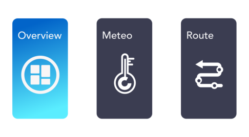
A ‘Tab navigation layout’ that takes references from daily-use applicati- ons was used for displaying this complex yet logically grouped information, aiming to allow users to access all information easily and efficiently, instead of “click to the next page”. Each tab is presented by a metaphorically deve- loped icon that includes the ‘Instructions’ to ensure its meaning reflects the real-world object, illustrating the rational correlation, and implying conno- tations (see Figure 1). All three symbols were designed with unified features of a round squared background and heteromorphic graphical elements to represent meanings and imply functions.
For example, the ‘Overview’ tab is highlighted by primary gradient colour. Different-sized squares are piled up into a form of a window, metaphorically representing a collection of different information and indicating the function of viewing/monitoring. Whereas the ‘Meteo’ uses the pictogram of a baro- meter as a metaphor for its meaning, and the ‘Route’ applies an arrow with directional connotations to represent the voyage, which is curved, and some circles indicating the WOPs.
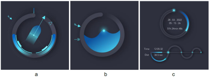
All the information displayed in the conning system is developed symboli- cally. At the first, the circular shape is the most used graphical element in this UI concept, as circular shapes are frequently used in ship bridges and other vessel workplaces, such as physical instruments like steering wheels, compas- ses, and peloruses, as well as screen-displayed information like radar charts. The crew members can easily relate to the circular symbols and understand their meanings of direction, bearing, and range based on their prior know- ledge. Then, the circled track is designed as an unenclosed circle with a start dot that gradually becomes invisible, implying the direction and guiding the user’s visual stream. To better distinguish the starting point and end, a directi- onal shadow with varying weights has been added, which increases the visual depth and builds information hierarchies. After that, the circled track is consi- stently used within different contexts. In the illustration of Figure 2, it serves as both an information container and a divider. The starting point is emph- asised by a highlighted line representing the north direction of the compass. Detailed measurements are displayed around the circle with intentionally low contrast to minimise distractions.
Other data information with directional meaning, such as wind, heading, and course, utilise the watch-face circle by employing differently designed
arrows respectively (Fig. 2-a): the wind arrow follows the Beaufort wind speed scale and indicates the accurate direction relative to the ship; the filled arrow overlaid on the ship pictogram runs through the bow and represents heading; and the hollow arrow without tails indicates the course information. The pictogram of the ship in the center is connected to two inner circle bars by subtle lines, demonstrating the vessel’s rudder angle. The thicker colou- red bars overlaid on the circle track indicate the power of propulsion. The circled track’s metaphorical meanings and functions are optimized to display complex information in an integrated illustration with visual hierarchies. By consistently using this graphical element and designing it to convey diffe- rent meanings in different contexts, the UI concept allows for efficient and intuitive access to information for the users.
Similarly, symbolic design is also used to represent and convey informa- tion (Figure 2). For instance, the flowing water is designed using a curvilinear pictogram filled with gradient colours to represent its depth. The two arrows outside the circled track indicate the direction and the level of current wind speed respectively (Fig. 2-b). In the Fig. 2-c, the metaphoric meaning of the track is magnified to express the route and voyage progress. Some sha- ding and gradually disappearing gradient colours are used to distinguish the starting and ending points and guide users’ sight.
Colour is one of the three factors of aesthetic design. The light grey is deci- ded/developed based on the background colour (dark grey) aiming to create a harmonious and visual richness effect while minimising distractions. Criti- cal information is presented with high saturation colour (HSL: 190, 100, 68), while other elements are coloured with lower saturation and lightness (HSL: 200, 60, 38). Additionally, a visual ‘Light effect’ is applied to highlight key information/data.
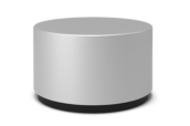
Microsoft Dial shown in Figure 3 is a tangible, interactive control that were introduced to the UI concept. Its name and form suggest that users can interact with it through rotation and pressing actions, which are commonly associated with steering and selection. Accordingly, a responsive GUI concept has been implemented. As shown in Figure 4, a transparent symbolic wheel is presented in the interface, with only half of it visible to conserve space and minimize attention (Fig. 4 left). The Dial can be touched at any time to acti- vate the symbol wheel. Once the wheel is awakened, it appears fully opaque
Interface and Interaction: The Symbolic Design for Bridge Conning System 209
Figure 3: The dial. (Microsoft, 2022).Figure 4: The dial interaction example. (2022).
with 100% visibility for interaction (Fig. 4 right). The wheel is designed as an unenclosed circle with a highlighted curved line to maintain consistency with the overall visual theme and to indicate its association with rotation.
THE EVALUATION AND DISCUSSION These symbolic concepts were evaluated through a focus group discussion, with 6 maritime industrial practitioners invited to assess if the design has improved the user experience. In general, the feedback was positive, and all the participants enjoyed the interactions with the new UI concept. they believe in the idea of transferring daily-life experience into the new interface “helps to learn quickly and easily to familiarise themselves”. The new design also ensures they perceive the visual depth of interfaces. The concept of layout customisation is popular, as well as presentation style is desirable.
A focus group discussion was conducted to evaluate this UI concepts. Six maritime industrial practitioners were invited to assess the user expe- rience of the new concept. In general, the feedback was positive, and all participants enjoyed the interactions with the new UI. They believe that tran- sferring daily-life experiences into interface design helps users learn quickly and easily familiarise themselves with the new design. The new UI also ensu- res that users can perceive the visual depth of interfaces. The concept of layout customisation is popular, and the presentation style is desirable.
All participants found the UI concept to be “very accessible” and “easy to understand.” The interface maximises interaction and minimises distraction, making it intuitive and effective. Most participants like the ‘Tab navigation’ layout but suggest providing multiple modes of interface navigation to cater to different users’ preferences. The symbolically designed icons and picto- grams were easily recognisable and correctly interpreted, with no participants expressing confusion or frustration. However, concerns were raised about
the use of motion effects in the UI concept, and some participants suggested adding an on/off function to avoid distractions when needed.
CONCLUSION
This paper showcases the iterative development of a conceptual interface and interaction design for the future ship bridge, based on the HCD design protocol. The design features metaphoric symbols, which have been emph- asised and explored using trendy GUI styles. Preliminary results from a user-centred evaluation confirm the advantages of using metaphorical UI symbols. In addition, symbolising actions provides further design opportuni- ties, with a particular focus on symbolic interaction design within the context of ship bridge operations and culture. The trendy GUI style helps to satisfy users’ aesthetic preferences, which are informed by their daily-life experie- nces. These findings are expected to benefit designers in future ship bridge design and may be generalized to create an ergonomic workplace that ensu- res user-friendly HMI in various contemporary industries. Further primary research should aim to investigate and confirm the findings clarified in this study and to gain a deeper understanding of the data within the real-world context.
ACKNOWLEDGMENT
The authors would like to acknowledge the support of the International Association of Maritime Universities (research project number 20220402).
REFERENCES
Apple (2017). Human Interface Guidelines Platforms Overview. Available at: https: //developer.apple.com/design/human-interface-guidelines/platforms/overview Blair-Early, A., and Zender, M. (2008). User interface design principles for interaction
design. Design Issues 24(3), 85–107. Bollini, L. (2016). From skeuomorphism to material design and back. The language of colours in the 2nd generation of mobile interface design. Colour and colorimetry. Multidisciplinary contributions 12, 309–320. Bollini, L. (2017). Beautiful interfaces. From user experience to user interface design.
The Design Journal 20(sup1), S89-S101. Brinkschulte, U., Siormanolakis, M., and Vogelsang, H. (1997). “Graphical user interfaces for symbol-oriented database visualization and interaction”, in: Visual Data Exploration and Analysis IV: SPIE), 266-273. Burlamaqui, L., and Dong, A. (2016). Affordances: Bringing them out of the woods.
Interactions 23(4), 80–82. Burmistrov, I., Zlokazova, T., Izmalkova, A., and Leonova, A. (2015). “Flat design vs traditional design: Comparative experimental study”, in: IFIP Conference on Human-Computer Interaction: Springer), 106–114. Candi, M., Jae, H., Makarem, S., and Mohan, M. (2017). Consumer responses to
functional, aesthetic and symbolic product design in online reviews. Journal of Business Research 81, 31–39. Carroll, J. M., and Mack, R. L. (1985). Metaphor, computing systems, and active learning. International journal of man-machine studies 22(1), 39-57.
Interface and Interaction: The Symbolic Design for Bridge Conning System 211
Cyr, D., Kindra, G. S., and Dash, S. (2008). Web site design, trust, satisfaction and e-loyalty: the Indian experience. Online Information Review. Eberts, R. E. (1994). User interface design. Prentice-Hall, Inc. Garrod, S., Fay, N., Lee, J., Oberlander, J., and MacLeod, T. (2007). Foundations
of representation: where might graphical symbol systems come from? Cognitive science 31(6), 961–987. Gatsou, C., Politis, A., and Zevgolis, D. (2012). The Importance of Mobile Interface Icons on User Interaction. Int. J. Comput. Sci. Appl. 9(3), 92–107. Google (2022). Material Design Introduction. Available: https://m2.material.io/desi
gn/introduction ISO (2010). “ISO 9241-210:2010 Ergonomics of human-system interaction — Part 210: Human-centred design for interactive systems”. Iverson (2020). Stop Trying to Use Neumorphism in Interface Design. Availa-
ble: https://uxplanet.org/stop-trying-to-use-neumorphism-in-interface-design-ce a90176a90c Jacob, R. J., Leggett, J. J., Myers, B. A. and Pausch, R. (1993). Interaction styles and input/output devices. Behaviour & Information Technology, 12 (2), 69–79. Karjalainen, T.-M. (2003). “Strategic brand identity and symbolic design cues”, in:
6th Asian design conference: Citeseer), 1–13. Krippendorff, K. (1989). On the essential contexts of artifacts or on the proposition that” design is making sense (of things)”. Design issues 5(2), 9–39. Kuan, P.-H., Huang, I.-C., Wang, Y., Li, M., and Duh, H. B.-L. (2015). “TAS
MOVE: The Processes of Applying Flat Design in an Efficiency Require Mobile Application”, in: IASDR2015 Congress), 1175–1188. Marcus, A. (1993). Human communications issues in advanced UIs. Communications of the ACM 36(4), 100–109. Microsoft (2022). Acrylic Material. Available: https://learn.microsoft.com/en-us/wi
ndows/apps/design/style/acrylic Miller, L. A., and Stanney, K. M. (1997). The Effect of Pictogram-Based Interface Design on Human-Computer Performance. International Journal of Human– Computer Interaction 9(2), 119–131. Neisser, U. (1976). Cognition and Reality. San Francisco: Freeman. Norman, D. (2013). The design of everyday things: Revised and expanded edition.
Basic books. Norman, D. (2019). Do Industrial Designers have a future? Available: https://jnd.or g/do_industrial_designers_have_a_future/ Norman, D. A., and Nielsen, J. (2010). Gestural interfaces: a step backward in
usability. interactions 17(5), 46–49. Rex Hartson, H., and Boehm-Davis, D. (1993). User interface development processes and methodologies. Behaviour & Information Technology 12(2), 98-114.
LISTED IN THE AHFE DIGITAL BOOKSTORE CATALOGUE
Explore the complete digital volume
Cognitive Computing and Internet of Things
Read this individual research paper free through the original publisher, or explore the full digital proceedings book.
ISBN 978-1-958651-49-0
Explore this ISBN in the AHFE Bookstore ↗Listed in the July 2026 bookstore catalogue; search by ISBN to confirm current availability · Digital book purchase optional